
Critique welcome
 Helpful Posts: 0
Results 1 to 9 of 9
Thread: BarCamp Lake
-
13th April 2010, 06:01 PM #1

- Join Date
- Aug 2009
- Posts
- 2,342
- Real Name
- Steve
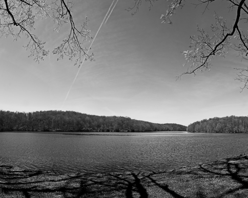
BarCamp Lake
-
13th April 2010, 08:24 PM #2Moderator

- Join Date
- Feb 2009
- Location
- Glenfarg, Scotland
- Posts
- 21,402
- Real Name
- Just add 'MacKenzie'
Re: BarCamp Lake
Steve
Hope this is useful.
I like the conversion. The foreground grass, the water, the trees on the farside of the lake and then the sky - all have a nice balance and harmony.
What makes it not work as well as it could, for me, is everything else.
By that I mean - the shadows on the grass, the trees on this side of the lake (apart from that one we can see in full view with the dark foliage, at the right-hand side) and the vapour trails. I think the combination of all these elements make it too busy and 'bitty' (I know there's no such word, but hope you know what I mean). There's too much in it that's screaming for attention - those dark shadows on the grass drag your eyes downward, the vapour trails scream at you to look upwards and the overhanging branches coming in at the top and the other trees, apart from the one mentioned above, are getting in the way of a beautiful view.
The harmony and balance referred to above, created by your conversion, is being bludgeoned and pushed-aside by all these others 'bits' stamping all over it. With these 'bits' not there, I then wouldn't touch the levels slider, but keep it 'Paul Strand-ish' in terms keeping the black and white sliders well away from their clipping points and leaving as a study where the mid-tones dominate.
That's one view. Hopefully others will come in to challenge it, or not!
-
13th April 2010, 08:42 PM #3
- Join Date
- Aug 2009
- Posts
- 2,342
- Real Name
- Steve
Re: BarCamp Lake
 Originally Posted by Donald

Thanks donald, i appreciate the critique. I agree about the jet trails and the overhanging limbs and the tree in the center. I disagree with the dark shadows of the trees on the grass. That is one of the things i love about the image.
I attempted a major clone of the sky, but wasn't happy with the destruction of the clouds. I may have to clone it as a color image so i can select things easier and then convert it to b&w.
Uncluttered wide open areas are not the norm around here, there is always something in the way
-
13th April 2010, 08:43 PM #4Moderator

- Join Date
- May 2008
- Location
- Windsor, Berks, UK
- Posts
- 16,775
- Real Name
- Dave Humphries :)
Re: BarCamp Lake
Thanks Donald,
I was just wondering how to put it, I read this earlier and left the tab open to return to later and reply, but I now find you've said exactly what I was thinking.
Hi Steve,
I really can't improve upon what Donald has said, it is the plethora of conflicting image content fighting with each other that spoils it. Unfortunately, if you imagine taking out any one or two things, what you're left with doesn't work either
Sorry,
-
13th April 2010, 09:00 PM #5Moderator
- Join Date
- Feb 2009
- Location
- Glenfarg, Scotland
- Posts
- 21,402
- Real Name
- Just add 'MacKenzie'
Re: BarCamp Lake
Steve
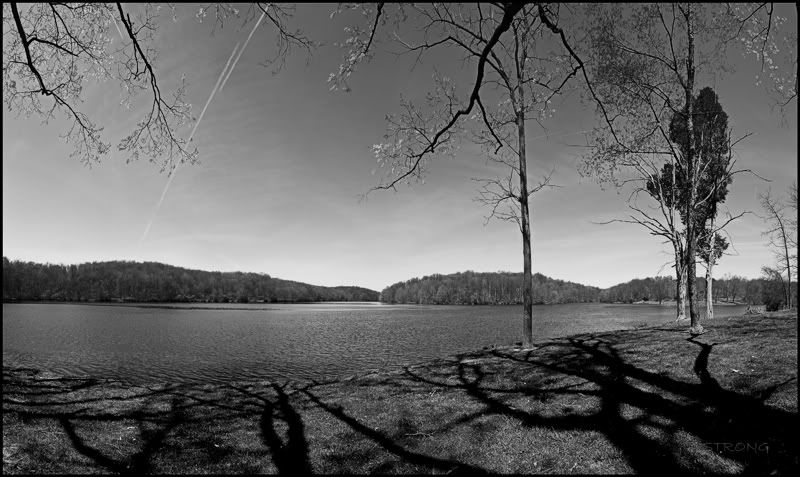
Hope you don't think this is too cheeky of me, but I was desperate to try and open up that view across the lake. Still tried to keep some shadow on the grass and get the bottom 'third' horizontal on a key line.
Nothing more than a crop (5:4 aspect ratio). Apologies if you don't like me doing this. Happy to remove if you wish.
-
14th April 2010, 11:39 AM #6

- Join Date
- Feb 2010
- Location
- Cairns, Queensland
- Posts
- 304
- Real Name
- Grant
Re: BarCamp Lake
Hello Steve
I far prefer your uncropped version. In cropping I think Donald has lost the dramatic tree shadows that lead the eye to the centre of the photo. By the way, Steve, you say that uncluttered wide open area are not the norm "around here". As a matter of interest where in the world is "here"
Grant
-
14th April 2010, 01:43 PM #7
- Join Date
- Jan 2009
- Location
- South Devon, UK
- Posts
- 14,897
Re: BarCamp Lake
An alternative to Donald's crop is something like this
which keeps the original size ratio (approx) but still centres the eye on the far side of the lake; while retaining some tree shadows. I agree with Donald that I find the heavy foreground shadows too overpowering.
A little bit of tweaking of the contrast etc is still needed. I have just looked at an alternative possible crop option here.Last edited by Dave Humphries; 14th April 2010 at 05:49 PM. Reason: remove 'spare' IMG tags
-
14th April 2010, 03:00 PM #8
- Join Date
- Aug 2009
- Posts
- 2,342
- Real Name
- Steve
Re: BarCamp Lake
It's interesting to see what others would do with the same shot.
My 4 shot pano got reduced to a single frame
Grant , i live in northern west virginia. This shot was taken in eastern ohio.
-
14th April 2010, 07:20 PM #9

- Join Date
- Feb 2010
- Location
- New Jersey, USA
- Posts
- 316
- Real Name
- Ben
Re: BarCamp Lake
I like Geoff F's version best. Perhaps with a title change to "Near Miss".

 Reply With Quote