
Hi All!
I'm trying decide which one I like better...Can I get some opinions please?????
Comments are appreciated too!!!!!
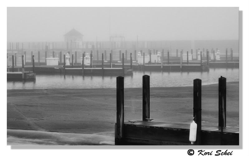
1) the original:
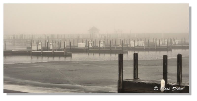
2) black/white:
Thank you!
 Helpful Posts: 0
View Poll Results: Which do you prefer?
- Voters
- 3. You may not vote on this poll
-
The first Image
2 66.67% -
The Second Image
1 33.33%
Results 1 to 17 of 17
Thread: Which one???
-
7th April 2010, 01:01 AM #1


- Join Date
- Apr 2009
- Location
- Menominee, MI
- Posts
- 348
- Real Name
- Kori

Which one???
-
7th April 2010, 01:25 AM #2

- Join Date
- Sep 2009
- Location
- Washington (state) USA
- Posts
- 976
- Real Name
- Pops
Re: Which one???
I prefer the B&W over the sepia tint of the original. Of course, I grew up on B&W.

Pops
-
7th April 2010, 01:27 AM #3
- Join Date
- Oct 2009
- Location
- Maryland, USA
- Posts
- 1,015
- Real Name
- Rick
Re: Which one???
Hi, Kori;
I certainly like the second one (B&W) better: it has more depth. Can you use curves to get the same depth in the color version? It probably wouldn't make sense: the range of hues is small, and B&W is probably a good choice.
One suggestion is that you might try cropping off about a third of the width from the left-hand side of the current image. This would bring the dock in the foreground more toward the center, and it would especially bring that white bumper close to the right-hand one-third line. The dock and white bumper would tend to draw your eyes into the image, and through to the ghostly tower that would then be at the left one-third line. I made a quick try at it below, if you don't mind my mucking with your image.
Cheers,
Rick

-
7th April 2010, 01:32 AM #4
- Join Date
- Apr 2009
- Location
- Menominee, MI
- Posts
- 348
- Real Name
- Kori
Re: Which one???
Thank you Pops!
Thank you Rick! I don't mind you playing with my image.! I'm all about learning here!
I don't dare play with curves; I always make it worse! I don't understand too much on how to use curves yet. Every time I "try" it gets horrible! You did a nice job "seeing" what it could be. I like your version, Thank you!!!!!
-
7th April 2010, 02:22 AM #5
- Join Date
- Oct 2009
- Location
- Maryland, USA
- Posts
- 1,015
- Real Name
- Rick
Re: Which one???
Hi, Kori;
I'm far from an expert in using curves, but I have a kind of standard workflow that I use, probably because I have the same problem of "making things worse." I'm not sure what tool(s) you're using, but I hope this will be applicable.
First, I always create a new adjustment layer. This lets me turn it on and off, and gives additional dimensions of control, either of the effect of the entire layer, or with the gradient tool.
Second, unless I know in advance what I'm trying to do (like increase contrast, darken, lighten), I hit the "auto" button, and see what PS does for me. It tends to do different things for different channels, which I rarely like, but the shape of what it does often gives me a hint of what I might want to do. If it's below the default line at the left and above it at the right, for example, I'll use one of the "increase contrast" presets, and then adjust to my taste. If it's all below the default line, I'll start from "darken." And so forth.
Cheers,
Rick
-
7th April 2010, 05:37 AM #6

- Join Date
- Apr 2010
- Location
- southern california
- Posts
- 40
- Real Name
- Nicole ("Nik")
Re: Which one???
i love the first one.
i do think you could boost the contrast just a tad though.
=)
-
7th April 2010, 05:07 PM #7Moderator

- Join Date
- May 2008
- Location
- Windsor, Berks, UK
- Posts
- 16,775
- Real Name
- Dave Humphries :)
Re: Which one???
Hi Kori,
Well I agree with Nicole - and Rick!
I think I prefer the border on the first, but the image could do with a small contrast boost.
However, one of the first things that struck me was how central the ghostly tower was, so I do like Rick's crop.
Just to make things really complex; I prefer the 'signature' to be on the border, rather than over the image, so, like the black one, but in white please")
Although, having done that, the lighter area on jetty edge to the right of foreground bumper is a little distracting, so I'd clone that out.
Cheers,
-
7th April 2010, 07:04 PM #8
- Join Date
- Jan 2009
- Location
- South Devon, UK
- Posts
- 14,899
Re: Which one???
All you need to know about using Curves is here https://www.cambridgeincolour.com/tu...hop-curves.htm but like Rick says, do it on an Adjustment Layer.
For that shot, I would basically just tweak the straight diagonal Curves line into a shallow S shape. Maybe a little bit more complicated in reality but still very easy to achieve.
-
8th April 2010, 12:07 AM #9
- Join Date
- Apr 2009
- Location
- Menominee, MI
- Posts
- 348
- Real Name
- Kori
Re: Which one???
Rick: Thanks for the information! I'll have to play around with it.
Dave: WOW.... you confuse me easily! LOL I'll have to see what I can come up with - hopefully this weekend I can find some time to play!
Geoff: Thank you! I will read the article over and HOPE it turns out okay!
I will post results.... Hopefully, like I said, this weekend; work has been a zoo lately so little time during the week.
Thanks again for all the help and suggestions!
-
9th April 2010, 12:58 AM #10

- Join Date
- May 2008
- Posts
- 1,543
- Real Name
- Ali
Re: Which one???
Black and White for me, and I agree with Nik, it can use a little bit of contrast. Too flat right now. But it may be the effect you want, foggy weather may be? It is such a surreal place anyway. Great shot!
-
9th April 2010, 01:04 AM #11
- Join Date
- Apr 2009
- Location
- Menominee, MI
- Posts
- 348
- Real Name
- Kori
Re: Which one???
Thank You Alis!
The black and white is really growing on me too now! There was very thick fog that morning and it was misting out slightly too!!!!
I'm trying to give it some contrast without losing the fog in the background.... sigh! It's fun to learn, but frustrating also! I'm playing with the curves tool as we speak! Hope to post a new version soon!
-
9th April 2010, 02:07 AM #12
- Join Date
- Apr 2009
- Location
- Menominee, MI
- Posts
- 348
- Real Name
- Kori
Re: Which one???
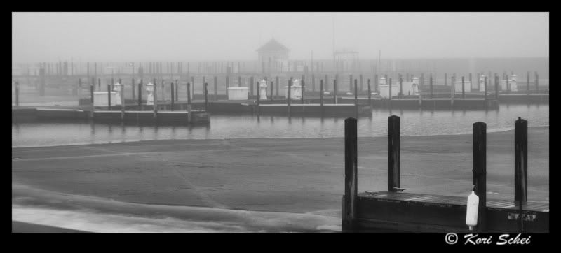
I did some adjustments, please take a look and let me know your thoughts. I'm not sure how to apply more contrast without losing the fog though, this is the best I can do tonight. It still looks like it needs something - ??????
Thanks for all the help!!!!!
-
9th April 2010, 02:45 AM #13
- Join Date
- Oct 2009
- Location
- Maryland, USA
- Posts
- 1,015
- Real Name
- Rick
Re: Which one???
Hi, Kori;
Very nice!! I like this a lot: the reflections of the pilings seem to jump out more, the ghostly tower is much more of a terminal point, and the foreground pier stands out beautifully from the rest of the image. A wonderful treatment!
Cheers,
Rick
-
9th April 2010, 02:50 AM #14
- Join Date
- Apr 2010
- Location
- southern california
- Posts
- 40
- Real Name
- Nicole ("Nik")
Re: Which one???
kori...
i hope you don't mind. {i'll take it down if you do.}
i played with the orginial image you posted.
i just pulled it down in curves a bit.
i think this is really a fabulous image.
i love coastal pictures. =)

-
9th April 2010, 02:52 AM #15
- Join Date
- Apr 2009
- Location
- Menominee, MI
- Posts
- 348
- Real Name
- Kori
Re: Which one???
Thanks Rick! Originally Posted by rick55

I do like it better than the first posted one, but I feel it still needs something.... I'm not sure if It's because I've been staring at it and just need to sleep and reopen my eyes tomorrow or not??? LOL
Thank you!
-
9th April 2010, 02:56 AM #16
- Join Date
- Apr 2009
- Location
- Menominee, MI
- Posts
- 348
- Real Name
- Kori
Re: Which one???
I don't mind at all! Originally Posted by Nik
This isn't a coastal picture; however! It a picture of the "Green Bay" just off of Lake Michigan
I do love pictures like this, I frequently take pictures of our local light house too! The area is nice with the bay/lake on our East and the River on our West! =)
I like your take on the picture also! Thank you Very much!
-
9th April 2010, 09:44 AM #17

- Join Date
- Dec 2009
- Location
- WNY
- Posts
- 36,716
- Real Name
- John
Re: Which one???
I like Nik's edit, it gives it the same impact as the b&w image with the border.
Originally Posted by Nik

 Reply With Quote