Helpful Posts:
Results 1 to 10 of 10
Thread: Gentleman reading newspaper
-
8th September 2013, 02:36 PM #1


- Join Date
- Aug 2013
- Location
- Corfu, Greece
- Posts
- 13
- Real Name
- Rob Dingwall
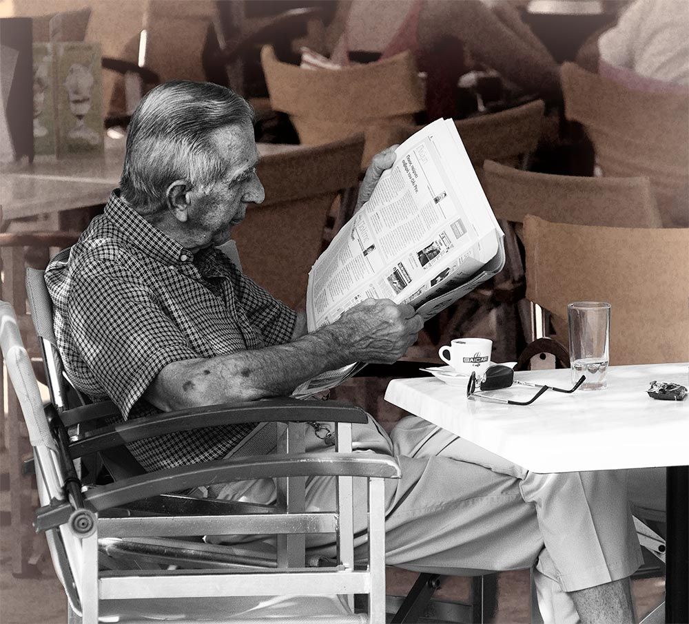
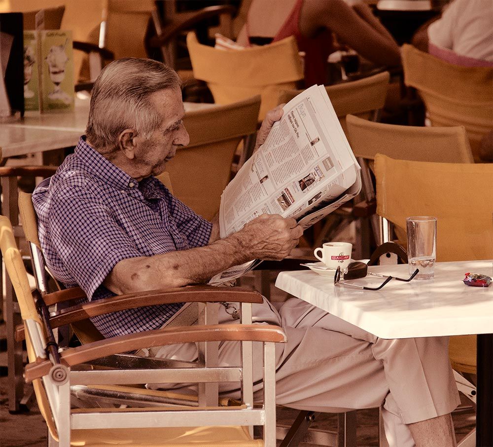
Gentleman reading newspaper
Last edited by RobDingwall; 8th September 2013 at 02:54 PM.
-
8th September 2013, 03:01 PM #2

- Join Date
- Sep 2011
- Location
- Columbus, Ohio, USA
- Posts
- 1,960
- Real Name
- Kevin
Re: Gentleman reading newspaper
An interesting face, and I see why you spotted him. It might have been interesting also to have included more of the background if it represented an intriguing contrast. I don't see color here that seems important, and I wonder if a B&W conversion would be more impactful.
-
8th September 2013, 03:07 PM #3
- Join Date
- Aug 2013
- Location
- Corfu, Greece
- Posts
- 13
- Real Name
- Rob Dingwall
Re: Gentleman reading newspaper
Thanks, there is slight colourisation in the reds on the cup and the wrapper on the table. The original was toned down to give a warm glow to the scene - it was very warm - around 35C (95F). The background was really just more tables and chairs. I will bo a B&W conversion and post it later - see how that looks.
-
8th September 2013, 03:28 PM #4
- Join Date
- Aug 2013
- Location
- Corfu, Greece
- Posts
- 13
- Real Name
- Rob Dingwall
-
8th September 2013, 03:49 PM #5
- Join Date
- Oct 2011
- Location
- Fife, Scotland
- Posts
- 169
- Real Name
- David
Re: Gentleman reading newspaper
The blackj and white I think really makes this photo. The red spot colour I'm not too sure about, as they take my eyes from the main image of the photo and slopes them out of the picture. Apart from that I like the shot and pleased you got it loaded up.
-
8th September 2013, 04:26 PM #6
- Join Date
- Aug 2013
- Location
- Corfu, Greece
- Posts
- 13
- Real Name
- Rob Dingwall
Re: Gentleman reading newspaper
Thanks, I'll be working on a better B&W version without the colour.
-
10th September 2013, 05:52 AM #7
- Join Date
- Aug 2013
- Location
- Corfu, Greece
- Posts
- 13
- Real Name
- Rob Dingwall
-
10th September 2013, 06:52 AM #8

- Join Date
- Sep 2012
- Location
- Nomadic but not homeless, ex N.Z. now Aust.
- Posts
- 4,167
- Real Name
- Paul

Re: Gentleman reading newspaper
I prefer your first B&W version. If you are to do a mix as above I think the other way around would possibly be better (even if a bit more usual). It is a very good bit of photojournalism style of photography of a very common activity.
-
10th September 2013, 10:49 AM #9
- Join Date
- Aug 2013
- Location
- Corfu, Greece
- Posts
- 13
- Real Name
- Rob Dingwall
Re: Gentleman reading newspaper
Still working on ideas - thanks for the input, everyone.
-
10th September 2013, 05:09 PM #10
- Join Date
- Oct 2011
- Location
- Fife, Scotland
- Posts
- 169
- Real Name
- David
Re: Gentleman reading newspaper
The muted look of the background is a nice colour and may be an option to use it as the onerall tone. Just an idea.

 Reply With Quote