
 Helpful Posts:
 A coloured photo that I converted to B&W using Elements 9
How did I do? I think it looks good, but something is not quite right about it? Too, dark?
Results 1 to 19 of 19
-
14th March 2013, 08:08 PM #1


- Join Date
- Jul 2011
- Location
- British Columbia, Canada
- Posts
- 7,244
- Real Name
- Christina
Trying to Learn what a good B&W conversion is
-
14th March 2013, 08:31 PM #2

- Join Date
- Jun 2012
- Location
- Detroit, Michigan
- Posts
- 1,009
- Real Name
- Lex
Re: Trying to Learn what a good B&W conversion is
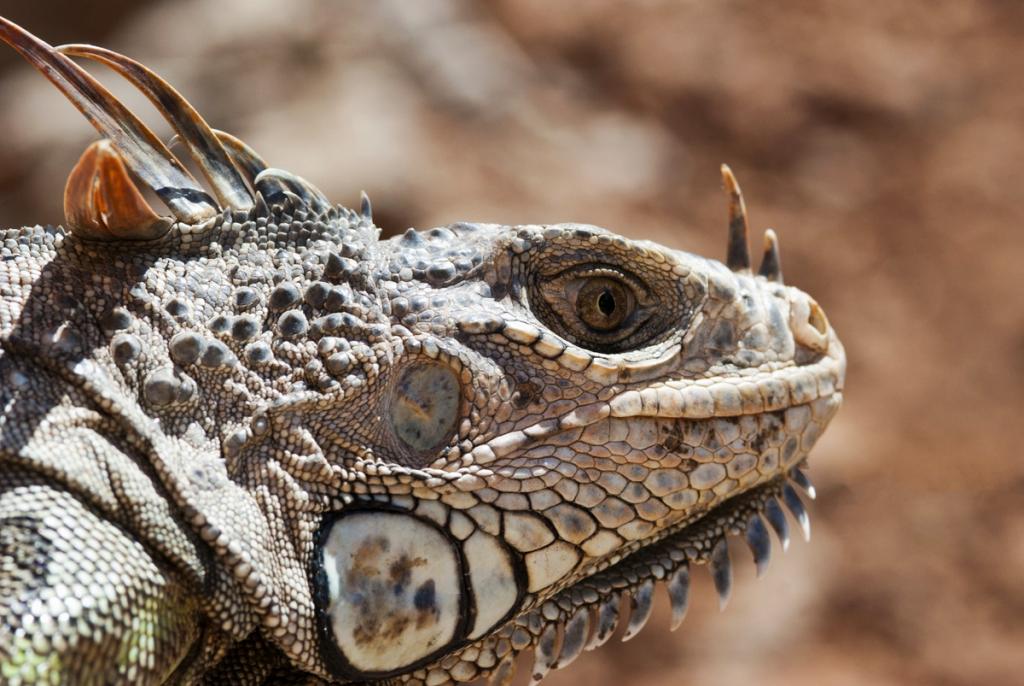
When you did the conversion, was it simply desaturation (one slider), or a channel-by-channel B&W conversion (multiple sliders)? Multiple sliders let you separate the subject from the background more strongly, or add contrast and visual weight to areas that lack it in the full-color version. It's also a great way to emphasize texture. For instance, you could drag down the green slider to make the lizard darker, essentially increasing the contrast to make it pop more, but since there's also a lot of green behind it, that area would get darker, too. On that basis, I'm not sure this photo is a particularly good candidate for B&W.
 A zoomed-in, macro-like shot of his head might be a better basis - the detail there should look great in B&W.
-
14th March 2013, 08:37 PM #3
- Join Date
- Jul 2011
- Location
- British Columbia, Canada
- Posts
- 7,244
- Real Name
- Christina
Re: Trying to Learn what a good B&W conversion is
Thank you Lex... No I have not been using the saturation process because I read somewhere that the results are kind of lame. For this photo I used either landscape or scenic landscape and I did play with the sliders a bit but the effects looked strange so I did not do too much... I do have a good head shot of an iguana somewhere so I will try it with the sliders more and post.
Thank you.
-
14th March 2013, 08:38 PM #4Moderator

- Join Date
- Feb 2009
- Location
- Glenfarg, Scotland
- Posts
- 21,402
- Real Name
- Just add 'MacKenzie'
Re: Trying to Learn what a good B&W conversion is
Christina - I think if you can tell us what you did to convert to B & W that will help people offer some advice and guidance.
Also, you ask, rhetorically, -'something is not quite right about it?' What? In other words what is your own assessment of the strengths and weaknesses?
EDIT - Aaahh,our posts have just crossedLast edited by Donald; 14th March 2013 at 08:50 PM.
-
14th March 2013, 08:59 PM #5
- Join Date
- Jul 2011
- Location
- British Columbia, Canada
- Posts
- 7,244
- Real Name
- Christina
Re: Trying to Learn what a good B&W conversion is
Thank you Donald.. I opened up the jpeg in Elements 9 and ended up just hitting the scenic landscape button for the conversion to b&w because nothing I tried with the sliders looked good. ie. it was the best of the worst
For one it does not look like your b&w photos : I think the top part around the head is nice because the lighting is better in that part of the photo? The lower portion of the photo is too, dark? There are no true blacks or whites in the photo? And something about the detail in the tail of the iguana looks unreal?
Here is another try..
Opened the jpeg Elements 9, hit landscape and here I decreased the green slider a bit, and I increased the blue slider a bit, and increased the contrast a tad...


Better because their are more true blacks in the photo?
-
14th March 2013, 10:28 PM #6Moderator
- Join Date
- Feb 2009
- Location
- Glenfarg, Scotland
- Posts
- 21,402
- Real Name
- Just add 'MacKenzie'
Re: Trying to Learn what a good B&W conversion is
Christina - Some comments for you to consider (and reject if you don't agree with them).
To take the second one first. I think the tones and textures across the image are too similar for it to be an effective B & W. What I mean is that the main subject gets a bit lost because, in terms of tones and texture, everything is quite similar. For example, look at the creature and the bark of the tree. They look the same. And although the background is made up of different textures and tones , I don't think they are sufficiently different to help the subject pop out of the image.
Now, your original image. I have to say that I like it very much and would have been very happy to have produced it. I think it has all the positive things that I think are lacking in the second one. I think the fact that you included your original colour picture is very help in showing us that the secret to a good B & W is to capture a good photograph in the first place. It seems to me that you got a very good exposure and captured a beautiful light on the creature. That makes the B & W conversion much easier because you've got light and shade built in to the original photograph. The focusing is spot-on.
You write that you are concerned there are no true blacks or whites in the B & W version. Many people thinks it is an absolute necessity that you should have blacks and you should have whites. Others disagree. Paul Strand, one of the greatest artists ever to work with a camera, produced a lot of work working with the range of greys between black & white. I think your image is a very good example of that can work so very well.
If you are keen to explore B & W, then clearly you will want to continue to experiment and build up your experience in using the tools in Elements. I would suggest that using something like 'scenic landscape' will not work for every B & W you want to make. It worked for this one and that's great. But you need to get to know all the tools you could use for B & W conversion. That way you will build up the experience to know which one to sue fro what type of images.
-
14th March 2013, 10:44 PM #7
- Join Date
- Jul 2011
- Location
- British Columbia, Canada
- Posts
- 7,244
- Real Name
- Christina
Re: Trying to Learn what a good B&W conversion is
Thank you Donald...
As someone who is still learning this explanation because of its simplicity was very helpful.
To take the second one first. I think the tones and textures across the image are too similar for it to be an effective B & W. What I mean is that the main subject gets a bit lost because, in terms of tones and texture, everything is quite similar. For example, look at the creature and the bark of the tree. They look the same. And although the background is made up of different textures and tones , I don't think they are sufficiently different to help the subject pop out of the image.
Thank you.
Great to know...
Will do!
-
14th March 2013, 11:44 PM #8

- Join Date
- Dec 2011
- Location
- New England
- Posts
- 9,210
- Real Name
- Dan
Re: Trying to Learn what a good B&W conversion is
Christina,
From what I have seen, Donald is a far more expert B&W photographer than I am, but perhaps I can add to what he suggested.
First, think about what B&W offers. Since color is gone, what is left? Lines, textures, contrasts, and tonal gradients. You have to make the image interesting based on those, so editing should reflect what you want in that respect. For example, Donald has posted some beautiful images with very gradual tonal gradients, such as misty scenes. Other people tend to use high-contrast images, such as some of Ansel Adam's work. So I see two steps. First, decide whether, and why, B&W is right for your image, given what YOU want to accomplish. Perhaps the color is boring, or a distraction. Perhaps there are some lines you want to highlight, e.g, in a photo of the wavelike shapes of dunes. If there isn't something like that, color may be better. If there is, try to think about how modifying the image will get you what you want. That should guide your editing.
For a mundane suggestion: If you are interested in black and white, I would shoot raw. It will give you much more flexibility than jpeg. For B&W conversions, I am very impressed with Lightroom. It is quite powerful, but more than that, it is a very good learning tool. First, you tell it to convert. That generally yields a pretty boring image, in my experience. However, some of the flaws are apparent and easily fixed. For example, the histogram might confirm that you don't have the full tonal range in the conversion, and if you want that (I generally do, but as Donald points out, you might not), that is easy to fix. You can make simple adjustments to contrast, etc. Then, the fun part: rather than playing with color sliders, you can use the targeted adjustment tool. for example, suppose there is one region you want to darken, and you suspect that it is mostly one color. You don't have to guess at the underlying color. Put the targeted adjustment cursor over a region, and LR figures out the color mix. If you then drag it up or down, LR will move the relevant sliders for you. if you don't like the result, just go back one step in the history panel and start again. When I discovered this, I found it very intuitive, easy to learn, and powerful.
Dan
-
14th March 2013, 11:54 PM #9
- Join Date
- Jul 2011
- Location
- British Columbia, Canada
- Posts
- 7,244
- Real Name
- Christina
Re: Trying to Learn what a good B&W conversion is
Thank you, Dan.
Your explanation of what a B&W photo offers after the colour is gone is terrific. Very helpful. Thank you.
I do shoot raw but for b&w conversions I've been using the presets in Elements, because my own edits in raw were lacking. (I will try raw again)... I will also try your suggestion of playing with B&W in lightroom which seems more intuitive to learn...
 Originally Posted by DanK

-
15th March 2013, 01:27 PM #10
- Join Date
- Jun 2012
- Location
- Detroit, Michigan
- Posts
- 1,009
- Real Name
- Lex
Re: Trying to Learn what a good B&W conversion is
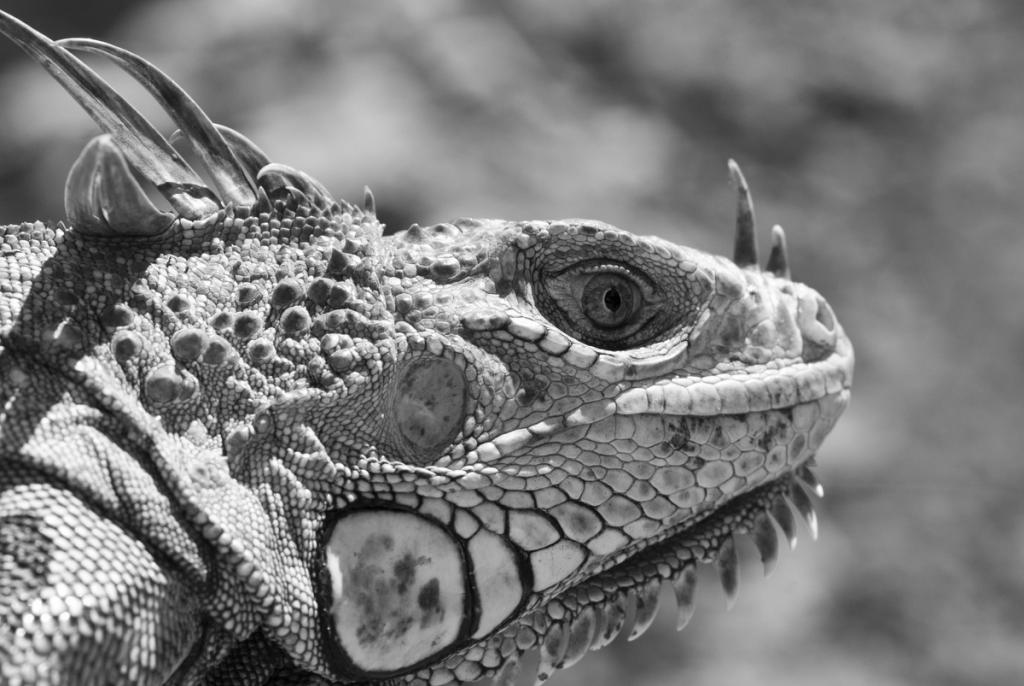
I respectfully disagree with Donald's preference for the first image. The second's B&W conversion really makes the iguana's rough skin pop, but it looks like there are some blown highlights (and therefore, a loss of detail) near its nostrils. I agree that the iguana's texture is close to the tree's, but the narrow DoF really helps minimize that problem. I would maintain the aspect ratio and crop out the bit of tree visible in the bottom right (ie, remove parts of the right and top edges of the shot). This would get your lizardy friend near a thirds line, which will probably help composition. Contrast may be a little high - try lowering it and see if you like the result.
-
15th March 2013, 01:48 PM #11
- Join Date
- May 2012
- Location
- northern Virginia suburb of Washington, DC
- Posts
- 19,064
Re: Trying to Learn what a good B&W conversion is
I've got a few thoughts that seem to be very different from those posted so far, and please brace yourself for my last suggestion.

I've seen in other threads that you are doing a great job of learning how to selectively isolate parts of an image. If the green background in the first photo bothers you when it is converted, select the background and change it before converting. (By the way, it looks generally fine to me as is in the conversion, though I would lighten the two dark areas.) That leads to my next recommendation.
After converting to black-and-white, be prepared to undo the conversion and revisit the color version. That's because it is very often easier to select two areas that might be quite different tones in the color version yet very similar tones in the monochrome version.
You mentioned that you're using the Elements presets because you weren't able to achieve success using the manual method. That would be fine if you were happy with the results produced using the preset, but you mentioned that the results are only the best of the worst outcomes. Whatever post-processing software you use, your long-term results will generally be improved in all ways if you dedicate yourself to learning how to master the manual methods. That's because they provide the most power and flexibility. Use the presets when you're under a deadline and have to get the best for now in the shortest period of time, but master the manual methods to take your photos to the level that you have explained you want to achieve.
You probably won't be able to achieve great black-and-white conversions until you first decide that you actually like the genre; without the passion for monochromes, it's difficult to imagine how you would ever make great monochromes. If I remember correctly, you haven't come around to preferring black-and-white photos, which is both understandable and fine. The best way to confirm whether or not black-and-white photos are your thing is to review decades of them over time.
Brace yourself; here it comes: I am getting the impression that you are taking on too much in too short a period of time. Especially considering that you prefer color photos and that you are still understandably dealing with the basics of how to capture and post-process them, I think you might be better off limiting yourself to mastering the issues that are pertinent to color photography. Once you have done that, consider making monochrome versions, but only if you've decided that you really like them. Otherwise, stick with making what you like.
Last edited by Mike Buckley; 15th March 2013 at 02:04 PM.
-
15th March 2013, 01:48 PM #12
- Join Date
- Jul 2011
- Location
- British Columbia, Canada
- Posts
- 7,244
- Real Name
- Christina
Re: Trying to Learn what a good B&W conversion is
Lex, thank you for sharing. Also very helpful.
I'm always amazed at the details noticed (ie; blown highlights near the nostrils) and I'll have to get better at analyzing my own photos. I will revisit this photo and try out the cropping and lowering contrast.
-
15th March 2013, 02:05 PM #13
- Join Date
- Jul 2011
- Location
- British Columbia, Canada
- Posts
- 7,244
- Real Name
- Christina
Re: Trying to Learn what a good B&W conversion is
Mike, as always, great advice (brace yourself) that I will follow through on. I have B&W moments from viewing the photos on CIC but also because some of my nature shots look cool in B&W (preset landscape and dragging the red slider to make the background white)


but yes, I prefer colour photography, and still have a lot to learn. Walk before running.. I will save learning more about black and white until later including all the great advice I learned from this thread. Thank you.
Originally Posted by Mike Buckley
Last edited by Brownbear; 15th March 2013 at 03:21 PM.
-
15th March 2013, 06:00 PM #14
- Join Date
- Jul 2011
- Location
- British Columbia, Canada
- Posts
- 7,244
- Real Name
- Christina
Re: Trying to Learn what a good B&W conversion is
To finish this learning exercise in B&W
The edit as recommended by Lex... ie selected the nose and decreased the brightness, then decreased the contrast and cropped... I think it works

Next I started from raw and did not use any preset conversions... I'd appreciate any and all feedback on my conversions even if it is too say that they don't work... that is how I learn... I added the gradient because they seemed too green

I added a b&w gradient

And I edited another similar photo that I found... from raw to make it B&W

with a gradient

And another iguana shot converted to B&W from raw ( I could not figure out how to fix the green tinge in the lower left hand corner)
In colour
Basically I would like to know if my conversions from raw (instead of using the preset B&W buttons) are good, or not... and if the gradient improved my edits, or not.
Thank you in advance.
-
15th March 2013, 09:49 PM #15
- Join Date
- May 2012
- Location
- northern Virginia suburb of Washington, DC
- Posts
- 19,064
Re: Trying to Learn what a good B&W conversion is
I think the second iguana shot would be the best of all of them if you toned down the brightness in the leg; that brigtness tends to make the leg the first thing that I see, whereas I'm sure you want me to see the face first.
In the last one, try selecting the animal and applying more contrast, perhaps also raising the black point. Do everything possible to make the eye pop though without appearing unnatural.
In all of them, I would apply more texture to the scaly parts of the animal. If your software doesn't have a slider dedicated to that (mine also doesn't), experiment with using High Pass sharpening with a radius of about 25 pixels in the Overlay mode and perhaps an opacity of about 35%. I would apply that adjustment to the color version before converting to monochrome.
You're mentioning that you're applying a black-and-white gradient. I wonder if there are two usages of the term, "gradient." I take the term to mean that whatever adjustment is being applied is being applied with gradual increasing or decreasing intensity. You and/or your software seem to be using the term very differently, so I don't know what you mean by a black-and-white gradient in the case of the above photos.Last edited by Mike Buckley; 15th March 2013 at 09:55 PM.
-
15th March 2013, 10:18 PM #16
- Join Date
- Jul 2011
- Location
- British Columbia, Canada
- Posts
- 7,244
- Real Name
- Christina
Re: Trying to Learn what a good B&W conversion is
Thank you for all your comments and advice.
Yes, I can see the effects of the overexposed foot. I will save this thread with the tips for later, when I'm ready for B&W. For now I really just want to know if the B&W conversions I did manually are lame or fairly good and just need more work, as per your suggestions. I'm trying to get a feel for B&W..
With respect to the gradient, I found these under photoshop elements - adjustments - gradient map - b&w is one of the selection. I see that I misunderstood how you were applying gradients.
Thank you.
Originally Posted by Mike Buckley
-
15th March 2013, 10:48 PM #17
- Join Date
- May 2012
- Location
- northern Virginia suburb of Washington, DC
- Posts
- 19,064
Re: Trying to Learn what a good B&W conversion is
Not at all lame. Surprisingly good considering that you're so new at it. Originally Posted by Christina S
-
15th March 2013, 11:01 PM #18
- Join Date
- Jul 2011
- Location
- British Columbia, Canada
- Posts
- 7,244
- Real Name
- Christina
Re: Trying to Learn what a good B&W conversion is
good to know. thank you.
-
16th March 2013, 12:40 AM #19
- Join Date
- May 2012
- Location
- northern Virginia suburb of Washington, DC
- Posts
- 19,064
Re: Trying to Learn what a good B&W conversion is
I explored my version 6 of Elements. The concepts compared to your much later version seem to be the same based on the information in your posts.
That method seems to produce the same results as a couple other methods that are automatic (lacking sliders that allow user control over the outcome). In this case, the gradient refers to the mapping of the tones to the black-and-white conversion. Hence, the program calls it a gradient map, which is very different from a gradient tool. The gradient map is the gradual change of tones from black on the left end of the spectrum to white on the right end of the spectrum. That makes sense. Originally Posted by Christina S
All of that is very different from gradually applying an adjustment to an image using a gradient tool. Hopefully that also makes sense.
You might want to consider searching in the Help screens for anything about a gradient tool. I don't know if Elements has one.


 Reply With Quote