 Helpful Posts: 0
Results 1 to 9 of 9
Thread: A weed in a field
-
3rd September 2009, 03:38 AM #1

- Join Date
- Aug 2009
- Posts
- 2,342
- Real Name
- Steve
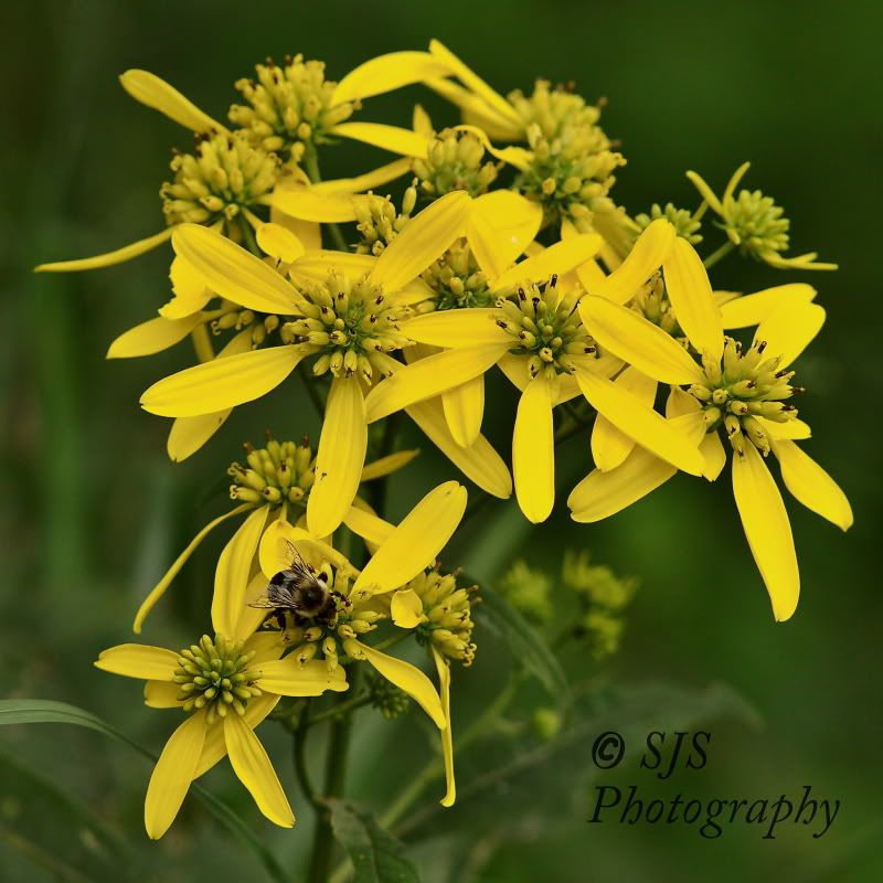
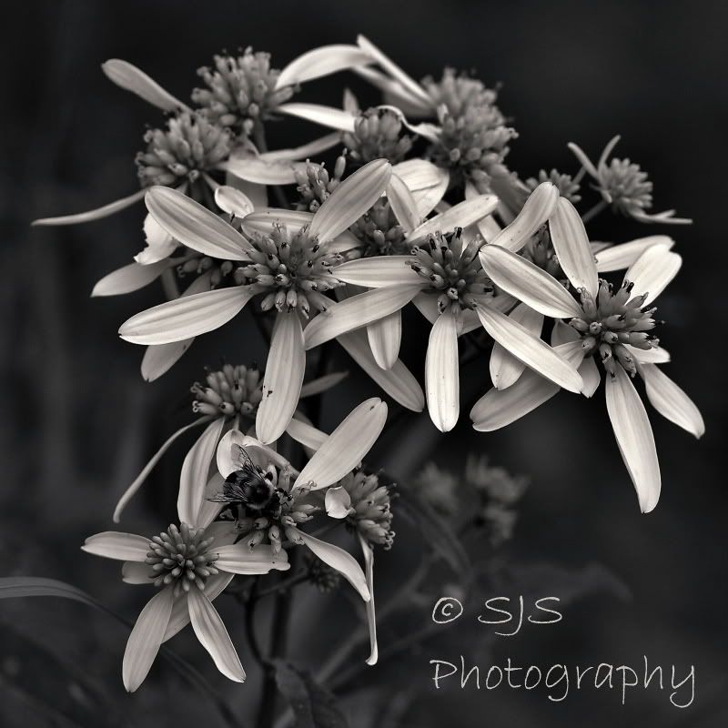
A weed in a field
-
3rd September 2009, 04:39 AM #2

- Join Date
- Dec 2008
- Location
- New Zealand
- Posts
- 17,660
- Real Name
- Have a guess :)
Re: A weed in a field
It looks weedy good (sorry, couldn't resist)!
Seriously, for just a moment ...
Not sure if this would imrove it or not, but to my eye;
- the highlights look a bit subdued - I suspect that adding a levels layer and playing with the white clipping point (and midtone slider) may improve it a little.
- I'd be tempted to clone out some of the minor imperfections in the petals
- To my eye the copyright symbol / name is a bit too big
- A slight sharpen might wring a bit more out of it as well
All minor stuff - hope this helps!
-
3rd September 2009, 05:52 AM #3

- Join Date
- May 2009
- Location
- Southern California
- Posts
- 466
Re: A weed in a field
I dont like the subject of the photo, I dont think it translates into BW very well , no matter who does it. I think the photo is too top heavy and busy especially where the petals are interweaving. But I actually dont like it as a color photo either, But i understand u just took this to try to BW it. I hope I didnt hurt your fellings, but Id try a different subject..


maybe zebras?
-
3rd September 2009, 06:02 AM #4

- Join Date
- Aug 2009
- Posts
- 4,049
Re: A weed in a field
The composition is rather messy. There is too much to look at with nothing in particular drawing the eye. The conversion is OK, but it needs more contrast. What method did you use?
Logo - Try this experiment. Download someone else's image that is about 200kb. Print it at A3. Try selling it. I have enough difficulty selling high quality prints from a 16bit 15mb TIFF file. If you want a logo for stylistic reasons then I would make it a lot smaller. Not a criticism, I'm just saying how I (and probably many others) see it. In this particular shot the logo is the thing that's drawing my eye.
rob
-
3rd September 2009, 07:09 AM #5

- Join Date
- Jun 2008
- Location
- Ardfern,Argyll
- Posts
- 145
Re: A weed in a field
Steve
You have a very slight colour cast to your photograph. The average colours are R-68,G-67 and B-65 was this black and white conversion started from a desaturated RGB file? One way to avoid this colour cast is to convert the colour file to Greyscale and Assign a black and white profile before you edit the file.
I have run a quick conversion and edit on your photo as a before and after
To print from this type of conversion open the file in photoshop and convert to RGB before printing.
John
-
3rd September 2009, 10:34 AM #6

- Join Date
- Aug 2009
- Posts
- 2,342
- Real Name
- Steve
-
3rd September 2009, 10:42 AM #7

- Join Date
- Aug 2009
- Posts
- 2,342
- Real Name
- Steve
Re: A weed in a field
Thanks for the input carregwen. The conversion is something i came up with.............i don't have PS4 yet . I'm using the free software 'gimp' which only supports a 8 bit file. The conversion is desaturated 95% and i use the little bit of color to get some more tonal range.
-
3rd September 2009, 03:03 PM #8
Re: A weed in a field
I think as true with any art form, beauty is in the eye of the beholder.
That said, this beholder likes what you did in the first place. I love that you are stepping away from what is expected with b/w - throwing is a bit of a hint of color. (I do this all the time, so I am soooo on your side )
)
-
3rd September 2009, 03:20 PM #9

- Join Date
- Jan 2009
- Location
- South Devon, UK
- Posts
- 14,854
Re: A weed in a field
Wildflowers are a difficult subject, Steve, and can tend to look a bit messy; especially when compared with, for example, a single orchid in a stylish vase. They can work but you need to get the angle exactly correct.
After doing the enhancements suggested by Colin, I would have a look at cropping away some of the out of focus flowers at the top. Not sure if it will help as it is really a try it and see suggestion.
Some subjects convert well to B & W while others are more of a struggle. If you only have rather basic software (like me) this is what I do to get more personal input. Don't know if it will work with Gimp but it might be worth a try.
Add a Hue/sat adjustment layer, but don't adjust anything yet. Add a Curves, or Layers, adjustment layer, no adjustment. Then a Channel Mixer layer, and select Monochrome (name varies with different software). Adjust the balance of R G B levels to suit, just make sure the numbers add up to 100. R30 G60 B10 is a good starting point but you can vary the mixture to replicate different styles of B&W film.
When approx correct use the Curves layer to add a bit of contrast. Then go to the Hue layer and try moving the Hue slider around to see if that gives an improvement. Sometimes a little will help and sometimes a lot is needed. Often it doesn't work at all; but is worth a try, particularly with landscapes which require a good dark sky.


 Reply With Quote
