
Not sure about this one thoughts appreciated as to composition and processing.
Thanks
 Helpful Posts: 0
Results 1 to 7 of 7
Thread: B&W Devil's Chimnley
-
22nd August 2012, 11:31 AM #1

- Join Date
- Jul 2012
- Location
- Cheltenham England
- Posts
- 51
- Real Name
- Chris White
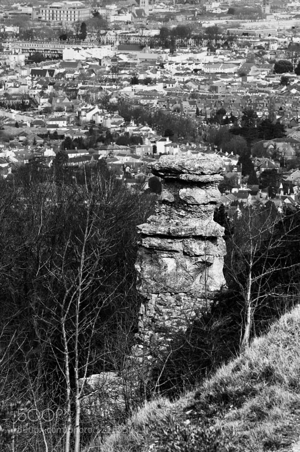
B&W Devil's Chimnley
-
22nd August 2012, 12:58 PM #2
- Join Date
- May 2012
- Location
- northern Virginia suburb of Washington, DC
- Posts
- 19,064
Re: B&W Devil's Chimnley
I assume the subject is the interesting rock formation in the bottom of the image. If so,consider cropping just a little bit above the top of it.
-
22nd August 2012, 02:26 PM #3

- Join Date
- Jul 2008
- Location
- Southern California, USA
- Posts
- 17,409
- Real Name
- Richard
Re: B&W Devil's Chimnley
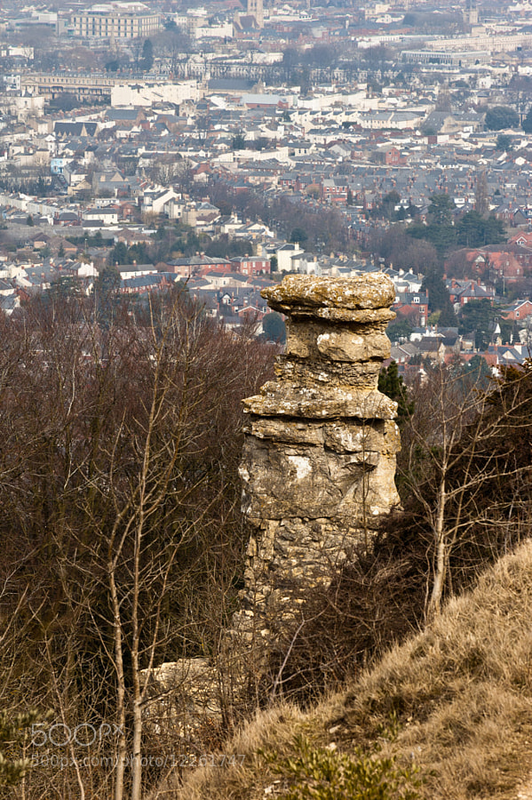
I am wondering what a colour version of this shot would look like. Perhaps it might separate the "chimney" from the background.
-
22nd August 2012, 03:36 PM #4
- Join Date
- Jul 2012
- Location
- Cheltenham England
- Posts
- 51
- Real Name
- Chris White
Re: B&W Devil's Chimnley
Good point about the crop, colour version below. Just thinking i need to get lower on the chimnley and avoid the town altogether.
-
22nd August 2012, 04:02 PM #5
- Join Date
- May 2012
- Location
- northern Virginia suburb of Washington, DC
- Posts
- 19,064
Re: B&W Devil's Chimnley
I think a cropped color version works better than B&W.
-
22nd August 2012, 08:07 PM #6

- Join Date
- Sep 2011
- Location
- Athens, Greece
- Posts
- 719
- Real Name
- Miltos
Re: B&W Devil's Chimnley
Chris a B&W photo is usually about about constrast (or texture) but in your case there is no contrast in your BW version so I agree with Richard and Mike that the color version works better, a cropped one would be even better.
-
22nd August 2012, 10:29 PM #7
- Join Date
- Jul 2012
- Location
- Cheltenham England
- Posts
- 51
- Real Name
- Chris White
Re: B&W Devil's Chimnley
Many thanks Guys for your feedback and expertise.
Based on your input and reflection I tend to agree, the colour one does work better and the composition is wrong based on the town below.
Good learning experience for me, thanks again

 Reply With Quote