
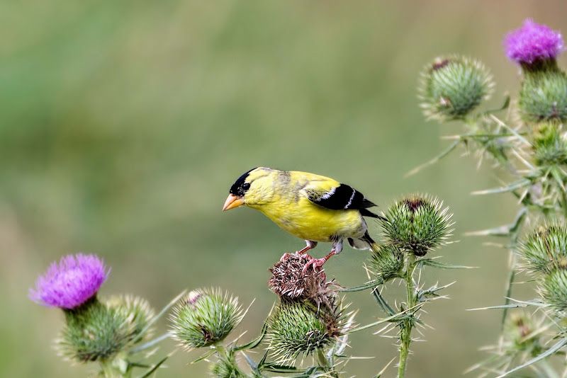
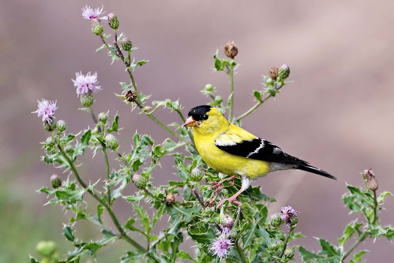
Lovely little birds - easily panicked and move faster then lightning. It was nice that this one stood his ground for a few shots.
Does the pp look ok here? Could have increased the saturation on the yellow but was afraid of blowing it. Thoughts please.
1.
2.
3.
 Helpful Posts: 0
Results 1 to 17 of 17
Thread: Goldfinch
-
10th August 2012, 07:38 PM #1

- Join Date
- Apr 2011
- Location
- Ontario (mostly)
- Posts
- 6,667
- Real Name
- Bobo
Goldfinch
-
10th August 2012, 09:26 PM #2

- Join Date
- Sep 2011
- Location
- Lakeland, Florida
- Posts
- 3,073
- Real Name
- Joe
Re: Goldfinch
Hi Bobo, nice image of the Goldfinch and Thistle. I like the composition and the background. You asked if you should saturate the yellow more...I looked up the bird in Stoke's Field Guide To Birds and the photos in the book actually show a softer yellow.
Although I like then as they are.
-
10th August 2012, 09:33 PM #3
- Join Date
- Apr 2011
- Location
- Ontario (mostly)
- Posts
- 6,667
- Real Name
- Bobo
Re: Goldfinch
Thanks Joe. Appreciate the checkup. They do look much brighter in the field but could be the light/shadows etc.
-
10th August 2012, 10:10 PM #4

- Join Date
- Jun 2010
- Location
- London, UK
- Posts
- 891
- Real Name
- Tommy
Re: Goldfinch
Great pics! I really like that first one. The composition with the thistles is super! Thanks for posting :-)
-
10th August 2012, 11:24 PM #5
- Join Date
- Sep 2011
- Location
- Lakeland, Florida
- Posts
- 3,073
- Real Name
- Joe
Re: Goldfinch
I agree Bobo. We photograph light that is reflected. The intensity and quality of light affects how it is reflected.
-
10th August 2012, 11:35 PM #6

- Join Date
- Jan 2011
- Location
- Seattle Washington
- Posts
- 3,550
- Real Name
- Paul
Re: Goldfinch
Nice work Bobo. I like the color as we see it here. Many things beside the light change the color of this little bird. We have many here and there can be several degrees of color. When young they are pinkish even. When the first arrive here they are rather dull and you see splotchy color. This is a good representation of early to mid summer color I think.
-
11th August 2012, 06:30 AM #7
- Join Date
- Apr 2011
- Location
- Ontario (mostly)
- Posts
- 6,667
- Real Name
- Bobo
Re: Goldfinch
Thanks Paul. I have yet to see a pinky one but will keep looking.

Thanks Tommy, Joe.
-
11th August 2012, 08:34 AM #8

- Join Date
- Apr 2012
- Location
- Darjeeling
- Posts
- 378
- Real Name
- pinaki
Re: Goldfinch
Bobo I just love those pics.Nice capture.Which lens did you use?
-
11th August 2012, 01:44 PM #9

- Join Date
- Apr 2012
- Location
- New Jersey, USA
- Posts
- 800
- Real Name
- Ken Curtis
Re: Goldfinch
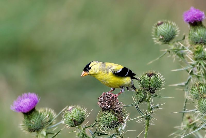
Bobo, I took the liberty of cropping your first image, increasing the contrast slightly and have included it here.

I like this better than the original because the bird stands out more and still shows the context. It also moves the bird more off center. Increasing the contrast seemed to bring up the yellow a bit and still keeping it realistic, although the bird's color seems correct without saturation.
My two cents worth...
-
11th August 2012, 02:07 PM #10
- Join Date
- Apr 2011
- Location
- Ontario (mostly)
- Posts
- 6,667
- Real Name
- Bobo
Re: Goldfinch
Thanks Ken, the crop works great. Sometimes it does take a second eye to see the warts and possibilities. Thanks.
Thanks Pinak - lens is the Canon 70-300L.
-
11th August 2012, 02:44 PM #11
- Join Date
- Aug 2009
- Posts
- 2,342
- Real Name
- Steve
Re: Goldfinch
Hi bobo, great job on these. I like all of them.
A couple things you can play around with.
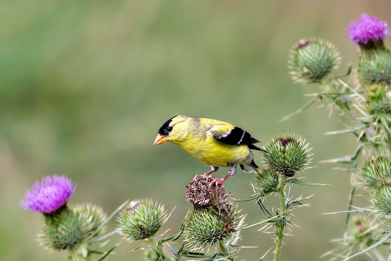
First , i noticed a slight red cast to the images. Color casts tend to muddy your colors a bit. You can correct it by adding a bit of cyan.
The background and forground kind of blend into one. You can add some contrast by desaturating the background a little bit.
The light is falling very even on the scene. You can make the bird pop out with a slight vignette. This will keep the brightness of the bird the same and darken the background a little, adding some contrast .
Here is a side by side example...............
Your first image
With a few of the suggestions i made.
And lastly, do things the way you like them, not because I or anyone else has suggested something.
Very nice work bobo, i can see improvements every day.
-
11th August 2012, 11:26 PM #12
- Join Date
- Apr 2011
- Location
- Ontario (mostly)
- Posts
- 6,667
- Real Name
- Bobo
Re: Goldfinch
Thanks Steve. I appreciate the assistance.
The rework is subtle but noticeable and a clear improvement. My main problem is that it is difficultfor me to judge what is a colour cast and what is not. Unless it is quite obvious I tend to just consider colours as part of the image. Is there some way to tell if there is one or not?
-
12th August 2012, 12:28 AM #13
- Join Date
- Aug 2009
- Posts
- 2,342
- Real Name
- Steve
Re: Goldfinch
 Originally Posted by Bobobird

Colors are prob. the hardest to get a grasp on. It took me a long time to figure out. After i started printing, it became very obvious if i had a color cast. Very hard to spot on the screen, but very easy to see in print. After wasting alot of ink and paper, I found a way to spot color casts before i printed.
You can tell very easy by looking at your histograms. R G B C M Y
In your image, it had a slight red cast. The opposite of red is cyan. If you looked at the levels of the cyan channel , you would see a space at the left side of the histogram. That space tells me there is a red cast. If you then go to the curves tool and place a spot in the middle of the line(red channel) and pull down towards the bottom right corner, you can correct it . You can also go to color balance and add some cyan. Either way will fix it. I usually use the curves tool. Most of the time , i over do it and then adjust the opacity slider.
Now for the hard part, you have to add enough to get rid of the cast, but not too much you introduce a cyan cast. If you move the opacity slider back and forth, you can usually spot the balance point between the two.
-
12th August 2012, 05:34 AM #14
- Join Date
- Apr 2011
- Location
- Ontario (mostly)
- Posts
- 6,667
- Real Name
- Bobo
Re: Goldfinch
Thanks Steve. I have read and re-read it many times but still cannot make head or tail of it. Would it be too much of an imposition to post a screen cap that shows how your right panel (assuming PS) looks like and what/where to look?
It very late here and my head/eyes just dont seem to be working right.
Will get back to this in the morning when in a clearer state of mind.
Thanks again, I really appreciate it.
-
12th August 2012, 05:28 PM #15Moderator

- Join Date
- May 2008
- Location
- Windsor, Berks, UK
- Posts
- 16,775
- Real Name
- Dave Humphries :)
Re: Goldfinch
It's odd, the thought I take away from switching in the Lytebox between Steve's two examples is that 'the sun went in' on the latter.
I'm not sure if the sun was actually shining, I can't see any well defined shadows.
Even then, what's technically correct may not be the right artistic answer
As to colour casts, the most obvious way to avoid them would seem to be to shoot a WhiBal card every hour or so throughout the day, but you need to have it in the same light that will fall on/hit the subject. Then sample the Colour Temperature from that shot and use it to WB the RAW shots taken half hour either side. Do I bother doing that? No
I'd also be interested to see that cast detection (and subsequent correction) method Steve.
Bobo, Context is all very well, but I just wanna see the birds bigger 
Cheers/Thanks,
-
13th August 2012, 01:06 AM #16
- Join Date
- Aug 2009
- Posts
- 2,342
- Real Name
- Steve
Re: Goldfinch
I don't know how to take a screen shot

So i just took a quick snap of the screen.
woops i almost forgot to post the screen shot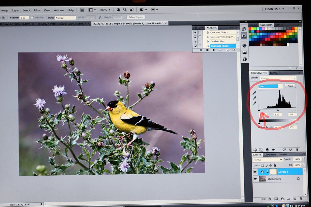
Dup. the image---adjustments / mode/ CMYK---levels---cyan channel (check the magenta and yellow as well---usually it is only the cyan or magenta channels )
As you can see the levels of the cyan channel are not adjusted. This is showing a red cast because the black slider isn't touching the left side of the histogram. To correct for a red cast , you have to add cyan. I use the curves tool . The opposite of red is cyan, so go to the curves tool---red channel---place a dot in the middle of the curve---pull it down to the bottom right corner (over do it untill you see a cyan tint to the image) ---adjust to your liking with the opacity slider. Nothing hard about it.
Sometimes a color cast is wanted, like for a sunset. You may not want to adjust for it.
-
13th August 2012, 03:01 AM #17
- Join Date
- Apr 2011
- Location
- Ontario (mostly)
- Posts
- 6,667
- Real Name
- Bobo
Re: Goldfinch
Thanks Dave.
Sun was there but it was close to evening 6:30ish. Light was coming in from the left. Shooting position was almost parallel to them and slightly crouched. The plant was isolated with the background quite a distance away so basically no shadows.
About bigger - yes could be bigger but at the expense of the "landscape". #1 can take a cut to the blurry right side, #2 can too on the left and right, # 3 probably cannot without losing the flowers. So as a set decided to crop them to about the same bird size.
Once I have managed to come to grips with Steve's colour cast correction technique will redo and post bigger.
White balance - in the field very very difficult. Ahead of time maybe but 90% of the time AWB or the sunny setting holds up ok so it is something for post. I hate for all the technicalities to take away the enjoyment of the scenes and the pic taking. I am confused enough most of the time and can do with one less.
Thanks again Steve, very very helpful screen shot. Now to go over some images and see if I can see like you guys. Will get back on that later.


 Reply With Quote