
 Helpful Posts:
 I spent a few hours last weekend wandering around the beautiful harbour in the equally beautiful little town of Crail in the East Neuk of Fife. I've already posted a couple of images here and here.
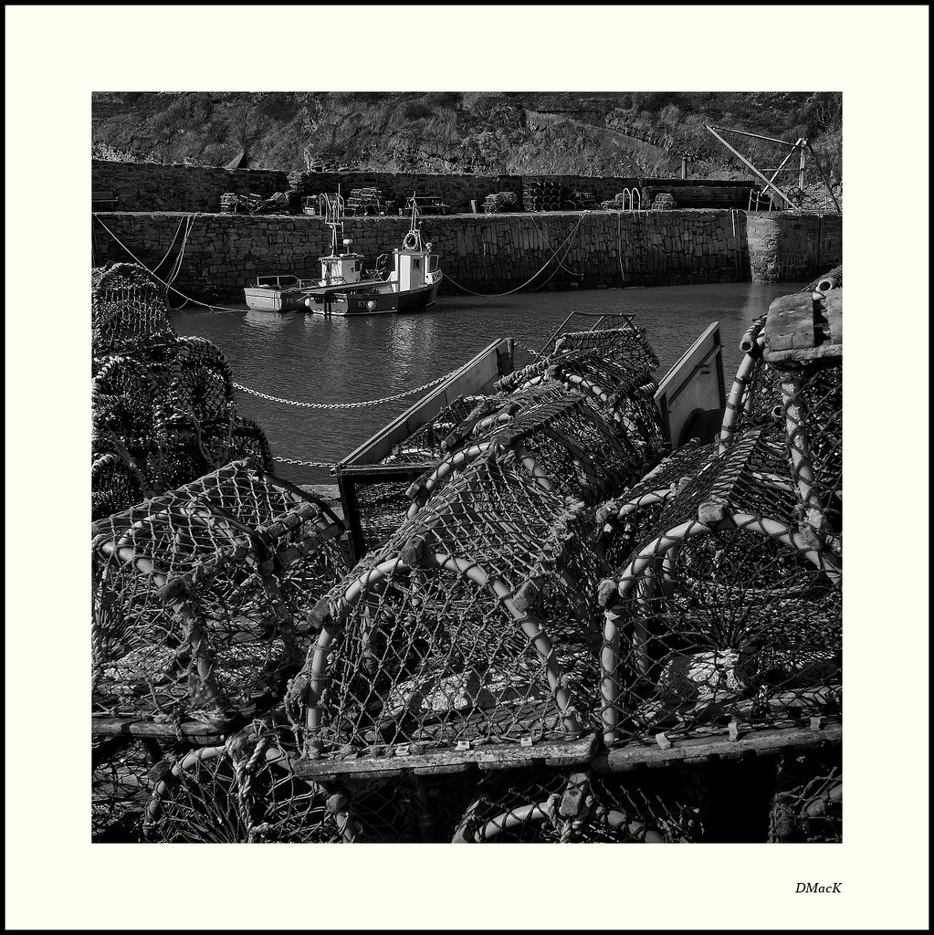
On the second of these, Dave said he couldn't work out what Kylie did. Well, here is the answer - Lobsters. In fact that's Kylie beside her friend in the background.
Right - enough background. Let's get to this image.
This is far, far busier than I would normally do. I liked it as I was setting it up. I wanted a strong narrative that connected the boats with the lobster pots ... and both with the harbour and the sea. So, I suppose one question is - Does it tell that story? And the second question has to be - If it does, does it do it well or poorly?
I liked how the line formed by chain at the edge of the harbour, was mirrored at the other side by the ropes on the boats.
But as I was processing it, I felt: 'It's too busy. There's too much in it. It's too contrasty'.
But, as I've spent the week coming back to it, I feel it does what I set out to do and does so not too badly. But since I'm maybe trying to convince myself, I'd like to read what you think.
Canon 40D, EF 24-70 f2.8 L @ 24mm. ISO100. 1/90@f11
Results 1 to 20 of 24
Thread: Crail Harbour #2
-
19th May 2012, 09:01 AM #1Moderator


- Join Date
- Feb 2009
- Location
- Glenfarg, Scotland
- Posts
- 21,402
- Real Name
- Just add 'MacKenzie'
Crail Harbour #2
Last edited by Donald; 19th May 2012 at 09:36 AM.
-
19th May 2012, 10:19 AM #2

- Join Date
- Sep 2011
- Location
- Athens, Greece
- Posts
- 719
- Real Name
- Miltos
Re: Crail Harbour #2
Donald I am afraid this one doesn't work for me.
It is very confusing and my eyes don't stay long enough to get the message as they slip away from the subject very soon. Perhaps if you cropped the bottom raw of these "cages" could work.
I like the other two of your images much much better.
-
19th May 2012, 12:01 PM #3

- Join Date
- May 2011
- Location
- Fort Mill, South Carolina, USA
- Posts
- 6,294
- Real Name
- Frank Miller
Re: Crail Harbour #2
Hi Donald. Please realize that I am biased towards light and bright images so take my views of this image with a grain of salt.
When I first glanced at this image I felt it was very somber and dark but the boats quickly drew my attention.
I think you have two subjects here (the pots and the boats) that, owing to the differences in brightness, simplicity, and size don't complement each other as well as they could. I mentally want to zoom in on the boats and minimize, but not eliminate the foreground clutter.
For my tastes, I feel you have far more potential available in this image than is coming through at the moment.
-
19th May 2012, 01:45 PM #4

- Join Date
- Aug 2011
- Location
- Wick, Caithness, Scotland.
- Posts
- 2,609
- Real Name
- Sharon
Re: Crail Harbour #2
I keep coming back to this one Donald...and I hope these ramblings make some kind of sense.
I have large painting of this very scene on the wall above my monitor ( not one of mine) and the emphasis is totally different..a white row boat dominates the foreground left with some creels mid ground right and two other boats ( one may even be kylie) , wall and hills beyond in the backround.....lots of space in it. I bought it because I find it peaceful and therin lies the problem with Crail Harbour. It is both picturesque and yet a working Harbour . My painting shows the pretty side of it where your photograph shows what you set out to show...the hard working practical aspect to it and that does mean showing it as you have.. packed with creels and busy with activity. Plentyof space and some well placed boats are vital to the tourist shots and paintings of a peaceful harbour whereas loads of contrast and little space is vital to what you are trying to convey.
So, while I was initially a little uncertain of it you have certainly achieved what you set out to and I am not sure how else you could have done that.
I do think the mirrored chains are a really classy touch.....My eye goes to them every time.
-
19th May 2012, 06:36 PM #5
- Join Date
- Jan 2009
- Location
- South Devon, UK
- Posts
- 14,875
Re: Crail Harbour #2
It works for me, Donald. An amazing depth of sharpness.
Possibly, the quayside is a little on the dark side but that is the angle of light and I don't really find it to be a serious problem.
-
19th May 2012, 08:08 PM #6Moderator
- Join Date
- Feb 2009
- Location
- Glenfarg, Scotland
- Posts
- 21,402
- Real Name
- Just add 'MacKenzie'
Re: Crail Harbour #2
Aaww, now I'm all confused.
I thought I was getting pretty clear after the first couple of responses, that my thoughts about it being 'not quite' were right. But then another two respected commentators come in with comments that swing me back towards the 'well, it's maybe is okay' school of thought.
Mmmm. I think I need to just sit with it for a while. I'll maybe go as far back as the RAW file and look again at just what I was seeing in the scene. I do feel it has quite a strong narrative, which I like. But it's the presentation of that story that's still got me thinking. I feel another 5am journey to Crail coming on.Last edited by Donald; 19th May 2012 at 08:13 PM.
-
19th May 2012, 08:11 PM #7
- Join Date
- May 2012
- Location
- UK
- Posts
- 56
- Real Name
- David
Re: Crail Harbour #2
I like it. Clear, sharp, and B&W always works for me!!
-
19th May 2012, 08:34 PM #8
- Join Date
- Jan 2009
- Location
- South Devon, UK
- Posts
- 14,875
Re: Crail Harbour #2
I think this shot probably depends on what people are expecting to see.
For me, this is a documentary (industrial) photo rather than a stunning landscape.
-
19th May 2012, 11:25 PM #9

- Join Date
- Feb 2011
- Location
- Hertfordshire, England
- Posts
- 1,437
- Real Name
- Philip
Re: Crail Harbour #2
I am not sure that I have sufficient experience to qualify as another respected commentator, but here are my thoughts anyway:
Firstly, I agree with Geoff's point - for me the quayside is too dark, and so I would prefer to see the shadows lightened a little at the top of the image, to reveal more of the detail and texture there as the dock is part of the story.
Secondly, for me the image seems unbalanced, the pots being just too dominant. The composition would benefit from a 4:3 crop which would serve to remove the bottom row of pots, as suggested by Miltos, and to give the boats greater relevance to the story. This not only restores the balance between foreground and background but also, incidentally, almost restores the rule of thirds to the image.
Philip
-
20th May 2012, 12:55 AM #10
- Join Date
- Aug 2009
- Posts
- 2,342
- Real Name
- Steve
Re: Crail Harbour #2
Donald , this is a brilliant composition!!!!!! Really like this one alot.
Unlike the others, i see the lobster pots as the dominate subject and the boats as a supportive role.
I first kind of zoom in on the boats, but seem to always go back to exploring the lobster pots.
-
20th May 2012, 01:10 AM #11

- Join Date
- Jul 2008
- Location
- Southern California, USA
- Posts
- 17,409
- Real Name
- Richard
Re: Crail Harbour #2
Donald,
I do like this shot and I like it processed the way you have done it.
I wonder however, if cropping out the bottom row of traps wouldn't place more emphasis on the boats and the quay because the resulting traps lead my eye to that area...
-
20th May 2012, 10:41 AM #12
- Join Date
- Aug 2011
- Location
- Wick, Caithness, Scotland.
- Posts
- 2,609
- Real Name
- Sharon
Re: Crail Harbour #2
 Originally Posted by Geoff F

Geoff has got it in a nutshell.
-
20th May 2012, 10:53 AM #13Moderator
- Join Date
- Feb 2009
- Location
- Glenfarg, Scotland
- Posts
- 21,402
- Real Name
- Just add 'MacKenzie'
Re: Crail Harbour #2
I'm very glad there are so many seemingly different views. It:
- Reassured me that my own mixed feelings are reasonable and I'm not going mad
- Should serve to remind newer photographers viewing this that there is no one 'good' or 'bad' view - that there are many views as there are people and that at the and of the day, unless someone is paying you a lot of money to produce the image, the only person you have to please is yourself.
I think this has been a wonderful exchange of views so far and in the privacy of my darkened digital darkroom I'm going to take all the suggestions and advice on board and see what comes out the other end.
-
20th May 2012, 12:07 PM #14

- Join Date
- Jan 2012
- Location
- rotherham south yorkshire uk
- Posts
- 290
- Real Name
- glenn
Re: Crail Harbour #2
I am with geoff and david on this one donald. I love it, it really as a nice feel about it. I love the b & w feel.
I am probably the least experienced person to comment on this, but i don't care, I may not see all the technical aspects in this shot,like the others do, but i like what i see through my eyes. And thats all that matters to me.
Job well done.
-
25th May 2012, 10:15 PM #15Moderator
- Join Date
- Feb 2009
- Location
- Glenfarg, Scotland
- Posts
- 21,402
- Real Name
- Just add 'MacKenzie'
Re: Crail Harbour #2
We had a good discussion here, with alternative ideas being put forward as to how this image could be best presented.
Although satisfied, I retained some doubts about the quality, whilst holding on to the idea that there was a good image in here somewhere.
I tend not to like re-working what I've already done, but in this case I felt it was worth going back to the beginning. In particular, I compose my image at the time of capture. To depart from that sort-of feels a bit like a betrayal to myself.
But ....................!
As well as re-composing, I have, I think, 'quietened' the brightness of the lobster pots. I think the result is that attention is thrown more onto the boats. So they become the starting point, after which the eye can roam around the pots and the harbour wall etc.
Do you have any thoughts? What you can do is click on one of the two images. That opens it in the Lightroom. Then use the arrows to flick between the two versions to compare them.
-
25th May 2012, 11:14 PM #16
- Join Date
- Dec 2011
- Posts
- 780
Re: Crail Harbour #2
Well Donald I know that I am the least qualified to speak up but here is my thoughts. First I love B & W and this one does do it for me in that area. I really like the second image the best, the crop brought everything together for me. This is the scene of a hard working class of men. The up keep on the boats to keep them ready to go when needed and then the backbreaking work of keeping the creels up and then loading them onto the boat then placing bait and setting them out later to return and haul them to the surface to see the bounty each one has, making the haul either a good living or a poor one. Though I have not made a living from boats and the ocean I have shrimped on occasion and fished for tuna on others both included hard and at times backbreaking work some paying good and some not so good. Its as if I can smell the saltyness of the sea in the air and smell fuel mixed with the lingering odor of leftover bait and lobster. A real life picture I think and you nailed it.
-
26th May 2012, 11:47 AM #17
- Join Date
- Aug 2011
- Location
- Wick, Caithness, Scotland.
- Posts
- 2,609
- Real Name
- Sharon
Re: Crail Harbour #2
Yep....the rework has really nailed it Donald.

-
26th May 2012, 02:52 PM #18Moderator

- Join Date
- May 2008
- Location
- Windsor, Berks, UK
- Posts
- 16,770
- Real Name
- Dave Humphries :)
Re: Crail Harbour #2
Hi Donald,
I missed this originally, but I do definitely prefer the second crop (and other treatments applied), it retains all the good things about the image.
Cheers,
-
26th May 2012, 09:16 PM #19
- Join Date
- Dec 2011
- Location
- Québec,Canada
- Posts
- 696
- Real Name
- Louise
Re: Crail Harbour #2
Hello Donald, I do prefer the second image. I would like to know how you get such clear focus from forground/middle ground and background all of it in focus and so shap?
-
26th May 2012, 09:23 PM #20

- Join Date
- May 2012
- Location
- Carrollton, Georgia (USA)
- Posts
- 2,757
- Real Name
- Bruce
Re: Crail Harbour #2
Donald: The photos are good; however I stiil find the foreground in both pic takes away from the subject (boat).
Very nice b/w. Bruce


 Reply With Quote