
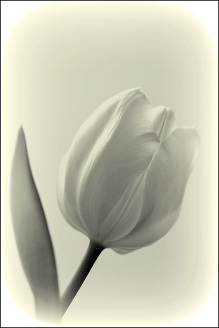
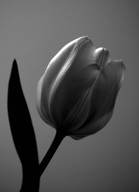
Two different takes on the same tulip.
I like the second one best but then I am a bit on the wicked side.
white by Sharon Reid2010
Ready for my close up.... by Sharon Reid2010, on Flickr
 Helpful Posts: 0
Results 1 to 19 of 19
Thread: The light and the dark
-
13th January 2012, 05:33 PM #1


- Join Date
- Aug 2011
- Location
- Wick, Caithness, Scotland.
- Posts
- 2,609
- Real Name
- Sharon
The light and the dark
-
13th January 2012, 05:34 PM #2

- Join Date
- Dec 2011
- Location
- Monroe Twp, NJ
- Posts
- 51
- Real Name
- Bob Murphy
I think if you combined the two and got a shot in the middle it would look awesome
-
13th January 2012, 05:39 PM #3
- Join Date
- Dec 2011
- Location
- Finland
- Posts
- 106
- Real Name
- Reima
Re: The light and the dark
Looking great! I also like the second one best, I think the dark one brings the texture up nicely. Really delicate and beautiful.
-
13th January 2012, 06:03 PM #4
- Join Date
- Aug 2011
- Location
- Wick, Caithness, Scotland.
- Posts
- 2,609
- Real Name
- Sharon
Re: The light and the dark
Thanks a lot Reima... really appreciate it.
murfdogg645...I could have but it's not what I am looking to achieve here.
-
13th January 2012, 06:48 PM #5
- Join Date
- Sep 2011
- Posts
- 674
Re: The light and the dark
I do like the first one but the second does take it. Very nicely done.
-
13th January 2012, 07:06 PM #6
- Join Date
- Jul 2011
- Location
- Scotland
- Posts
- 216
- Real Name
- Anne
Re: The light and the dark
lovely photos but i go with #1 that is my fav. well done
-
13th January 2012, 07:41 PM #7
- Join Date
- Aug 2011
- Location
- Wick, Caithness, Scotland.
- Posts
- 2,609
- Real Name
- Sharon
Re: The light and the dark
Thanks Dave and Annie...I love that you both like different ones as that was exactly what I wanted.

-
13th January 2012, 08:45 PM #8

- Join Date
- May 2011
- Location
- Ann Arbor, MI
- Posts
- 471
- Real Name
- Scott Benz
Re: The light and the dark
Sharon,
You have the set up for this type of image pretty well nailed. The results are really a pleasure.
My only question in this case is how you came to choose the pure white vignette in for the first image??
In any case, nice work!
-
13th January 2012, 08:46 PM #9

- Join Date
- Nov 2011
- Location
- Gold Coast, Australia
- Posts
- 1,798
- Real Name
- Mal
Re: The light and the dark
I prefer the first one but both lovely versions
-
13th January 2012, 08:54 PM #10

- Join Date
- Dec 2011
- Location
- Gold Coast, Australia
- Posts
- 286
- Real Name
- Kerry
Re: The light and the dark
I prefer the first one, I must be pure innocence, no wickedness in me
 Hee hee hee hee (this is my best witchy poo laugh) LOL. Lovely photos, I really like your work Sharon
-
13th January 2012, 09:26 PM #11
- Join Date
- Aug 2011
- Location
- Wick, Caithness, Scotland.
- Posts
- 2,609
- Real Name
- Sharon
Re: The light and the dark
Lol...thank you Malcolm and Kerry.
I really appreciate your comments and kind words.
-
13th January 2012, 10:11 PM #12

- Join Date
- Oct 2010
- Location
- Freehold NJ
- Posts
- 602
- Real Name
- Rob Douglas
I like it Sharon. A touch of wicket, with a soft side.
-
13th January 2012, 10:21 PM #13
- Join Date
- Aug 2011
- Location
- Wick, Caithness, Scotland.
- Posts
- 2,609
- Real Name
- Sharon
Re: The light and the dark
Thanks Rob!
That sounds like me.
-
13th January 2012, 11:19 PM #14
- Join Date
- Jul 2011
- Location
- A Pacific Island
- Posts
- 941
- Real Name
- Andrew
Re: The light and the dark
I like them both but prefer the first only due to the lack of any tone difference in the leaf. It unbalances the shot for me and would almost look better without it.
-
14th January 2012, 12:01 AM #15
- Join Date
- Apr 2011
- Location
- Ontario (mostly)
- Posts
- 6,667
- Real Name
- Bobo
Re: The light and the dark
Lovely.
Just looked into your flickr -awesome shots there.
-
14th January 2012, 12:43 AM #16

- Join Date
- Jul 2008
- Location
- Southern California, USA
- Posts
- 17,409
- Real Name
- Richard
Re: The light and the dark
I also like #2 the best...
-
14th January 2012, 11:35 AM #17
- Join Date
- Aug 2011
- Location
- Wick, Caithness, Scotland.
- Posts
- 2,609
- Real Name
- Sharon
Re: The light and the dark
Thank you Richard and Bobo...am so glad you liked my flickr acct Bobo...very kind of you to say
Andrew, I totally accept what you mean about the darkness of the leaf and did indeed try an image without it but after a lot of thought I felt that the silhouette nature of it might just work given the sort of wicked 'glamour' nature of the shot.
-
14th January 2012, 03:37 PM #18
- Join Date
- Aug 2009
- Location
- Canada
- Posts
- 3,113
- Real Name
- Wendy
Re: The light and the dark
#1 gets my vote, but is it possible to feather the vignette. On my screen and to my mind the white vignette contrasts too much with the yellowish background.
Very nice shot(s) though, such subtle light.
Wendy
-
15th January 2012, 09:25 PM #19
- Join Date
- Aug 2011
- Location
- Wick, Caithness, Scotland.
- Posts
- 2,609
- Real Name
- Sharon
Re: The light and the dark
I take your point Wendy, it does seem a little 'abrupt' .I will have a little play with it.
Thanks for your comments, really appreciate it.


 Reply With Quote