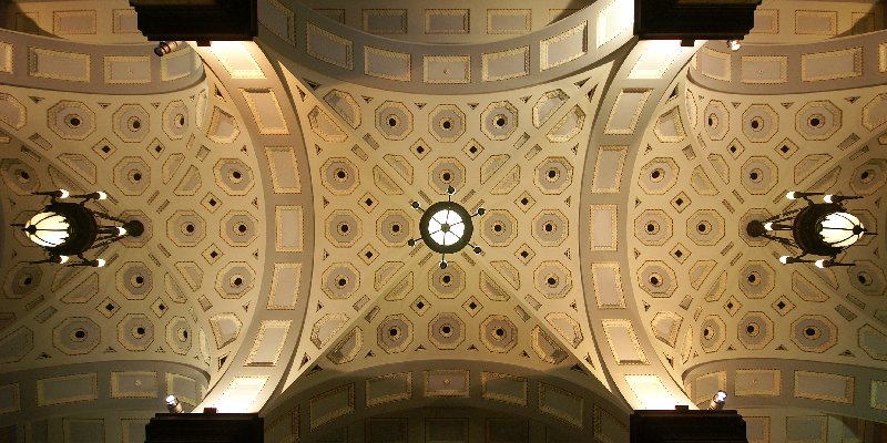
3-panel panorama taken with D90 & Sigma 10-20:
eNo
http://esfotoclix.com
 Helpful Posts: 0
Results 1 to 8 of 8
Thread: St Chapelle, Paris
-
3rd May 2009, 06:23 AM #1
St Chapelle, Paris
Last edited by eNo; 3rd May 2009 at 07:36 PM.
-
3rd May 2009, 08:41 AM #2

- Join Date
- Apr 2009
- Location
- Tne Netherlands
- Posts
- 82
- Real Name
- Jan Diepeveen
Re: St Chapelle, Paris
Ho eNo,
Beautifull shot, specialy like the symetry and the detail!!
Did you take it , lying on your back?
Best Regards,
JanDiep
-
3rd May 2009, 07:33 PM #3
Re: St Chapelle, Paris
Hi eNo,
Stunning image, and well stitched too, congratulations
-
3rd May 2009, 07:35 PM #4
Re: St Chapelle, Paris
Thanks, guys. I took this while seated on the floor -- a very hard, cold stone floor, but so far no one I tell this has been sorry for me. The usual response goes something like, "yeah, in Paris, France, and you're whining about a cold floor." Here's another one taken that day.

eNo
http://esfotoclix.com
-
3rd May 2009, 08:33 PM #5
Re: St Chapelle, Paris
Greta shot, eNo, you have centred the ceiling perfectly. Lighting is almost perfect, just a tad blown on the left centre. My eye was first caught by the rich colours of glass and arches.. a beauty!
On the subject of cold backsides .. a friend gave me a valuable tip once ..
Most of these high vaulted roofs have a clear area "dead centre" below the middle, perhaps even with a floor pattern centred to relate to the ceiling; It's then possible to align your camera placed on the floor at the spot and get the shot with delayed shutter release and no ice on your bum!
Here's my example; Brisbane city hall , not so grand as your beautiful cathedral but I was pleased wtih the outcome of the technique.

roxyLast edited by Roxy; 3rd May 2009 at 10:24 PM. Reason: grammatical adjustment :D
-
3rd May 2009, 09:04 PM #6
Re: St Chapelle, Paris
wow lovely images
-
3rd May 2009, 09:22 PM #7
Re: St Chapelle, Paris
Very nice, Roxy. I did try several adjustments to get dead center, and yes, the floor helped. This was my best attempt, after which I gave up because my shoulders and neck were giving out.
-
3rd May 2009, 09:44 PM #8
Re: St Chapelle, Paris
the straight up shot(s) are clever pieces of camera work, but the 2nd shot tells me far more about it as an architectural space. I suppose room for both with as many votes cast each way if there were votes.


 Reply With Quote