
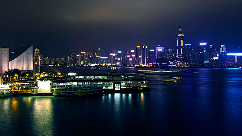
Taken this evening. Yes, I am in Hong Kong for the next couple of weeks.
2nd try at long exposure. Some may recall the disastrous first attempt with the lake and sunset..
I quite like it but there is something about it that does not seem quite right but cannot pinpoint what that could be!
What comes to mind is the ferry in the foreground is not sharp but that could be due to the wobbling from water movement.
The other is the far background that does not appear as sharp as other pics of this place that I have seen.
Lastly, there are lots of lights neons to spotlights etc. They are all blown to some degree. How can that be fixed during a shoot?
There are probably other issues but those are eluding me.
2 versions. 16x9 crop - too much space top and bottom.
Normally processed, blues taken down a bit.
Added the Wille lumo procedure to the above version.
Thanks. All input deeply appreciated - cannot just shoot flowers, bugs and birds all the time!
 Helpful Posts: 0
Results 1 to 10 of 10
Thread: I like it, but...
-
5th October 2011, 07:21 PM #1

- Join Date
- Apr 2011
- Location
- Ontario (mostly)
- Posts
- 6,667
- Real Name
- Bobo
I like it, but...
-
5th October 2011, 08:50 PM #2

- Join Date
- May 2011
- Location
- Brisbane Australia
- Posts
- 4,636
- Real Name
- Dave Ellis
Re: I like it, but...
I like it too Bobo. Unfortunately the small size image we see on the web doesn't really do justice to a scene like this. It would be nice to see a much higher resolution version of it. Could you post it at 1500 wide ?
What camera settings did you use by the way ?
One suggestion is to crop about 20% off the right and top and a little off the bottom. This would show a bit more detail of the main parts of the scene.
Cheers DaveLast edited by dje; 5th October 2011 at 09:28 PM.
-
5th October 2011, 10:47 PM #3

- Join Date
- Sep 2009
- Location
- Burton on Trent, UK
- Posts
- 4,788
- Real Name
- Steve
Re: I like it, but...
Nice one

-
5th October 2011, 11:40 PM #4

- Join Date
- Aug 2009
- Location
- Melbourne, Australia
- Posts
- 1,968
- Real Name
- Peter
Re: I like it, but...
I like the colours and the panorama format. The ferry will move with the water so not a lot you can do about it, as you are aware.
When downsizing for the internet sharpness will be lost during conversion so more sharpening needs to be done before posting. I think you might be a little hard with your own critique on this one.
-
5th October 2011, 11:42 PM #5

- Join Date
- Apr 2008
- Location
- London
- Posts
- 1,502
- Real Name
- Ian
Re: I like it, but...
The neons are very bright and are very difficult to balance with the darker areas, so I would suggest reshooting the scene with some very short exposures to capture the neons and then blend these in HDR with a much longer exposure of the darker areas. Not easy, especially with the ferry bouncing around.
How far are you from the ferry? Is there a way of getting more light onto the boat, car headlights etc or are you too far away even for that?
Alternatively shoot it without the boat and just have the illuminated quay, although I get the feeling you wanted the ferry in there?
-
6th October 2011, 12:32 AM #6

- Join Date
- Jun 2008
- Location
- Manchester
- Posts
- 787
- Real Name
- Mark Fleming
Re: I like it, but...
Bobo,
A difficult subject to get entirely right. You haven't put any of your camera settings up, so it's even more hard to judge.
I kind of agree with Ian (shreds) on a reshoot. But I'm not sure it needs an hdr touch.
-
6th October 2011, 01:10 AM #7

- Join Date
- Dec 2009
- Location
- WNY
- Posts
- 36,716
- Real Name
- John
Re: I like it, but...
Lucky you. Nice image.
-
6th October 2011, 01:34 AM #8
- Join Date
- Apr 2011
- Location
- Ontario (mostly)
- Posts
- 6,667
- Real Name
- Bobo
Re: I like it, but...
Thanks Dave, Steve, Peter, Ian and Mark. Your valuable comments are truly appreciated.
The pics are hosted on Picasa and can be seen here
https://lh6.googleusercontent.com/-Q...11005_6990.jpg
https://lh3.googleusercontent.com/-E...005_6990-2.jpg
Settings were - ISO 100, f16, 30 secs, 17mm on a 1.6. Distance to pier is about 100m. Shooting position is the roof of a cruise ship terminal roughly 5 stories up. The only location that gives a clear view of the entire harbour area from left to right. There is much more to the right then can be seen. I have taken multiple shots for a pano but wanted to "fix" the problems first if possible or reshoot before doing the pano.
Boat - that is its night time mooring and there is no way to light it up unless I catch it coming in for the night. Could be worse actually because then the light will be the bouncing.
HDR - not sure if that would work. The softness comes from more of the flare being captured by the longer exposure. The in-focus lights in a shorter exposure will cover a smaller area. I do know how to work out the merge.
Sharpening - none except for a mild details push. Was wary about overdoing it. Will sharpen and post later.
One issue about the "softness" could be because it was manually focused to the clock tower on the left as it was the easiest to do. Also used a CPL to reduce the light reflections on the water.
-
6th October 2011, 02:01 AM #9
- Join Date
- Jan 2011
- Location
- Tennessee
- Posts
- 1,732
- Real Name
- james
Re: I like it, but...
Looks great Bobo!!

-
6th October 2011, 07:32 AM #10
- Join Date
- Apr 2011
- Location
- Ontario (mostly)
- Posts
- 6,667
- Real Name
- Bobo
Re: I like it, but...
Thanks James.


 Reply With Quote