
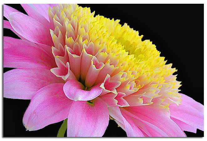
#1
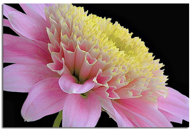
#2
#3
.
#4
All taken with 60mm at f29
 Helpful Posts: 0
Results 1 to 13 of 13
Thread: C&C, please!
-
30th January 2011, 11:53 PM #1

- Join Date
- Sep 2010
- Posts
- 2,064
C&C, please!
-
30th January 2011, 11:58 PM #2

- Join Date
- Jan 2011
- Location
- Seattle Washington
- Posts
- 3,550
- Real Name
- Paul
Re: C&C, please!
Fantastic! I like the first two the most. Great focus and wonderful pastel colors. The only thing I think is disruptive in #2 is the rim of the vase. I think it would look better without it or even if we could see a bit more of the vase. Just enough there to distract as I first wonder what it is.
-
30th January 2011, 11:59 PM #3Moderator

- Join Date
- Feb 2009
- Location
- Glenfarg, Scotland
- Posts
- 21,402
- Real Name
- Just add 'MacKenzie'
Re: C&C, please!
First reaction .......
I prefer #1 an #2 because they're not so 'in-my-face'.
#3 and #4 are up-front and too bold for me. But that, of course, is a very subjective reaction.
-
31st January 2011, 12:18 AM #4

- Join Date
- Nov 2010
- Location
- Manila, Philippines
- Posts
- 3,804
- Real Name
- Willie or Jiro is fine by me.
Re: C&C, please!
These images are whispering... dark background... dark background.
 Nice set of images, Katy. You're doing great. I just wish the bright background be darker so I can focus my attention on the wonderful colors and curves and patterns of the flower. Other than that, all I can say is - Wonderful!
This is just an idea. Hope I did not offend you by working on your image.
Or this:
Last edited by jiro; 31st January 2011 at 01:23 AM.
-
31st January 2011, 12:52 AM #5

- Join Date
- Dec 2010
- Location
- Brisbane, Australia
- Posts
- 500
- Real Name
- Mark
Re: C&C, please!
I agree with Jiro. Lovely pics but the edge detail is lost with the white background.
-
31st January 2011, 12:58 AM #6
- Join Date
- Jan 2011
- Location
- Seattle Washington
- Posts
- 3,550
- Real Name
- Paul
Re: C&C, please!
I do also like the darker background. However it does look a little over saturated now as I did like the softer pastel coloring.
-
31st January 2011, 01:15 AM #7
- Join Date
- Nov 2010
- Location
- Panama City, FL
- Posts
- 3,540
- Real Name
- Chris
Re: C&C, please!
Me too...somewhere in the midle would be just right...said mama bear. Originally Posted by jeeperman

-
31st January 2011, 02:36 AM #8
- Join Date
- Sep 2010
- Posts
- 2,064
Re: C&C, please!
Suzy.....

It's just not the same, is it. (oh, we were on the phone talking about it.... )
)
-
31st January 2011, 03:49 AM #9

- Join Date
- Dec 2010
- Location
- New England, USA
- Posts
- 103
- Real Name
- Suzanne
Re: C&C, please!
I like this better, though it did lose a little of the luminosity. A little to the right now (camera that is) Originally Posted by Katy Noelle
-
31st January 2011, 03:56 AM #10
- Join Date
- Feb 2010
- Location
- Victoria Australia
- Posts
- 2,634
- Real Name
- Kay
Re: C&C, please!
I am turning into quite the fence sitter of late - but the pastel almost 'high key' look of your set particularly # 1 and #2 I thought were really lovely....BUT then with the Black background they look terrific....but in a whole other way...both good just different.
The perspective of 3 and 4, I agree with Donald - they just don't grab me compositionally like the first 2.
-
31st January 2011, 04:17 AM #11

- Join Date
- Jul 2009
- Location
- Whitianga, NZ
- Posts
- 640
- Real Name
- Mark
neat pics
I love the look of 1 and 2. I actually prefer the white background with these soft pastel shades. It gives a kind of soft ethereal feel to the images. I hate to say this but they could be the kind of pics they like to use with toilet tissue ads
. Comfort and softness blah blah blah....
-
31st January 2011, 04:24 AM #12

- Join Date
- May 2010
- Location
- In a bus somewhere in New Zealand
- Posts
- 795
- Real Name
- Kit, aka Slimtla
Re: C&C, please!
Katy, when I saw these first, just straight on the monitor, I thought "Too soft, too unsaturated...they need more saturation & contrast." But then I saw Willie's and...no, no, no! They "need" to be just as you gave them to us.
Certainly putting them in the Litebox, with it's black frame and lights out effect does them a favour, but they are beautiful, especially #'s 1 & 2, and especially especially #2.
I do agree that cloning out the vase rim would help, as it would give it a more floating, ethereal feel.
-
31st January 2011, 04:46 AM #13
- Join Date
- Aug 2009
- Location
- Canada
- Posts
- 3,113
- Real Name
- Wendy
Re: C&C, please!
Lovely Katy: 1 & 2 get my vote also, and of course me being me, I like the softer look of the white background. That's just me though, Jiro's rework is great and they do look good on the black, but my personal and very subjective preference is for the white.
I also love the tone and texture in the last shot, but somehow or other it is lacking in the composition department. I wish I could be more helpful and suggest why, or how to improve it but I can't, there is just something missing. Beautiful colours and texture though.
Wendy


 Reply With Quote