
This article isn't yet public on the main site, but I thought I'd release it here first. There will also likely be several changes to it over the next couple of days (particularly with the diagrams).
Soft Proofing: Matching On-Screen Photos with Prints
Soft proofing is a really useful application of color management. The article covers all of the basic terminology associated with performing a soft proof, how to interpret the results and a discussion of the various pitfalls.
As usual, please let me know if you feel anything is unclear, if you notice any typos or just want to add something from your own experience.
Many thanks!
 Helpful Posts: 0
Results 1 to 17 of 17
-
19th January 2011, 12:29 AM #1Administrator

- Join Date
- Apr 2008
- Location
- California, USA
- Posts
- 1,473
- Real Name
- Sean
New Tutorial: Soft Proofing - Matching On-Screen Photos with Prints
Last edited by McQ; 23rd January 2011 at 06:54 AM.
-
19th January 2011, 12:57 AM #2
- Join Date
- Nov 2010
- Location
- Panama City, FL
- Posts
- 3,540
- Real Name
- Chris
Re: New Tutorial: Soft Proofing
You are an exceptionally articulate writer. Even though I do not print at that level in color, I found the tutorial very informative. I have given this a once over for typos and found none but will read it one more time anyway. Very well accomplished.
-
19th January 2011, 01:14 AM #3

- Join Date
- Aug 2009
- Location
- Melbourne, Australia
- Posts
- 1,968
- Real Name
- Peter
Re: New Tutorial: Soft Proofing
Hi Sean,
I did enjoy this and as usual did learn something else to include into my workflow. I feel I am at the stage to understand this. I opened an image and followed along with the tutorial but I had to search for a little time to find the dialogue box in question.
May I suggest just above the dialogue box (shown immediately under the heading Typical Soft Proofing Settings) you might include where to look in Photoshop to find it.
-
19th January 2011, 06:44 AM #4Administrator
- Join Date
- Apr 2008
- Location
- California, USA
- Posts
- 1,473
- Real Name
- Sean
Re: New Tutorial: Soft Proofing
Chris & Peter: Thanks for the feedback.
Yes, cannot believe I left that out. It's in there now though. Originally Posted by Peter Ryan

-
19th January 2011, 07:31 AM #5
- Join Date
- Dec 2008
- Location
- New Zealand
- Posts
- 17,660
- Real Name
- Have a guess :)
Re: New Tutorial: Soft Proofing
Hi Sean,
I must admit to wondering how you'd handle the different gamuts, but glad to see the answer was "very well" at the end
Couple of minor thoughts ...
1. It's Photoshop, not photoshop, and
2. With regards to profiles, is it worth mentioning the option for people to produce their own? Also, I thought you were a little hard on manufacturers profiles; I find they actually work OK - but - the catch is, "only for the correct ink/paper combination". Inks don't vary much - a given paper type doesn't vary much, and printer to printer variation is pretty negligible. It's once you change one or more of the variables that they become a lottery.
-
19th January 2011, 05:37 PM #6
- Join Date
- Dec 2010
- Location
- South Coast, UK
- Posts
- 405
- Real Name
- Nick
Re: New Tutorial: Soft Proofing
Sean,
Thanks for a terrific web site – and even more so for your continuing educational efforts. Please feel free to ignore my comments as you see fit.
1) Every printer I have ever purchased (Epson, Canon, HP) has come with a software disk. All such disks have icc profiles for the printer / oem ink / oem paper. These where all standard - not extra cost.
2) I think there may be a stated or implied assertion (in the text) that monitor gamuts are bigger than printer gamuts. Whilst that is likely the case in the specific example given (reds), generally even expensive (e.g. Eizo) monitors struggle to cover the whole Adobe RGB colourspace. In contrast, many of the better pigment ink printers (e.g. Epson 3800) have a colourspace that considerably exceeds the Adobe RGB colourspace – but not necessarily in all casses. So generally I feel that monitors have a more restricted colour space than printers – not the other way round.
3) Again, I think there may be a stated or implied assertion (in the text) that printers are unable to print as dark a black as monitors can display. I have experienced that situation. I also have experienced the opposite. I have found that – in practical ambient light conditions – monitors have a typical max black of about 18-20. In contrast I have seen many printer / ink / paper combos that print down to 8-10.
HTH
Regards,
Nick.
-
19th January 2011, 06:46 PM #7Administrator
- Join Date
- Apr 2008
- Location
- California, USA
- Posts
- 1,473
- Real Name
- Sean
Re: New Tutorial: Soft Proofing
The wording for that part has been toned back a tad, with a qualifier. The other comments have also been added/changed. Originally Posted by Colin Southern
Personally, my big problem with generic printer profiles is that their accuracy can vary substantially from brand to brand, and it's difficult to tell whether the generic profile you have is indeed a good one until you've made lots of test prints (at which time you've likely already spent as much time and money as it would've required to have a custom profile measured). I also often want to use my own custom papers, and as you say, then it is anyone's guess whether the generic profile will still hold up OK.
In addition, generic profiles are designed to measure average device behavior, so they're often quite conservative when it comes to the edges of the color gamut. By contrast, a custom printer profile is guaranteed to permit access to the far reaches of a given device's gamut since it no longer needs to represent average device behavior. Yes, inkjet printers vary much less than say CRT monitors, but there they still do have some variation. This is probably me just nitpicking and erring on the side of caution though.Last edited by McQ; 19th January 2011 at 07:14 PM.
-
19th January 2011, 08:25 PM #8Administrator
- Join Date
- Apr 2008
- Location
- California, USA
- Posts
- 1,473
- Real Name
- Sean
Re: New Tutorial: Soft Proofing
Hi Nick -- thanks for all the feedback. Please see below...
Yes, that's the generic profile -- it's the custom ones that you need to have specifically measured for your device. The custom profile can be made for other types of paper/ink, in addition to addressing any particular variations/eccentricities of your particular device. Originally Posted by nickjohnson
I added the following note in the "What You'll Need Before You Start" section: Originally Posted by nickjohnson
"Strictly speaking, an accurate soft proof also requires a computer display that is capable of reproducing the full range of image colors as they will appear in the print. However, the requirements for this vary from image to image, and even if the monitor isn't fully capable in this respect, it can often still provide a helpful soft proof for those colors which it can produce (as long as one is also aware of those which it cannot). See the discussion at the end for more..."
I agree, the above disclaimer/note is something also worth mentioning up-front. It really depends on the particular image though -- not just the gamut of the monitor. Often times an image may not even use the highly saturated colors of AdobeRGB/ProPhotoRGB/etc, so having a monitor that extends all the way into AdobeRGB can in that case be irrelevant.
-
19th January 2011, 09:09 PM #9
- Join Date
- Dec 2010
- Location
- South Coast, UK
- Posts
- 405
- Real Name
- Nick
Re: New Tutorial: Soft Proofing
Sean, Originally Posted by McQ
All noted - great work. I need to remember that you've managed to explain – in a few web pages – what I had to glean from three books – oh and a small mountain of poor prints. Good job, and more power to your elbow.
Regards,
Nick.Last edited by McQ; 20th January 2011 at 04:31 PM.
-
19th January 2011, 09:20 PM #10
- Join Date
- Dec 2008
- Location
- New Zealand
- Posts
- 17,660
- Real Name
- Have a guess :)
Re: New Tutorial: Soft Proofing
Having just said that, I discovered the hard way that even custom profiles produced by 3rd parties can have issues. I remember one that produced horrible muddy browns on a canvas print, and in the end I used a profile for a 260gsm semi-gloss paper with great results; "go figure" as we say Originally Posted by McQ
 In the end I just started doing my own, although there are few things in life I "enjoy more" than hand-scanning 700+ patches
The reason I came out in defence of generic profiles though is that I suspect that many people don't have a "tuned eye" for any variations, and as such the results look "good" to them (or at least a lot better than what they were getting).
-
19th January 2011, 11:36 PM #11Administrator
- Join Date
- Apr 2008
- Location
- California, USA
- Posts
- 1,473
- Real Name
- Sean
Re: New Tutorial: Soft Proofing
Yes, profiles can be a real pain in general. I guess the key is just finding a workflow that works and you understand -- whether this be generic or custom profiles -- and just sticking with it. Originally Posted by Colin Southern
-
19th January 2011, 11:37 PM #12Administrator
- Join Date
- Apr 2008
- Location
- California, USA
- Posts
- 1,473
- Real Name
- Sean
Re: New Tutorial: Soft Proofing
I just added several more diagrams to the "Typical Soft Proofing Settings" section, including ones for black point compensation, simulate black ink and simulate paper color. Thanks again everyone for all the feedback.
-
20th January 2011, 12:15 AM #13
- Join Date
- Aug 2008
- Location
- Ariege, France
- Posts
- 558
- Real Name
- Paul
Re: New Tutorial: Soft Proofing
Excellent tutorial. Is it worth mentioning perhaps that if you don't make the right selections in the printer dialog then your hard copy probably isn't going to resemble your soft proof (preventing double profiling for example). I mention this because a friend of mine was doing the soft proof thing, selecting the output profile for printing ... and was then letting the printer decide what it was going to do with the output anyway. Boy did I er ... he feel stupid

-
20th January 2011, 02:10 AM #14
- Join Date
- Aug 2009
- Location
- Melbourne, Australia
- Posts
- 1,968
- Real Name
- Peter
Re: New Tutorial: Soft Proofing
Sean, when you talk of out of gamut range I assume it makes some little difference if you are using Adobe RGB or sRGB. I assume it shows the out of gamut range for the colour profile you are using?
-
20th January 2011, 04:19 PM #15Administrator
- Join Date
- Apr 2008
- Location
- California, USA
- Posts
- 1,473
- Real Name
- Sean
Re: New Tutorial: Soft Proofing
Hi Paul - thanks for the feedback. Yes, keeping the soft proofing and printer settings synchronized is an important point. I have a paragraph about it at the end of stage 1 of "how to interpret soft proofs", but perhaps it should be mentioned earlier. With regards to double profiling: I think it makes sense to have a tutorial specifically about printing and color management. That's a whole other topic that probably deserves its own treatment. Originally Posted by bambleweeney
-
20th January 2011, 04:22 PM #16Administrator
- Join Date
- Apr 2008
- Location
- California, USA
- Posts
- 1,473
- Real Name
- Sean
Re: New Tutorial: Soft Proofing
Yes, the gamut warning applies for the soft proof profile you have in place. However, if you're using AdobeRGB as your image working space then there's more potential colors that can be out of gamut than with sRGB, so in that sense it could make a difference. Originally Posted by Peter Ryan
-
21st January 2011, 12:48 AM #17

- Join Date
- Sep 2008
- Location
- Wellington
- Posts
- 59
Re: New Tutorial: Soft Proofing
Hi Sean,
great work again!
In "simulates the out of gamut colors", "out of gamut" should be "out-of-gamut".
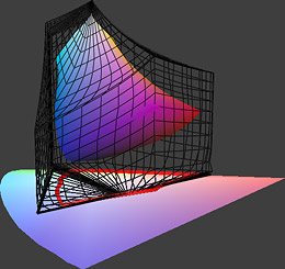
Maybe in the diagram that illustrates the difference between "Relative Colorimetric" and "Perceptual", the arrows coming from out-of-gammut areas could have a different colour. This would make it easier to spot the difference between the two approaches.
The left hand side image featuring the clown mask, has three versions "default", "relative colorimetric" and "perceptual". What is the "default" (no softproofing?)? The fact that the default version is shown when the mouse cursor is between the two softproofing options makes it hard to compare the latter. Maybe the third "default" option should have an explicit "button" and the image should not change unless the mouse cursor hovers over a new choice? The same applies to the later clown mask image for "Choose a Soft Proof Setting".
I would replace "--" with the typographical "–".
You write "Ensuring that your image has a neutral white balance can make colors appear more saturated". My experience is that some non-neutral WB settings can significantly increase saturation (for blues or yellows, or greens and magentas if one includes tint). I'm not sure what your recommendation is based on.
Hope this helps.

 Reply With Quote