
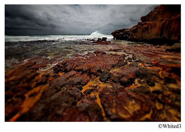
I'd appreciate any and all C&C on this image please. Taken in Oct last year at Waddy Point on Fraser Is, looking north. This is the yet another effort of mine to get something out of this image but my previous attempts have resulted in it looking over cooked in saturation and contrast.
What I don't like is the flat sky and dark rock ledge (top RHS). What I do like is the aspect, the foreground and the wave top being blown back.
In this particular effort I've limited my playing around to exposure, lens correction and vibrance in ACR, then levels and sharpening in CS5.
Perhaps I'm seeing potential here that isn't? Tell me, I can take it
500D + Sigma 10-20mm f3.5 @ 10mm, 1/1250, f8, ISO 100.
Original, as shot.
 Helpful Posts: 0
Results 1 to 20 of 20
Thread: C&C Please - Waddy Point
-
8th January 2011, 09:59 PM #1


- Join Date
- Dec 2010
- Location
- Brisbane, Australia
- Posts
- 500
- Real Name
- Mark
C&C Please - Waddy Point
-
8th January 2011, 10:41 PM #2Moderator

- Join Date
- Feb 2009
- Location
- Glenfarg, Scotland
- Posts
- 21,402
- Real Name
- Just add 'MacKenzie'
Re: C&C Please - Waddy Point
I think you've provided a perfectly good and appropriate C & C yourself. And the important thing is to acknowledge that you are able to assess and analyse in this way. I think so many people ignore the development of that skill and fail to appreciate it is an integral part of the skill set required to take their work onto the next level. Originally Posted by whited3

My own feeling, Mark, is that this one isn't going to succeed with that dark rock ledge at the top right. It's just too domineering and powerful. On the other hand, I like what you've achieved with the sky. I think that, sometimes, people try to go too far with the 'dramatic' sky. In your processes image you've got a sky that retains a sense of realism bit, I don't think, is at all flat. I think it's a perfect complement to the rest of the scene.
-
8th January 2011, 10:50 PM #3

- Join Date
- Dec 2010
- Location
- California Wine Country
- Posts
- 102
- Real Name
- Emory Winship
Re: C&C Please - Waddy Point
I tend to agree with Donald on all points, especially "Help, I love this shot, but do I love it too much?" We've all been there. At least you asked. Every effort to make the dark cliff work just blows up the rocks in the foreground, drowning out the rest. You have to get light on the cliff to make this work (but I do love the scene, too.).
-
8th January 2011, 11:08 PM #4
- Join Date
- Dec 2010
- Location
- Brisbane, Australia
- Posts
- 500
- Real Name
- Mark
Re: C&C Please - Waddy Point
Donald/Emory,
Thanks for the feedback. Since posting I've been having a closer look and trying to crop out the rocks on the RHS. Unfortunately this then raises the other problem with this image and the limitations (I think) of the Sigma 10-20mm; the upper LHS is lousy is terms of focus and distortion. Cropping this side out as well leaves basically.............................nothing
Oh well....live and learn
-
8th January 2011, 11:16 PM #5Moderator
- Join Date
- Feb 2009
- Location
- Glenfarg, Scotland
- Posts
- 21,402
- Real Name
- Just add 'MacKenzie'
Re: C&C Please - Waddy Point
And that's the second major learning point you've demonstrated to others in this thread - Knowing when to let go and say, 'This ain't going to work the way I wanted it to'. Originally Posted by whited3
I know I was far too keen to squeeze everything out of photographs and convince myself that they could work, when the reality was that they needed to be dumped. I think (hope) I'm better at doing that now, telling myself that I learned something and, if possible, committing to going back to the same location to do it again ... but better!.
-
9th January 2011, 12:03 AM #6
- Join Date
- Aug 2009
- Location
- Canada
- Posts
- 3,113
- Real Name
- Wendy
Re: C&C Please - Waddy Point
Hi Mark: I really like what you have done with PP to bring out the foreground and the sky. This is a beautiful shot and I can understand why you want to make it work for you. I'm wondering if it might work to crop the left instead of the right. Work it so that it is composed to have the dark cliff face and the foreground pointing to the wave. Just a thought, I wouldn't want to toss this one either, and so I'm doing what I'd do with one of my shots - trying to find a way to make it work.
Wendy
P.S. When all is said and done though, I'd still be keeping the processed version of this one. The cliff face is dark, but it has different tones and to my eye it's still an acceptable shot, even if it is one that you might go back to improve on later
-
9th January 2011, 12:34 AM #7

- Join Date
- Nov 2010
- Location
- Manila, Philippines
- Posts
- 3,804
- Real Name
- Willie or Jiro is fine by me.
Re: C&C Please - Waddy Point
Hi, Mark. On your image, I like the way the rock ledge seems to point to the direction of the blown waves at the center. The blown waves in my opinion (though it only occupies a small area of the frame) can be the central focus provided you make all the element point to that direction. What I meant is that you can selectively control the light distribution on the image and highlight the waves more. You can do this by darkening the perimeter and then lighten the waves. You can probably also add some form of bokeh or selective focus on the frame and keep the waves as the only element that is in focus.
Mind if I play a little bit with your image? Here is what I came up with. I hope I did not offend you by working on your image.
Thanks.Last edited by jiro; 9th January 2011 at 02:09 AM.
-
9th January 2011, 12:43 AM #8

- Join Date
- Jan 2010
- Location
- California, USA
- Posts
- 304
- Real Name
- Troy
Re: C&C Please - Waddy Point
Without reading your text I noticed the sky was horribly pale, so I copied into photoshop and made a masked curves adjustment to the sky so I could demonstrate my point. Then, after reading the post, I realized you had already pointed out the sky
")
well here it is anyway:

I lasso'd the sky and blurred the selection by 60 pixels. Using this selection I created a mask for a curves layer which I then used to clip out the histogram's left and right sides.
-
9th January 2011, 01:43 AM #9
- Join Date
- Nov 2010
- Location
- Panama City, FL
- Posts
- 3,540
- Real Name
- Chris
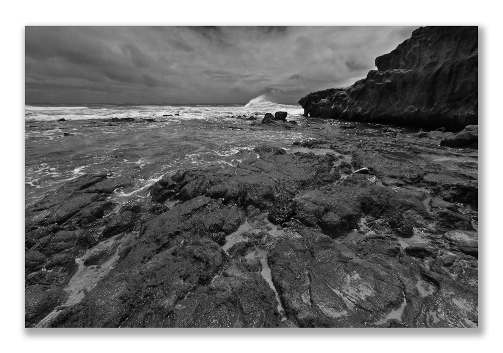
Re: C&C Please - Waddy Point
And just for kicks on Route 66 (it's an American thang), I did a B&W of it...and it does help to solve the dark cliffside. I am quite sure it would look infinitely better from the original image. Originally Posted by pwnage101

-
9th January 2011, 02:20 AM #10
- Join Date
- Dec 2010
- Location
- Brisbane, Australia
- Posts
- 500
- Real Name
- Mark
Re: C&C Please - Waddy Point
Jiro,
Excellent work. Brings a new perspective to the shot. The bokeh certainly focuses attention on the wave.
Originally Posted by jiro
-
9th January 2011, 02:24 AM #11
- Join Date
- Dec 2010
- Location
- Brisbane, Australia
- Posts
- 500
- Real Name
- Mark
Re: C&C Please - Waddy Point
Troy, I love what you've done with the sky and the ocean "green" is a bonus. I won't pretend to understand your explanation but I'll use it as a self-teach lesson on the mysteries of CS5 when I have time.
Originally Posted by pwnage101
-
9th January 2011, 02:38 AM #12
- Join Date
- Dec 2010
- Location
- Brisbane, Australia
- Posts
- 500
- Real Name
- Mark
Re: C&C Please - Waddy Point
Chris,
Interesting idea. When I first saw what you'd done I hated it (I mean that in the nicest possible way!) but then I thought I'd give the B&W a go as you suggest. Not too much tinkering by me....just mucked around with the green and blue channels to give a back drop to the wave top.
Originally Posted by ChrisC
-
9th January 2011, 05:47 AM #13
- Join Date
- Nov 2010
- Location
- Panama City, FL
- Posts
- 3,540
- Real Name
- Chris
Re: C&C Please - Waddy Point
I figured after you made nice-nice comments to the other two, you weren't overly thrilled with it as a B&W -or with my rendition. It didn't bring me to tears or anything, though I suspect I might be traumatised for a few weeks and lose at least a night's sleep - NOT.
I like how you bolstered up the front, leading edge and were able to get enough contrast between the wave and the back clouds. I think it has great potential as a B&W.
-
9th January 2011, 11:49 PM #14
- Join Date
- Dec 2010
- Location
- California Wine Country
- Posts
- 102
- Real Name
- Emory Winship
Re: C&C Please - Waddy Point
Not to tread on Mark's vision, again, but I'm with Chris. The b&w doesn't just rescue the shot, which I think the other amazingly skilled color edits do to some degree, it gives the shot it's own true character. The problems of your competing tones and levels, especially the now infamous cliff face, now become shapes and textures more easily bent to your will to create a strong image with its own integrity. If you get in and work on your color filters, tones and some artful adjustment brushing, I think this could become quite dramatic (ok, I'm a b&w addict). When you get time to work more in CS5, go straight to RAW. So worth it. Anyway, sleep tight, Chris.
-
10th January 2011, 02:30 AM #15
- Join Date
- Dec 2010
- Location
- Brisbane, Australia
- Posts
- 500
- Real Name
- Mark
Re: C&C Please - Waddy Point
I think the only thing I can do is go back there and do it again. I know, it's a tough call having to spend another week on Fraser Is but it's got to be done
 Unfortunately I have to wait for Oct to do so
Thanks for all the feedback folks
-
10th January 2011, 02:50 AM #16

- Join Date
- Aug 2009
- Location
- Melbourne, Australia
- Posts
- 1,968
- Real Name
- Peter
Re: C&C Please - Waddy Point
Hi Mark,
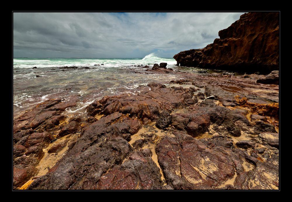
I like the idea of another trip.
Below is some quick and dirty work with Shadows/Highlights in Adjustments. The problem is we are not sure what it is you saw or are trying to show.

-
10th January 2011, 03:21 AM #17
- Join Date
- Dec 2010
- Location
- Brisbane, Australia
- Posts
- 500
- Real Name
- Mark
Re: C&C Please - Waddy Point
Thanks a lot Peter. Your image is definitely the closest to what I was after. I'll go back and have another play with it.
Cheers.
Originally Posted by Peter Ryan
-
10th January 2011, 04:56 AM #18
- Join Date
- Aug 2009
- Location
- Melbourne, Australia
- Posts
- 1,968
- Real Name
- Peter
Re: C&C Please - Waddy Point
Hi Mark,
A few tips for when you have a go. When you open this dialogue box click Show More Options. The default setting in Shadow/Highlights is to increase the shadow area by 50%, which it far too strong. Start around 25% and then play with the Tone adjustment. In Shadows I usually use a radius around 165.
Normally Highlights default is Nil. (I have head if you have an image that requires both adjustments then something is seriously amiss but it happens). Again increase the Highlights slider to reduce the brightness of the sky. Again play with the Tone and I leave the radius at 30 (default).
This type of flattening of the tone range can desaturate the colour and make the image a little flat or ‘milky’. Increase the Colour Correction to +30 and the Midtone Contrast to +10.
If required you can also do a bit of Dodge & Burn to the sky for effect (I did not do any of this).
Now open the Levels command and slightly clip both the Black and White clipping point, again to add back contrast.
-
10th January 2011, 08:10 AM #19
- Join Date
- Dec 2010
- Location
- Brisbane, Australia
- Posts
- 500
- Real Name
- Mark
Re: C&C Please - Waddy Point
Thanks Peter. Much appreciated
-
10th January 2011, 02:55 PM #20
- Join Date
- Dec 2010
- Location
- California Wine Country
- Posts
- 102
- Real Name
- Emory Winship
Re: C&C Please - Waddy Point
Nice job, Peter.


 Reply With Quote