
 Helpful Posts:
 Another image from the Utah archive re visited.
Captured in 2010 in the Devil's Garden area of Arches NP.
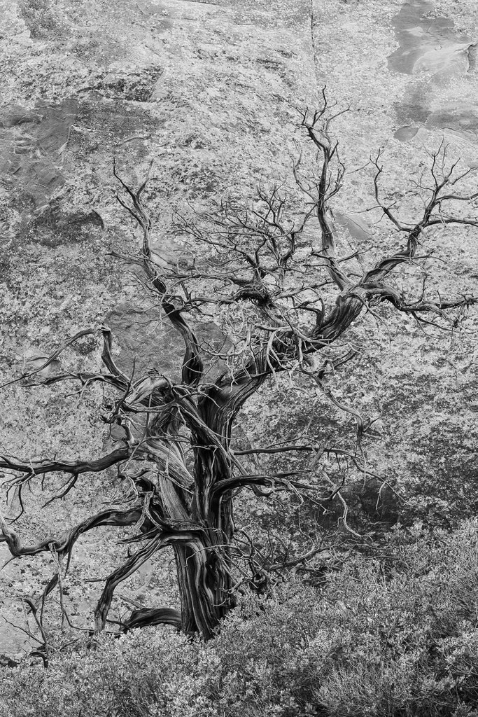
A skeletal juniper, sand oak and lichen covered sandstone canyon walls.....
C&C always welcome.
Juniper, Oak by Len Reeves, on Flickr
Results 1 to 13 of 13
Thread: Juniper, Sand Oak
-
28th June 2026, 05:49 PM #1


- Join Date
- Jan 2020
- Location
- Calgary, Alberta, Canada
- Posts
- 593
- Real Name
- Len
Juniper, Sand Oak
-
29th June 2026, 02:22 AM #2

- Join Date
- Apr 2015
- Location
- Ottawa, Ontario, Canada
- Posts
- 1,637
- Real Name
- André
Re: Juniper, Sand Oak
Hi Len, Originally Posted by LenR

The link does not leads to your photo on Flickr but rather to a flickr "Explore" page!
-
29th June 2026, 02:10 PM #3
- Join Date
- Jan 2020
- Location
- Calgary, Alberta, Canada
- Posts
- 593
- Real Name
- Len
Re: Juniper, Sand Oak
Hi Andre, if you click on Len Reeves it should take you to the photo in Flickr.
Is the image not visible on the Forum?
-
29th June 2026, 04:08 PM #4
- Join Date
- Apr 2015
- Location
- Ottawa, Ontario, Canada
- Posts
- 1,637
- Real Name
- André
Re: Juniper, Sand Oak
Hi Len,
No, the photo is not visible on the Forum. The "Juniper,Sand Oak" points to the sign in page for Flickr and the "Len Reeves" point to your photostream on your Flickr page.
-
29th June 2026, 07:21 PM #5
- Join Date
- Jan 2020
- Location
- Calgary, Alberta, Canada
- Posts
- 593
- Real Name
- Len
Re: Juniper, Sand Oak
Hi Andre, something of a mystery. The image shows on the Forum on both computers I use and also on my wife's I Phone.....
I will repost to see if that helps.........
-
29th June 2026, 08:17 PM #6
- Join Date
- Jan 2020
- Location
- Calgary, Alberta, Canada
- Posts
- 593
- Real Name
- Len
Re: Juniper, Sand Oak
Image re posted.....

Juniper, Oak by Len Reeves, on Flickr
-
30th June 2026, 12:45 AM #7
- Join Date
- Apr 2015
- Location
- Ottawa, Ontario, Canada
- Posts
- 1,637
- Real Name
- André
Re: Juniper, Sand Oak
I am sorry to say but this one does not work for me. You have three subjects that do not cooperate together. The tree which I believe is your main subject blends in the sand and lichens whereas the greenery just looks out of place.
I would suggest that you try a black and white version. You could make the sand and greenery blend together and add overall contrast to make the tree stand out. Something along these lines:
-
30th June 2026, 07:00 PM #8

- Join Date
- Dec 2011
- Location
- New England
- Posts
- 9,331
- Real Name
- Dan
Re: Juniper, Sand Oak
It will be a while before I can get back on a computer and look more carefully, but I think I partly disagree. I agree that the tree needs more separation, but I don’t see this as multiple subjects.
Sent from my iPhone using Tapatalk
-
30th June 2026, 07:54 PM #9
- Join Date
- Jan 2020
- Location
- Calgary, Alberta, Canada
- Posts
- 593
- Real Name
- Len
Re: Juniper, Sand Oak
My thanks to Andre & Dan.
Look forward to seeing Dan's interpretation shortly.....
-
30th June 2026, 08:53 PM #10
- Join Date
- Dec 2011
- Location
- New England
- Posts
- 9,331
- Real Name
- Dan
Re: Juniper, Sand Oak
I like the backgound, and the green forms a nice diagonal. My question is how to get the tree to stand out more. Often, I would desaturate and/or darken the background to help with that, but that wouldn't work here, since the tree is dark. So, if you'll excuse a very sloppy edit that I did just to explore:
--I darkened the tree, both overall and especially whites/highlights. The ACR select subject had no difficulty selecting the tree.
--I slightly increased staturation and brightness of the rocks.
--I kept the green fairly dark and a bit desaturated.
--I cropped from the top.
I didn't do any fine tuning yet, e.g., dodging or burning.
Are these directions worth pursuing?

-
30th June 2026, 09:32 PM #11
- Join Date
- Jan 2020
- Location
- Calgary, Alberta, Canada
- Posts
- 593
- Real Name
- Len
Re: Juniper, Sand Oak
Dan, thanks for your input.
I like the direction you are suggesting, darkening the tree certainly makes it stand out better against the background rock face.
Interestingly, OOC, the tree was quite dark and the background rock light. My edits were going opposite to what you have suggested.
I will revisit the image along the lines suggested.
Appreciate your time.......
-
30th June 2026, 11:58 PM #12
- Join Date
- Dec 2011
- Location
- New England
- Posts
- 9,331
- Real Name
- Dan
Re: Juniper, Sand Oak
Len,
IMHO, making the tree stand out makes it clear that the tree is the subject, not the background rocks. I would almost never increase saturation in a background, but in this case, since the tree is monochrome, I thought it would help separate the two.
Dan
-
1st July 2026, 11:23 AM #13
- Join Date
- Apr 2015
- Location
- Ottawa, Ontario, Canada
- Posts
- 1,637
- Real Name
- André
Re: Juniper, Sand Oak
I love the approach that you suggested. It never occurred to me that the "select subject" would work on such an intricate subject as the tree. You just opened up a whole new world of possibilities for me. Thanks.


 Reply With Quote
