
 Helpful Posts:
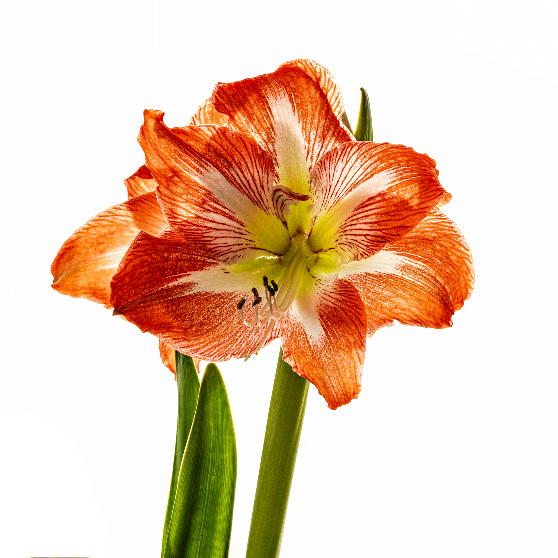
 I shot this amaryllis in front of a large window covered by a sheer white curtain. Maybe it is because I usually use a black background but I find that the resulting photo looks "cut-out" and somewhat clinical. Is it just me?
C & C always welcomed.
Results 1 to 14 of 14
Thread: Amaryllis
-
15th December 2025, 03:12 AM #1


- Join Date
- Apr 2015
- Location
- Ottawa, Ontario, Canada
- Posts
- 1,617
- Real Name
- André
Amaryllis
-
15th December 2025, 12:04 PM #2

- Join Date
- Dec 2011
- Location
- New England
- Posts
- 9,296
- Real Name
- Dan
Re: Amaryllis
I agree. Perhaps it would work better if the background
were a bit darker and showed texture or some other variation.
Sent from my iPad using Tapatalk
-
15th December 2025, 02:34 PM #3

- Join Date
- Mar 2025
- Location
- Setúbal - Portugal
- Posts
- 322
Re: Amaryllis
How about this ?

-
15th December 2025, 04:17 PM #4
- Join Date
- Apr 2015
- Location
- Ottawa, Ontario, Canada
- Posts
- 1,617
- Real Name
- André
Re: Amaryllis
Yes Antonio. This is much better.
Thank you
-
15th December 2025, 08:09 PM #5

- Join Date
- Jan 2020
- Location
- Calgary, Alberta, Canada
- Posts
- 557
- Real Name
- Len
Re: Amaryllis
Andre, this is a genre I find most appealing but confess I have not dabbled in.
I wonder if the vignette is not a little too bold in Antonio's interpretation.......
-
15th December 2025, 10:30 PM #6
- Join Date
- Mar 2025
- Location
- Setúbal - Portugal
- Posts
- 322
Re: Amaryllis
André, I confess I wrestled quite a bit with the idea of applying a vignette to this image... It's an effect I use so rarely, almost never, in fact. This time, though, it seemed like a delicate and promising choice. Now, I recovered the original file and removed it, and there you have itthe photo gained a lightness and authenticity that make it even more captivating.

-
16th December 2025, 11:14 AM #7Moderator


- Join Date
- Mar 2012
- Location
- Ottawa, Canada
- Posts
- 22,497
- Real Name
- Manfred Mueller
Re: Amaryllis
Yes, it does look somewhat clinical, but there is nothing wrong with that, in principle. A lot of photographers shoot against dark background to help the subject "pop", so the white is a bit more unusual.
I find that the downs side to that look is that the subject seems to be floating in mid-air and that is the part that often does not work all that well. The other issue is that a plain white background can be distracting as it can overpower the subject.
As you are effectively shooting a back-lit subject, which means you either have to brighten the subject up in post or you can add some front lighting to do that for you. If you overpower the back-lighting by adding another light source from the front, you can get more interesting results.

-
16th December 2025, 12:47 PM #8
- Join Date
- Mar 2025
- Location
- Setúbal - Portugal
- Posts
- 322
Re: Amaryllis
Manfred, I appreciated your proposal as it has merit and shows your usual good aesthetic sense. Unlike the initial idea with an isolated flower, yours incorporates a light shadow that reinforces the volume, enriching the whole in a subtle way.
It's a sound choice that values the main element.
Cheers !
-
16th December 2025, 01:28 PM #9
- Join Date
- Apr 2015
- Location
- Ottawa, Ontario, Canada
- Posts
- 1,617
- Real Name
- André
Re: Amaryllis
Thanks Manfred, Originally Posted by Manfred M

My problem is that I want to capture the effect of the light coming through the petals. So overpowering the back light is counterproductive. The lack of shadows contributes to the floating in mid air effect. I will experiment with different artificial backgrounds to try to create some apparent volume to the image. If all else fail, I'll go my usual black.
-
16th December 2025, 01:48 PM #10
- Join Date
- Dec 2011
- Location
- New England
- Posts
- 9,296
- Real Name
- Dan
Re: Amaryllis
I do a lot of this sort of photography, or at least I used to and hope to soon. One consequence of our downsizing is that I lost my study/studio, and the table and lights I use for this are in the dusty basement, waiting for us to clear other junk away.
Anyway, I think one of the important things is to create tonal variation. There are lots of ways to do this, and IMHO, no one way is best. Manfred's photo shows one way. The tonal variation there is primarily the shadows created by the front lighting. The flower itself is rather flat. Andre's original is the opposite: the background is obviously completely free of tonal variation, but the flower has a lot of it because of the backlighting.
I generally use Andre's approach and rely on tonal variation in the flower, which I most often obtain by varying the direction of front and side lighting. I usually use flat black backgrounds, and I try to limit how much of that negative space there is.
IMHO, Andre's original has a few problems. First, the background is very bright, which is distracting. Second, it's entirely featureless, with no tonal variation. Antonio's edit, either with or without the vignette, addresses these to some degree.
Again just IMHO, the amount of tonal variation needn't be large, and in some cases, I've opted for none. I can illustrate my taste with two images of an Asiatic lily. Here's one that is more or less typical of what I do. This was done with two lights, one bounced off an umbrella and the second direct but diffused:

Here's another that is unusual for me, with the contrast almost entirely with the background:

-
17th December 2025, 10:48 AM #11Moderator
- Join Date
- Mar 2012
- Location
- Ottawa, Canada
- Posts
- 22,497
- Real Name
- Manfred Mueller
Re: Amaryllis
I also prefer when flowers are shot with back and / or side lighting to reveal the internal structures. A composite approach (especially in the type of setting you are shooting it) works. One back light to reveal the textures and one front light (that overpowers the natural light and casts a shadow) can be combined in post to get the best overall image. Originally Posted by Round Tuit
-
17th December 2025, 11:14 AM #12
- Join Date
- Mar 2025
- Location
- Setúbal - Portugal
- Posts
- 322
Re: Amaryllis
My simples and unsophisticated approach

-
17th December 2025, 12:45 PM #13
- Join Date
- Apr 2015
- Location
- Ottawa, Ontario, Canada
- Posts
- 1,617
- Real Name
- André
Re: Amaryllis
That sound like the solution I was looking for. Thanks Originally Posted by Manfred M
-
17th December 2025, 12:48 PM #14
- Join Date
- Apr 2015
- Location
- Ottawa, Ontario, Canada
- Posts
- 1,617
- Real Name
- André
Re: Amaryllis
I am sorry Antonio but that does not work for me at all. Originally Posted by AntonioCorreia

 Reply With Quote
