
 Helpful Posts:
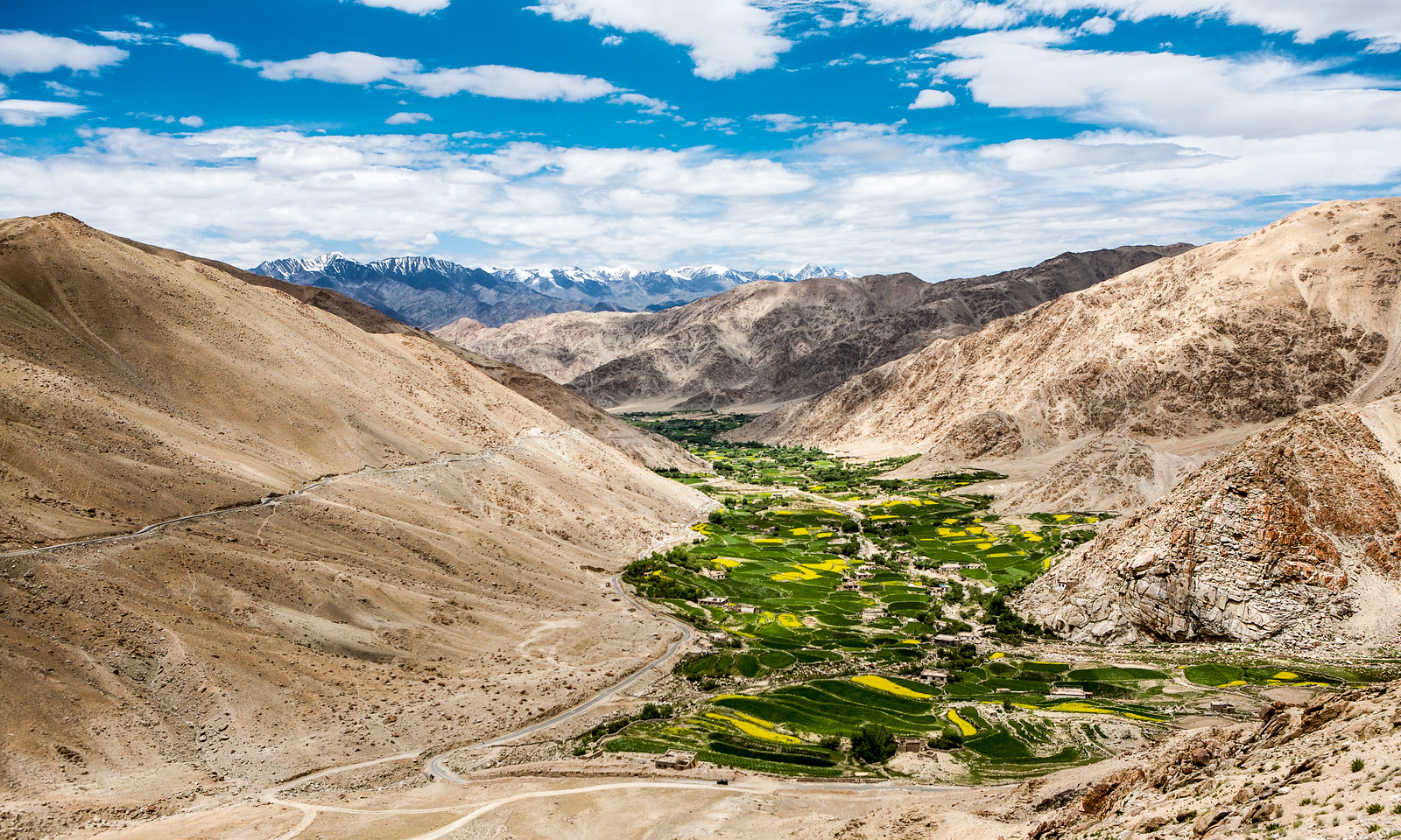
 Amid arid mountains emerges a green and yellow valley, marked by mustard fields that contrast with the dry landscape. The blue sky with distant clouds enhances the beauty of this rugged scenery where human presence is revealed in the fertile lands of the valley.
Results 1 to 10 of 10
Thread: Valley Contrast
-
13th September 2025, 09:45 PM #1


- Join Date
- Mar 2025
- Location
- Setúbal - Portugal
- Posts
- 322
Valley Contrast
-
14th September 2025, 10:04 AM #2

- Join Date
- Aug 2015
- Location
- Scotland
- Posts
- 3,195
- Real Name
- Bill
Re: Valley Contrast
I like the intended story-telling but the blues and greens are somewhat over-saturated for my taste.
-
14th September 2025, 11:54 AM #3

- Join Date
- Apr 2015
- Location
- Ottawa, Ontario, Canada
- Posts
- 1,630
- Real Name
- André
Re: Valley Contrast
This photo of a fertile valley in the midst of such an arid landscape effectively captures the uniqueness of this place. The crunchy style of the picture is a deviation from your usual softer approach. I agree with Bill that the saturation might have been pushed a bit too far but it certainly brings out the natural contrast of the land.
-
14th September 2025, 02:45 PM #4
- Join Date
- Mar 2025
- Location
- Setúbal - Portugal
- Posts
- 322
Re: Valley Contrast
Bill and André, many thanks to both of you for your comments, which I truly appreciate, and especially for the shared opinion regarding the colour saturation. I do recognise that I went too far, and only after your objective observation was I able to look at the image again with some distance. It now feels much more balanced.
From this same journey I also keep a black and white collection, made more than ten years ago, which fascinated me at the time but which I am not sure will awaken the same emotion today.

-
14th September 2025, 04:22 PM #5
- Join Date
- Apr 2015
- Location
- Ottawa, Ontario, Canada
- Posts
- 1,630
- Real Name
- André
Re: Valley Contrast
Antonio,
I could be wrong but it looks to me like you globally de-saturated the image slightly. The result is better than the original. Processing the three areas(sky, mountain,vegetation) separately would give you more flexibility. Here is an example. Not necessarily what you would want to do but it illustrate the possibilities.
P.S. I would also recommend that you post image in sRGB rather than Adobe RGB
-
14th September 2025, 08:30 PM #6

- Join Date
- Dec 2011
- Location
- New England
- Posts
- 9,315
- Real Name
- Dan
Re: Valley Contrast
I agree with Andre. I think the greens are more oversaturated than the blues. A nice image, worth some further tweaking.
-
20th September 2025, 05:23 PM #7
- Join Date
- Mar 2025
- Location
- Setúbal - Portugal
- Posts
- 322
Re: Valley Contrast
Thank you André and Dan for your comments, which I only now have the chance to reply to.
I spent the past week away from home and I do not like replying either on the tablet or on the phone.
I cannot help but agree that, in the previous image, I limited myself to reducing the vibrance, which gave it less liveliness. This time I reset that parameter to zero and separately selected the mountains, the sky and the mustard valley.
I believe I have now reached a balance that seems reasonable, although it is becoming increasingly difficult to make adjustments since I have only a very faint perception of the changes I introduce.
For the export I converted to sRGB as suggested.

-
21st September 2025, 10:02 PM #8New Member
- Join Date
- Sep 2025
- Location
- Beaumaris, Victoria, Australia
- Posts
- 4
- Real Name
- Doh!
Re: Valley Contrast
G'day Antonio, Originally Posted by AntonioCorreia

I agree about converting to sRGB before posting. Some browsers and forum software cannot automatically recognise colour spaces, and/or convert them properly for display. Better to do it yourself. sRGB is nearly as abominable as Apple colour space, but it will display correctly, regardless of the web site, browser or forum software used.
-
22nd September 2025, 06:42 AM #9Moderator

- Join Date
- Mar 2012
- Location
- Ottawa, Canada
- Posts
- 22,501
- Real Name
- Manfred Mueller
Re: Valley Contrast
Our visual system is attracted to areas of brightness, high contrast and saturated colours, so we have a lot to process and distract in this scene. I tend to reduce the impact of the sky in my work so that it does not compete with the other parts of the image. In fact, I often try to minimize the amount of sky in my images in order to do this. I suspect cropping most of the sky in this shot might be worth exploring.
-
22nd September 2025, 10:06 PM #10
- Join Date
- Mar 2025
- Location
- Setúbal - Portugal
- Posts
- 322
Re: Valley Contrast
Thank you Manfred for sharing your perspective, I really enjoyed reading the way you explained your point of view. Its always nice to see how each person looks at an image differently.
In this case, I feel that cropping too much of the sky might not be the best option, because I think it adds atmosphere and fits well with the overall composition. To be honest, Id probably struggle to reframe it effectively without losing the balance of the photo.
That said, I truly appreciate your suggestion it made me look at the composition with fresh eyes, and thats always valuable.
Cheers !


 Reply With Quote