
 Helpful Posts:
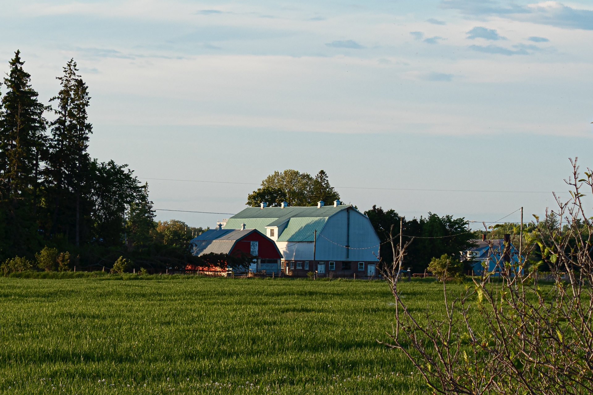
 I took this photo two days ago moments before sunset. Unfortunately, thin clouds appeared in the west as I was setting up and filtered out most of the golden light.
I plan on eliminating the two horizontal electrical cables. I am also opened to other suggestions on how to process this picture.
Results 1 to 9 of 9
Thread: Local Farm at Sunset
-
31st May 2025, 12:54 AM #1


- Join Date
- Apr 2015
- Location
- Ottawa, Ontario, Canada
- Posts
- 1,423
- Real Name
- André
Local Farm at Sunset
-
31st May 2025, 08:41 PM #2

- Join Date
- Mar 2025
- Location
- Setúbal - Portugal
- Posts
- 167
Re: Local Farm at Sunset
André, I took your photograph and made a few adjustments, although, to be honest, I didnt manage to achieve a result that was substantially different or better.
I started by slightly warming the white balance, since its a sunrise scene, a time when the light tends to be softer and more inviting. Then I selected the sky to darken it a little and increase the contrast, trying to give it more depth and enhance the overall atmosphere of the scene.
I applied a similar treatment to the foreground, from the green area to the houses, using Lightrooms Linear Gradient in order to maintain a certain balance throughout the image. If I had had access to the RAW file, I would also have experimented with changing the colour profile something that usually gives me good results in this kind of situation.
I also added a touch of Clarity, but only a little.
In any case, thank you for sharing this serene image, bathed in delicate light.

-
1st June 2025, 12:53 PM #3
- Join Date
- Apr 2015
- Location
- Ottawa, Ontario, Canada
- Posts
- 1,423
- Real Name
- André
Re: Local Farm at Sunset
Thank you Antonio.
I like what you did particularly the tweaking of the white balance. It brought back the golden sunset light that the wispy clouds had washed away.
-
1st June 2025, 05:29 PM #4
- Join Date
- Jan 2009
- Location
- South Devon, UK
- Posts
- 14,673
Re: Local Farm at Sunset
To be brutally honest, Andre, this is one of those situations where I would have strong words with myself about not taking more care over the composition. And even when I think I have got everything correct I frequently take a series of shots from different angles and delete most of them. Too often it is all of them.
I would have shot with auto exposure bracketing and done a careful merge to improve the sky while increasing brightness on the tree shadows.
But the chief problem for me is that distracting foliage in the bottom right corner. Maybe a crop and a bit of cloning would help. Removing the other distant building would also help to concentrate on the main subject, which includes the sky.
-
2nd June 2025, 01:09 AM #5
- Join Date
- Apr 2015
- Location
- Ottawa, Ontario, Canada
- Posts
- 1,423
- Real Name
- André
Re: Local Farm at Sunset
Wow Geoff. This is refreshing. No beating around the bush. I take it you don't like the picture and that is OK with me. I like the brutally honest approach. You made my day. Originally Posted by Geoff F

-
2nd June 2025, 05:13 PM #6
- Join Date
- Jan 2009
- Location
- South Devon, UK
- Posts
- 14,673
Re: Local Farm at Sunset
I didn't intend to be overly harsh and without that jumble of tangled foliage in the bottom right corner I think this image could be made interesting by doing something along the lines of Antonio's edit.
I am extremely critical of my own work so I tend to judge other images in the same way.
-
2nd June 2025, 05:46 PM #7
- Join Date
- Mar 2025
- Location
- Setúbal - Portugal
- Posts
- 167
Re: Local Farm at Sunset
Id like to share my perspective on the importance of foreground elements, especially when it comes to scenes with vegetation, like grasses.
In my view, these elements can be key to making an image more engaging.
They help create depth, provide context and offer that almost three-dimensional effect that draws us into the scene.
They also visually connect the different planes of the composition, making it richer.
Let me give an example: a few overhanging branches in the top right corner could serve as a natural frame, breaking up the sky and guiding the viewers gaze.
Or the grasses below used intentionally, could create a dialogue between two planes, perhaps with the foreground softly out of focus and the background subtly lit, with a touch of editing to emphasise the luminous transition.
To illustrate this idea, I quickly found one of my own photos.
Its not the best, I admit, but I think it helps to convey the logic behind what Im trying to explain.

-
Today, 11:59 AM #8
- Join Date
- Apr 2015
- Location
- Ottawa, Ontario, Canada
- Posts
- 1,423
- Real Name
- André
Re: Local Farm at Sunset
As far as I am concern, you were not overly harsh. Obviously, "that jumble of tangle foliage" struck a nerve with you but I deliberately placed it there and even went to great length to make sure that it was well focused. I would have preferred a more 'solid' bush but I needed it to counter balance the two trees in the upper left corner as well as to establish a foreground. The white line of dandelion seed heads at the bottom of the frame is too subtil to serve that purpose. Of course, I could have eliminated most of the grass; that would have flatten the depth of the scene and lost an important element of the picture. Originally Posted by Geoff F
I had not processed the photo before posting it with the exception of a slight contrast adjustment. I will do that in the coming days and post it to see I can get a more positive reception. I am not expecting a "wall hanger" out of this experiment but something useful would be nice.
-
Today, 12:09 PM #9
- Join Date
- Apr 2015
- Location
- Ottawa, Ontario, Canada
- Posts
- 1,423
- Real Name
- André
Re: Local Farm at Sunset
I do share your perspective on the importance of foreground elements. Originally Posted by AntonioCorreia
The example that you show though does not do justice to the concept. I find that in this case the dark trees overwhelm the scene.

 Reply With Quote