 Helpful Posts: 0
Results 1 to 20 of 20
Thread: Does this work?
-
28th December 2010, 01:31 AM #1
-
28th December 2010, 01:36 AM #2
Re: Does this work?
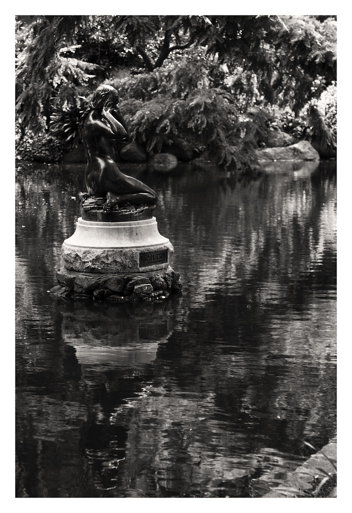
I believe your background is a bit "busy". Also, your main subject is being "covered" by the background due to their tonal similarities. However, I have to commend you for placing it nicely on the top 1/3 part of the frame. If you can come back to this site and take another shot at it, I'd recommend you walk around the main subject until it's tonal contrast is brighter or darker from the background (whichever works better). Although usually, a brighter main subject works better than the opposite. How about showing the original colored version for us?
-
28th December 2010, 01:42 AM #3
Re: Does this work?
Hi Raylee,
I agree with Jiro and I'd like to see a coloured version.
I would guess the statue is black(?), so there ought to be a possible combination of channel mixing that increases greens and yellows (my guess for background foliage) making them much lighter and a larger contrast from the statue itself.
Cheers,
-
28th December 2010, 02:02 AM #4
Re: Does this work?
Very nice suggestion, Dave. I almost forgot that. Raylee, if you will look at the separate R,G, and B layers of the channel of your image, you can actually extract that layer (via apply image command inside photoshop) and use that as your starting b&W conversion layer. We'll wait for your colored image so we can further help you out on this one.

-
28th December 2010, 02:04 AM #5
-
28th December 2010, 02:35 AM #6
Re: Does this work?
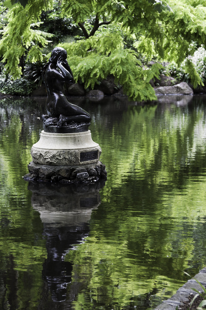
Raylee, thanks for posting the colored image. Honestly, I think this works just fine as a colored image. Though there are only 2 colors present (predominantly green and shades of black to gray) it can still be "enhanced", IMO.
What I would probably do is:
1. Make a mask on the statue and then lighten it a little bit. I'd also increase the contrast a little bit to separate it from the dark background.
2. Use selective dodging and burning on the whole image to further separate the subject from the background.
3. The element on the lower right corner of the frame is getting some unwanted attention so I might burn it a little to blend with the rest of the background.
If you would allow it, I can upload my "processed" image here so you can further understand what I did to your original colored image. Thanks.Last edited by jiro; 28th December 2010 at 02:49 AM.
-
28th December 2010, 03:03 AM #7
-
28th December 2010, 03:18 AM #8

- Join Date
- Sep 2010
- Posts
- 2,064
Re: Does this work?
Hi, Raylee! Just my very humble two cents worth.... I really like the colored version. The green reflections and ripples in the water are very lush and soothing and rich and seem to advance the story or feeling that goes with the statue. It's just a thought...
-
28th December 2010, 03:25 AM #9
-
28th December 2010, 03:50 AM #10
Re: Does this work?
Frankly, I don't know much about the science of b&w conversion. What I always do as my guide is "if it works well in color, then color it is." However, I have to admit that if it works very well in color it has a strong potential to work well also in b&w depending on your color selection.
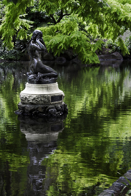
Here is my version of your image. As a guide, this is just my interpretation of your image so that means it might not be agreeable to all. Thanks for allowing me to work on your image.

5298836560_d60c28b65e_bEN by jiro bau, on Flickr
-
28th December 2010, 03:57 AM #11

- Join Date
- Feb 2010
- Location
- Victoria Australia
- Posts
- 2,634
- Real Name
- Kay
Re: Does this work?
Hi Raylee
I am a fan of your B&W work - but this one is much better for mine in the colour version.
Jiro's adaptation (I think) further enhances the statue - it looks a beautiful place.
-
28th December 2010, 04:13 AM #12

- Join Date
- Sep 2010
- Posts
- 2,064
-
28th December 2010, 04:29 AM #13

- Join Date
- Nov 2010
- Location
- Panama City, FL
- Posts
- 3,540
- Real Name
- Chris
Re: Does this work?
I know this is going to sound terribly picky, but shouldn't the reflection of the statue in the water match tonally with the statue itself.?Seems very muted compared to the richness of the black you made in the masking.
Overall, while I like the image itself, I really don't like the green anywhere except in the reflection which I like very much. Someone described it as lush...and it is, almost to the point of sensual...the trees don't give me that same feeling. I think they are too brash for the softness of the figure's pose.
It's like putting earrings on the Mona Lisa
-
28th December 2010, 06:50 AM #14
Re: Does this work?
Thanks! That has more punch to it.
In terms of going back for another shot, it will have to wait until my next trip to Melbourne.
Kay - you might like to visit the Queen Victoria Gardens. There is another lovely pond there too. That's one of the things I love about Melbourne - beautiful parks and gardens right in the middle of the city.
-
28th December 2010, 08:02 AM #15Moderator


- Join Date
- Feb 2009
- Location
- Glenfarg, Scotland
- Posts
- 21,402
- Real Name
- Just add 'MacKenzie'
Re: Does this work?
Raylee
Good. Me too.
The key, for me, with B & W is the concept of 'seeing in B & W'. A lot of people speak and write about it. The person I hold as my 'guru', Michael Freeman, in his writing, led me to start thinking about and, hopefully, to developing the skill to apply it in practice.
As you will have noticed, 99% of what I produce is in B & W. I don't think I have the skill/talent/ability (delete as required) to flip back and forth between B & W and colour when I'm shooting. I have a certain admiration for those who do.
When I'm out in the field I'm there to shoot a B & W or, occasionally, a colour photo. It's never, ever a case of, 'I'll take the shot and then decide whether to make it colour of B & W'. Which is also why I will never make a colour version of a shot that was intended to be B & W, nor vice-versa. When I get back onto the digital darkroom, load up the photos and see that one looks not too bad in colour, that's as far as it goes. If it hasn't worked the way I wanted it to in B & W then it's dumped. It will never be made into a colour picture.
And that's not about being precious in any way. It's purely part of my behaviour/actions to continue the practice of being able to 'see' in B & W.
So far as your image above is concerned, I think that once you get that 'eye' fully trained, you would see that the tones on the statue and the background would have given you a B & W problem and you would/could have decided to shoot for a colour image in the first place.
That's probably all a bit of a ramble, but hopefully provides some helpful information about one way to approach a commitment to B & W.Last edited by Donald; 28th December 2010 at 08:12 AM.
-
28th December 2010, 08:53 AM #16
-
28th December 2010, 10:23 AM #17

- Join Date
- Feb 2009
- Location
- Bucharest,Romania
- Posts
- 1,367
Re: Does this work?
Hi,
In the future You might take into account this pp actions
1 lasso tool then Ctrl J
2 transform,free transform and cover entire shot
3 eraser tool to discover what You'll consider as Your taste will tell (15 min no more)
4 with clone stamp it covers the too luminous area of the head

(worked in Adobe PSE)
A Happy New YearLast edited by Radu Dinu Cordeanu; 28th December 2010 at 12:25 PM.
-
29th December 2010, 05:20 PM #18
Re: Does this work?
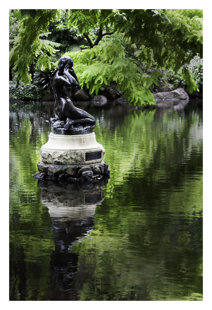
Well, here's my attempt, with the caveat that I know nothing about Photoshop (though I'm starting a class next week!). I started with a Lightroom preset "Green Filter," and then fiddled with the different color channels -- I was trying to darken everything but the statue, and to that end I brightened up the highlights on the shadow and reflection and then did a little burning on the other highlights. I don't know if it works (especially if the whole thing is too dark now), and it's probably a pretty bumbling use of PS, but I think the statue and reflection stand out more? I also cloned out the thing in the lower right corner.
-
30th December 2010, 10:49 AM #19
-
30th December 2010, 01:20 PM #20
Re: Does this work?
I have to say, I had a go at this in B&W and failed to improve upon other's efforts, and gave up

If we all learn one thing from this, it should be to keep an eye on the tones of subject in relation to background so as to try to avoid making life difficult later

Sometimes a simple relocation, or shooting am vs pm, or in winter vs summer, is all that is needed, however, this one looks to be a challenge.
In fact I would say sometimes it just isn't realistically possible - I have quite a similar statue in a local park near me, I have shot it on more than one occasion; in differing lighting situations, but the results are always disappointing, its position, tone and close, dark background just make it unphotogenic - at least not with out booking Colin (or Joe McNally) with a generator and a cart load of strobes and VALS (with wellies) to light it artifically and separate it from the background.
My statue is surrounded by conifers, so things don't get any better in winter when there are no leaves on many trees
I'm sure there's a way, but for me, I'll pass ...
(VALS = Voice Activated Light Stand, basically a person who can follow orders holding the strobe where the photographer requests)Last edited by Dave Humphries; 30th December 2010 at 01:25 PM.


 Reply With Quote


