 Helpful Posts: 0
Results 1 to 18 of 18
-
12th December 2010, 09:08 AM #1

- Join Date
- Dec 2008
- Location
- New Zealand
- Posts
- 17,660
- Real Name
- Have a guess :)
Seriously folks, this is a good as it gets!
-
12th December 2010, 09:13 AM #2Moderator


- Join Date
- Feb 2009
- Location
- Glenfarg, Scotland
- Posts
- 21,402
- Real Name
- Just add 'MacKenzie'
Re: Seriously folks, this is a good as it gets!
Colin
I would find it helpful if you were to say why you think it's perhaps amongst the, if not the, nicest portrait you've taken. What is it that makes you feel that?
I don't know. There are poses etc that I find more 'attractive', 'pleasing' and 'pleasant' than others. But, in terms of their technical and artistic excellence, I can't distinguish one being 'better' or 'nicer' than another. So, your own thoughts would be insightful and, I think, a lesson for others.
-
12th December 2010, 09:37 AM #3

- Join Date
- Dec 2008
- Location
- New Zealand
- Posts
- 17,660
- Real Name
- Have a guess :)
Re: Seriously folks, this is a good as it gets!
Hi Donald,
A question that's both difficult and easy to answer, both at the same time!
Some things I can quantify ...
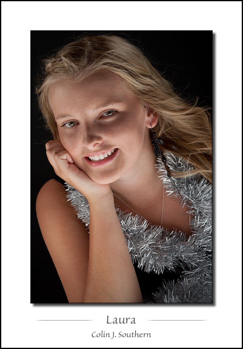
- Stunningly attractive young lady with a beautiful smile, and perhaps to add to that, knowing that she's only 15 - has never modeled before - and yet at an age where looks are everything to people this age, she had the faith and courage to front up to a guy she'd never met before - with little to no makeup - and have her photo taken. She's also a really nice girl, and I really enjoy doing nice things for nice people.
- The lighting. I built the light table for shooting babies, but I LOVE the under-lighting that it offers "older" models. It's a very soft light, and from an unusual direction; almost like it programs our brains to think "candle light". Add to that some perfectly (if I do say so myself!) balanced - directional - fill light (it's really a key light, so in essence the image is constructed from 2 key lights).
- The pose. The tinsel prop worked well (don't you love it when a good plan comes together!), but the pose was nothing too radical, but different enough to avoid what I call a "cookie cutter" style. Interestingly, I tried the same pose with a girl last week, and it just didn't work. Laura made it work effortlessly.
And of course, some things about it that I can't quantify, so all I can say in that respect is - for me - "it just works". This one is - hands down - going my my studio "wall of fame"
-
12th December 2010, 09:50 AM #4Moderator


- Join Date
- Feb 2009
- Location
- Glenfarg, Scotland
- Posts
- 21,402
- Real Name
- Just add 'MacKenzie'
Re: Seriously folks, this is a good as it gets!
-
12th December 2010, 01:04 PM #5
Re: Seriously folks, this is a good as it gets!
Hi Colin,
What was your lighting setup? i think you have one from left, from bottom and one infront?
Really nice shot. Its so natural. And shes very photogenic.
Good job.
B/R,
Mark
-
12th December 2010, 01:14 PM #6

- Join Date
- Dec 2008
- Location
- New Zealand
- Posts
- 17,660
- Real Name
- Have a guess :)
Re: Seriously folks, this is a good as it gets!
Hi Mark,
Thanks for the kind words
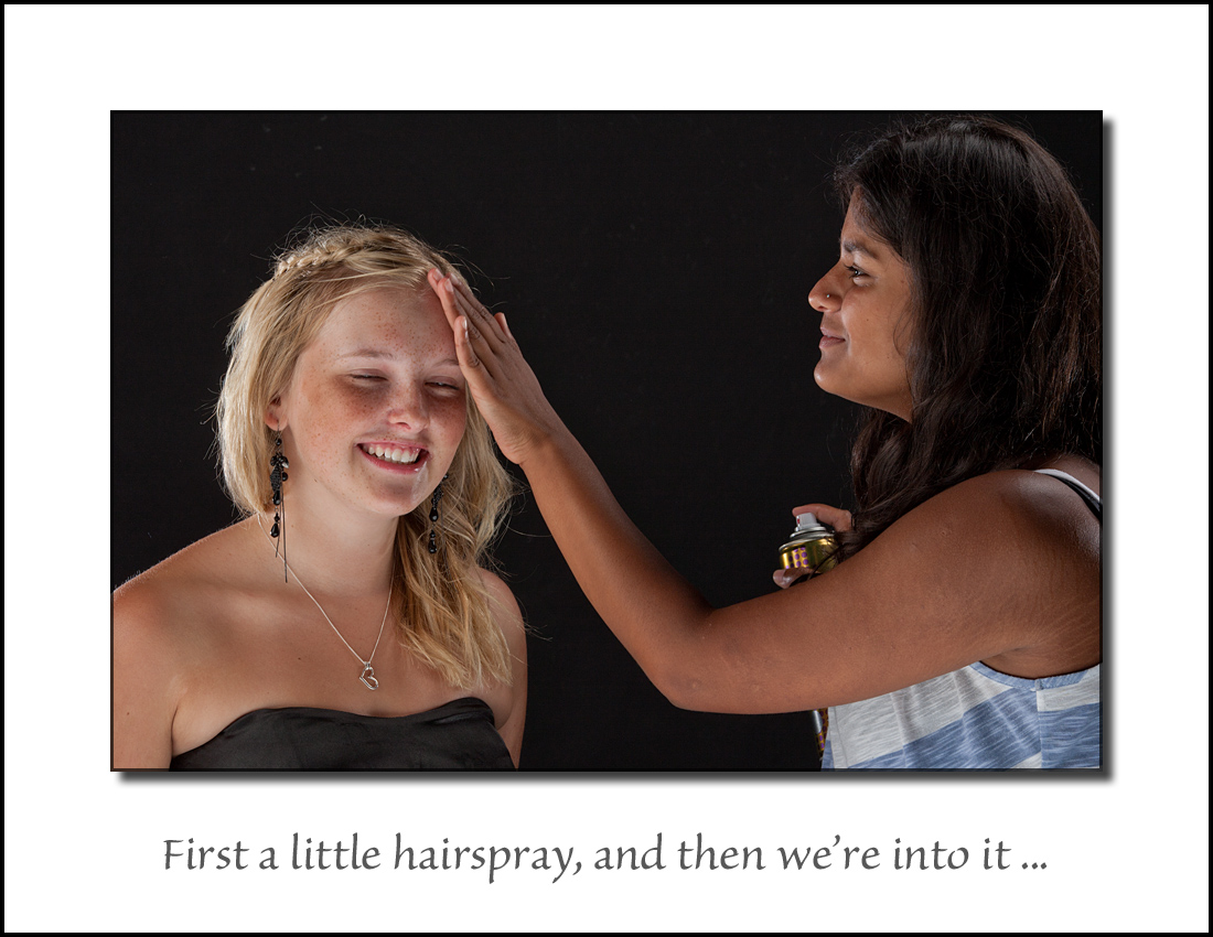
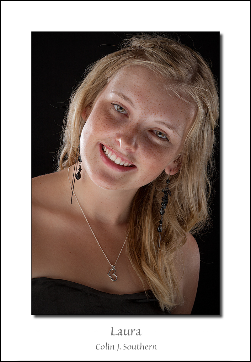
The "main" source of light comes from an approx 1m square lightbox; which is a 10mm thick translucent acrylic panel setup as a table, with a big strobe underneath (shooting through a softbox). The "Fill light" (which is almost as strong) is a large octabox with a 2nd big strobe that's to camera left (to give some direction to the light). A third big strobe with softbox is setup high to camera right to act as a hair light, and often I'll also use a couple more strobes with grids to add an element of rim light (only the right-hand one used on this shot though) (although you can't really see it's effect) (I was using the 2nd one on the left, but I'd turned it off previously, and forgotten to turn it on again). You can see the effect of the rim light clearly in the 3rd photo though.
So yeah - up to 5 studio heads for a single shot (sometimes with a reflector thrown in for good measure!)
-
12th December 2010, 01:20 PM #7
Re: Seriously folks, this is a good as it gets!
Wow.
Thanks for sharing. Kudos to your work.
Mark
-
12th December 2010, 01:37 PM #8
-
12th December 2010, 03:21 PM #9

- Join Date
- Nov 2009
- Location
- Provence, France
- Posts
- 993
- Real Name
- Remco
Re: Seriously folks, this is a good as it gets!
What struck me most was actually how different she looks in that last photo compared to e.g. the 'Armed & dangerous' series, I'd almost say it was a different model...
And that last one is spectacular
-
12th December 2010, 04:04 PM #10

- Join Date
- Nov 2010
- Location
- Panama City, FL
- Posts
- 3,540
- Real Name
- Chris
Re: Seriously folks, this is a good as it gets!
I've never been much of a portrait shooter or even a studio shooter other than doing school pictures which is the lowest form of photographic prostitution there is -IMO. Even so, while I share everyone else's admiration for your shooting prowness and your ability to get stunning photographs, in these I have a bit of "I wonder if's..." I wonder if you lowered the bottom light by a 1/3-1/4 of a stop and increased the frontal by an equal or slightly lower amount, if it wouldn't increase the viewer's desire to study more of the young lady and less of the lighting effect. I almost get that feeling someone is holding a flashlight under her for that "Halloween" look..almost and I'll probably get hammered on here for making this remark...but I cannot change what I "see." (You would have to teach high school photography students to get a true feeling of what I am "seeing." They do some of the oddest things with light.)
That said, I will endeavor to immediately construct such a setup so my students can learn from a true master as I have thoroghly enjoyed your work so far. Thank you for sharing your techniques that others can learn to shot better.
-
12th December 2010, 07:31 PM #11

- Join Date
- Feb 2010
- Location
- Victoria Australia
- Posts
- 2,634
- Real Name
- Kay
-
12th December 2010, 10:55 PM #12

- Join Date
- Dec 2008
- Location
- New Zealand
- Posts
- 17,660
- Real Name
- Have a guess :)
-
12th December 2010, 10:56 PM #13

- Join Date
- Dec 2008
- Location
- New Zealand
- Posts
- 17,660
- Real Name
- Have a guess :)
-
12th December 2010, 10:59 PM #14
Re: Seriously folks, this is a good as it gets!
Excellent work indeed. However, your young model needs to bring her smile up into her eyes more.

-
12th December 2010, 11:09 PM #15

- Join Date
- Dec 2008
- Location
- New Zealand
- Posts
- 17,660
- Real Name
- Have a guess :)
Re: Seriously folks, this is a good as it gets!
Hi Chris,
There's always a zillion ways to vary studio shots, so it's very easy to create a different look ... the trick is to create one that first of all "works", and second, one that looks unique or different (I find it easy to get sucked into "cookie cutter" studio work, which is probably only 1 better than "school photo prostitution"!).
So with the lighting here - what's different - is the underlighting; to my mind, it's similar to what one would get photographing someone enjoying a candle lit dinner (ie "romantic") - so I tend to think of this as being "romantic" lighting, and of course the softness adds to it. So ... if I changed the ratios around as you suggest then - personally - I'm not saying it wouldn't work (to the contrary, I know it works well), but it does tend to get away from the "romantic" lighting and more towards "cookie cutter" lighting where I shoot the models with a big octabox to the left, two sheet of 1.2 x 2.4m white polystyrene to the right (for fill), and a white or silver reflector to throw the light back up under the chin. I do a fair bit of the latter as part of the "bread and butter" of a studio shoot, but the lighting comes definately close to "boring" (I can set it up - including power levels - with my eyes closed now).
In what I've got above, the amount of "fill" coming from the octabox is critical; too little and one definately gets a halloween look (which one also can get on an incorrectly adjusted monitor), and too much and the lighting just starts to look flat - so what I've got there is pretty finely balanced.
-
12th December 2010, 11:14 PM #16

- Join Date
- Dec 2008
- Location
- New Zealand
- Posts
- 17,660
- Real Name
- Have a guess :)
Re: Seriously folks, this is a good as it gets!
Hi Len,
Thanks for the kind words. Unfortunately, Laura has somewhat of a "gummy" smile, so this is about as far as we can go with it. More of a sparkle in the eyes would be nice (que Photoshop), but it competes with the naturally slightly decreased lighting one gets with this lighting setup (the eye levels are already adjusted slightly in Photoshop).
-
13th December 2010, 12:38 AM #17

- Join Date
- Nov 2010
- Location
- Panama City, FL
- Posts
- 3,540
- Real Name
- Chris
Re: Seriously folks, this is a good as it gets!
-
13th December 2010, 12:45 AM #18

- Join Date
- Dec 2008
- Location
- New Zealand
- Posts
- 17,660
- Real Name
- Have a guess :)
Re: Seriously folks, this is a good as it gets!
Oh I did throw rocks at you, but I'm a lousy shot, and they all missed!
Just kidding
Seriously, with a lot of photography, I think we often get to a point where different presentations appeal to different people; I'll often post a short series of images and people will have all different favourite ones. It's a bit like the song "Always on my Mind"; Elvis did the classic version, but Willie Nelson also hits the notes so effortlessly (and with his unique voice), and then Anne Murray does a wonderful version too (showing off the deeper end of her range) ... so 1 song ... 3 versions ... all wonderful to listen to, but all different (and none right or wrong).


 Reply With Quote

 ) she strikes on this photo. The others are ok, this one stands out. Something natuaral about how she looks. Great.
