
 Helpful Posts:
 You have good colour vision. We seem to be in the same age group, so it is good to confirm that you can distinguish the hues quite well.Originally Posted by george013

It's much more than the software. It's a combination of the abilities of the hardware, having the hardware that is properly set up and the working environment. It is definitely not just the software.
Tt depends on what is in the image. If you photograph brightly coloured flowers or tropical birds with brilliant colours or shoot night scenes with bright, intense lights, then Adobe RGB will display colours "more accurately" than an sRGB screen. The wider colour spaces handle the brighter and more intense colours. AdobeRGB can handle about 50% more colours than sRGB can. If those colours are in the scene and they are in gamut for the wider gamut hardware, then an AdobeRGB compliant screen will render the colours more accurately.
That being said, those colours have to be in the image for this to be important, so if you are shooting subdued colours, chances are that the entire image might not be as wide as even the sRGB colour space, then there is no advantage to a wider gamut screen in that particular situation. Both an sRGB and AdobeRGB screen will replicate the colours accurately.
People would not spend the extra money on an AdobeRGB compliant screen if it did not make a meaningful difference in how well the colours are reproduced. I use a dual screen setup with my primary screen being AdobeRGB compliant and my secondary screen being an sRGB one. There is a perceivable difference in how the colours look when I have a scene with colours that are OOG for sRGB.
Results 41 to 60 of 80
-
2nd December 2017, 07:54 PM #41Moderator


- Join Date
- Mar 2012
- Location
- Ottawa, Canada
- Posts
- 22,407
- Real Name
- Manfred Mueller
Re: Why one should use a wide colour space when editing images on a narrow gamut scre
Last edited by Manfred M; 2nd December 2017 at 08:17 PM.
-
2nd December 2017, 08:16 PM #42
- Join Date
- May 2014
- Location
- amsterdam, netherlands
- Posts
- 3,182
- Real Name
- George
Re: Why one should use a wide colour space when editing images on a narrow gamut scre
I do agree that a wide gamut screen will show colors nicer as a smaller gamut screen. But that's not the thread. Why one should use a wide colour space when editing images on a narrow gamut scre Originally Posted by Manfred M
George
-
2nd December 2017, 10:33 PM #43
- Join Date
- Feb 2012
- Location
- Texas
- Posts
- 6,956
- Real Name
- Ted
Re: Why one should use a wide colour space when editing images on a narrow gamut scre
How is color "accuracy" measured, George? Originally Posted by george013
Wouldn't it be nice if the bone of contention could be quantified and the differences in accuracy measured, like in terms of CIE delta-E?
It's much more difficult to argue against numbers which have no respect for how something "looks".
Might do it. It's cold and dark outside and I've got small MacBeth card up on the wall. As we all know, one of the MacBeth patches is slightly out of sRGB gamut so that would be the one, eh?
Take the shot. Open and edit it in ProPhoto working space and save as sRGB. Open again but in sRGB working space, do exactly the same edits and save again as sRGB. Will there be significant differences or not?
Taking bets but no guilders, please.
Last edited by xpatUSA; 3rd December 2017 at 06:55 PM.
-
2nd December 2017, 11:29 PM #44

- Join Date
- May 2011
- Location
- Brisbane Australia
- Posts
- 4,636
- Real Name
- Dave Ellis
Re: Why one should use a wide colour space when editing images on a narrow gamut scre
Have a look at this video George. It is one put out by Affinity and gives a couple of examples (note the second one in particular) of how you can get more out of an image editing in ProPhoto RGB even when the final product and the view on screen is sRGB. It is fairly extreme editing though and it doesn't show what could be achieved by bumping up the adjustments further in sRGB mode. Originally Posted by george013
DaveLast edited by dje; 2nd December 2017 at 11:58 PM.
-
2nd December 2017, 11:40 PM #45
- Join Date
- Feb 2012
- Location
- Texas
- Posts
- 6,956
- Real Name
- Ted
Re: Why one should use a wide colour space when editing images on a narrow gamut scre
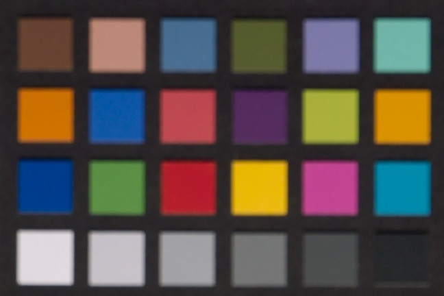
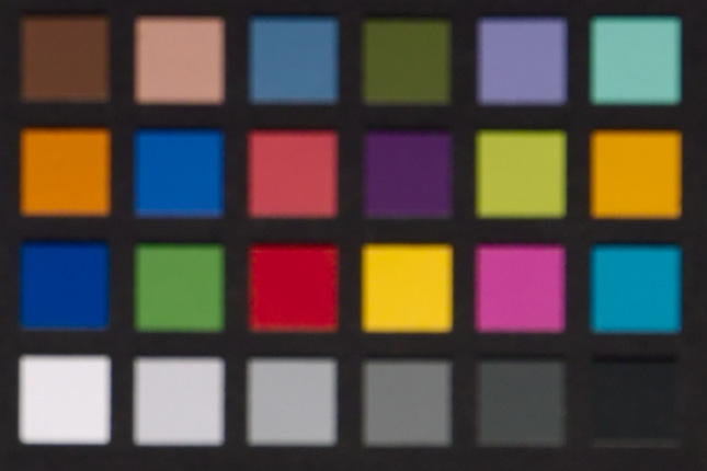
Even better, I found a card shot from previous color accuracy testing. Here are two developments, one with ProPhoto working space, the other with sRGB. Recall that I mentioned that one patch is out of gamut in sRGB. Originally Posted by xpatUSA
Here's the sRGB working space version:
Here's the ProPhoto working space version:
Not a lot of difference on my monitor.
Still, here are the numbers in CIELAB space for the MacBeth cyan patch #18:
ProPhoto WS: a* = -27.3 and b* = -27.0
sRGB WS: a* = -23.4 and b* = -26.9
In HSV space, the one is 190 degs of hue, the other is 192 degs of hue, a mere 2 degs different.
The obvious conclusion is that, with my stuff, problems only arise if the editor or the display driver has no color management.Last edited by xpatUSA; 2nd December 2017 at 11:45 PM.
-
2nd December 2017, 11:51 PM #46

- Join Date
- Sep 2012
- Location
- Nomadic but not homeless, ex N.Z. now Aust.
- Posts
- 4,167
- Real Name
- Paul

Re: Why one should use a wide colour space when editing images on a narrow gamut scre
The question is missing a crucial piece of information - What is the final use of the image. Is it to be printed or just viewed on a screen? If just to be viewed on a screen is it Adobe RGB capable or just a sRGB screen standard for most internet viewers? If printed what gamut is available? Originally Posted by george013
Just because at an editing step it may not be possible to display the colours accurately does not mean they should be discarded at that stage.
Just over twenty years ago I sat beside a top graphics designer while we worked on the design of a book cover. (A book about the Dutch merchant navy during the second world war) He used the screen as just a tool for the layout that also gave some indication of colour. Whenever I queried a specific colour he would grab a colour chart and show me the colour it would be once printed. His proofing printer was his colour reference, not the display screen. In the end, due to costs, we opted for a duotone cover and I was surprised at how much the monitor's representation varied from the printed version. However, the designer seemed to have no trouble in visualising the final outcome from the image on the screen.
-
3rd December 2017, 12:16 AM #47

- Join Date
- Dec 2011
- Location
- New England
- Posts
- 9,178
- Real Name
- Dan
Re: Why one should use a wide colour space when editing images on a narrow gamut scre
Nope, not always. But I suspect you knew that and that the question was rhetorical.Take the shot. Open and edit it in ProPhoto working space and save as sRGB. Open again but in sRGB working space, do exactly the same edits and save again as sRGB. Will there be significant differences or not?
George, watch the video that Dave posted. It proves the point: it does matter.Why one should use a wide colour space when editing images on a narrow gamut scre
QED
-
3rd December 2017, 01:30 AM #48

- Join Date
- May 2012
- Location
- Canada (west coast)
- Posts
- 2,084
- Real Name
- Bruce
Re: Why one should use a wide colour space when editing images on a narrow gamut scre
Yes, I scored 0. Originally Posted by Manfred M
My hearing isn't what it used to be but it seems my colour discrimination still works.
-
3rd December 2017, 05:17 AM #49Moderator
- Join Date
- Mar 2012
- Location
- Ottawa, Canada
- Posts
- 22,407
- Real Name
- Manfred Mueller
Re: Why one should use a wide colour space when editing images on a narrow gamut scre
See post #1 in this thread. If you don't believe what I have written, check out Dave's link in #44. Originally Posted by george013
Using more data is almost always the best way to proceed with any approach and throwing data away should be done as late as possible in the process.
-
3rd December 2017, 10:26 AM #50
- Join Date
- May 2014
- Location
- amsterdam, netherlands
- Posts
- 3,182
- Real Name
- George
Re: Why one should use a wide colour space when editing images on a narrow gamut scre
I read post 1. You explained something about colors and how these are rendered to fit on the screen, and about the OOG colors. But half way we noticed that for imaging the perceptual rendering intent was used. All the image is placed in the narrow gamut. No OOG by definition. The soft proof is showing what happens if you want to use another gamut and with which preferences. Nowhere I did get the explanation of the "why". Originally Posted by Manfred M
I did look at the video linked to by Dave. I only have CapturNx2 and sometime I play with Gimp. It's impressive what it shows. It looks as the pixel values are changed when another profile is selected. The picture itself doesn't change but the histogram does.
Correct me if I'm wrong. He's doing some editing in a ProPhotoProfiel. Once he's ready he shows what would have happened when the same editing would have been done in a sRGB profile,
George
-
3rd December 2017, 11:49 AM #51
- Join Date
- May 2011
- Location
- Brisbane Australia
- Posts
- 4,636
- Real Name
- Dave Ellis
Re: Why one should use a wide colour space when editing images on a narrow gamut scre
Yes thats correct. The base image is in ProPhoto when the adjustment layers are set up amd then the base image is convereted to sRGB. This means that the adjustments contained in the layers are re-calculated on the sRGB image. Originally Posted by george013
-
3rd December 2017, 04:08 PM #52Moderator
- Join Date
- Mar 2012
- Location
- Ottawa, Canada
- Posts
- 22,407
- Real Name
- Manfred Mueller
Re: Why one should use a wide colour space when editing images on a narrow gamut scre
Why - because your get a more accurate handling of out of gamut colours. This is true regardless of which rendering intent is used as the new edited values always use the data from the wide colour space. The rendering intent only impacts the colours that are displayed on the screen; it has no impact on the data the is being manipulated by the computer. Originally Posted by george013
If the histogram changes, so does the colour information in the image. You might not be able to see those changes visually as they will be subtle, but the histogram, which analyses the underlying data will pick up those differences. Originally Posted by george013
Correct. He is trying to explain / demonstrate why editing in a wider colour space is preferable to doing so in a narrow colour space when viewing the output on a narrow (sRGB) computer screen. The same as I was trying to do in #1. Originally Posted by george013
He reaches the same conclusion I did - more subtle and more accurate colours are produced by using that workflow.
-
3rd December 2017, 11:10 PM #53
- Join Date
- Feb 2012
- Location
- Texas
- Posts
- 6,956
- Real Name
- Ted
Re: Why one should use a wide colour space when editing images on a narrow gamut scre
I asked someone else here about 'accuracy' as regards color, but no response received yet. Originally Posted by Manfred M
Is the accuracy of 'handling of out of gamut colours' quantifiable in any way, or are we doomed to discuss it in general terms only?
I discovered this effect long ago with Elements 6. PSE's color picker numbers did not always agree with my screen color picker numbers, depending on how PSE6's crude color management was set up from the 'Edit' menu.This is true regardless of which rendering intent is used as the new edited values always use the data from the wide colour space. The rendering intent only impacts the colours that are displayed on the screen; it has no impact on the data that is being manipulated by the computer.
The effect still exists in my current raw converter. It's color-picker numbers vary depending which working color space is selected but the review image appearance does not change.
Some of us have perhaps noticed this oddity. Most of us perhaps have not.Last edited by xpatUSA; 4th December 2017 at 03:00 AM.
-
4th December 2017, 04:07 AM #54
- Join Date
- Feb 2012
- Location
- Texas
- Posts
- 6,956
- Real Name
- Ted
Re: Why one should use a wide colour space when editing images on a narrow gamut scre
I thought I would illustrate the above effect with an old and troublesome sunflower image: Originally Posted by xpatUSA
Working space sRGB:
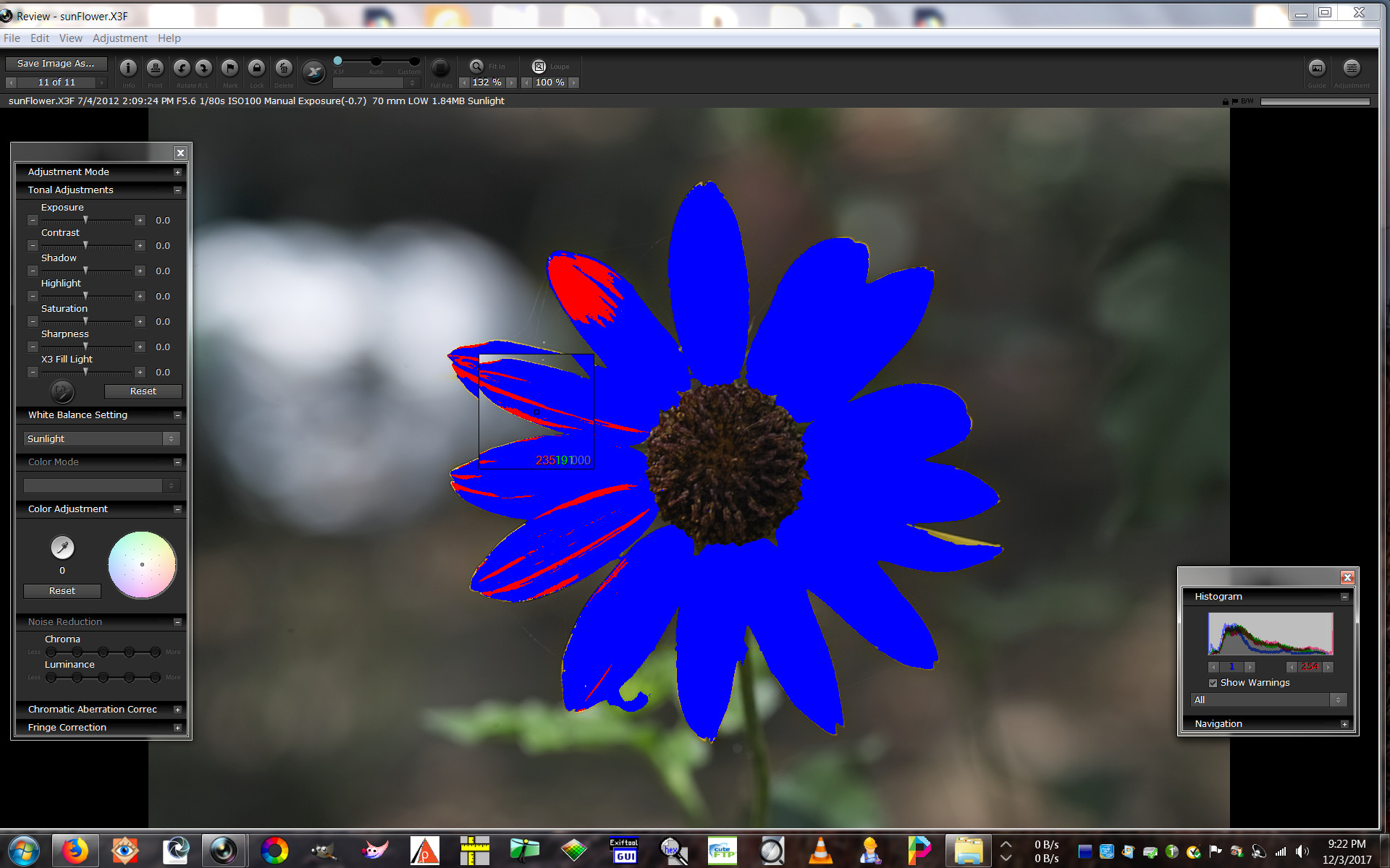
In this review image the exposure warnings are on, 1 for low and 254 for high. The blue areas are 1 or 0, mostly 0 meaning (to me) out-of-sRGB-gamut because they are 100% saturated.
Opened in ProPhoto working space:
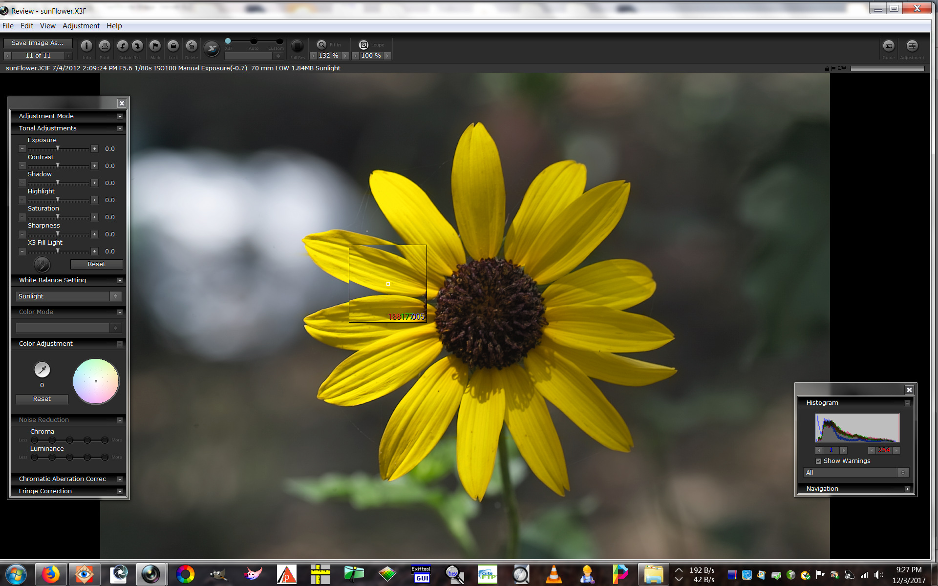
In this review image, the warnings are still on but observe the color-picker numbers - no over-saturation there.
I could even crank up the saturation a bit to make the flower look even prettier without setting off any warnings. A few of us, including George I think, would say "you shouldn't do that!". And they would be right - I'm not even going to bother to do it. The result, when 'converted for the web' will be horrible, complete with faux colors everywhere.
And so, for viewing on my sRGB monitor and for posting on the web, I will continue to edit with my converter set to sRGB working space.Last edited by xpatUSA; 4th December 2017 at 05:20 AM.
-
4th December 2017, 07:09 AM #55
- Join Date
- May 2014
- Location
- amsterdam, netherlands
- Posts
- 3,182
- Real Name
- George
Re: Why one should use a wide colour space when editing images on a narrow gamut scre
It looks a quite impressive example but is it? Is this Rawtherapee? I'm just trying to figure out what's happening. Originally Posted by xpatUSA
You start with a picture in sRGB that contains some clipping based on the histogram. The pixels have a value based on that color space.
Than you change to Prophoto. The pixels are getting another value. To maintain the same image on your screen the value is mostly lower in that wider color space. You can see the histogram moving to the left. But the warnings are still 1 and 254. So no clipping.
Would be better to start with a nearly/partly clipping image in Prophoto and then change to sRGB.
George
-
4th December 2017, 07:40 AM #56

- Join Date
- Sep 2012
- Location
- Santa Barbara, CA
- Posts
- 624
- Real Name
- E. James
Re: Why one should use a wide colour space when editing images on a narrow gamut scre
Manfred, I have read that editing an sRGB image in AdobeRGB is preferred over ProPhoto. Something about the size differences. Is there any reason why this may be true?
-
4th December 2017, 08:40 AM #57
- Join Date
- Sep 2012
- Location
- Nomadic but not homeless, ex N.Z. now Aust.
- Posts
- 4,167
- Real Name
- Paul
Re: Why one should use a wide colour space when editing images on a narrow gamut scre
It is not a recommendation I agree with. Although AdobeRGB is larger than sRGB I understand it doesn't completely include the sRGB colour space whereas ProPhoto does. I would not consider size as being of much significance. Originally Posted by Abitconfused
-
4th December 2017, 12:34 PM #58Moderator
- Join Date
- Mar 2012
- Location
- Ottawa, Canada
- Posts
- 22,407
- Real Name
- Manfred Mueller
Re: Why one should use a wide colour space when editing images on a narrow gamut scre
The statement is incorrect, so far as I know. The only time that I understand that ProPhoto should not be used is when the final product output will be CMYK. That is unlikely to affect any of the members here as we dont create output for press work. Originally Posted by Abitconfused
Even here I am not sure that this information is up to date. The problem with any RGB to CMYK colour space conversion is that one can make up a colour purely from a direct mapping of RGB to CMY values. The K; which is the black ink makes the colours more or less "rich", so doing a conversion means real world testing is required to determine the right amount of K on a CMY overlay. This is further complicated by the fact that the cyan inks are not as "efficient" as the cyan or magenta ones and about 30% more is required to get correct colour.Last edited by Manfred M; 4th December 2017 at 01:16 PM.
-
4th December 2017, 08:27 PM #59
- Join Date
- Feb 2012
- Location
- Texas
- Posts
- 6,956
- Real Name
- Ted
Re: Why one should use a wide colour space when editing images on a narrow gamut scre
Yes. Originally Posted by george013
No.Is this Rawtherapee?
I don't really need to be told what I did and what the results were, George. So, no commentI'm just trying to figure out what's happening.
You start with a picture in sRGB that contains some clipping based on the histogram. The pixels have a value based on that color space.
Than you change to Prophoto. The pixels are getting another value. To maintain the same image on your screen the value is mostly lower in that wider color space. You can see the histogram moving to the left. But the warnings are still 1 and 254. So no clipping.
That statement shows us that, sadly, you didn't get it.Would be better to start with a nearly/partly clipping image in Prophoto and then change to sRGB.
George
However, please do try that and post your results. Would you like the raw file?
Er, what is a "nearly/partly clipping image"?
In my world, images are either clipped or they are not. There is no "partly" , sorry.Last edited by xpatUSA; 4th December 2017 at 09:14 PM.
-
4th December 2017, 08:57 PM #60

- Join Date
- Apr 2015
- Location
- Ottawa, Ontario, Canada
- Posts
- 1,528
- Real Name
- André
Re: Why one should use a wide colour space when editing images on a narrow gamut scre
Ed, Originally Posted by Abitconfused
I think that there is a theoritical possibility to introduce banding when a larger gamut is used because of the size of the discrete steps in digitizing the colour space. If you are editing in 8 bit mode, for example, then each channel has only 256 levels and therefore a wider gamut would result in larger difference in "shade" between each level than a smaller gamut. However, I have never seen this effect using 16 bit mode nor have I tried editing in 8 bit mode to see if it happens there.
André


 Reply With Quote
