 Helpful Posts: 0
Results 1 to 9 of 9
Thread: 17 Mile Drive
-
1st December 2008, 07:44 AM #1
17 Mile Drive
Last edited by ajith.rajeswari; 1st December 2008 at 07:47 AM.
-
1st December 2008, 08:11 AM #2
Re: 17 Mile Drive
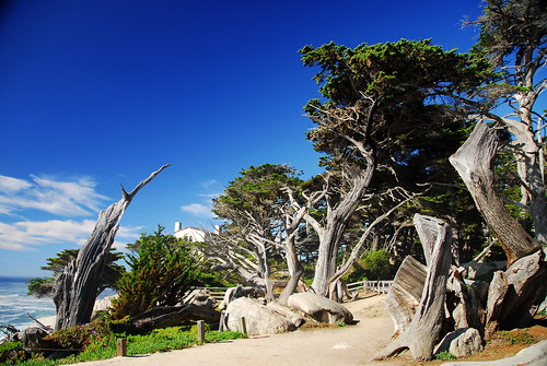
lovely landscapes mrajith
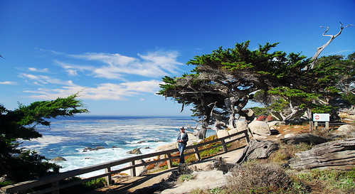
 as there are no human elemant in this pics except in one
 the colors play a very important role in attracting the viewer to view such pics
 off course the composition draws the viewers eye
 as these pics do not show any specific point of interest,the blue color of the sky is having a ball here
 the blues and whites are competing with each other fr viewers attention
 so the land without blues or whites, its surely sulking away fr some attention
 coming to the human element....with the girl in tight jeans
 the poor blues and whites and greens are surely playing second fiddle, as there is no way i am going take my eyes of that pretty girl

 the tinted pic surely is a clever move by mrajith,to attract female viewers
  and not so male viewers to enjoy that pic...as pink is a loved by girls and woman alike
 over all great sharp,colorful pics indeed
-
1st December 2008, 01:25 PM #3
Re: 17 Mile Drive
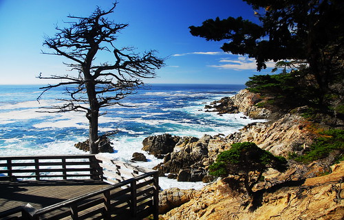
Ajith - super shots. I remember the site well when I did a tour of the region many years ago, pre-digital. My efforts were pathetic. My only slight criticism is for the thid shot where I might have tried to bring out a bit more green in the tree foliage to the right hand side. I think that would make the silhouette of the tree in the sea even more dramatic.
Cheers
David
-
1st December 2008, 07:49 PM #4
Re: 17 Mile Drive
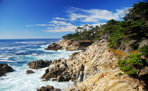
Ajith, you are photographing some fabulous landscapes and in UK early winter I am indeed jealous....but your questions seem to hinge on quite exotic refinements and I can't help wondering if you should spend a little more time on the basics. On this edition of your Pic4 (a bit small to work on, but hope enough to make point) the horizon is (a) levelled (b) barrel distortion on it removed, not sure how it got half way up, usually only at edges (c) a bit of gradient darkening of the sky at the left where it is fading. On the bigger version I would expect you would be able to sharpen up the sea foam, possibly using high pass filter if unsharp not right
Likewise on the previous HDR post, it looked as if careful levelling and cropping would possibly make HDR less necessary. On both it seems a real shame to tint out such gorgeous natural coloursLast edited by crisscross; 21st March 2009 at 12:46 PM.
-
1st December 2008, 10:58 PM #5
Re: 17 Mile Drive
Some very attractive images, but all look a little over exposed, the whites are blown, and the horizons are all at an angle, the rocks have lost a lot of their detail, it is obvious that the sun was very bright and high, maybe nit quite the best time to catch that perfect shot.
Like the last but not in pink.
Lincs1
-
4th December 2008, 10:39 PM #6
-
4th December 2008, 10:42 PM #7
Re: 17 Mile Drive
Hi Taken ,
Most of the pics were in blue (for guys) ...so why not some for gals too :-) ..
Dedicating the pink for the female viewers :-)..
-
4th December 2008, 10:46 PM #8
-
4th December 2008, 10:50 PM #9
Re: 17 Mile Drive
Hi crisscross,
I was using a UV filter + CP filter and the shot was taken at 18 mm .. that can be the reason for the distortion in the edges. I didnt do a good cropping on this one , have to improve on that.


 Reply With Quote

