
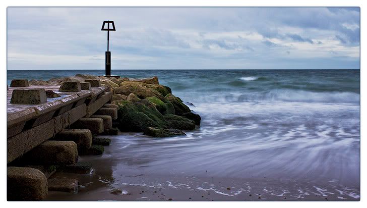
I popped down to the beach this morning to take a few pics. This is the result and I'm pretty happy with it but I'd love to get some views on it.
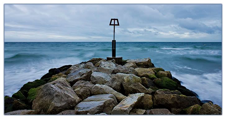
Plus here's a second that I wasn't as keen on because of the clutter but again I'd love to know your thoughts.
 Helpful Posts: 0
Results 1 to 10 of 10
Thread: Bournemouth Morning
-
29th September 2010, 08:54 AM #1


- Join Date
- Aug 2010
- Location
- London, UK
- Posts
- 140
- Real Name
- Richard
Bournemouth Morning
-
29th September 2010, 09:03 AM #2

- Join Date
- May 2010
- Location
- Margate, England
- Posts
- 111
- Real Name
- Gareth
Re: Bournemouth Morning
I love them mate!!!
#1 is awesome Is there a way in PP to straighten the marker pole so it's vertical (I know, its a bit anal, but it's the first thing I spotted
  )
)
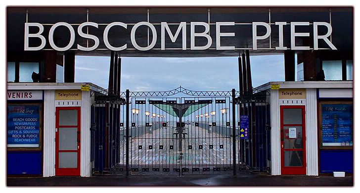
#2 might be worth retaking, so it just shows the metal gate and pier beyond (cutting out the sign and doors, etc, out of the shot completely)
But really well done Richard!
-
29th September 2010, 09:12 AM #3
- Join Date
- Dec 2008
- Location
- New Zealand
- Posts
- 17,660
- Real Name
- Have a guess :)
Re: Bournemouth Morning
Hi Richard,
Great job on both
Just one thought though ... sometimes it can work a little better if you don't centre things. What do you think of this?
-
29th September 2010, 02:48 PM #4

- Join Date
- Mar 2010
- Location
- New Jersey, USA
- Posts
- 505
- Real Name
- Jason
Re: Bournemouth Morning
I really like the first one. The way the lights look like theyre mounted on the gate is nice. i also like the pull from behind the gate. I also really like the symmetry with the two sides of the building. i think i would have cloned out the sign that says venirs though. the second shot i like but i don't feel it is as interesting as the first. the water has a good feeling of movement without being too flat
-
29th September 2010, 06:01 PM #5
- Join Date
- Aug 2010
- Location
- London, UK
- Posts
- 140
- Real Name
- Richard
Re: Bournemouth Morning
Gareth thanks a lot. Drat you for pointing out the wonky marker pole though, I hadn't noticed it before so I might have to fix that. Although I don't think I'd do good enough a job to make it worthwhile as it isn't so noticeable to me. I've done a crop of the second pic as you described and I like the idea but it was suprisingly uninteresting, I will have to go and retake it at some point though. I wanted to go and take pictures from that pier but unfortunately it was locked
 .
.
Colin I have to agree with you that everything is too centered, yours is a more balanced composition. I'm not sure I'll re do it that way as I want to print it and my girlfriend is very against "Doctored" photos, not that she likes the picture anyway .
.
Jason thanks, I have cloned out the "venirs" sign and it looks better I reckon.
Just to prove I wasn't all out to make symmetrical shots I did shoot off center pictures they just weren't as good I don't think.
Last edited by RichB; 29th September 2010 at 06:12 PM.
-
29th September 2010, 06:14 PM #6

- Join Date
- Sep 2009
- Location
- Burton on Trent, UK
- Posts
- 4,788
- Real Name
- Steve
Re: Bournemouth Morning
I just like to know what it is. Thev pier is nice really nice.
-
29th September 2010, 06:34 PM #7Moderator

- Join Date
- May 2008
- Location
- Windsor, Berks, UK
- Posts
- 16,771
- Real Name
- Dave Humphries :)
Re: Bournemouth Morning
Hi Richard,
I think a level horizon is even more noticeable than a non-vertical pole, so you made the correct choice there, but I agree with Colin's 'less centred' version.
I also agree with Jason's thoughts on #2; I might go further and tackle the white box (for dog water?) on the ground on right and possibly even the sheet of paper in the right hand telephone cubicle. I like the composition though - just right.
Cheers,
-
29th September 2010, 07:16 PM #8
- Join Date
- Nov 2009
- Location
- Provence, France
- Posts
- 993
- Real Name
- Remco
Re: Bournemouth Morning
I seem to be a minority, but I don't like Colin's version: that pole looks like a beacon, indicating a danger. Put it off to the side, and boats might misjudge the danger... (done a decent bit of sailing, and hitting rocks hurts, even in small boats and w/o damage
 ) I guess it just feels wrong to me to have the beacon off-centre
Remco
-
29th September 2010, 08:38 PM #9
- Join Date
- Dec 2008
- Location
- New Zealand
- Posts
- 17,660
- Real Name
- Have a guess :)
Re: Bournemouth Morning
How about this?
-
29th September 2010, 11:20 PM #10
- Join Date
- Feb 2010
- Location
- Victoria Australia
- Posts
- 2,634
- Real Name
- Kay
Re: Bournemouth Morning
Both are terrific Richard - personally I think the off centre works much better for this 1 as well Originally Posted by RichB
 - because brings in the extra texture and tone/colour of the slimey rocks.

 Reply With Quote