
 Helpful Posts:
 Week 1
My goals for this year's Project 52 are pretty much the same as last: shoot more, become more adept as using my lighting equipment and learn Photoshop.
I see this natural light image was shot on December 29, and I am going to use it as my starting shot, as it is going to be the subject of my first Week 2 shoot, using flash.
[IMG]_DSC7724 - Version 2 by Janis Hughes, on Flickr[/IMG]
Nikkor 50 mm, f/5.6, 1/30 sec, 400 ISO
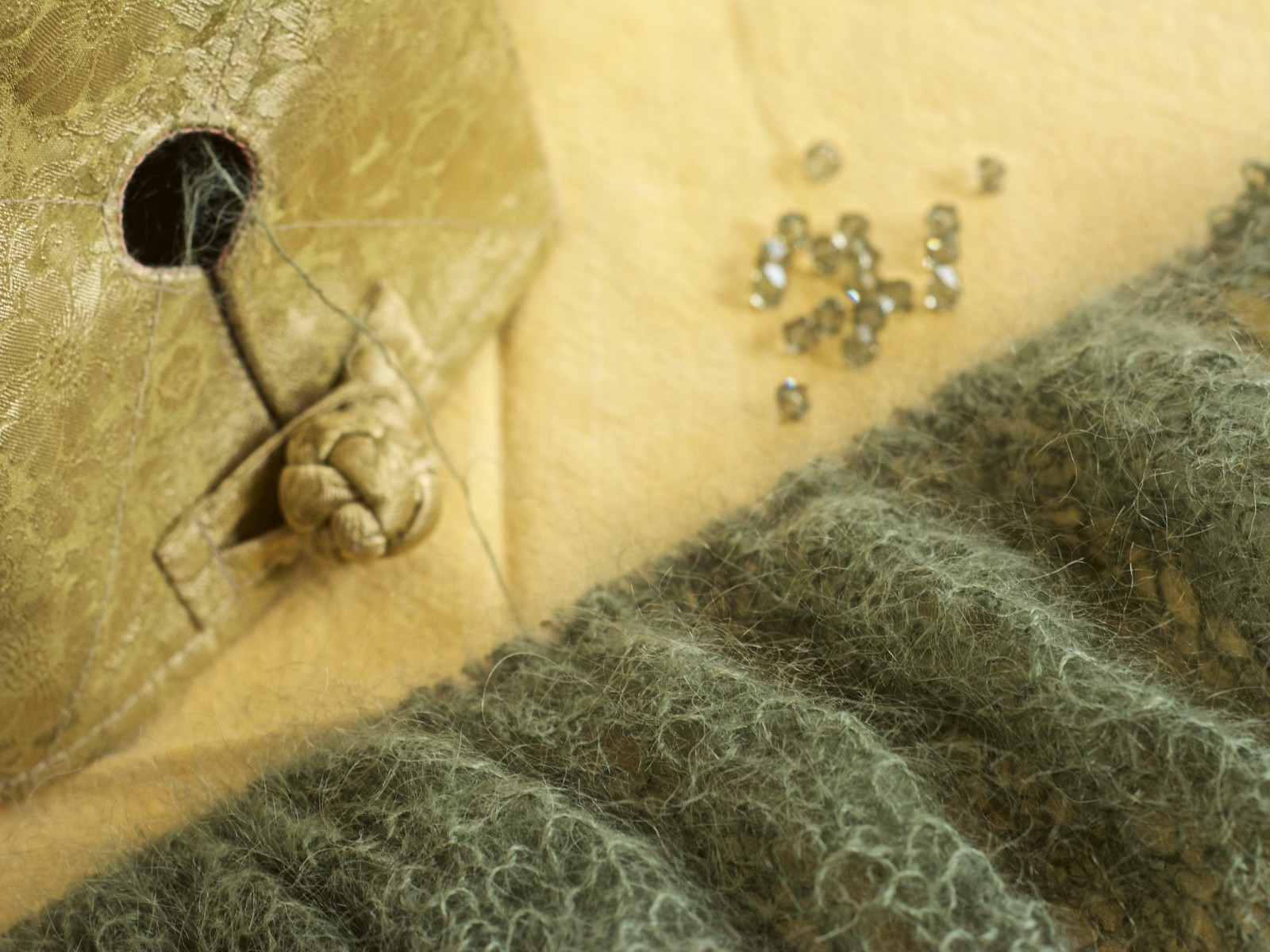
The subject is a Swarovsky crystal-embellished shawl I made as a Christmas present for a friend. I shot this somewhat hastily in the natural light of my sunroom while the project was still in progress. The best I can say for it is I got the colour pretty accurate in PP. The name of the colourway, by the way, is Drab. Had I read the label before I bought it, I think that name might have given me pause. But the colour appealed in the store.
My DOF is too shallow, due to my shooting handheld. And I don't like the creases in my table topper. I wanted to deliver the item tomorrow, but I only finished it just now and I can't let it go without a good image for my portfolio. As it is kind of late to set up a studio shot now, I may wait until tomorrow. Part of the challenge of shooting it under artificial light will be getting the colour right.
Results 1 to 20 of 58
-
5th January 2016, 04:12 AM #1


- Join Date
- Oct 2010
- Location
- Canada
- Posts
- 1,998
- Real Name
- Janis
2016 Project 52, 1st Quarter by Janis
Last edited by purplehaze; 5th January 2016 at 04:22 AM.
-
5th January 2016, 10:20 AM #2Moderator

- Join Date
- Feb 2009
- Location
- Glenfarg, Scotland
- Posts
- 21,402
- Real Name
- Just add 'MacKenzie'
Re: 2016 Project 52, 1st Quarter by Janis
An excellent piece of self-analysis/critique, none of which I would argue with.
Rather a lack of imagination on the part of the person whose job it is to give a name to the material you used. I like the colour, byut then again maybe I'm a bit drab!
-
5th January 2016, 10:48 AM #3
- Join Date
- Oct 2010
- Location
- Canada
- Posts
- 1,998
- Real Name
- Janis
Re: 2016 Project 52, 1st Quarter by Janis
Thanks, Donald. I suppose my taste runs more to drab than to dazzling and I was going for the least glittery crystal.
Anyhow, I was so determined to do better that I stayed up this night and so we already have a contribution for...
Week 2
I can't believe how much I have forgotten and this was a bit of a struggle.
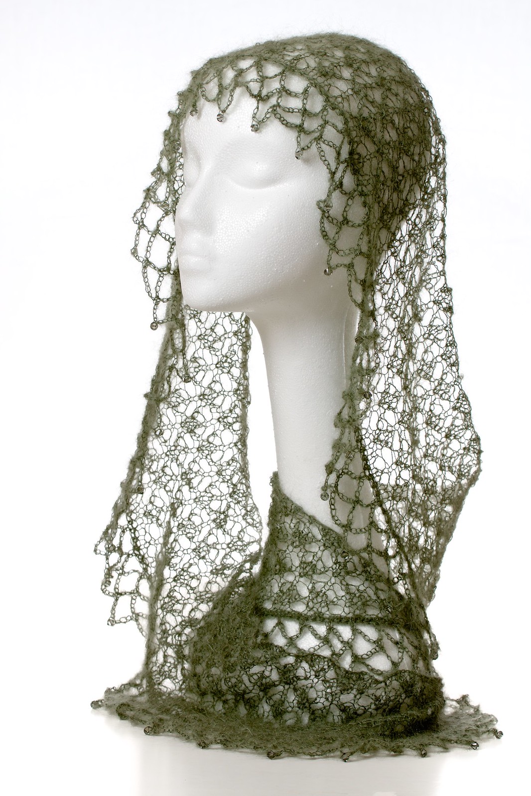
D7100 and 70-200 mm lens on a tripod. Subject on white bristol board, lit by a single SB700 in a softbox from left. My new collapsible background in the rear, lit by a second SB700 on right, with improvised flag to prevent rim lighting of subject. Handheld trigrip reflector used to fill shadow side. All functions on auto.
[IMG]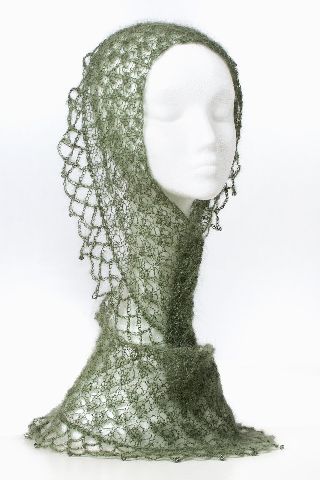
_DSC7792 - Version 2 by Janis Hughes, on Flickr[/IMG]
I edited this on my laptop and so colour may be off. I will look at it on the big monitor. In the meantime, if anyone has any suggestions for improvement, I may be able to try again after some sleep.
-
5th January 2016, 11:20 AM #4Moderator
- Join Date
- Feb 2009
- Location
- Glenfarg, Scotland
- Posts
- 21,402
- Real Name
- Just add 'MacKenzie'
Re: 2016 Project 52, 1st Quarter by Janis
My goodness, that's beautiful. The shawl I mean. The pic is good too.
What a beautiful thing to make and give to someone.
-
5th January 2016, 04:07 PM #5
- Join Date
- Jan 2009
- Location
- South Devon, UK
- Posts
- 14,900
Re: 2016 Project 52, 1st Quarter by Janis
Week 2 is working well, although I wonder if you could get away with a fraction more brightness which was carefully and selectively applied?
-
5th January 2016, 04:15 PM #6

- Join Date
- Jan 2012
- Location
- Tulsa, OK
- Posts
- 2,359
- Real Name
- mark
Re: 2016 Project 52, 1st Quarter by Janis
Janis that is beautiful.
-
5th January 2016, 06:14 PM #7
- Join Date
- Oct 2010
- Location
- Canada
- Posts
- 1,998
- Real Name
- Janis
Re: 2016 Project 52, 1st Quarter by Janis
Thanks, Donald, Mark and Geoff.
I had to smile a little ruefully at your comment, Donald, as I read a story on Ravelry (knitters' website) last night about a woman who spent a month or so knitting a shawl for her mother-in-law, who after graciously accepting it, threw it away because (she said) she didn't like the colour! In truth, I knit for myself, because however much I might try to match another person's taste and desires, I can never know for sure how well my gift will be received or handled and preserved. I knit a beautiful intarsia wool sweater for a niece once that was well worn and then passed on to another branch of the family, who I suspect put it into the washing machine after the first wearing and ruined what should have and could have lasted generations. While it is a delight to see people wearing and enjoying what I have made, I focus mainly on the joy of the making and try not to care too much what happens when a piece leaves my hands. It is important to me to photograph it well, however, so that I can continue to admire it after it is gone and take pleasure in the sense of accomplishment. Knitting and photography are both hobbies that I took up in my youth and abandoned for a while. When I came back to knitting, it was natural to resume the photography.
Interesting you should zero in on the brightness, Geoff. I am not sure whether we are seeing the same thing, but I notice that on Ravelry, the background is showing less bright across the middle. And there is a colour cast showing on the big monitor. I will have to recalibrate my screens and revisit the processing.
-
5th January 2016, 06:16 PM #8
- Join Date
- Dec 2013
- Location
- Turkey
- Posts
- 12,779
- Real Name
- Binnur
Re: 2016 Project 52, 1st Quarter by Janis
A beautiful shawl Janis
 IMO the warmer color in your first image is better.
-
5th January 2016, 06:26 PM #9
- Join Date
- Oct 2010
- Location
- Canada
- Posts
- 1,998
- Real Name
- Janis
Re: 2016 Project 52, 1st Quarter by Janis
Thanks, Binnur! Yes, mastering that colour thing, that was one of last year's goals, too. Though I suppose one could spend a lifetime on that alone, and I have less than half of one left. Yikes! Who has time for sleep?!!
-
5th January 2016, 06:56 PM #10

- Join Date
- Dec 2013
- Location
- Chesterfield, Missouri/Melbourne, Australia
- Posts
- 17,827
- Real Name
- Izzie
Re: 2016 Project 52, 1st Quarter by Janis
Oooohhh.. I like that shawl...did you knit it yourself? Mom taught me how to knit a long time ago but I never did catch up to it going to work and all the hassles of taking care of the house and the family...I failed in that department but I guess I can take it up again in the community school. You are such an inspiration.
-
5th January 2016, 07:54 PM #11

- Join Date
- Dec 2009
- Location
- WNY
- Posts
- 36,716
- Real Name
- John
Re: 2016 Project 52, 1st Quarter by Janis
Nice effort on week 2 capture. Similar color to week 1's entry, the white works for revealing detail but doesn't offer a worthy contrast. Have you considered adding a gel to your flash?
-
5th January 2016, 09:21 PM #12
- Join Date
- Oct 2010
- Location
- Canada
- Posts
- 1,998
- Real Name
- Janis
Re: 2016 Project 52, 1st Quarter by Janis
Thanks, Izzie. If you do take up knitting again, it provides useful material for learning product photography techniques.
John, yes I did consider gelling the background but it took a lot of effort to get where I did and I ran out of steam. I have a small set of gels that go on my little SB200s. (I think) I know from trying that one SB200 does not get the background bright enough to provide contrast for the shawl. I suppose I could try two or three of them. I also have a larger set of round gels that fit a Rogue Grid, but I think the grid would concentrate the light too much. No harm in experimenting though, and no doubt much to be learned. Next time I pass the local photo store, I should pop in and get some regular-sized gels for the SB700s.
-
5th January 2016, 09:38 PM #13
- Join Date
- Oct 2010
- Location
- Canada
- Posts
- 1,998
- Real Name
- Janis
Re: 2016 Project 52, 1st Quarter by Janis
Oh yeah, the other problem with gelling the background is that the base will become visible and I will have to frame in such a way as not to include it.
-
6th January 2016, 07:23 PM #14
- Join Date
- Jan 2009
- Location
- South Devon, UK
- Posts
- 14,900
Re: 2016 Project 52, 1st Quarter by Janis
Interesting you should zero in on the brightness, Geoff. I am not sure whether we are seeing the same thing, but I notice that on Ravelry, the background is showing less bright across the middle. And there is a colour cast showing on the big monitor. I will have to recalibrate my screens and revisit the processing.
Yes, Janis, that is what I am seeing. Less noticeable at full screen size but there does appear to be a slight dark shadow tint across the background.
-
8th January 2016, 02:34 AM #15
- Join Date
- Dec 2013
- Location
- Chesterfield, Missouri/Melbourne, Australia
- Posts
- 17,827
- Real Name
- Izzie
Re: 2016 Project 52, 1st Quarter by Janis
Anything at the moment is ideal for photography, just gotta have the eye for what is good...and your project is.
-
10th January 2016, 11:37 PM #16
- Join Date
- Oct 2010
- Location
- Canada
- Posts
- 1,998
- Real Name
- Janis
Re: 2016 Project 52, 1st Quarter by Janis
Although this was shot this morning, it is the culmination of the past week's work and so I am including it in Week 2. And what a lot of work. I had not calibrated either display since getting the new laptop this fall. The Cinema Display has been calibrated three times due to a poor installation of my Spyder4Pro software; after I finally got the software properly installed, I realized I had been starting from the wrong default profile and need do to it once again. Here's hoping the fourth time is the charm.
Anyhow, this is the shot, edited on the laptop display, and I think it is an improvement over the first one. Colour is truer, though still not bang on I don't think.
_DSC7942 - Version 2 by Janis Hughes, on Flickr
I did a few things differently this time round. For one thing, I layered my approach, getting each of the background and key lights right before shooting them together. Camera and flashes were each on manual, shutter was set to highest synch speed to get rid of ambient light. The background was deliberately blown to obliterate the creases in the fabric, which would be otherwise visible due to my aperture, which was kept high enough to give sufficient detail from foreground to back in the knitting (f/8). Background and subject were in the dining room, and I was shooting from the central foyer. I had put about as much distance between the background and the subject as I was able and still have decent working room for the camera. Background flash was sitting on a little table below the table on which the subject was sitting with diffuser on and power was on full. Key light was triple diffused in a softbox sitting at a 45 degree angle on the left and on fractional power, probably 1/2.5. I played around a lot with different settings. Again, there was a reflector positioned on the right to bounce light back on the subject. The foam core the subject was sitting on was brightened in post to make it appear it was on a seamless background. You can see a reflection on the foam core in the foreground. It did not bother me so and so I left it.
I did try gelling the background, John, but as I thought, the Rogue grid that my creative filters fit was too focused. I tried using the yellow colour correction filter that came with my SB700 but it wasn't a good contrast for the subject.
The whole exercise was useful for getting familiar with my flashes again. I played with the power settings and the direction of the beams. I thought about how it would be nice to have a third SB700, or an SB910, and then I thought how much I could do with what I already have.
And oh yeah, I finally delivered the shawl at noon today and it was very, very well-received.
-
11th January 2016, 12:12 AM #17
- Join Date
- Dec 2009
- Location
- WNY
- Posts
- 36,716
- Real Name
- John
Re: 2016 Project 52, 1st Quarter by Janis
Janis,
Nice control of the shadows, I like this version over the 3quarter view on your flickr account. Sorry the gels didn't work out.
-
11th January 2016, 03:55 PM #18
- Join Date
- Oct 2010
- Location
- Canada
- Posts
- 1,998
- Real Name
- Janis
Re: 2016 Project 52, 1st Quarter by Janis
Thanks, John. I am less pleased with it today, as it looks a little flat. It's hard to put contrast in without making the shawl go darker than it is in real life, and this is supposed to be a record shot...
-
12th January 2016, 01:31 AM #19
- Join Date
- Oct 2010
- Location
- Canada
- Posts
- 1,998
- Real Name
- Janis
Re: 2016 Project 52, 1st Quarter by Janis
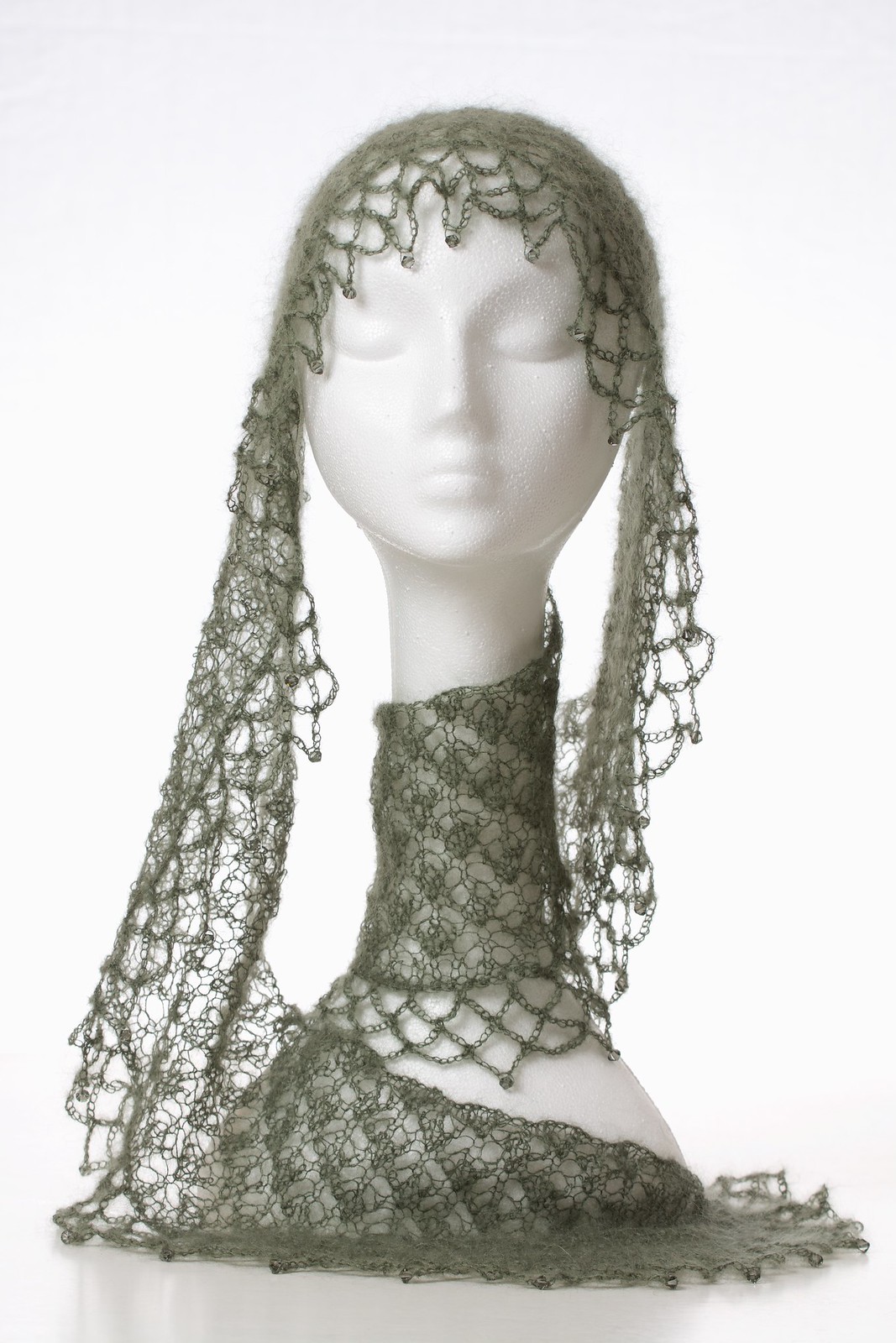
A different shot from Saturday.
_DSC7933 - Version 2 by Janis Hughes, on Flickr
I recovered the highlights in the previous image, which was a mistake, I think. I left them alone in this one, and boosted the mid-contrast. A cleaner, sharper image, I think, though the head looks out of proportion to the base relative to the other shot.
-
12th January 2016, 09:57 AM #20
- Join Date
- Dec 2009
- Location
- WNY
- Posts
- 36,716
- Real Name
- John
Re: 2016 Project 52, 1st Quarter by Janis
This last one has the best presentation of the shawl's texture and appearance. Are you happy with this presentation? Originally Posted by purplehaze


 Reply With Quote