
 Helpful Posts:
 Today I had a little conversation via FlickrMail with Rob (carregwen) about BW conversion. I asked him for some techniques and tips for BW conversion. He replied me that a thread on the Cic forums would be a better way.
Therefore I want to ask him, and of course all other members to share some of their techniques and tips for black and white conversion to get one of those beautiful BW images with great contrast, mood and detail.
At first I would like to refer to the Cic BW conversion tutorial for the theory behind to conversion and some basic techniques.
So feel free to post your own tips here and discus yours with others.
Results 1 to 13 of 13
Thread: BW conversion
-
13th April 2010, 07:14 PM #1


- Join Date
- Mar 2009
- Location
- The Netherlands
- Posts
- 610
- Real Name
- Jeroen
BW conversion
Last edited by JK6065; 14th April 2010 at 06:41 PM.
-
13th April 2010, 08:12 PM #2

- Join Date
- Jun 2008
- Location
- Manchester
- Posts
- 787
- Real Name
- Mark Fleming
Re: BW conversion
I've got a mate on flickr who adjusts all the colour channels before desaturating. Personally it depends on the image. I like Nik software myself. Alot of people swear by the channel mixer. Some people go outrageous and use something called film.

-
13th April 2010, 08:23 PM #3
- Join Date
- Aug 2009
- Posts
- 4,049
Re: BW conversion
Thanks Jeroen. I'm busy tomorrow (Wed) but I'll do something on Thursday. I've recently decided to do a lot more B&W photography rather than colour, so I'd also like to hear from others regards process methods.
-
13th April 2010, 08:28 PM #4Moderator

- Join Date
- Feb 2009
- Location
- Glenfarg, Scotland
- Posts
- 21,402
- Real Name
- Just add 'MacKenzie'
Re: BW conversion
Jeroen
Good question and thanks for putting it up here. Like Rob, I'd like to take time to post a, hopefully, sensible response. Out of action all day Wednesday, so will do so on Thursday.
-
14th April 2010, 12:18 PM #5
- Join Date
- Aug 2009
- Posts
- 4,049
Re: BW conversion
OK, I’ll do my contribution in two parts – 1. Why BW, and essential elements of BW scenes. 2. The processing in Photoshop. I’ll do #1 now, and #2 tomorrow.
PRACTICAL BASICS
1. Always, always, always shoot in RAW. You will never get a great BW from a JPEG. Trust me, I’m not a doctor.
2. Never use the BW setting in your camera. It might look great on your view-screen, but you are essentially throwing away important COLOUR data that can be essential to producing BW.
3. Always be on the look-out for BW scenes. Only a few shots are suitable, so you need to be really observant to spot them. Try to imagine in your mind’s eye what it will look like in BW. Do you dream in BW?
4. You can shoot in bright sun in the middle of the day (I find). You don’t have to worry about colours being washed out. And it can give very edgy shots using the high contrast that is available during the day. I know some people are going to disagree with that.
5. It’s tempting, very tempting, to think that BW is ‘arty’, abstract looking, trendy, edgy etc. Often, it is, but remember that if you are doing a shot like that it still has to be good composition, with good contrast, and interesting. Otherwise you may invite those unwanted forum comments that go ‘I can see what you were trying to do here, but...’ BW is not a easy way to get a good shot.
Why BW?
A lot of people say ‘I love BW photography’ Why do they say that in a world full of great colours? Possible reasons are...
1. Life is complicated. BW reduces everything to a more simple level. When people discuss an issue or have an argument they will often say ‘Look! It’s black and white, why can’t you see that...’ meaning they want it to be black and white (simple). We all, at some time yearn for simplicity.
2. Colour can be a distraction, especially garish colour. We can get so preoccupied with the (perhaps intrusive) colour that we lose sight of what the scene is showing us. BW removes that obstacle.
3. It’s perhaps easier on the eye when viewing
4. It often looks atmospheric or ‘dated’. As such it invokes emotional feelings in us (bygone ages and all that) which add to a shot’s appeal. The dated thing only works because we know that before colour film everything was BW, so when we see BW now we automatically make that connection.
5. We often think that BW has ‘character’ Much of this dates from film days where the effect of photo-journalists using high ISO film produced a very grainy finish. It’s hard to get that look with digital, but we still yearn for it.
But there’s a problem with not having colour.
1. Colour gives shape and depth to a shot. Without it we have to rely upon something else to provide that shape and depth.
2. Our brains use colour to help inform us of what something is. Here’s a shot of deckchairs http://www.freefoto.com/images/19/30...Summer_web.jpg We know by looking that they are deckchairs, but the colours help reinforce that. The sea is blue, but it’s not always blue is it? In a storm it may look grey, so in this shot our brain says ‘It’s also sunny’ IOW, the colour informs us. There are shadows in the shot, so we would know in a BW shot that it was sunny, but we wouldn’t have the colour information to reinforce it.
3. Colour can be attractive to the eye/brain. If you take it away then you also take away the pleasure. What is left? Perhaps that’s why a lot of BW shots are edgy, abstract, have a feeling of tension?
Let’s have some examples of what’s needed in BW to make them impressive without colour.
SHAPE If colour is absent then the shape has to be better than in a colour image, where the viewer can be distracted from the fact that the shape isn’t all that good.
This tree shot has a great shape. Lot’s of detail, a beautiful arc shape. It’s isolated from everything around it, so you are forced to consider it’s shape. It doesn't have much contrast but the shape is effective. It is dramatic.

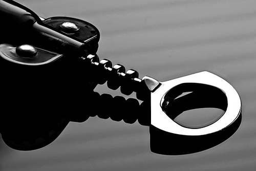
CONTRAST – Without colour, tonal contrast is all that is available to make up for the shape/scale properties that colour would have given. Here we have another impressive shape, but this one also has great contrast, from the very dark areas on the left which are completely black, to the very bright cap remover. I reflected the image by laying it on black acrylic which gives it those black shadows underneath. Had I shot it on a table-top it just wouldn’t have looked the same. I also used the reflection of a slatted blind to give those contrasting lines running laterally across the shot. So, we have gone from ‘shape and colour’ in a colour shot to ‘shape and contrast’ in a BW. This is not really a criticism but I see a lot of BW shots on this forum that would be greatly improved with more contrast. It really is important in BW, but it’s quite hard to achieve.
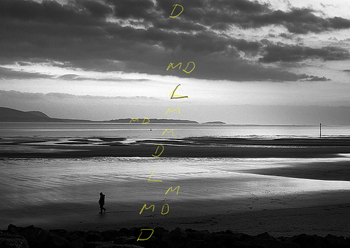
In this next shot we have both shape and contrast. Looking at a vertical slice in the centre (where I’ve annotated it) you can see the range of contrast. D=dark, MD=medium dark, M=medium, L=light. See how the different layers alternate. This gives both variety and spatial depth – colour would have done this, but I’ve had to rely on varieties of tonality to get the same effect.
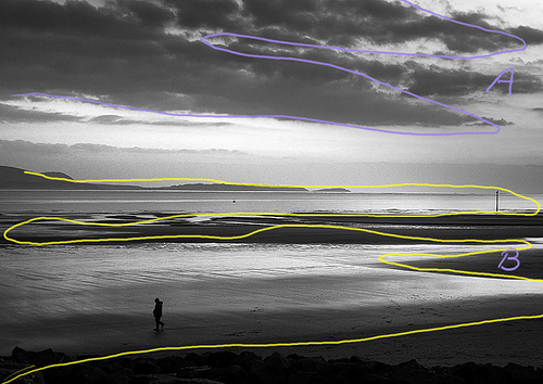
And here’ the shape patterns on the same shot. See how the yellow line weaves through the shot taking you to the top. And the blue line shows the shape of the clouds. Look at A and B – they match, don’t they (have a few beers if you can’t see it!) If you laterally reversed A and moved it down it would almost fit over B. I know these things are also important in colour shots, but they are more important in BW.
I'll cover my processing method later.
Last edited by carregwen; 14th April 2010 at 03:21 PM. Reason: typo
-
14th April 2010, 12:41 PM #6Moderator

- Join Date
- May 2008
- Location
- Windsor, Berks, UK
- Posts
- 16,771
- Real Name
- Dave Humphries :)
Re: BW conversion
Wow Rob,
That's excellent, no pressure, but I can see that this is going to be useful in future, so I have added it to the Links to Useful & Informative Threads
Great post, thanks.
Thanks also to Jeroen for asking in the first place, with the link to the tutorial, it got the thread off to a good start
Cheers,
-
14th April 2010, 01:05 PM #7
- Join Date
- Aug 2009
- Posts
- 4,049
Re: BW conversion
Thanks, Boss. As I said, I'll do the PS processing tomorrow. I'd like to hear from others on how they see BW and process for it. It's a good idea having the links to useful threads, but I can't help thinking it should be in a more prominent place (like the main page). It's currently under 'site suggestions and feedback' which rather implies giving info, rather than getting it. Lot's of new members seem to start a thread asking for general info that is already detailed in one of useful threads. Just a thought. Originally Posted by Dave Humphries

-
14th April 2010, 01:51 PM #8

- Join Date
- Sep 2009
- Location
- Burton on Trent, UK
- Posts
- 4,788
- Real Name
- Steve
Re: BW conversion
A hundred years ago when I was at school colour film was forbidden and so I suppose I prefer colour, but occasionally I do a B+W or rather a sepia and use the easiest method to process, OptikVerve filters.
Using these I can choose any colour filter I like, but really the only way to do b+W is too think B+W right from the start. If it is B+W I forget all the rules for exposure and just try for something with impact.
Interesting tutorial rob. cheers
-
14th April 2010, 06:58 PM #9
- Join Date
- Mar 2009
- Location
- The Netherlands
- Posts
- 610
- Real Name
- Jeroen
Re: BW conversion
Rob,
this is really what I had hoped for: a detailed step by step explanation. It's really worth the try.
Dave,
would this be useful (thought it depends on the contribution) for some kind of sticky or a guideline for a more advanced BW conversion tutorial for the Cic tutorials?
I think BW is by some a underrated kind of photography as BW images can be so much powerful. I'm not sure why, though Rob's gives us a list of very good reasons. I feel like just because BW images do not have colour (and might seem less powerful or complex because there's no need to worry about how to use colours in your shot since they simply aren't there) the can be much stronger in their BW. A bit like a photograph can be much more powerful than a movie because of the 'disadvantage' of only having one image to tell the story. I think this can be an advantage because it always is a single image that keeps running trough your mind, a good photograph can be all this.
I really would encourage you to post images with your tutorials and tips to visualize what you want to say.
We might do some analysing about why we find a BW image so good and get in to how it's made this good.
I would ask competitors in the monochrome competition (and especially winners) to tell something about how they did it.
-
15th April 2010, 09:01 AM #10Moderator
- Join Date
- Feb 2009
- Location
- Glenfarg, Scotland
- Posts
- 21,402
- Real Name
- Just add 'MacKenzie'
Re: BW conversion
Like the man said, "Great post". I am, therefore, not going to repeat what I, too, consider to be an excellent commentary/statement on the subject.OK, I’ll do my contribution in two parts –
There are two points that I would make in addition to/slightly different from, what Rob has written. I'll state these before, below, going on to briefly mention my workflow.
The first of these points is in relation to contrast and about setting the black & white points. I will remain eternally grateful to eNo for making a reference to Michael Freeman in one of his posts (as others have as well). Freeman's 'The Complete Guide to Black & White Digital Photography', Ilex, 2009 (Think it's got a different title and publisher in the US) has become my photographic bible. In talking about how some great photographers (e.g. Paul Strand) have "...(dwelt) on the grays, from dark-gray to light-gray", Freeman states (p146), "... it helps the effect not to close up both black and white points, and then to lower the contrast." And he illustrates the use of the reverse-S curve to lower contrast. The point being that there is an alternative to having the black and/or the white points right up to the edges. Freeman illustrates his point by reproducing Strand's The Family, Luzzara, Italy 1953. I just keep staring at it. It's magical. And I'm experimenting to see what I can do.
My second point follows from Rob's call to ...I now never go out to take a photograph and then have a look to see if it works better in colour or B & W. I go out to capture an image that will be a B & W photograph or, more rarely, a colour photograph. It's not a case of 'get the image' and then decide whether it'll be B & W or colour. If the colour image I attempted to get works, then I'll have a colour picture. If the B & W image I attempted to get works, then I'll have a B & W image. One effort will never become the 'other' end product.Always be on the look-out for BW scenes. Only a few shots are suitable, so you need to be really observant to spot them. Try to imagine in your mind’s eye what it will look like in BW.
Which is why you will not see, on here, anything from me that asks whether you think it's better in B & W or colour. If I went for a B & W image and I get it, then that's what you'll see. The capture that contains colour information is merely a step on the way to producing the photograph I started creating when I pushed the button. If I want to produce a colour photograph, then there never will be a B & W version of it.
For me, that has been an essential discipline to impose upon myself in order to 'think in B & W'. Again, my adopted 'guru' (Freeman) explains it as follows: "... black & white photography means anticipating, selecting and composing monochrome right from the start. And the only way to do this is to train oneself to think and see in black & white."(p140)
When I first started reading these references to 'seeing in B & W', I thought ,'Yep, okay, I can do that. What's all the fuss about?' From where I think (hope) I am now, I can appreciate how naive and stupid I was in assuming I possessed a skill that I was nowhere near possessing. I now think, perhaps presumptuously but more objectively, that I have that skill. And the only way I found to acquire that skill was to practice, practice and practice ... and then practice some more.
Go out - look at scenes - tell yourself what it's going to look like in B & W (write it down or voice-record into one of these dictaphone things) - take the picture. Go home and convert. How close is the result to what you told yourself it would be? Now go back out and do it again. And again. A less effective tool for learning, in my view, is to set the camera to monochrome - take the picture - and have a look to see if the grayscale matches what you thought it would look like. This can never, in my opinion and in line with Rob's thinking, be thought of as anything other than learning exercises and not steps to a final product. However, I have read of some photographers shooting in mono in order to then PP these into a final product. But this isn't a route I intend to go.
Anyway, gradually you start to realise that you are developing the ability to think and see in B & W.
So, that's my contribution to the first part of the discussion. The second part is about workflow. And given that I'm not an Adobe products user (which most of the world is), I'll restrict myself to saying that my weapons of choice are RAW Therapee and the GIMP.
Following perceived wisdom, I do as much as possible in RT before transferring the file over to the GIMP for layer and masking work (curves, local contrast enhancement, etc, etc). Because of my particular interest in B & W, I've found RT an excellent tool. Its Channel Mixer is a bit of nightmare to get to grips with (there's a lot less support around for Open Source software). But I can relate what I can do with RT's Channel Mixer to Freeman's guidance regarding the use of Adobe's Black & White dialogue, which, I believe, you can access in ACR.
Hope that above makes a useful contribution to the discussion.Last edited by Donald; 15th April 2010 at 03:18 PM. Reason: sentence construct
-
15th April 2010, 09:28 PM #11
- Join Date
- Aug 2009
- Posts
- 4,049
Re: BW conversion
Here are some promised details of how I do my BW processing.
You might find this link useful, especially the BW shots. He has some great BW images. http://www.bwvision.com/
I use...
Photoshop (CS4)
Power Retouche plugins. http://www.powerretouche.com/index.htm
These are excellent, but not cheap. Probably best to look at the website to get the detail, but generally speaking they are a range of plugins that work direct from Photoshop. They offer high quality photo retouching and image editing in 8 and 16 bit. Supports RGB, CMYK, Lab, Grayscale, Duotone. The Windows version is for all versions of Photoshop, Elements, Fireworks, Paint Shop Pro, Corel Draw, Illustrator and other software that supports Photoshop plug-ins. Mac version is for intel mac and all versions of Photoshop and Elements and all OS versions. The full pack is 75 euros, but you can get them individually. For BW conversions the 'BW Studio' is very good. If you want full details, click on downloads, then userguides. You will get a zipped PDF for all the plugins and lot's of info on them.
Optik Verve Photographer plugins. http://www.optikvervelabs.com/virtualPhotographer.asp
These are very good too, but can in some cases cause 'distress' to your image if you push it too much. They can however produce some very nice BW images, especially if you want them tinted or to change the softness/hardness. They are FREE! They also do a Optik Verve Studio (also free) which handles data processing such as retouching and enhancing. I find Photographer the most use, so I don't use Studio.
This demo only covers Power Retouche usage.
I had trouble selecting a suitable image to demonstrate. In the end I went for something quite simple. I wish to point out that this is just a test/demo. I use different methods, and this is just one of them.
This is the basic RAW out of the camera. It's the roof of the National Botanic Garden great glass-house a few miles from my house. My dear botanist wife used to work there. http://www.gardenofwales.org.uk/

So, to PS RAW/ACR and load the DNG RAW file.
Exposure was OK.
Recovery - I slid to right slightly as I don't want clipping in PS when I adjust contrast.
Fill light =14 for same reason for blacks
Blacks I took back to 0
Clarity increased slightly. This works better with more detailed images (not the case here)
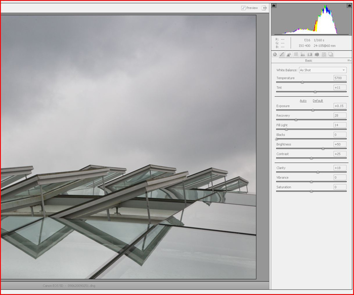
Next I go to the tone curve panel. I use the parametric slidesr as I find them easier to use. Here I have boosted the contrast quite a bit. We are now getting closer (still in RAW) to the sort of contrast we want. Note the slider settings on the right. See previous screen.

OK. Now we export to PS/CS4 as a 16bit file. Why? Because I want to keep as much data as possible because we still have editing to do in PS. Save it as a PSD.
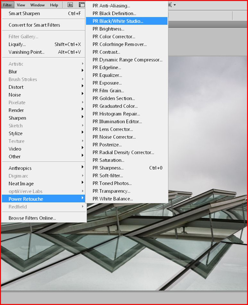
We are now in CS4. Now I select Photo Retouche (PR) menu. This shows all the plugin options. Some of the PS options on the left menu are not available as it's a 16bit file.
Here's what the PR BW Studio panel looks like with all the sliders reset. Basically there isn't enough space to show it all, so there is a second page which shows the tone range method of BW conversion. This page has the 'film/print' method, which I normally use. I haven't changed anything yet. Note the histogram at bottom.

Here I have made the adjustments. I pushed the multigrade slightly (gives more contrast), pushed some more black into the shot, and pushed the black contrast slider to the left (darker). And you can see the result (more contrast)

Back in PS - My shot is looking better now. But the sky still lacks contrast, so time to use the PR-Contrast plugin. I selected the sky area with a tool and feathered it. PR works with part selected images so you don't have to change the whole thing. If you do a selection of a copied layer it actually shows the masked off area. This shows selected area of sky...

Now I've gone into PR-exposure plugin with my sky selected, and have changed the sliders as shown, with the effect that it has.

Now, that only changed the sky, but the windows are a little too dark. So I'm going to invert the selection (just the building now) and expose that. This time I have done some lightening, but only to the building.

OK. Pretty much done, but I want to dodge some of those window panes to make them really stand out. Ran Neat Image to get any noise out (there wasn't much at all), and a bit of sharpening to finish.
We have gone from this...
To this...

Any questions gladly answered.Last edited by carregwen; 15th April 2010 at 09:42 PM.
-
19th April 2010, 10:04 AM #12
- Join Date
- Mar 2009
- Location
- The Netherlands
- Posts
- 610
- Real Name
- Jeroen
Re: BW conversion
Rob, thanks for your detailed 'how to'
It's quite helpfull and challenging to take a dive into BW photography. I would again point at
http://www.bwvision.com/topics/photography-techniques/. The turorials are very useful.
A thing that really caught my attention is long exposure black and white photography. I've seen some long exposure images on the forums so I guess there's some knowledge available about that. But are there members out here who have experience with the black and white version of it?
-
23rd April 2010, 09:06 AM #13Moderator
- Join Date
- Feb 2009
- Location
- Glenfarg, Scotland
- Posts
- 21,402
- Real Name
- Just add 'MacKenzie'
Re: BW conversion
One final jump back to this thread. Originally Posted by JK6065
As said above, Rob has put up significant posts here in terms of learning information. If you (and others) want to continue to develop your learning and believe that work put in to capturing the image is as important as what you do in the post-processing, then another useful bit of text is this. It's good 'starter guide' for anyone getting into B & W. This is some more of what I referred to above about thinking in B & W.
By his own admission he writes sort of as he thinks - there are a few full stops and commas missing here and there. But, given the quality of the work he produces, it's well worth a read.

 Reply With Quote