
Hi,
I took these shots at some heritage hotel. For the first time, I am happy with the quality of my shots, in terms of sharpness and clarity. I need some critiques on these, please.
 Helpful Posts: 0
Results 1 to 7 of 7
Thread: Sculptures
-
8th March 2010, 07:55 AM #1

- Join Date
- Nov 2009
- Location
- Chandigarh, India
- Posts
- 1,542
- Real Name
- Sahil Jain
Sculptures
-
8th March 2010, 10:39 AM #2

- Join Date
- Dec 2009
- Location
- WNY
- Posts
- 36,716
- Real Name
- John
Re: Sculptures
Sahil,
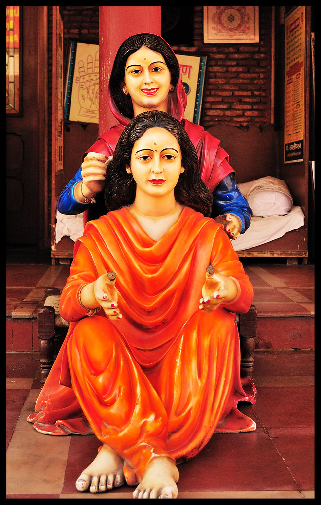
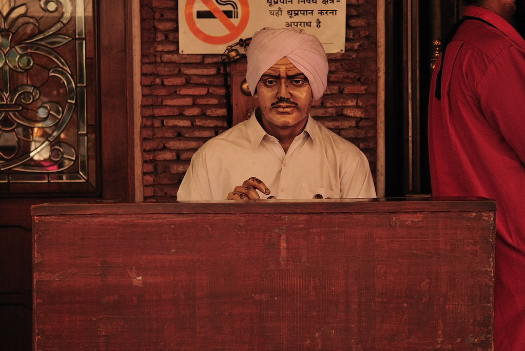
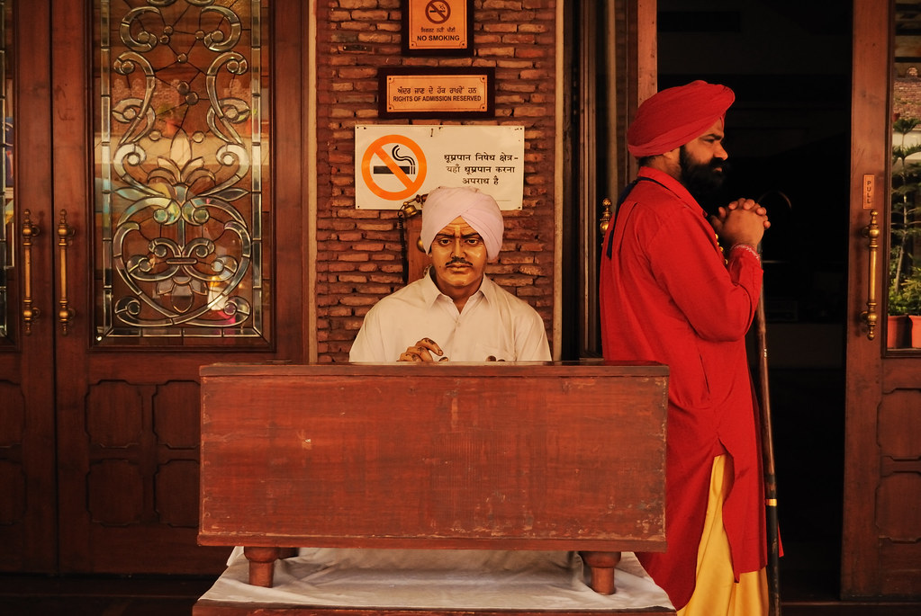
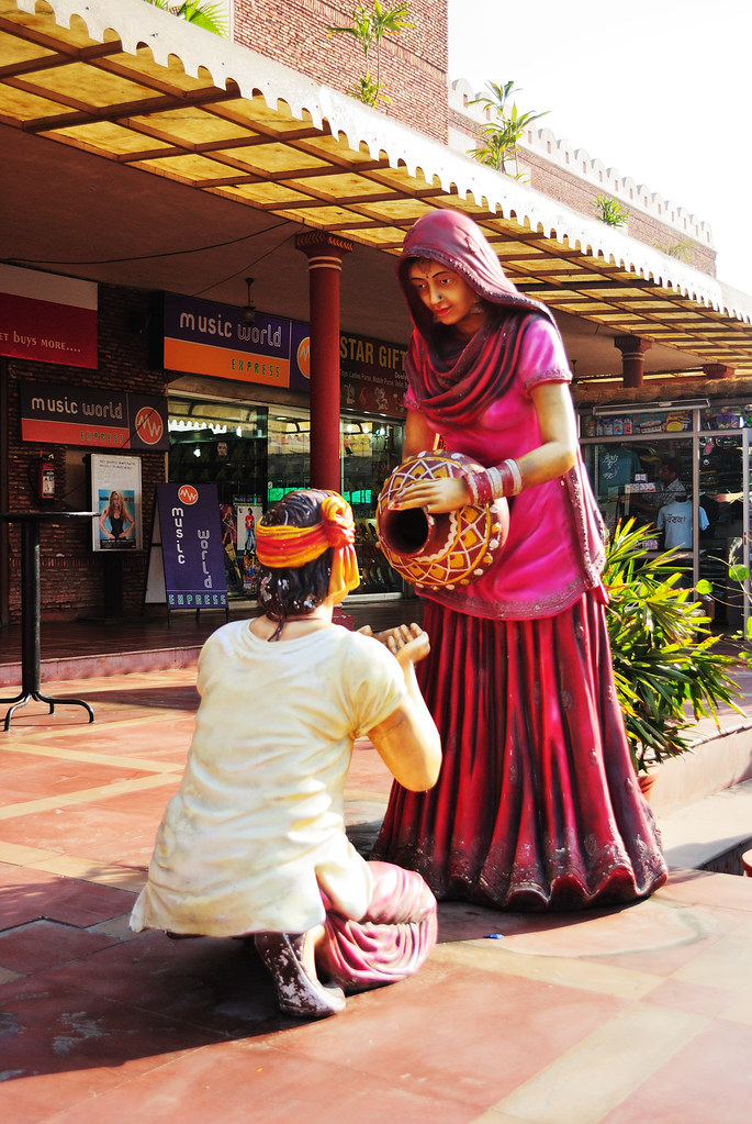
All are pretty good. #1 suffers only a little because the figure's toes are cropped out. #3 looks better than #2 only because of the distracting sign behind the figure's head, plus having the man standing nearby helps the viewer relate to the size of the figure.
-
8th March 2010, 03:40 PM #3
- Join Date
- Oct 2009
- Location
- Maryland, USA
- Posts
- 1,015
- Real Name
- Rick
Re: Sculptures
These are very sharp, very nice colors. They really pop.
You might improve #1 with a different angle. The pole behind the rear figure seems to become part of her garment.
In #3, I would clone stamp the flower pots toward the top to remove them. They're similar in color to parts of the dress, and they draw the eye.
I might also clone out the valve that shows between the woman and the man on her left, and maybe some of the clutter on the counter. That depends on what you want the image to suggest: if it's the traditional against the modern, then those things add the modern part.
All in all, a nice series.
Cheers,
Rick
-
8th March 2010, 07:51 PM #4
- Join Date
- Jan 2009
- Location
- South Devon, UK
- Posts
- 14,885
Re: Sculptures
After trying to imagine some different angles for No. 1, I don't think you could do any better without moving the subjects. That pole is just too close and shooting on too much of an angle would spoil their faces. I think I prefer it as it is; slightly to one side instead of directly behind her head. It is a pity that the colours are so close here but there is just about enough variation that I don't find it excessively distracting.
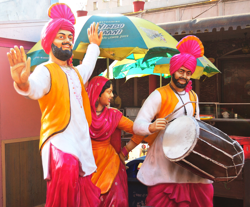
I agree with the flower pots on No. 4. If you can clone them out, or even blur and fade them a bit it would help. Otherwise they are all fine.
-
9th March 2010, 04:30 AM #5
- Join Date
- Nov 2009
- Location
- Chandigarh, India
- Posts
- 1,542
- Real Name
- Sahil Jain
Re: Sculptures
Thanks everyone for the feedback.
Well I saw the original pic of the 1st image (I had to crop it down) and found that it her toe is too crooked to be shown. The plastic on toe is too worn out. And I will try changing the colour of the pillar a bit. I hope it should go neat. Will do something about the pots too, as soon as I get time.
Thanks once again.
-
9th March 2010, 05:35 AM #6
- Join Date
- Nov 2009
- Location
- Chandigarh, India
- Posts
- 1,542
- Real Name
- Sahil Jain
Re: Sculptures
Here are the edited versions.


-
9th March 2010, 02:49 PM #7
- Join Date
- Oct 2009
- Location
- Maryland, USA
- Posts
- 1,015
- Real Name
- Rick
Re: Sculptures
Very nice, Sahil. I keeps attention on the subjects more (to my eye).
Cheers,
Rick

 Reply With Quote