
I have a question which seems to be common but can't find a definitive answer on the web.
Perhaps there should be a paragraph or two in the color space tutorial or the color space conversion tutorial to explain why pics in Adobe RGB mode look dull on the sRGB monitor. Any clarification on this would be appreciated.
 Helpful Posts: 0
Results 1 to 5 of 5
-
14th April 2008, 05:57 AM #1


- Join Date
- Apr 2008
- Posts
- 69
Why do Adobe RGB 1998 photos look dull on my monitor?
Last edited by McQ; 14th April 2008 at 06:00 AM.
-
14th April 2008, 06:35 AM #2Administrator
- Join Date
- Apr 2008
- Location
- California, USA
- Posts
- 1,473
- Real Name
- Sean
In short: These images appear dull because whatever is displaying them is not a color-managed application.
The reason the colors appear more dull, as opposed to the reverse, is because the Adobe RGB 1998 color space is quite large compared to sRGB:
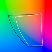
The white line is sRGB and the black line is Adobe RGB 1998 (at 50% luminance).
To understand why this happens, let's compare two sets of red,green,blue (R,G,B) color values:
(1) A green color represented by the numbers 0,180,0 (R,G,B) from sRGB
(2) A green color represented by the numbers value of 101,178,42 (R,G,B) from Adobe RGB
Both (1) and (2) will actually appear identical when correctly shown using a color-managed application-- even though case (2) is clearly much less saturated than case (1). This is apparent because case (1) is pure green, whereas case (2) has just as much green, but is also diluted with lots of red and blue. This much like mixing paints.
Even though case (2)'s numbers are less saturated, this is compensated for by color management, and these are mapped to just as intense and pure a color green as the 0,180,0 number in sRGB. On the other hand, if there is no color management, the colors are shown as is and (2) remains much less saturated (examples how each have been attached).
If you're interested, you can even try loading up each of the attached images in Photoshop to verify that they are indeed the same color if assigned the appropriate color profile. Case (1) is the image attached on the left and case (2) is the image on the right.
-
12th June 2008, 10:43 PM #3New Member

- Join Date
- Jun 2008
- Posts
- 2
Re: Why do Adobe RGB 1998 photos look dull on my monitor?
This is what I did in the attached JPEG (AdobeRGBvsRGB.jpg): I opened the indexed colour PNGs, assigning them the correct colour space in each case (Adobe Photoshop Elements 3.0 can't read embedded profiles in PNGs), converted them to RGB colour mode and saved them as JPEGs with the correct colour profile embedded. Originally Posted by McQ

Those JPEGs were then opened in Flock, a non-colour-managed browser, and Safari on Microsoft Windows, which is practically the only default color-managed browser for that platform (Firefox 3 will make colour management a non-default option on Windows).
The result was arranged with the sRGB-tagged patches on the top row and the AdobeRGB-tagged on the bottom, and with Safari on the left, Photoshop Elements in the centre, and Flock on the right.
All the managed patches measure consistently HSB(120 degrees, 100% saturation, 79% brightness) and RGB(0, 201, 0), just the result one would expect, or at least hope, that the two different colour mapping engines of Adobe and Apple would provide, while the unmanaged sRGB patch in Flock is only slightly less bright with identical hue and saturation, and RGB(1, 180, 0)--some kind of error in Flock's rendition of the red channel, I'm not sure what or why.
The slight but observable colour deviation of the AdobeRGB patch in the non-colour-managed browser on the lower right is just what would be expected by uncompensated display of the same colour defined in a different colour space and thus different RGB numbers.
Photoshop users posting photos on Flickr sometimes forget to convert them from the AdobeRGB to the sRGB colour space, with the result that their photos have a desaturated look to them. The attached random example (AdobeRGB_vs_sRGB2_small.jpg) shows the result: the left half is a non-colour-managed browser showing a JPEG with an embedded AdobeRGB profile, while the right half shows the same image in the colour-managed Safari browser. Quite a difference in the facial reds and saturated fruit orange colour!
Anyway, I hope these examples are as instructive to others as they were were to me.Last edited by mjdl; 15th June 2008 at 03:26 AM. Reason: Clarity and a better screen capture.
-
14th June 2008, 06:22 AM #4
- Join Date
- May 2008
- Location
- Berkeley CA
- Posts
- 23
Re: Why do Adobe RGB 1998 photos look dull on my monitor?
A side note: one very popular image viewer utility - FastStone Viewer, which I love for everyday image editing, you know, resizing, cropping, jpegging etc, actually has an option to enable color management (CMS). Once enabled, nothing changes regardless of the embedded color profile. If your using FastStone Viewer, knowing this may save some frustration. When in doubt, get a second opinion : ).
-
4th September 2008, 11:04 AM #5

- Join Date
- May 2008
- Location
- Herefordshire UK
- Posts
- 816
- Real Name
- Chris
Re: Why do Adobe RGB 1998 photos look dull on my monitor?
What I keep asking is when ALL browsers are going to catch up with Safari and Firefox3 (plus color management add-on) and be colour managed to the adobe RGB standard? Surely not too much to ask 10 years on?
Although from McQ's examples I can see Photoshop (elements 4) does this chameleon act of picking up the correct colour for the image in hand, none of the applications I actually use do without altering the colour space ad hoc. Is this part of the monopolies' protection scheme?
In the meantime it seems that one would need to keep a 3rd version (1=original, 2=reduced for quick reference for one's own use) for web posting. Is this what people do?
Actually its going to go to 4 versions as my local camera club is going to be using a digital projector and that seems to need an intermediate size (1600x1200 as far as I can see) for big screen viewing; yet to discover what that will do with colour profiles using cheap PC software to run.
Using Nikon Capture NX2 the original and edited nef files are merged into 1 and including a togglable step for any printing fine tune, otherwise maybe one would need 2 more versions.
What is normal practice for more of you good people??

 Reply With Quote