 Helpful Posts: 0
Results 1 to 4 of 4
Thread: Ivy
-
13th February 2010, 04:54 AM #1

- Join Date
- Jan 2010
- Location
- Vancouver, Canada
- Posts
- 67
- Real Name
- Rod
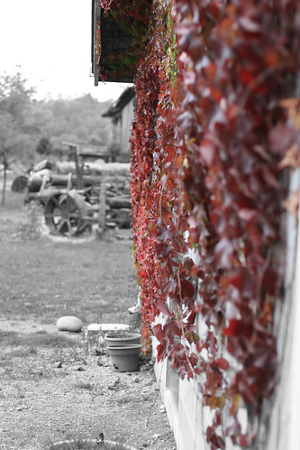
Ivy
-
13th February 2010, 08:23 AM #2
Re: Ivy
Looks like you have done it OK to me with posting

In respect of critique on the image, I like what you have done here, but feel it could be improved with a few PP modifications;
a) The composition is a bit 50/50, so if room in a re-crop, I would include a litte more to camera left and take a smidgin off the right hand side.
b) Crop off, or clone out, the extreme foreground pot that is just creeping into shot at bottom edge of frame
c) The very dark gutter/roof overhang on the more distant building is a distraction, if mine, I would either clone away the entire building or lift the blackness of its roofline to match the greyness of the other distant objects.
d) I think I would do similar with many other distant dark shadows amongst the logs and bits.
While the effect of each of these mods would be quite small, I think the combination of them all will make a stronger composition for the effect and subject you want to showcase.
Hope you find that helpful,
-
13th February 2010, 03:17 PM #3
Re: Ivy
I like the concept but would reshoot at a different angle. The current composition makes it look like the background is the center of interest, especially the wheel; but that object is out of focus and not the title of the photo.
-
13th February 2010, 08:05 PM #4

- Join Date
- Jan 2010
- Location
- Vancouver, Canada
- Posts
- 67
- Real Name
- Rod
Re: Ivy
I was thinking the same when sending this through ps, should have taken a step or two to the left.


 Reply With Quote
