
 Helpful Posts:
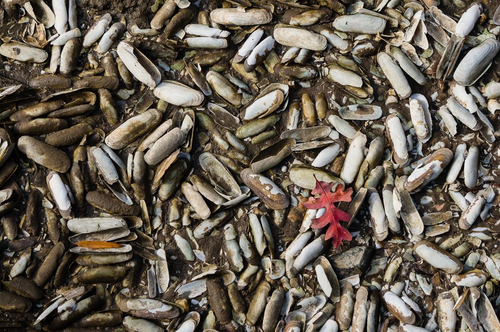
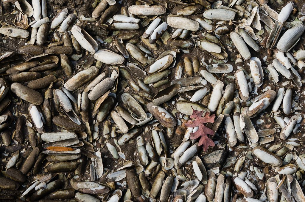
 This image is close to natural color. Trying to keep a light touch in the PP but I'm sort of tempted to increase the saturation in the red leaf. Any comments or criticisms of any sort regarding the image are appreciated.
Andrew
Results 1 to 8 of 8
-
20th January 2014, 03:19 AM #1

- Join Date
- May 2013
- Location
- Delaware, USA
- Posts
- 586
- Real Name
- Andrew
Shells and Leaves......bump up the color?
-
20th January 2014, 09:30 AM #2

- Join Date
- Dec 2013
- Location
- Chesterfield, Missouri/Melbourne, Australia
- Posts
- 17,827
- Real Name
- Izzie
Re: Shells and Leaves......bump up the color?
I ran this through ACR to bump the contrast to +32; vibrance to +8 and saturation to +12. It looks good.
-
20th January 2014, 01:00 PM #3
- Join Date
- Jun 2012
- Location
- Anywhere that strikes our fancy...
- Posts
- 460
- Real Name
- Nancy (surprised you!)
Re: Shells and Leaves......bump up the color?
Nice texture. Hmmm, yeas, a little bump to the red would be interesting. ( and how you do it, or does Izzie have it figured out? )
I have (new) PSE 11 and on big learning curve.
Nancy
-
20th January 2014, 01:02 PM #4
- Join Date
- May 2013
- Location
- Delaware, USA
- Posts
- 586
- Real Name
- Andrew
Re: Shells and Leaves......bump up the color?
Thanks for looking and commenting Isabel.
-
20th January 2014, 01:41 PM #5
- Join Date
- May 2013
- Location
- Delaware, USA
- Posts
- 586
- Real Name
- Andrew
Re: Shells and Leaves......bump up the color?
Here is another version where I selected the red leaf in Lightroom and muddled about with the various sliders and tools to increase saturation. LR also has a color picker that allowed me to shift the color of the leaf. I need to learn a disciplined approach to this as I was mostly just pushing sliders and things about to see the effect. I didn't change the yellow leaf. I thought the color of the two leaves against the textured shell background was kind of neat looking.
Nancy....as you can tell I've not much skill with the post processing. A bit of a prayer and wing it. Plus, I don't have any notion of how this is done in Photoshop. Thanks for looking and commenting.
Andrew
-
20th January 2014, 02:00 PM #6
- Join Date
- Dec 2011
- Location
- Québec,Canada
- Posts
- 696
- Real Name
- Louise
Re: Shells and Leaves......bump up the color?
Nice effect Andrew. I would suggest a tighter crop to bring the leaf to a more central role of "star of the picture" as it is your main subject. I like the repetition of the patterns formed by the shells.
-
20th January 2014, 02:06 PM #7
- Join Date
- Dec 2013
- Location
- Chesterfield, Missouri/Melbourne, Australia
- Posts
- 17,827
- Real Name
- Izzie
Re: Shells and Leaves......bump up the color?
I use Photoshop CS5/6 for editing. Unfortunately when I saw this message this morning, I had already deleted the image before I accessed my email. Sorry...next time I will upload my corrected image. Does PSE have ACR, Nancy?
 Originally Posted by Nancy Moran G

-
20th January 2014, 02:07 PM #8
- Join Date
- Apr 2011
- Location
- Ontario (mostly)
- Posts
- 6,667
- Real Name
- Bobo
Re: Shells and Leaves......bump up the color?
Bump works great.

 Reply With Quote