
 Helpful Posts:
 Hi, going forward on my photography venture I stopped and clicked another shot. Can you please review it and let me know what exactly is missing for it to reach position Perfect?
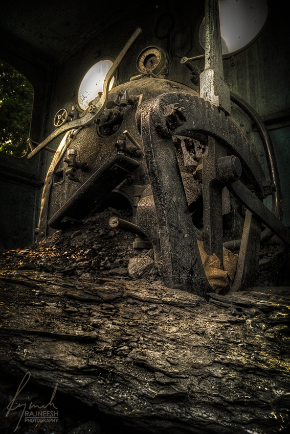
It is an HDR and I deliberately gave it a grungy & dreamy look. It was a good challenge for me to post process it as the whole image was full of textures & fine details everywhere. I have to take care of hard shadows too because of the sunlight.
EV Range : -2 0 +2
Thank You
Results 1 to 3 of 3
Thread: Old Coal Engine
-
9th October 2013, 02:55 AM #1

- Join Date
- Apr 2013
- Location
- India
- Posts
- 1,348
- Real Name
- Raj
Old Coal Engine
-
9th October 2013, 07:29 AM #2Moderator

- Join Date
- Feb 2009
- Location
- Glenfarg, Scotland
- Posts
- 21,402
- Real Name
- Just add 'MacKenzie'
Re: Old Coal Engine
Technically, I think this is a very good image. It is possible to see how your post-processing skills have developed as you gain more experience.
In artistic terms, I wonder if the image is as strong as it could be? In another, current thread, here, Kevin (kdoc856) wrote, "... remember that all elements must have a reason to be included. What doesn't add, detracts."
I think teh same could be said of this image. Do you think that the bottom third of contributes to the image, or does it detract? There is indeed nice line and texture in the material upon which the metal is sitting. But is there a reason why it should be included. And then, in the bottom left-hand corner, we have a patch of darkness which, again, does not seem to contribute anything to the image.
So, my question for consideration would be whether a significant crop at the bottom of this frame to give a picture in a 1:1 (square) or 4:5 aspect ratio, would result in a stronger image?
-
9th October 2013, 10:08 AM #3
- Join Date
- Apr 2013
- Location
- India
- Posts
- 1,348
- Real Name
- Raj
Re: Old Coal Engine
Thanks a lot for the valuable review and for sharing such wonderful knowledge. The textured material is the coal. I will surely crop the image in 1:1 and 4:5 ration to see the results. Originally Posted by Donald


 Reply With Quote