
 Helpful Posts:
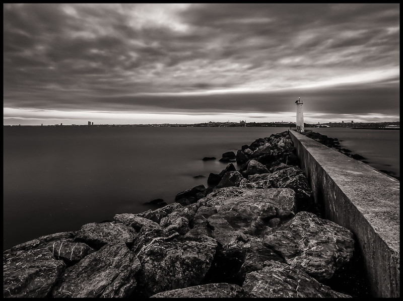
Kadikoy Lighthouse by batmura, on Flickr
B&W
Kadikoy Lighthouse 2 by batmura, on Flickr
Results 1 to 5 of 5
Thread: Lighthouse
-
5th October 2013, 07:21 PM #1

- Join Date
- Aug 2013
- Location
- Istanbul, Turkey
- Posts
- 293
- Real Name
- Murat Batmaz
Lighthouse
Last edited by batmura; 5th October 2013 at 07:58 PM.
-
5th October 2013, 08:13 PM #2

- Join Date
- May 2012
- Location
- Carrollton, Georgia (USA)
- Posts
- 2,757
- Real Name
- Bruce
Re: Lighthouse
These are very nice images.
Bruce
-
6th October 2013, 12:23 PM #3Moderator

- Join Date
- May 2008
- Location
- Windsor, Berks, UK
- Posts
- 16,775
- Real Name
- Dave Humphries :)
Re: Lighthouse
Hi Murat,
I cannot decide which version I prefer;
Colour:
because of the colour
but the lighthouse is the same luminance as the sky, so tends to get lost in it
B&W:
for the greater contrast and more foreground/less sky composition and brighter sea wall exposure giving a better 'lead-in'
but against this; I don't like the halo that has appeared in the sky surrounding the light house
The EXIF on the colour shot, from Flickr = Nikon D7100 (nice, isn't it?) 10-20mm lens at 10mm and f/8, 100 iso, ss = "130" (seconds, I assume?), all processed in LR4.4.
I wondered to myself ...
if the light house could be 'light painted' during the exposure somehow?
or failing that, if a precise selection of it and some selective dodging could be done to make it appear brighter, without impacting the sky
Either of these ideas may look unnatural though.
You did well with use of 10mm to avoid the (usually) obvious distortions.
Hope that helps,
-
6th October 2013, 04:36 PM #4

- Join Date
- Jul 2008
- Location
- Southern California, USA
- Posts
- 17,409
- Real Name
- Richard
Re: Lighthouse
I tend to prefer the monochrome version. On the color version, my eye tends to follow the pier and then turn to follow the horizon, ending up at the top left of the image where the color is most vibrant. In the monochrome version, the pier is the main attraction for my eye...
-
6th October 2013, 05:25 PM #5

- Join Date
- Aug 2012
- Location
- Kerala, India
- Posts
- 13,862
- Real Name
- Nandakumar
Re: Lighthouse
Excellent...both
But i am not sure how far the title goes with the image...the light house gets no prominence, especially in the color. But i will enjoy these without being captioned


 Reply With Quote