
 Helpful Posts:
 Hi all,
I am a beginner in photography. I shot some b&w picture recently. There're some pictures i taken.
All these pictures were cropped (because I was using a short lens, 18-55mm) and RAW was processed by using Capture one. I feel it not attracted to eyes, but I don't know where the problem is. Is the subject composition, the focus, image tones or lighting... Pls do help to give some advice and any comment is welcomed.
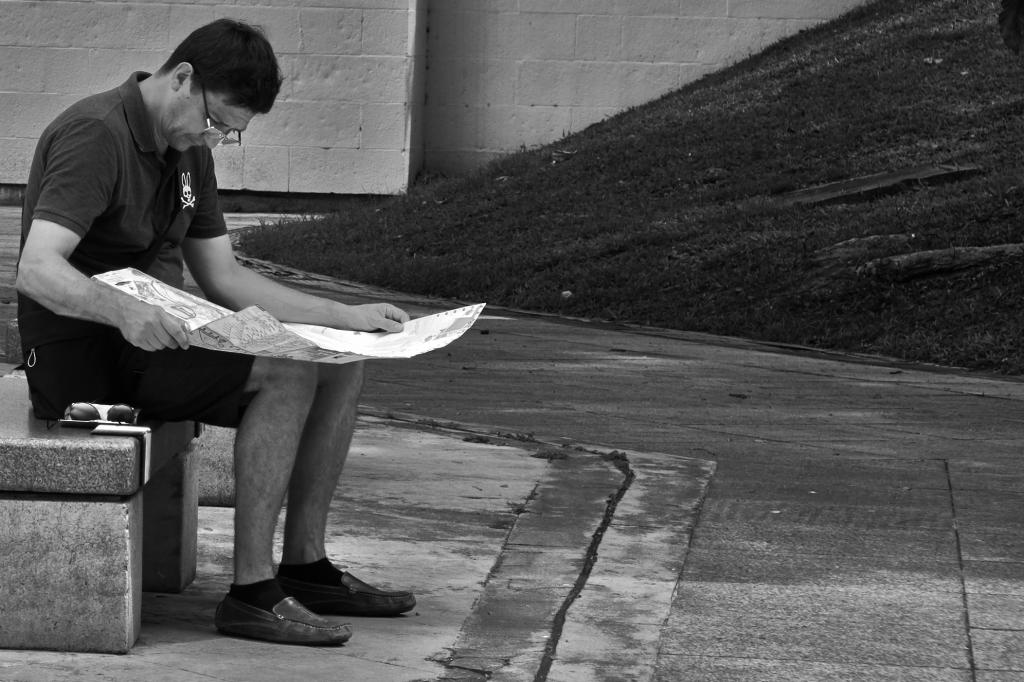
#1
Equipment: Fujifilm X-E1, 55mm, ISO 200 f/8, 1/400
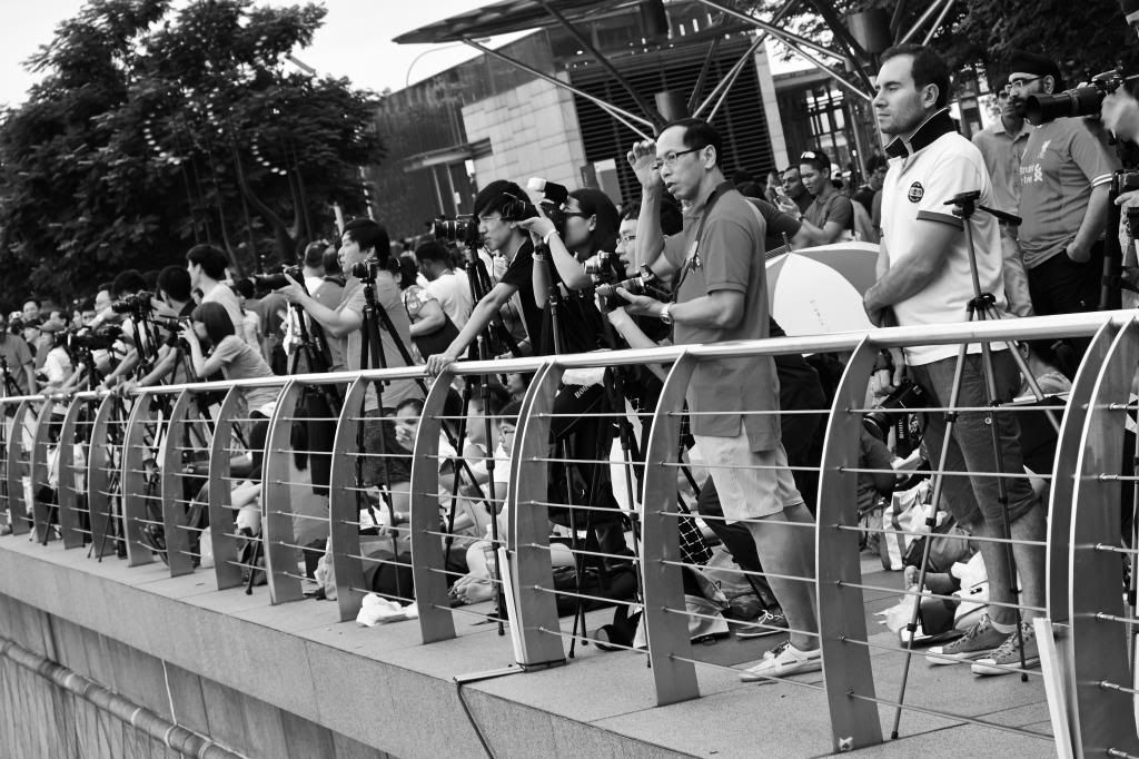
#2
Equipment: Fujifilm X-E1, 55mm, ISO 320 f/8, 1/30
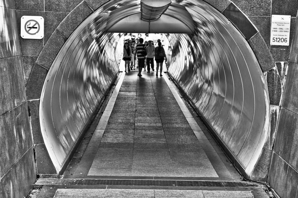
#3
Equipment: Fujifilm X-E1, 55mm, ISO 250 f/8, 1/30
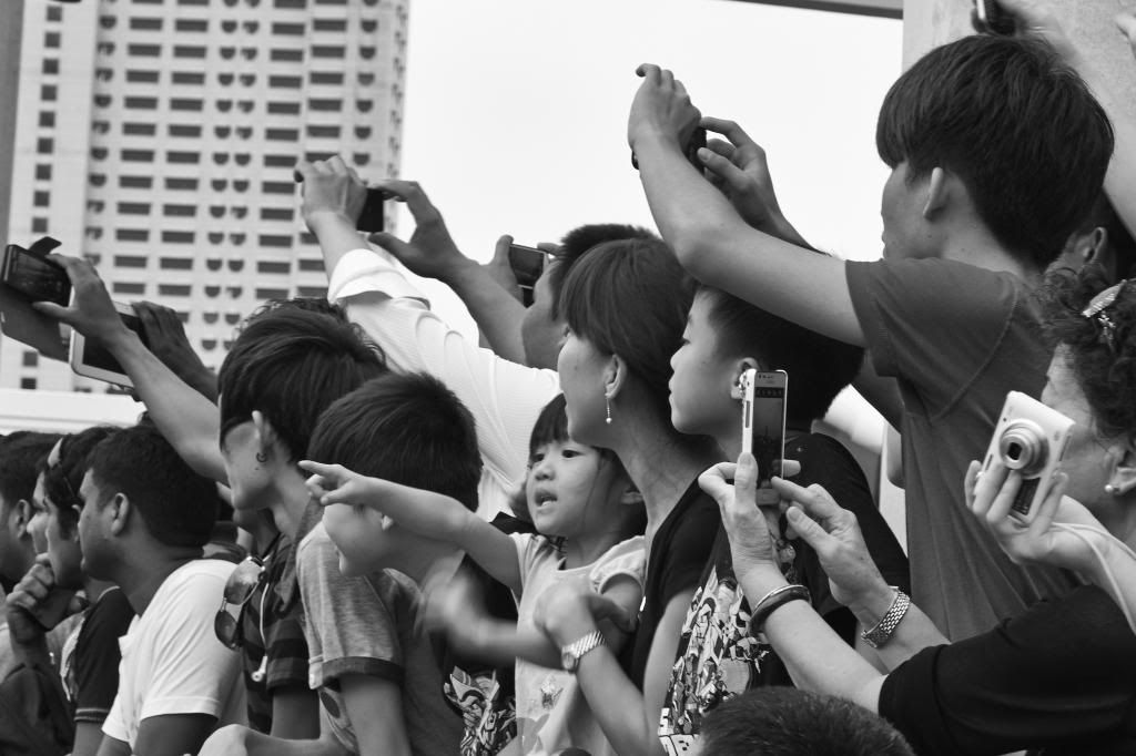
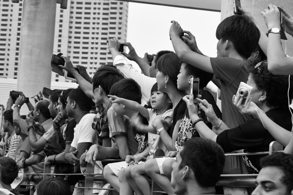
#4
Equipment: Fujifilm X-E1, 55mm, ISO 250 f/8, 1/30
Results 1 to 14 of 14
-
21st August 2013, 02:45 PM #1

- Join Date
- Jul 2012
- Location
- Singapore
- Posts
- 12
- Real Name
- Zien

Pls give some suggestion about B&W
-
21st August 2013, 02:58 PM #2

- Join Date
- Apr 2012
- Location
- Hertfordshire, United Kingdom
- Posts
- 480
- Real Name
- Graham Serretta
Re: Pls give some suggestion about B&W
Zen, all of these images appear to me to lack high-light detail and to have high contrast with limited tonal range. I think that the problem is the B&W conversion technique that you are using in CaptureOne. I don't use CaptureOne personally and would suggest that you use either Photoshop Elements or Lightroom to do the B&W conversion, both of which will do better justice to the Fuji X-E1 RAW files.
-
21st August 2013, 03:06 PM #3

- Join Date
- Sep 2011
- Location
- Athens, Greece
- Posts
- 719
- Real Name
- Miltos
Re: Pls give some suggestion about B&W
Hello Zien.
You need to ask youself why you want to convert these images to B&W. Is there a really purpose or you just want them to look vintage?
In a simple approach we usually convert when an image is about textures, tonalities, when color obstructs from the main theme or if we want a vintage look. In any case not all image ask for B&W while some people prefer images close to our world, thus in color (not me).
-
21st August 2013, 03:07 PM #4
- Join Date
- Jul 2012
- Location
- Singapore
- Posts
- 12
- Real Name
- Zien
Re: Pls give some suggestion about B&W
thanks Graham, I will try Photoshop and Lightroom.
-
21st August 2013, 03:20 PM #5
- Join Date
- Jul 2012
- Location
- Singapore
- Posts
- 12
- Real Name
- Zien
Re: Pls give some suggestion about B&W
Miltos, thank you for your remind. I love B&W because I think it has a strong power to express these subjects. Originally Posted by MilT0s

-
21st August 2013, 03:59 PM #6

- Join Date
- Dec 2009
- Location
- WNY
- Posts
- 36,716
- Real Name
- John
Re: Pls give some suggestion about B&W
To me, the 3rd and 4th images are just candids and would benefit from either a caption or including the person or object the photographers are viewing.
The 1st and 2nd image have a lot (and I mean a lot) of visual elements (patterns, leading lines) but also some distractions, such as the sloping grass which appear to be touching the man reading. Also, your crop is a bit tight on both.
-
22nd August 2013, 12:14 AM #7
- Join Date
- Jul 2012
- Location
- Singapore
- Posts
- 12
- Real Name
- Zien
Re: Pls give some suggestion about B&W
Thanks John, your comments is very useful to me. Originally Posted by Shadowman
-
22nd August 2013, 02:48 AM #8
- Join Date
- Nov 2011
- Location
- Tulsa, OK
- Posts
- 468
- Real Name
- Larry Saideman
Re: Pls give some suggestion about B&W
I would suggest a more minimal approach to your next few subjects. Black and white, for me, is a lot about lines and shapes. If there are too many different lines and shapes, I feel the impact dwindles. For example, I like the general idea of the tunnel image, but there is so much going on with the reflections, the two signs, the people, the bright light at the end, and the varied tones of the tiles in the foreground. Plus, it is just a bit crooked. Getting the lines 100% straight is key. I also like the railing in the next picture. My feeling is to attack these same subjects but without the people. So much easier to control, to adjust, to take your time when the scene is still. You could focus on the more abstract qualities that are already there. The first picture benefits from having only one person who seems pretty still but I am not sure what you are going after. The slight hill is obviously important to you but its presence has caused an unusual framing with the man compressed at the edge. Is it a portrait or a scenic? I would also lighten the grass since it seems unnaturally dark. There is also a slight tilt to this image as well. I feel that the man is the subject in this picture and should have greater emphasis in the crop. So, in general, try to reduce the number of objects in your scenes. I feel color might be more appropriate in some of these but especially the third. There is so much blending of dark tones (trees, hair, cameras, building) some color would add needed contrast.
-
22nd August 2013, 09:26 PM #9
- Join Date
- Jul 2012
- Location
- Singapore
- Posts
- 12
- Real Name
- Zien
Re: Pls give some suggestion about B&W
Thanks Larry, you given a deep analysis and that is very helpful for me.

-
23rd August 2013, 01:13 AM #10Moderator

- Join Date
- Mar 2012
- Location
- Ottawa, Canada
- Posts
- 22,497
- Real Name
- Manfred Mueller
Re: Pls give some suggestion about B&W
Black & white can be a very powerful compositional tool and as others have stated certain images seem to work better than others. That being said, it is not a panacea and if the image does not work compositionally, a B&W conversion isn't necessarily going to improve the image. As the image is lacking colours, you have to have enough tonal range to create an interesting image.
When I do a B&W conversion (I use Photoshop CC), I will manipulate the different colour sliders to see which channels I want to strengthen and which ones I want to weaken, this certainly gives me a better conversion. I don't know Capture One at all, but understand it is a very good RAW converter. I don't know how well it does image manipulation and the only people that I know that use Capture One import their conversions into Photoshop.
I find that going B&W really does three things for the photographer:
1, Compositionally if simplifies the image, so if we do have a shot that has too many colours and that is distracting, then a monochrome can be a useful tool;
2. Some subjects work well in monochrome. I like period shots (i.e. an old building or an old car) done this way. I also find that it can work well in portraiture;
3. In landscape work a grey sky in the background often does not work, but in a B&W shot, it's sometimes not quite as much of a problem.
Looking at the shots you posted, other than the first shot, I find the images rather busy, which means I can't really mentally figure out what the subject is. I think it probably would be compositionally stronger if there was a bit more space between the man reading the newspaper and the left side of the image.
I suspect the next three shots do look better in B&W than in colour, just because they are so busy.
The second shot is almost abstract looking, interesting but a bit busy for my taste.
The third shot, you've done a Dutch tilt on. It has a lot of straight lines in it so that might be an appropriate treatment, but it woudl be interesting to see it with more of a level alignment.
The fourth shot looks a bit wierd too. You've shot up at an angle, so the column and the building in the background look like they are collapsing inward. A perspective correction in post might improve the shot. A shallower DoF might be effective here too. I would be tempted to crop anything on the left side of the column, as that material does not add anything to the image and I'm not sure if I would want to try to crop the beam across the top out too. In some ways it acts as a frame, but the angle it runs out at, I don't know about.
-
23rd August 2013, 12:38 PM #11
- Join Date
- Jul 2012
- Location
- Singapore
- Posts
- 12
- Real Name
- Zien
Re: Pls give some suggestion about B&W
Thanks Manfred, your replies benefit a lot to me.
-
12th September 2013, 05:32 AM #12New Member

- Join Date
- Sep 2013
- Location
- Pensacola, FL. USA
- Posts
- 2
- Real Name
- John
Re: Pls give some suggestion about B&W
As someone who has done quite a bit of work in black and white I can tell you that it can be very hard to work in, but very rewarding. You have made a good start here, with some good feedback. Think about patterns and contrasts when you are composing your shots. What is your focus and how do you point to it? Is there too much going on, or not enough? Without color you have to think in terms of contrasts and shades. Keep shooting and asking for feedback. I think you have a good start, most of my early stuff was horrible, and some of it still is. The nice thing is all it costs is time. I look forward to seeing more of your work.
-
12th September 2013, 06:05 AM #13

- Join Date
- Jun 2012
- Location
- Suva, Fiji
- Posts
- 7,076
- Real Name
- Grahame
Re: Pls give some suggestion about B&W
Hi Zien,
I can not give advice on the B&W conversion as I'm also learning.
Regarding the images and the comments so far I find No 4 the most interesting. The fact that the child in the centre is pointing and looking in the opposite direction than the camera holders made me think 'hey, it's that way'. How about a crop of this one levelling the buildings, cropping the bottom and right side so the right bottom corner comes just above the elbow of the black sleeve?
-
15th September 2013, 10:26 AM #14
- Join Date
- Jul 2012
- Location
- Singapore
- Posts
- 12
- Real Name
- Zien
Re: Pls give some suggestion about B&W
Hi, Grahame
thank you for your comment. I like the child in that picture also. The day when I came back home I saw this picture, I said to myself, Damn why I did't take a focus on her. I hope I can focus on something more detail in next vision.
Is the cropping you suggested like this?

 Reply With Quote