
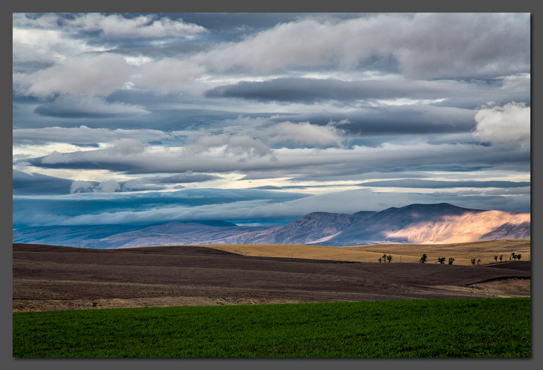
I'm not sure how many members here may be familiar with Oregon, but Spanish Hollow is a short valley in the north central part of the state that climbs from the Columbia River to the plateau above. Having just driven up, I looked behind me and saw this scene. I was struck by the layers of clouds atop layers of land, so I searched around for a suitable spot from which to photograph it.
I would appreciate any impressions and thoughts that you might share about this image.
 Helpful Posts: 0
Results 1 to 20 of 20
Thread: Spanish Hollow Layers
-
31st July 2013, 04:04 AM #1

- Join Date
- Mar 2012
- Location
- Oregon, USA
- Posts
- 212
- Real Name
- Arlen
Spanish Hollow Layers
-
31st July 2013, 04:11 AM #2
- Join Date
- May 2012
- Location
- northern Virginia suburb of Washington, DC
- Posts
- 19,064
Re: Spanish Hollow Layers
The layers are just terrific, Arlen. I could study a large print of this forever and never tire of the details.
Consider toning down the bright area considerably. For me, that much brightness is a distraction that makes my eye go immediately to the right side of the frame, rather than follow the horizontal striations that are so exquisite.
-
31st July 2013, 06:02 AM #3

- Join Date
- Dec 2010
- Location
- Southland - New Zealand
- Posts
- 473
- Real Name
- Robin
Re: Spanish Hollow Layers
I am trying to make up my mind.
It is great, sharp, just love the mountains, sky, blue and browns
but I have been looking at it without the green forground.
For me I am wondering if that is better. Maybe I will come back to it and think some more.
-
31st July 2013, 06:47 AM #4
- Join Date
- Jan 2011
- Location
- Kennewick, WA
- Posts
- 565
- Real Name
- Bob R
Re: Spanish Hollow Layers
I like it the way it is. I am often in the desert and even where the sun is shinning, it's akin to what I'm used to seeing. I am a cloud person myself and these just yell out. But one has to click on the image to see it in the lite box.
-
31st July 2013, 06:51 AM #5
- Join Date
- Nov 2012
- Location
- Australia (East Coast)
- Posts
- 4,524
- Real Name
- Greg
Re: Spanish Hollow Layers
Beautiful composition of layers, Arlen. I love those cloud layers.
I migh crop about half the green from the bottom.
-
31st July 2013, 09:18 AM #6
- Join Date
- Jun 2013
- Location
- North West of England
- Posts
- 7,178
- Real Name
- John
Re: Spanish Hollow Layers
Arlen, that's a lovely image. A definite wall hanger. Agree with losing a some of the green at the bottom for me it's not essential.
-
31st July 2013, 01:11 PM #7

- Join Date
- Apr 2012
- Location
- New Jersey, USA
- Posts
- 800
- Real Name
- Ken Curtis
Re: Spanish Hollow Layers
Hi Arlen.
I disagree with the others in cropping off half of the green. I suggest you try to lighten it just a little as that will emphasize the layers even more so. I love the details in the clouds, and I like the trees on the right as they give the eye something specific to enjoy. Well done.
-
31st July 2013, 02:49 PM #8

- Join Date
- Dec 2009
- Location
- WNY
- Posts
- 36,716
- Real Name
- John
Re: Spanish Hollow Layers
Very nice image. I wouldn't change anything.
-
31st July 2013, 04:55 PM #9

- Join Date
- Jan 2012
- Location
- Albertville, Mn
- Posts
- 1,567
- Real Name
- randy
Re: Spanish Hollow Layers
I am obviously going to run counter to previous posts, but I would crop about 1/3 off the clouds above. I think it makes a stronger composition.
-
31st July 2013, 07:01 PM #10
- Join Date
- Mar 2012
- Location
- Oregon, USA
- Posts
- 212
- Real Name
- Arlen
Re: Spanish Hollow Layers
Wow, I'm really impressed with the number of quick and helpful responses. I appreciate them all.
The diversity of opinion on the optimal processing treatment reflects the path I myself have wandered down to get to this point. It was time to get some more eyes and minds involved, to see if maybe a consensus would emerge. Not yet, apparently!
Mike, I see your point about the bright area on the right, and have gone back and forth on that myself. On the one hand, there's the useful guideline to avoid drawing the eye out of the frame, and part of me says get rid of it. On the other hand, the sunny patch was actually there, adding rather than detracting from the scene at the time; and part of me likes its contrasting warmth against the coolness of the sky. Sitting as it does in the area near the other focal point, the trees, seems to be a suitable place for the eye to come to rest. But maybe its brightness causes that to happen too soon.
How best to render the green field at the bottom, in terms of amount, brightness, contrast, etc., is something else I have played with extensively. I settled on this version, but will look again with fresh eyes.
I'll ponder the suggestions and come back with another version a little later for comparison. In the meantime, any further thoughts are most welcome.
-
31st July 2013, 08:47 PM #11

- Join Date
- Jul 2011
- Location
- British Columbia, Canada
- Posts
- 7,244
- Real Name
- Christina
Re: Spanish Hollow Layers
Stunningly beautiful, and perfect as is...
-
31st July 2013, 09:11 PM #12
- Join Date
- Dec 2010
- Location
- Southland - New Zealand
- Posts
- 473
- Real Name
- Robin
Re: Spanish Hollow Layers
I love your own critique. Originally Posted by Arlen

I thought similar thoughts to others about cropping some of the green out, but never said. Interesting that you have been pondering that as well.
Although the sun sghines brightly on the hills and does draw nmy eye, I too thought it was there, and in this case I didn't want to change it.
This photo and the comments show just how subjective it all is.
-
31st July 2013, 11:26 PM #13
- Join Date
- Mar 2012
- Location
- Oregon, USA
- Posts
- 212
- Real Name
- Arlen
Re: Spanish Hollow Layers
Christina and Robin, thanks for weighing in. Your comments are much appreciated.
Taking everyone's ideas into consideration, I've gone back and tested out some modifications to the image. Three versions are presented below. If you open the original image in the Lite Box by clicking it, you can then easily compare it to the new versions by clicking the arrow button at the bottom of the Lite Box.
Version 2: I abridged the sunlit area on the right side, so that it doesn't run off the edge and lead the eye so definitively outside the frame. I also cooled off the sunlight a tad, as I thought maybe that area was just a little too warm.

Version 3: I darkened the entire sunlit area considerably, so that it doesn't as strongly draw your attention; and further adjusted the color temperature to the cool side to match the surrounding area.

Version 4: Starting with version 3, about half of the green field at the bottom was cropped off.

Of course there are many other possible permutations intermediate between, or altogether different from, the ones shown here.
Thoughts and preferences? So as not to possibly bias anyone, I will hold off saying which way I am currently leaning.Last edited by Arlen; 31st July 2013 at 11:42 PM.
-
1st August 2013, 12:41 AM #14
- Join Date
- May 2012
- Location
- northern Virginia suburb of Washington, DC
- Posts
- 19,064
Re: Spanish Hollow Layers
Arlen,
I'm a firm believer that most (but not all) photographs tell a story and this photo is no exception in my mind. You have refined the photo to such a degree that it now comes down to what story you want to tell. In that sense, it really doesn't matter what I or anyone other than you thinks, and that is as it should be unless you are photographing for a client.
Considering that you're giving me the opportunity to choose, it will come as no surprise to you that I prefer the last two versions because of the darkened bright area on the right that I suggested.
As to which of those last two versions that I prefer, that comes back to which story you want to tell. Both versions are fabulous but one emphasizes the sky more than the other one. If you want to emphasize the sky, I recommend going with Version 4. If not, I recommend Version 3.
-
1st August 2013, 12:50 AM #15

- Join Date
- May 2012
- Location
- Carrollton, Georgia (USA)
- Posts
- 2,757
- Real Name
- Bruce
Re: Spanish Hollow Layers
Arlen, these photographs are all great.
Bruce
-
1st August 2013, 12:56 AM #16
- Join Date
- Jul 2012
- Location
- I live a stone's throw away from Cuyahoga National Park (NE, Ohio)..
- Posts
- 1,247
Re: Spanish Hollow Layers
Arlen, nice images. There are so many ways to process a picture like this. My favorite is no.3.
karm
-
1st August 2013, 04:13 AM #17
- Join Date
- Dec 2010
- Location
- Southland - New Zealand
- Posts
- 473
- Real Name
- Robin
Re: Spanish Hollow Layers
Well, like Mike I like the last two photos.
I think you have done a great job, my personal preference is for the 4th one, however if I had not seen no 4, I would be very happy with 3.
For the moment your photo is a backdrop on my computer - I think it is a superb photo.
I love the hills and the sky. colours/contrast, of course I am a fool for blue.
(I just love the colours of the Adriatic, (Italy-Croatia) especially with the white beach colours)
Mike I enjoyed (wrong word) your comments immediately above (which is not to say I didn't like your earlier comments).
They give me something to think about, I certainly appreciate your comments on the way the photo tells a story.
That is why I often think "what right have I to comment" as after all it is subjective.
We all see through our own eye, and often can see what others see.
Rbn
-
1st August 2013, 05:04 AM #18
- Join Date
- Mar 2012
- Location
- Oregon, USA
- Posts
- 212
- Real Name
- Arlen
Re: Spanish Hollow Layers
Great input from all of you. Mike, I too like your comments about story telling, and I've given more thought to it.
For me the primary choice is between versions 2 and 3. The layers of land and sky and how they interacted in that spot at that moment to make a whole that fit together harmoniously was the main "story" I wanted to portray. To me version 3 conveys that feeling of harmony of elements better than versions 1 or 2, because the sunlit area in the latter two disrupts rather than blends into the other layers. Version 4 does that too, but to me feels somehow less balanced, missing a part of one of the land layers.
I see version 2 as a substantial improvement over version 1. By not letting the bright area bleed out of the frame, my eye stops and rests at a reasonable place. And though lacking the harmony of version 3, the contrast provides a certain beguiling (to me) snap, and moreover it was actually present in the live scene. While I'm certainly no slave to reality (the instant we make a photograph, we have departed from it), I do give it a strong nod.
So which story will I finally settle on, 2 or 3? The decision may require some time, but at this moment I am leaning toward 3.
Of course it is all very subjective, but subjective conundrums are the very ones that benefit most from the input of others. Thanks to you all for playing a part in this process. And for the encouragement that your words and interest provide.
-
1st August 2013, 05:45 AM #19
- Join Date
- Dec 2010
- Location
- Southland - New Zealand
- Posts
- 473
- Real Name
- Robin
Re: Spanish Hollow Layers
Again, thank you Arlen, and Mike for your commentary on the photo(s).
Thought provoking to read your comments.
Let me add, of course it is subjective, 3+4 appeal because I see more detail in the "bright" area, it still attracts the eye, to itself and the trees, but not as powerfully as 1+2.
I guess the full green forground in all but 4 seems too much to my eye.
However, I wasn't there, I didn't take the photo, I didn't try to process it, and won't.
I am enjoying version 3+4.
Like I said already, the blue sky, brown hills and the intermediate between the hills and forground really attract me.
Of course we bring lots of previous scenes with us when we see your scene.
So how to expain that, I guess we can't.
Great work
-
1st August 2013, 08:30 PM #20
- Join Date
- Mar 2012
- Location
- Oregon, USA
- Posts
- 212
- Real Name
- Arlen
Re: Spanish Hollow Layers
Thank you Robin. I really appreciate your taking the time to consider the options and provide valuable feedback.

 Reply With Quote