
 Helpful Posts:
 My goals for this year are to continue to improve my photography skills, and to continue learn how to edit to enhance my photos.
I just moved back to Vancouver from Mexico, and I am adjusting to taking photos in different light conditions, right now in overcast and rainy conditions, and of different things.
Here are some recent shots, taken on a foggy day. Any and all feedback is appreciated.
Aperture Priority varying from F6 to F8, iso varying from 160-400.
I think these two are kind of pretty, but they also also dark and gloomy. The histogram is on the dark side, but if I try to up the exposure to correct this, it just does not look right. I used curves to edit to increase the contrast which also made the background of the photo darker. Are they too dark?
Here is an another almost shot (shutter priority 800, F6, iso 320, plus .3 exposure comp..) How could I have done this better?
Any tips for photographing in foggy conditions would truly be appreciated? Thank you.
Results 1 to 20 of 42
Thread: Project 52 - 2013
-
7th February 2013, 08:18 PM #1


- Join Date
- Jul 2011
- Location
- British Columbia, Canada
- Posts
- 7,244
- Real Name
- Christina
Project 52 - 2013
-
8th February 2013, 06:45 AM #2
- Join Date
- Dec 2012
- Location
- French Catalunia
- Posts
- 232
- Real Name
- mat
Re: Project 52 - 2013
Hello Christine, bit of a change from Mexico I would think ?
I like your shots but I think they do seem a little 'gloomy'. Speaking as an instinctive, rather than expert, camera carrier I suspect you should try using the M setting rather than the Aperture priority, I think this will give you more control over brightness/ contrast etc. The flying duck probably needs a fast shutter speed and doesn't require a huge depth of field, though this makes getting the shot even harder. . .!
Personally I struggle to capture the 'moodiness' of shooting in fog so can not offer any suggestions except try, and try again. And when you're through trying, try some more.
Hope you enjoy Vancouver, and hope this was helpful
mat
-
8th February 2013, 07:18 AM #3

- Join Date
- Sep 2012
- Location
- Nomadic but not homeless, ex N.Z. now Aust.
- Posts
- 4,167
- Real Name
- Paul

Re: Project 52 - 2013
Fog lowers contrast and saturation which needs to be corrected with caution and sympathetically. A bit heavy handed and it does not work. In photoshop I used to do my initial adjustment with levels. In Lightroom 4 I use the whites and blacks adjustments followed by upping the saturation and vibrance a bit more than I normally would.
I think the first two photographs has been done well but I think need a bit of cropping and lifting the highlights a fraction. Try and avoid placing the main point of interest on or near the centre unless it is a very deliberate composition choice. I know it is a bit cliché but on a third seems to work most times.
The horizon or anything floating must look absolutely level otherwise it annoys grumpy old men not that they matter but I think your levels are pretty good.Last edited by pnodrog; 8th February 2013 at 07:31 AM.
-
8th February 2013, 02:38 PM #4
- Join Date
- Jul 2011
- Location
- British Columbia, Canada
- Posts
- 7,244
- Real Name
- Christina
Re: Project 52 - 2013
Hello Matt, Yes, it's a huge change from Mexico. Thank you, your suggestions are very helpful. I had my camera on aperture priority because initially I was hoping to catch the swans in action, switched to capturing the scenery and forgot. Next foggy day, I will try manual.
L Paul, thank you. Very helpful. I will try editing using your suggestions, and post later. For foggy days would it work well to set the tone curve in camera to achieve higher contrast?
Sorry about the horizon. Will fix.
-
8th February 2013, 03:35 PM #5

- Join Date
- Dec 2009
- Location
- WNY
- Posts
- 36,716
- Real Name
- John
Re: Project 52 - 2013
Very, very nice, I like each of them just as they are. The imagery or symbolism of fog is subjective, each of us react to it in different ways.
-
8th February 2013, 09:16 PM #6Moderator

- Join Date
- May 2008
- Location
- Windsor, Berks, UK
- Posts
- 16,775
- Real Name
- Dave Humphries :)
Re: Project 52 - 2013
Hi Christina,
Like John, I don't feel they particularly need the exposure boosting.
If I have one observation, it would be that the subjects are rather central in the frame - I'm the first to appreciate that they need to be there for focusing, but I usually crop to get a better composition in PP.
Hope that helps,
-
9th February 2013, 05:15 AM #7
- Join Date
- Jul 2011
- Location
- British Columbia, Canada
- Posts
- 7,244
- Real Name
- Christina
Re: Project 52 - 2013
Thank you John and Dave... Yes, Dave very helpful. Thank you.
Cropped and straightened, although straightening was a challenge because the photos are so dark. (hard to see the horizon)
L Paul I tried your suggestions in Photoshop Elements 9, and I can see how increasing the contrast and saturation, would help these types of photos, even though it did not work that well here. (I'm still learning to edit photos) I could not figure out what to do with the levels. I tried to edit on the separate channels, but everything kept turning a funky colour, and even increasing the saturation made the swans a little yellow.
Photoshop Elements

Kind of yellow...

Lightroom 4.1
L Paul this seemed to be easier for me, ie just playing with the white and black sliders, and the saturation and vibrancy sliders.
I don't like this edit but it was a good lesson in editing for me.
Kind of green
I do like this edit, which was a mistake when I was playing with the white and black sliders in LR.
Has potential

Thank you to all for helping.
-
9th February 2013, 06:48 AM #8
- Join Date
- Sep 2012
- Location
- Nomadic but not homeless, ex N.Z. now Aust.
- Posts
- 4,167
- Real Name
- Paul
Re: Project 52 - 2013
This is a shot at placing the two swans on the thirds (1/3 from left and 1/3 from bottom) and it seems to work.

-
9th February 2013, 04:19 PM #9
- Join Date
- Jul 2011
- Location
- British Columbia, Canada
- Posts
- 7,244
- Real Name
- Christina
Re: Project 52 - 2013
Thank you L Paul... I guess I avoided cropping there because it puts the horizon in the middle... It looks better... Did you edit the photo to improve it? If yes, what did you do? Or does it just look improved because it is smaller in size, and one can't see all its' faults?
-
9th February 2013, 06:21 PM #10
- Join Date
- Sep 2012
- Location
- Nomadic but not homeless, ex N.Z. now Aust.
- Posts
- 4,167
- Real Name
- Paul
Re: Project 52 - 2013
Christina the photo only needed minor adjustments that I did using curves where I lowered the deep shadows, boosted the the mid tones a bit and then the highlights. After doing that I did curve adjustments on the red channel pulling the red down a fraction but the photo still had a magenta cast so I increased the green curve a tiny amount.
-
9th February 2013, 06:59 PM #11

- Join Date
- Feb 2013
- Location
- in Your mind
- Posts
- 32
Re: Project 52 - 2013
Hi L Paul, by this style curve editing you did, is this what is referred to as the "S curve" ? Originally Posted by pnodrog

I have a general feel to the curves, but don't truly understand them to be honest, kind of just sit there moving them about a little bit to make the colours have greater impact.
-
9th February 2013, 07:01 PM #12
- Join Date
- Jul 2011
- Location
- British Columbia, Canada
- Posts
- 7,244
- Real Name
- Christina
Re: Project 52 - 2013
Thank you for doing this.. It helps me to learn by seeing another persons edit, and I suppose I will get better at it with practice.
Rob, I will let L Paul answer that as I don't have much experience at this, but yes, I believe he is referring to the S curve in the first part of his statement, and for the 2nd part I think he used levels to change the curve on just the red channel, and this is where you can edit individual channels of colour, red, green and blue... I tried it on my photo but everything I tried made the colours look wonky, so I just used the default curve under curves.
?Last edited by Brownbear; 9th February 2013 at 07:30 PM.
-
9th February 2013, 07:33 PM #13
- Join Date
- Sep 2012
- Location
- Nomadic but not homeless, ex N.Z. now Aust.
- Posts
- 4,167
- Real Name
- Paul
Re: Project 52 - 2013
Yes it was basically an s curve but not at all symmetrical. The bulk of the s shape was small and down in the shadow area and then the top lifted slightly about 2/3rds up the overall range. Originally Posted by Dukatum
-
9th February 2013, 07:40 PM #14
- Join Date
- Jul 2011
- Location
- British Columbia, Canada
- Posts
- 7,244
- Real Name
- Christina
Re: Project 52 - 2013
Paul, was what I said correct? And how do you know when you are in the red channel, which sliders to pull, and where and how much? Simply by the look?
-
9th February 2013, 09:46 PM #15
- Join Date
- Sep 2012
- Location
- Nomadic but not homeless, ex N.Z. now Aust.
- Posts
- 4,167
- Real Name
- Paul
Re: Project 52 - 2013
Yes, you need to believe your eyes so normally it is just the look. For fine adjustments I nearly always work on the curves by dragging them at different points until I get the right shape(result). For the adjusted green curve in your photo just glancing at the curve it may not even be noticed that it had been pulled up silghtly but when looking at the image it is obvious. Originally Posted by Christina S
NOTE: I used curves not levels for all these adjustments. For big adjustments I will use levels but all the really fine tweaking I tend to do using curves. These are all done in photoshop. When using lightroom my approach is slightly different but I seldom import anyone else's images into lightroom.Last edited by pnodrog; 9th February 2013 at 10:00 PM.
-
9th February 2013, 10:58 PM #16
- Join Date
- Jul 2011
- Location
- British Columbia, Canada
- Posts
- 7,244
- Real Name
- Christina
Re: Project 52 - 2013
thank you
-
11th February 2013, 08:58 PM #17Moderator
- Join Date
- May 2008
- Location
- Windsor, Berks, UK
- Posts
- 16,775
- Real Name
- Dave Humphries :)
Re: Project 52 - 2013
Yes, it just needs a bit of rotation to make the reflection fall vertically below the real thing, it is easy to check this with the crop tool. Originally Posted by Christina S
Here I just put the vertical edge of my screen snipper alongside the necks to demonstrate;
Just needs a tad clockwise.
HTH,
-
12th February 2013, 01:09 AM #18
- Join Date
- Jul 2011
- Location
- British Columbia, Canada
- Posts
- 7,244
- Real Name
- Christina
Re: Project 52 - 2013
Thank you so much Dave... I did not notice that the photo was not perfectly straight, and now I see and understand how to see and fix that.
Originally Posted by Dave Humphries
-
14th February 2013, 08:42 PM #19
- Join Date
- Jul 2011
- Location
- British Columbia, Canada
- Posts
- 7,244
- Real Name
- Christina
Re: Project 52 - 2013
This week we have
Floating Geese Aperture priority F10 1SO 400
which I edited by hitting auto fix in Photoshop Elements 9, and using local contrast enhancement. I could not manage a shot of the geese from the front as they were intent on not heading my way.

And Flying Geese
Aperture Priority 5.6 Exposure +.7 ISO 800
(adjusted shadows using curves and local contrast enhancement to sharpen)
I know it is not a great shot, but it represents the types of shots I would like to be able to do well and I was pleased to actually get 3 birds in flight in one shot.
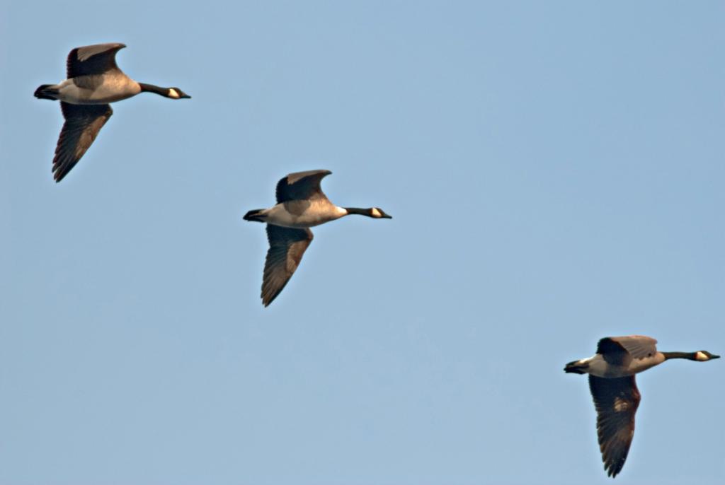
And here I used DE-speckle in Photoshop Elements to try and decrease the noise. Does it help? I chose DE-speckle because I could see lots of speckles in the sky and it seemed to suit the problem?

-
14th February 2013, 09:36 PM #20
- Join Date
- Apr 2012
- Location
- Dunedin New Zealand
- Posts
- 2,697
- Real Name
- J stands for John
Re: Project 52 - 2013
So you captured three birds in flight ... good!
But that is not the end of the story I feel and one has two options [ at least ] which are to increase canvas size and clone across sky so that the lead bird has 'room to flying into' or else to copy it and move it back a bit for the same reason and then clone sky to cover where it was .... that including my coupling the two images into one is fairly easy when you have layers as I believe your editor has. [Sorry its nose is a little cloned out doing it the first way]

A basic guide I follow is that there should always be more room ahead of a moving subject than behind it ... room to breath etc.Last edited by jcuknz; 14th February 2013 at 09:47 PM.


 Reply With Quote