
Different as in not creepy or scary.
Different as in style and mood.
1.
2,
3.
 Helpful Posts: 0
Results 1 to 20 of 22
Thread: Different
-
15th November 2012, 07:07 PM #1

- Join Date
- Apr 2011
- Location
- Ontario (mostly)
- Posts
- 6,667
- Real Name
- Bobo
Different
-
15th November 2012, 07:12 PM #2

- Join Date
- Jul 2011
- Location
- Ontario, Canada
- Posts
- 1,300
- Real Name
- Andrew
Re: Different
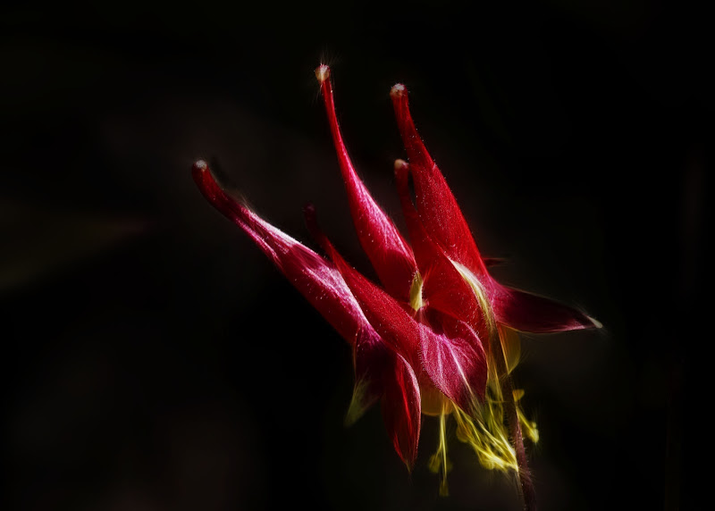
#3 has it for me. If 'style and mood' were what you were going for, that is it. It should be about 24x30, and canvased, hanging on someone's great room wall.
I really like that one.
-
15th November 2012, 07:43 PM #3
- Join Date
- Apr 2011
- Location
- Ontario (mostly)
- Posts
- 6,667
- Real Name
- Bobo
Re: Different
Thanks Andrew, I might just do that but hang it on my own wall.
-
16th November 2012, 07:33 PM #4
- Join Date
- Jan 2012
- Location
- Jackson Hole, Wyoming, USA
- Posts
- 959
- Real Name
- Chuck
Re: Different
Bobo, Number 3 is a very nice photo. I like everything about it.
-
16th November 2012, 07:45 PM #5

- Join Date
- Jun 2012
- Location
- Colorado & Texas, USA
- Posts
- 2,031
- Real Name
- Terri
Re: Different
ooh, ooh, ooh... I LOVE #3. That is stunning!
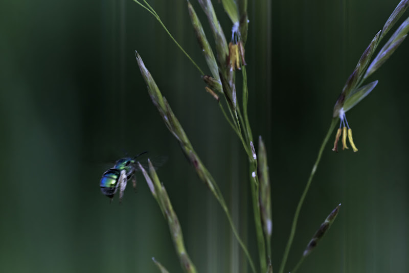
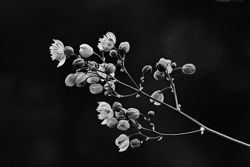
OK, not to ignore the other two. I really like the colors in the first one but it seems like the focus is soft. Maybe that's what you were aiming for (or it very well could be my eyes) but I want that insect to be sharper. The second one, I can't really articulate why it doesn't strike me but I am wondering what that thing is to the right.
but wow... that third one...
-
16th November 2012, 07:59 PM #6Moderator

- Join Date
- Feb 2009
- Location
- Glenfarg, Scotland
- Posts
- 21,402
- Real Name
- Just add 'MacKenzie'
Re: Different
I'm going with the rest of the folks (too frightened to disagree!) and identify #3 as a beautiful image. It's actually quite a complicated structure simply presented and that, for me, is its beauty. The tones, shapes and texture are sublime.
But I want to ask one thing - What do you think of going to a 7:5 (14:10) ratio by keeping the top, bottom and right hand side as is and cropping off the left-hand side? I accept that people might feel it then constrains the plant too much inside the frame and doesn't give it room. But this thought came into my head as soon as I saw it and I tried it on a copy I took down and liked it.Last edited by Donald; 16th November 2012 at 08:06 PM.
-
16th November 2012, 10:49 PM #7
- Join Date
- Jan 2011
- Location
- Tennessee
- Posts
- 1,732
- Real Name
- james
Re: Different
Its 3 for me too Bobo, I like it for all the reasons Donald said. I just didnt know it until he said it lol. I loved your presentations with birds but I see you were far from limited to just birds .
-
16th November 2012, 11:40 PM #8New Member
- Join Date
- Nov 2012
- Location
- South Korea (temporarily)
- Posts
- 3
- Real Name
- Justin
Re: Different
#3 is fantastic! How did you get such a black background? Any software manipulation?
-
16th November 2012, 11:45 PM #9

- Join Date
- Feb 2011
- Location
- Seymour, Vic., Land of Oz
- Posts
- 1,293
- Real Name
- Ken Outch
Re: Different
Bobo
Have to go with the flow. Number 3 is a real winner. Agree with Donald about a very mild crop of dead space on LHS might be interesting.
#2 is very interesting. Quite Ethereal result which I find very appealing.
For me #1 is a bit too soft. The impact of the insect on the LHS which has the potential to have been a dramatic eye catcher seems a bit lost because of this IMO.
-
17th November 2012, 12:56 AM #10
- Join Date
- Apr 2011
- Location
- Ontario (mostly)
- Posts
- 6,667
- Real Name
- Bobo
Re: Different
LOL, I thought the thread was dead having already gone into page 2.
Thanks Chuck, Terri, Donald. James, boomingemu, Ken for the excellent comment.
#1 - agreed. It is soft and not as nice as I first thought it was. It was a try at a pastel like treatment. Back to the drawing board on that. No point redoing it but will try pp refinement with a better image should the chance come up. I was probably drawn to the nice spread of colour but ignored the quality of the shot.
#2 - another experiment that may or may not have gone too well. It was given a tiny bit of fractals treatment to emphasise the ray of light going in from right to left. On reflection, the LH leaf could have been taken out. Not sure about the right hand branch - instinct says takes it out but then the light direction would be lost. Probably not worth redoing so will leave it at that.
#3 - Happy this one meets with approval. 1:3 is pretty good for me. Will redo the crop as suggested. It was an attempt at a "Donald" treatment. In response to boomingemu - this was pretty much out of camera due to the angle of light, the angle of the shot and that the background was pretty dark anyway.
Thanks everyone, couple of very good lessons learned.
-
17th November 2012, 02:12 AM #11
- Join Date
- Jul 2011
- Location
- Ontario, Canada
- Posts
- 1,300
- Real Name
- Andrew
Re: Different
See, I told you!

-
17th November 2012, 04:18 AM #12
- Join Date
- Apr 2011
- Location
- Ontario (mostly)
- Posts
- 6,667
- Real Name
- Bobo
Re: Different
Yes you did. Originally Posted by Andrew76


Btw was looking at your pics - some awesome stuff there.
-
17th November 2012, 06:32 AM #13
- Join Date
- Feb 2011
- Location
- Seymour, Vic., Land of Oz
- Posts
- 1,293
- Real Name
- Ken Outch
Re: Different
Bobo
Not too sure what was in your mind with #2. But I really like it and just had to have a play with it, in the hope you would not mind. It is a great capture which fascinates me. Anyway, I took out the two side 'distractions' and had a play with selective sphererize distort filter, trying to bring out the core subject. Hope this taking of liberty with your post does not offend you. Not my intent to try in any way to attempt to 'improve ' on your original post. Just looking at it on a 'what if' basis...
Ken

-
17th November 2012, 10:35 AM #14

- Join Date
- Sep 2011
- Location
- Columbus, Ohio, USA
- Posts
- 1,960
- Real Name
- Kevin
Re: Different
Bobo,
#3 is just stunning, a true piece of art. I wouldnt give up on #2, a more central crop similar to Ken's suggestion works for me, and sans peripheral distractions, pulls us right into a really lovely and mysterioiusly beautiful image.
-
17th November 2012, 10:47 AM #15
- Join Date
- May 2012
- Location
- Johannesburg South Africa
- Posts
- 2,547
- Real Name
- Andre Burger
Re: Different
Well done Bobo. Agreed on No 3.
I think No 1 is one of those shots that just happened, you aim to shoot and this bug comes flying in and out. To quick to get proper focus. I caught a honey bee like that, yesterday. I was lucky to get her in focus.
PS: I like what Ken has done to No 2.
-
17th November 2012, 11:53 AM #16
- Join Date
- Apr 2011
- Location
- Ontario (mostly)
- Posts
- 6,667
- Real Name
- Bobo
Re: Different
Thanks Ken, that is a great presentation. Personally, I feel honoured that someone would take the time and make the effort on any of my images to make me see things in a different way. Seeing an example is a great learning experience for anyone particularly myself who gets into a rut more often then I care to admit.
Thanks Kevin. Ken has done a great job on this so the respectful thing to do is to re-work it myself.
Thanks Andre - exactly as you say. It was'nt even supposed to be in there...
I will attempt to replicate Ken on #2 and re-do #3's cropping and post those later.
-
17th November 2012, 12:26 PM #17

- Join Date
- Jul 2011
- Location
- British Columbia, Canada
- Posts
- 7,244
- Real Name
- Christina
Re: Different
Adore #3... Simply stunning
-
17th November 2012, 04:11 PM #18
- Join Date
- Apr 2011
- Location
- Ontario (mostly)
- Posts
- 6,667
- Real Name
- Bobo
Re: Different
Thanks Christina. Glad you like it.
---------
Edits.
2a.
3a

-
17th November 2012, 04:31 PM #19
- Join Date
- May 2012
- Location
- northern Virginia suburb of Washington, DC
- Posts
- 19,064
Re: Different
Despite that I have absolutely nothing new to add to the thread, I'm compelled to mention that #3 is masterful.
-
17th November 2012, 08:15 PM #20
- Join Date
- Sep 2011
- Location
- Columbus, Ohio, USA
- Posts
- 1,960
- Real Name
- Kevin
Re: Different
3a - perfect
2a - I'd think you've lost some of the ethereal "mystery" by the crop of the translucencies to the immediate left of the flower. I'd recommend a synthesis of your crop and Ken's- taking out all the stuff from the right, and just the far left leaf.


 Reply With Quote