
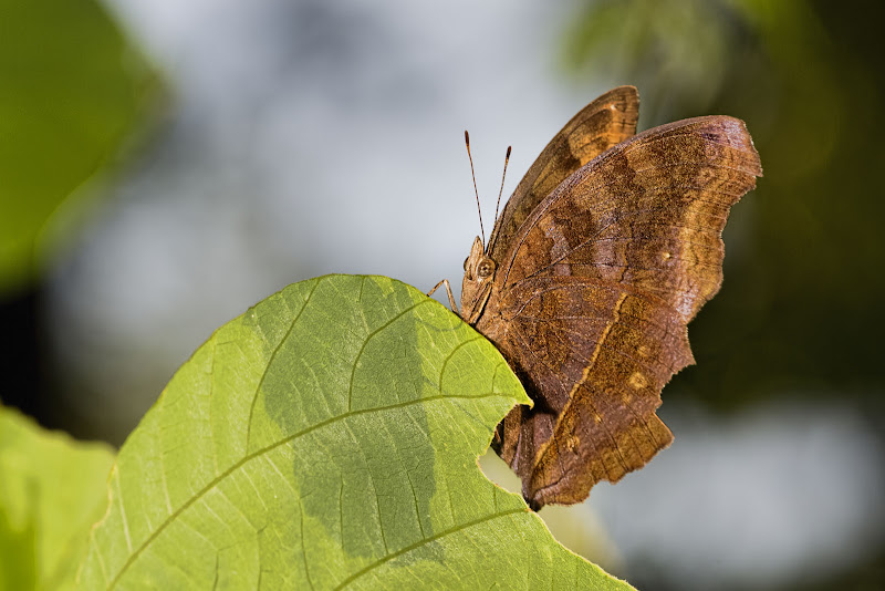
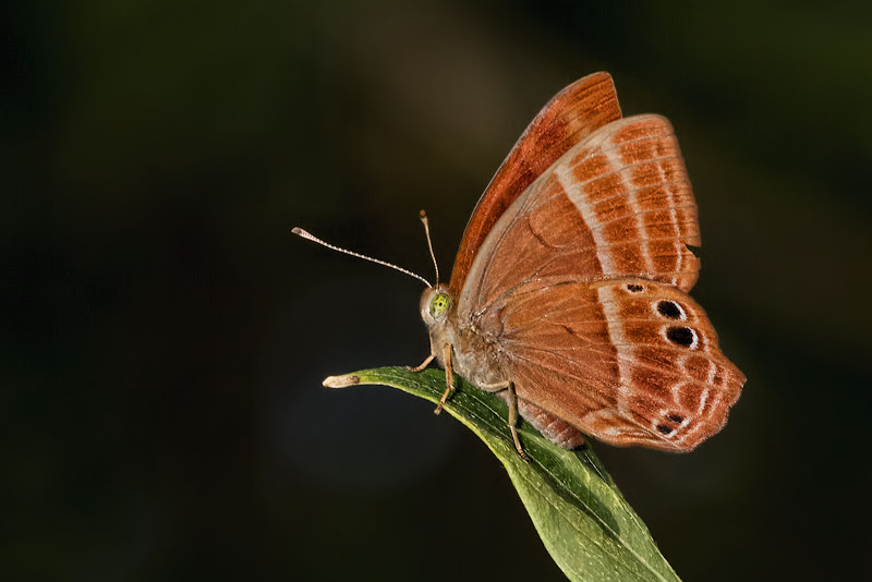
A couple of butterflies taken over the past week or so.
Of course, comments and suggestions always welcomed and appreciated. How else can we improve otherwise?
No idea about ID but if someone knows please help out.
Hope you like.
Thanks for viewing.
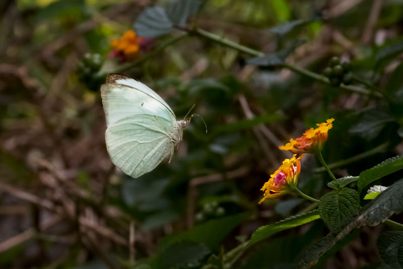
1.
2.
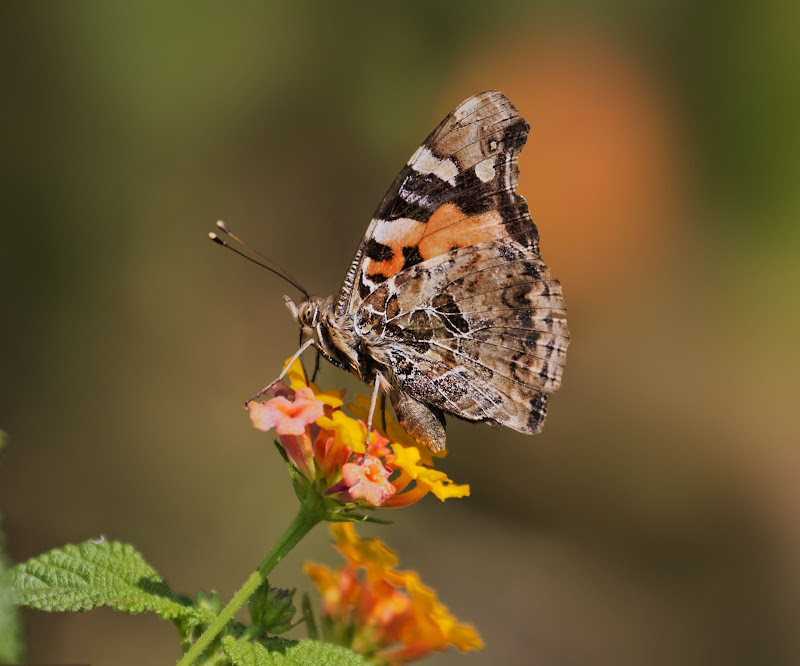
3.
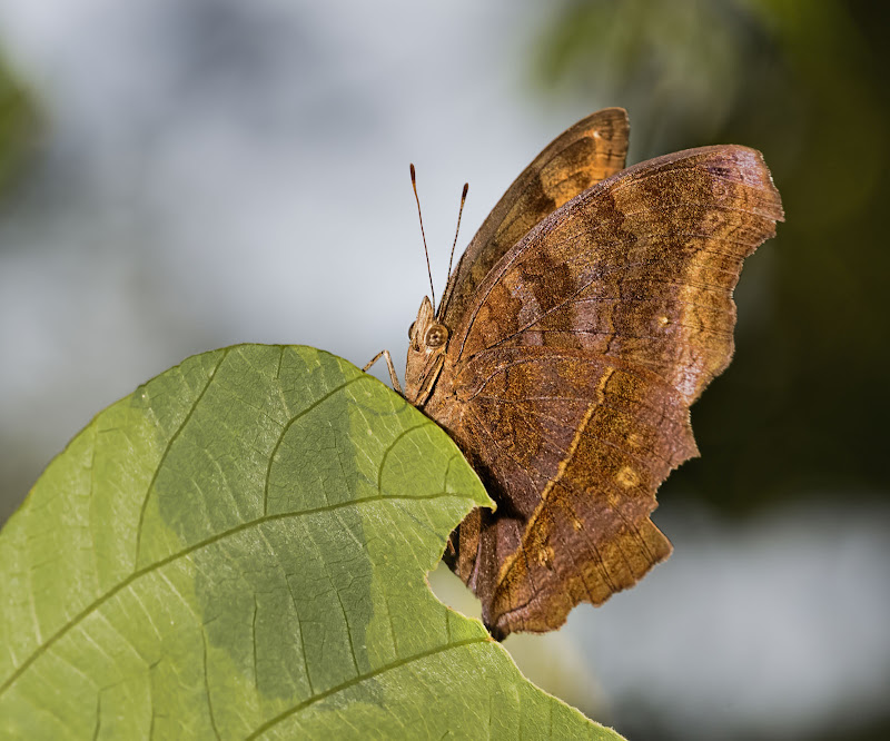
4.
5.
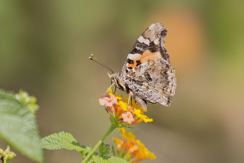
6.
 Helpful Posts: 0
Results 1 to 15 of 15
Thread: Wings
-
13th November 2012, 03:18 AM #1

- Join Date
- Apr 2011
- Location
- Ontario (mostly)
- Posts
- 6,667
- Real Name
- Bobo
Wings
-
13th November 2012, 03:32 AM #2

- Join Date
- Jan 2011
- Location
- Seattle Washington
- Posts
- 3,550
- Real Name
- Paul
Re: Wings
All are nicely done Bobo. The first one suffers a little from the background and not quite enough DOF but it is a nice image. #2 is good timing but a bit busy. #3 is likely my favorite between clearity and color, very nice. #4 is nice but maybe slightly soft in the face. A tighter crop to get rid of the extra leaves might help. #5 is nice, I would crop off the left side. And last but not least my second favorite, nice clean background good focus. Well done.
-
13th November 2012, 03:47 AM #3
- Join Date
- Apr 2011
- Location
- Ontario (mostly)
- Posts
- 6,667
- Real Name
- Bobo
Re: Wings
Thanks Paul for the detailed commentary. Will see what can be done and redo.
-
13th November 2012, 04:36 AM #4
- Join Date
- Apr 2011
- Location
- Ontario (mostly)
- Posts
- 6,667
- Real Name
- Bobo
Re: Wings
Well that was not hard. Only needed a bit of work.
Re-works.
1a.

2a.
3a.

4a.
5a.
Last edited by Bobobird; 13th November 2012 at 05:10 AM.
-
13th November 2012, 04:41 AM #5

- Join Date
- Aug 2012
- Location
- Northampton
- Posts
- 1,848
- Real Name
- Phil Page

Re: Wings
Hi Bobo
I've never tried macro, but have always been tempted! For me, #3 is my favourite image.
A quick question - are you sharpening and saturating the whole image? It just looks as if the out of focus areas have been sharpened - it could be a result of rescaling to a smaller resolution to post though. Or maybe a boost to the saturation and vibrance which is bringing out the definition around the areas with overlapping colours (bright green out of focus leaves vs. blue)
-
13th November 2012, 04:49 AM #6
- Join Date
- Jan 2011
- Location
- Seattle Washington
- Posts
- 3,550
- Real Name
- Paul
Re: Wings
All are an improvement I think. I think the first one is a Chinese peacock.

-
13th November 2012, 05:15 AM #7

- Join Date
- Feb 2011
- Location
- Seymour, Vic., Land of Oz
- Posts
- 1,293
- Real Name
- Ken Outch
Re: Wings
G;day Bobo
As with all you do, nicely done. And as sharp and crisp as a Spring morning here. And as is usual others see in our posts what we often miss. Your reworks have come up well. Small points I would raise, which are purely only my opinion and not tech bizzo, is that maybe 2a coud have just a whisker more shaved off all around. The orange blob in the back ground on 4a I found a little eye drawing, especially as it lines up with the same orange on the wing of the butterfly. For me 5a has a lovely diagonal
line through the leaf and the butterfly which I found most attractive. My favourite post would be 6 although I would prefer it more, perhaps, if there was a bit of a crop on the LHS. As for 3 or 3a this is a great capture of the butterfly, sharp, clear, crisp, nice colours. However I think it is one of those captures that will always have a problem with the background which is beyond complete resolution. But as I say, only my opinion on what is great work. Well caught. Thanks for sharing
Ken
-
13th November 2012, 05:15 AM #8
- Join Date
- Apr 2011
- Location
- Ontario (mostly)
- Posts
- 6,667
- Real Name
- Bobo
Re: Wings
Thanks Paul, still checking that place. Great shots there to study. hehe
-
13th November 2012, 05:41 AM #9
- Join Date
- Apr 2011
- Location
- Ontario (mostly)
- Posts
- 6,667
- Real Name
- Bobo
Re: Wings
Thanks Ken, much appreciated.
2/2a. I did think about that at pp but a closer crop would have diminished the shaft of light going through the top of the wing and hitting the flowers on the right. Taking out some of the left would have made the shot "unbalanced". So in the end opted for this crop. Would not have been posted if not for getting it sharp in flight.
3/3a. The sharp bits were all on the left and the tall grass was further off on the right. As can be seen from the angle it is not from my usual position of being at its level. I had no time to get in position - another tiny and very flighty one.
- 4/4a. That orange blob was there at capture. I had to move very fast on this one as it was constantly on the move. The only decent one of about 20 tries.
-
13th November 2012, 06:59 AM #10

- Join Date
- Feb 2012
- Location
- Tawau
- Posts
- 750
- Real Name
- Steven
Re: Wings
Hi Bobo
My favs are #1a; #4a and #6
the challenge is always to get a clean background so that the subject would stand out.
-
13th November 2012, 07:39 AM #11
- Join Date
- Apr 2011
- Location
- Ontario (mostly)
- Posts
- 6,667
- Real Name
- Bobo
Re: Wings
Thanks Phil.
Not quite sure about how to respond to the latter parts of your question. Please kindly elaborate. Thanks.
As for sharpening/boosts those are done selectively because one needs the subject to stand out and the background not to compete with it. Actually most times a moderate NR is run at the end to tone everything down somewhat for a smoother more polished look.
From all the education CiC has given me - the most important one is to work the historgram in pp - nothing blown, nothing clipped, no unusual colour casts (ie not blues over black, no cyans over green etc). No artifacts, little or no noise, no banding. Tons of good shots are discarded just because of this.
Sometimes I am thinking of print and will be mellower then a web shot. Posting one of those has got me into more trouble then not.
Last edited by Bobobird; 13th November 2012 at 07:56 AM.
-
13th November 2012, 07:59 AM #12
- Join Date
- Apr 2011
- Location
- Ontario (mostly)
- Posts
- 6,667
- Real Name
- Bobo
Re: Wings
Thanks Steven.
Yes that is THE most challenging. Always the greatest looking background ends up with a terribly shot subject.
-
13th November 2012, 08:03 AM #13

- Join Date
- Sep 2011
- Location
- Madrid
- Posts
- 452
- Real Name
- Tony Marshall
Re: Wings
Hi Bobo,
I particularly like 1a and 3a. The sharpness and brilliance of the butterfly in 1a really makes it for me.
But 3a is my favourite. I think that the background makes the image more interesting. (It's curious how our opinions can vary so much ) When I saw it, I was immediately reminded of computer animation films by the likes of Pixar. The arc of the leaf the butterfly is on is very attractive, and the out-of-focus leaves in the background cause my eyes to rove over them, but they always return to the sharply focussed butterfly. A very nice photo.
BTW, what lens did you use?
Tony
-
13th November 2012, 08:04 AM #14
- Join Date
- Aug 2012
- Location
- Northampton
- Posts
- 1,848
- Real Name
- Phil Page
Re: Wings
It must be just the bokeh of the lens then. I'm referring to the darker blue fringes around the leaf edges (top middle) Originally Posted by Bobobird

-
13th November 2012, 08:18 AM #15
- Join Date
- Apr 2011
- Location
- Ontario (mostly)
- Posts
- 6,667
- Real Name
- Bobo
Re: Wings
Thanks Tony. Appreciate the kind words. Should try more like this. The lens is the Canon 70-300 L.
Thanks Phil - oh you mean in 3/3a?? LOL. Yes that was the sky peeking into the gaps in the grass. I was going to tone that down but felt that it being there added something to the shot so left it alone as sort of a counterbalance to the large amount of green/yellow.


 Reply With Quote