
 Helpful Posts:
 This has no post production at all, any suggestions.
Results 1 to 10 of 10
Thread: Father and son
-
23rd July 2012, 10:23 PM #1

- Join Date
- Feb 2011
- Location
- Tin Can Bay Qld Australia
- Posts
- 14
- Real Name
- Bob
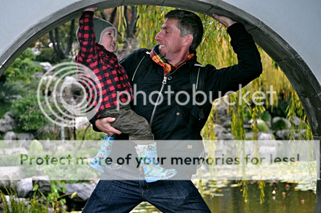
Father and son
-
23rd July 2012, 10:46 PM #2

- Join Date
- Nov 2011
- Location
- Essex, UK
- Posts
- 1,475
- Real Name
- John
Re: Father and son
Bob,
great idea.
On the C&C front, perhaps a little colour saturation and selective sharpening, might be worth considering. Overall one for the family album. Well done.
-
25th July 2012, 01:51 AM #3

- Join Date
- Oct 2010
- Location
- Oregon, USA
- Posts
- 117
- Real Name
- Shawn
Re: Father and son
Hey there Bob,nice. This is a nice shot of a priceless moment, good work. I would have to agree with John about the sharpening and saturation. I would also tinker with the contrast a little. This is what I would do with this shot.

-
25th July 2012, 01:42 PM #4
- Join Date
- Feb 2011
- Location
- Tin Can Bay Qld Australia
- Posts
- 14
- Real Name
- Bob
Re: Father and son
Thank you both John and Shawn. I can certainly see the difference. I am using GIMP, but it is slow going. I will keep at it. Thank you again.
-
25th July 2012, 06:33 PM #5Moderator

- Join Date
- Feb 2009
- Location
- Glenfarg, Scotland
- Posts
- 21,402
- Real Name
- Just add 'MacKenzie'
Re: Father and son
Stick with it, Bob. It's a great tool. Originally Posted by Bobix

Are you using any online tutorials? If you haven't found it, I strongly recommend Meet the Gimp (I have no stake in it, but found it a wonderful resource when I was trying to learn).
Depending where you feel you are on the learning curve, you can decide which video tutorials to view. If you feel you're pretty much at the beginning, then get into the archive section for the tutorials and Rolf's (site owner) own suggestion for the sequence of videos to follow to follow is:
001
066
037
025
003
004
005
009
010
Even though we're now few versions up from when Rolf started producing these, the early ones are still relevant in terms of grasping the basics.
-
25th July 2012, 07:23 PM #6
- Join Date
- Jan 2009
- Location
- South Devon, UK
- Posts
- 14,878
Re: Father and son
For me, Shawn's reworking is a little heavy on saturation and sharpening.
There are a few slight 'fringing' problems with your original shot, Bob, caused by light coming partly from behind. A very common occurrence, with little that you can do to avoid it.
Adding saturation and sharpness just makes the matter worse. So I agree with John's comment about 'a little colour saturation and selective sharpening.
-
30th July 2012, 03:50 AM #7

- Join Date
- Nov 2010
- Location
- Owensboro, KY
- Posts
- 1,530
- Real Name
- Brian
Re: Father and son
I love this photo!
I agree just a slight tweak in saturation would help along with some sharpening.
If this were my image, and I was using GIMP, I would start with a slight adjustment with the curves tool, tweaking the overall contrast a little bit. I don't usually mess with saturation in GIMP, I try to get this right in DPP before using GIMP (i know i have an odd work flow!). In this case, I suspect a little more saturation would help, though I'm very careful not to overdo it! Then I would apply a UnSharp Mask (aka USM), and I might try to add a very subtle vignette as well.
Are you using GIMP 2.8? I'm very excited because it allows very large feathered edges on selections/adjustments
-
30th July 2012, 05:21 AM #8
- Join Date
- Feb 2011
- Location
- Tin Can Bay Qld Australia
- Posts
- 14
- Real Name
- Bob
Re: Father and son
Brian, I am so new to GIMP I don't have a 'workflow'. I am studying Meet the GIMP tutorials and hope to improve. I have downloaded GIMP 2.8. Thank you for your suggestions.
-
30th July 2012, 05:48 AM #9

- Join Date
- Jan 2011
- Location
- Seattle Washington
- Posts
- 3,550
- Real Name
- Paul
Re: Father and son
I too use Gimp. I did a quick edit. While I first thought the contrast needed bumping along with the slight saturation...I decided to just adjust the clipping points in levels. Go under the heading called colors, scroll down to levels. In levels it gives you a histogram with triangle sliders at the bottom. I slide the sliders in from the right and left until it met the start of the color. The first that shows up is Values.....there is a box that you can select red, green and blue in this same dialog. Select each of these and do the same. Later you can lean to use the dropper tools also available in that same box. The are quite powerful.
I then went in to filters and scrolled down to enhance, a pop up side box will pop up containing.....sharpen and unsharp mask. Unsharp mask is more powerful and I use this to for the main sharpening tool. The sharpen I use for output sharpening after resizing an image for post. I gave yours a very slight unsharp mask.
Hope this helps.
-
30th July 2012, 08:06 AM #10
- Join Date
- Feb 2011
- Location
- Tin Can Bay Qld Australia
- Posts
- 14
- Real Name
- Bob
Re: Father and son
Paul, your comments were so helpful; I followed your workflow and achieved an acceptable result. One thing I did notice was the image looked much darker on my laptop than on my friends PC monitor. Thank you to everyone who contributed to my understanding. CiC is a great site!


 Reply With Quote