
Was browsing the Image Post-processing and Printing forum and came across this rather interesting discussion Beyond frustrated with colour print settings. Would SO appreciate advice. Thanks!) and got me thinking (not often, I might add).
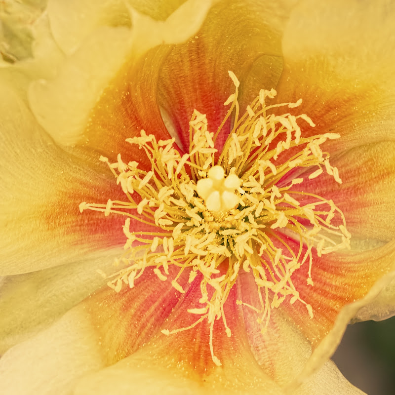
So when I think, I do something about it and dug up a pic to work on. Did one version with a sRGB profile in ACR and PS5 and one with a ProPhoto profile. Settings etc and minor touch-ups are exactly the same for both versions.
What do you think?
How would either of these come out as a print?
1. sRGB
2. ProPhoto
 Helpful Posts: 0
Results 1 to 14 of 14
Thread: Colour Space experiment
-
5th July 2012, 01:25 AM #1

- Join Date
- Apr 2011
- Location
- Ontario (mostly)
- Posts
- 6,667
- Real Name
- Bobo
Colour Space experiment
-
5th July 2012, 02:22 AM #2
- Join Date
- Mar 2010
- Location
- East Coast of Canada
- Posts
- 873
- Real Name
- Myra
Re: Colour Space experiment
Bobo, I've been doing the same thing. For instance, I used ProPhoto today to process some x-country photos. They looked fine. I uploaded them to my flickr account. They looked OK until I then viewed them via the slideshow feature... they took on the greyish desaturated tone that I had been having trouble with last week. According to the Ian Lyon's article, and I'm paraphrasing here, not everything can handle the ProPhoto colour spaces. I then went back and ran everything through ACR and PhotoShop using the sRGB (with all the numbers). Things looked fine on Flickr. Now, back to that article. Mr. Lyons mentions that the sRGB is fine is one is using mainly web applications.
I used the Adobe 1998 colour settings to process and then print photos at a local lab. They seemed to be OK. I am going to use ProPhoto on a few and then the sRGB to see what difference there are in print.
With your two examples, I see more greys and browns in the second photo. Personally, I think the first one would make a better print. Which one looks like the best representation to you?
-
5th July 2012, 05:01 AM #3
- Join Date
- Apr 2011
- Location
- Ontario (mostly)
- Posts
- 6,667
- Real Name
- Bobo
Re: Colour Space experiment
Thanks Myra.
I really don't know. On the monitor, #1 looks more natural but #2 looks good too as it is much warmer.
Please do let us know how the print comparison went. I do not print much so does not quite matter which colour space to use. The few times a print was done sRGB came out all right so will probably stick with that if only for the simplicity.
One thing I did find was that converting from Prophoto to sRGB, the red channel blew quite excessively. The 2 versions were therefore saved straight as jpg without any profile conversions and uploaded to Picasa. Both look ok to my untrained eye in the Picasa slideshow.Last edited by Bobobird; 5th July 2012 at 05:13 AM.
-
5th July 2012, 07:12 AM #4
- Join Date
- Aug 2009
- Posts
- 2,342
- Real Name
- Steve
Re: Colour Space experiment
How did you convert the image. If you went to edit---convert to profile---then choose sRGB , there will be no color shift and the image will look exactly like the proPhoto. If you choose edit --- assign profile---sRGB , then you will see a color shift.
-
5th July 2012, 07:48 AM #5
- Join Date
- Apr 2011
- Location
- Ontario (mostly)
- Posts
- 6,667
- Real Name
- Bobo
Re: Colour Space experiment
Thanks Steve.
I have tried both.
Assign profile --- sRGB = there is a colour shift.
Convert to profile --- sRGB = there is no colour shift but the histogram shows that the R channel is seriously blown.
-
5th July 2012, 09:39 AM #6
- Join Date
- Dec 2008
- Location
- New Zealand
- Posts
- 17,660
- Real Name
- Have a guess :)
Re: Colour Space experiment
Hi Bobo,
Here begins a journey ...
Prophoto is pointless the way you've done it because your monitor can only display sRGB colours. It's a bit like how changing the speedo in your car from one that goes from 0-200km/hr for one that goes from 0 to 300km/hr doesn't make your car go any faster. Changing from a small colour space to one that's much bigger doesn't let your monitor display more colours, as that's a physical limitation of the monitor.
So when you publish a prophoto image to the web like you have, one of only 2 things will happen: (1) It'll be displayed on a colour-managed system, in which case it'll look pretty much the same as the sRGB version because the colour management system in your PC / Browser / App will convert it back to something the monitor can handle (eg sRGB), or (2) it'll be displayed in a non-colour managed manner and look gawd awful.
Trying to edit in prophoto is also futile because the image may contain colours that your monitor is physically incapable of reproducing - but it'll put SOMETHING there ... it just won't be the correct colour - BUT - you'll adjust it assuming that that's the colour that it really is - and then when you print it on a printer with a wider gamut (which is quite common) you'll wonder why it looks different to the way it does on the screen.
Basically, the bigger the colour space, the bigger the trouble you can get yourself into if you don't know how to handle it (and you're essentially "working blink" when you do handle it).
PS: Never EVER use ASSIGN profile.
-
5th July 2012, 10:01 AM #7

- Join Date
- Sep 2009
- Location
- Burton on Trent, UK
- Posts
- 4,788
- Real Name
- Steve
Re: Colour Space experiment
I use aRGB while printing; the trouble is I can't see aRGB on my monitor. So unless 'I feel lucky' I print a test pattern because it's surprising how different shadows look for instance, with a bit more colour in them.
Most of the time I'm disapointed when 'I feel lucky', but if the histogram looks like a bell, mostly these just print straight out using the provided Ilford profile.
When I convert to jpeg I always save with the sRGB profile though, unless I forget.

The middle one was printed which was originally bottom left; I don't need to print small icons with greater range because I'm not ever that far out but I get the option to if I want to.Last edited by arith; 5th July 2012 at 11:16 AM.
-
5th July 2012, 04:56 PM #8
- Join Date
- Apr 2011
- Location
- Ontario (mostly)
- Posts
- 6,667
- Real Name
- Bobo
Re: Colour Space experiment
Thanks Colin and Steve for the explanations.
Hopefully beginning to understand this better.
I begin to understand Colin's points a bit better now - since 99.9% of my stuff never sees a printer (or lab) there is no point stressing over something that is not going to show up anyway.
However, I do not understand why #2 looks warmer/richer then #1 on the monitor/web as both were processed exactly the same?Last edited by Bobobird; 5th July 2012 at 05:10 PM.
-
5th July 2012, 09:22 PM #9
- Join Date
- Dec 2008
- Location
- New Zealand
- Posts
- 17,660
- Real Name
- Have a guess :)
Re: Colour Space experiment
Congratulations - you're the recipient of one of my rare "this person gets it" award for today Originally Posted by Bobobird

I don't use a colour-managed browser and to me, #2 looks ghastly. If you are using a colour-managed browser then they should look the same (in theory), but in practice, there are still some variables. Are you running the correct monitor profile for a start?However, I do not understand why #2 looks warmer/richer then #1 on the monitor/web as both were processed exactly the same?
-
5th July 2012, 11:03 PM #10
- Join Date
- Apr 2011
- Location
- Ontario (mostly)
- Posts
- 6,667
- Real Name
- Bobo
Re: Colour Space experiment
Yes, got it.
Yes, Firefox
Yes, correct monitor profiles (just checked to make sure).
Which browser are you using?
-
6th July 2012, 03:50 AM #11
- Join Date
- Dec 2008
- Location
- New Zealand
- Posts
- 17,660
- Real Name
- Have a guess :)
Re: Colour Space experiment
Currently using Chrome. Originally Posted by Bobobird
Colour management for browsers is - for the most part - a waste of time though because most images are already in sRGB colour space - those that aren't are still going to appear incorrect to the majority of people (we still live in an sRGB world) - those with colour managed browsers don't see anymore colours because all the colour management is doing is converting the image back to sRGB. And on top of that, many folks who are posting the images don't have calibrated and profiled screens -- and neither do many of the folks looking at the images.
So if the photographer publishing the image has captured an image with colours outside of the sRGB gamut - post-processes the image correctly on a calibrated and profiled screen - which is then viewed on a properly calibrated and profiled screen - that is capable of reproducing the Adobe RGB gamut - and all of this happens on a colour-managed browser then - and only then - does the viewer see the image correctly and with more colours.
In reality, until Adobe RGB gamut monitors become the norm (and we are getting there very slowly) then folks are far better off forgetting about colour managed browsers and concentrating instead on using calibrated and profiled monitors. Or put another way - an sRGB image on colour managed and non-colour managed browsers will look the same, and an Adobe RGB image on a colour managed monitor will look exactly like it should have looked if it had been correctly set to sRGB in the first place.
-
6th July 2012, 04:25 AM #12
- Join Date
- Apr 2011
- Location
- Ontario (mostly)
- Posts
- 6,667
- Real Name
- Bobo
Re: Colour Space experiment
Thanks Colin, will try Chrome.
As someone in the "go with the majority group (ie lazy or don't know)" it would indeed be a pain in the .... if what others see is not what I see. Well, so far so good and I shall continue on with my "know less is sometimes good" ways. As a non-print person it is perhaps better this way.
-
6th July 2012, 10:41 AM #13
- Join Date
- Sep 2009
- Location
- Burton on Trent, UK
- Posts
- 4,788
- Real Name
- Steve
Re: Colour Space experiment
We learn from each other Bobo; I like 'the suck it and see' method, and everything as easy as possible.My IPS profiled moniter only cost £100 and I'm pretty sure it doesn't display aRGB although PSE doesn't complain about it.Thanks Colin and Steve for the explanations.
Anyway in high contrast situation like dark with lamp in shot; I always have to increase brightness and this also increases a random colour not visible on the screen. Unless you look at it very hard and I may detect a hint.
On the other hand; a straightforward could have been taken on auto in good light ect shot, rarely needs any adjustment.
So it is a good idea to do a pattern print in high contrast cases, where the biggest problem is blue shadows, which look grey on screen.
-
6th July 2012, 04:42 PM #14
- Join Date
- Apr 2011
- Location
- Ontario (mostly)
- Posts
- 6,667
- Real Name
- Bobo
Re: Colour Space experiment
Thanks Steve.
Same here - do as little as possible person myself. But being new to all this stuff, it is equally important to expand ones tiny pool of knowledge. This exercise has been a good learning experience though it will not see much being done in future shots.


 Reply With Quote