
 Helpful Posts: 0
Results 1 to 20 of 20
Thread: Keeping it simple..
-
23rd June 2012, 08:07 PM #1


- Join Date
- Aug 2011
- Location
- Wick, Caithness, Scotland.
- Posts
- 2,609
- Real Name
- Sharon
Keeping it simple..
-
23rd June 2012, 10:10 PM #2
- Join Date
- Aug 2011
- Location
- Wick, Caithness, Scotland.
- Posts
- 2,609
- Real Name
- Sharon
Re: Keeping it simple..
C'mmon..love it, hate it......suggest it ..but acknowledge it.
I have seen so many good forum's go under recently from sheer lack of interaction.
Use it or lose it.
x
-
23rd June 2012, 10:46 PM #3
- Join Date
- Jun 2012
- Posts
- 10
Re: Keeping it simple..
i love the rose , love the soft tones
-
23rd June 2012, 11:06 PM #4

- Join Date
- Jun 2011
- Location
- Deep in the heart of Texas and Fort Wayne Indiana
- Posts
- 1,629
- Real Name
- Kristianna-Marie - I listen to Kris too.....
Re: Keeping it simple..
Acknowledged - as always, I love your work. Originally Posted by Daisy Mae

You make me so jealous!!!!!
-
23rd June 2012, 11:20 PM #5

- Join Date
- May 2012
- Location
- Carrollton, Georgia (USA)
- Posts
- 2,757
- Real Name
- Bruce
Re: Keeping it simple..
Sharon: Good work. Bruce Originally Posted by Daisy Mae
-
24th June 2012, 12:53 AM #6
- Join Date
- May 2012
- Location
- northern Virginia suburb of Washington, DC
- Posts
- 19,064
Re: Keeping it simple..
Sharon,
Always happy to see your images! A few comments...
The last one looks as if I might have taken it, which means that it's not up to your standard. I mean that it's solid, a keeper, but not special. Your images are typically special.
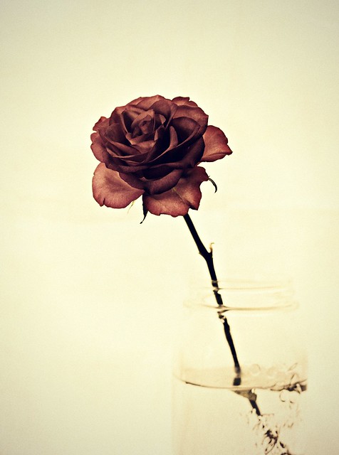
I love the tone and textural detail of the second one. I was puzzled by the diffraction caused by the water because I don't see the sides or top of the jar. I would not have known it was a jar if it were not for your description. Perhaps the jar shows up just fine in a larger image.
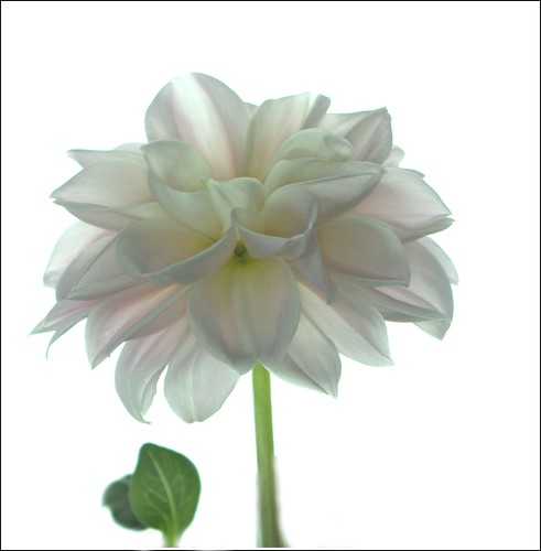
The first one is spectacular. I could stare forever at the shades of white and grey. I can't define why I like the leaves on the left, but I sure do like them.
Keep 'em coming!
-
24th June 2012, 03:52 AM #7
- Join Date
- Dec 2011
- Location
- pilot rock oregon
- Posts
- 592
- Real Name
- Jack R Mann
Re: Keeping it simple..
Great work as always, i love #1 soft yet crisp.
-
24th June 2012, 11:25 AM #8
- Join Date
- Dec 2011
- Location
- Québec,Canada
- Posts
- 696
- Real Name
- Louise
Re: Keeping it simple..
Hello Sharon,
I just saw your lovelies! The first one is "the one" for me. At first glance, I tought the leaves should not be there. So I hid them with my hand close to the screen. Nope. The flower did not look right alone. The leaves are like compagnons. The flower seem to bend ever so slightly toward them, as if in a conversation. Yep, I saw all that in your photo. Do you think ther is a cure for me?
I also had a good chuckle. Only 2 hours after posting, you fret about no having a response? If it is the normal time required for a response here, I might as well pack my bags and go. Ok, my pics are nowhere near yours in quality, and I may not be the only one on this site with no reply to my posts.
Rest assured, with your caliber of photography, you will always have all of us just hanging there to see the next one.
PS: unless we are out of range of reception due to flower/bug photo tacking out in the field. Yes, it happens a lot in summertime.
-
24th June 2012, 04:27 PM #9
- Join Date
- Aug 2011
- Location
- Wick, Caithness, Scotland.
- Posts
- 2,609
- Real Name
- Sharon
Re: Keeping it simple..
Thanks for your responses...I didn't see them before going to bed.
Louise..appreciate your comments immensely.
Mike...I can see the glass side and rim just fine on my screen....so you think you could've taken #3 then. ..I can see I will need to watch you ! lol. Thanks for the in-depth as always.
Jack, Bruce and Kris ..you are so kind.
-
24th June 2012, 07:50 PM #10

- Join Date
- Dec 2008
- Location
- West Virginia
- Posts
- 1,222
- Real Name
- Jim
Re: Keeping it simple..
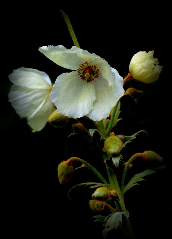
I really like #3.The lighting gives the impression of a Dutch painting.
Lovely!
-
25th June 2012, 10:37 AM #11
- Join Date
- Aug 2011
- Location
- Wick, Caithness, Scotland.
- Posts
- 2,609
- Real Name
- Sharon
Re: Keeping it simple..
Thank you very much Jim
-
25th June 2012, 12:40 PM #12
- Join Date
- Feb 2009
- Location
- Bucharest,Romania
- Posts
- 1,367
Re: Keeping it simple..
For me the third is the first.About the first I'm asking myself why not petals instead leafs,for equilibrium?I don't know till I'll see.
-
25th June 2012, 03:24 PM #13
- Join Date
- May 2012
- Location
- northern Virginia suburb of Washington, DC
- Posts
- 19,064
Re: Keeping it simple..
I should learn to keep my keyboard locked. Originally Posted by Daisy Mae
-
25th June 2012, 08:32 PM #14

- Join Date
- May 2010
- Location
- Germany
- Posts
- 361
- Real Name
- Robert S.
Re: Keeping it simple..
I like no 1 and 2. The first one transfers a real soft silk touch although it does not look unsharp. There are a lot of details in the highlights and the upper tones. The picture looks very good. Did you desaturate it a little bit? In my opinion the second one is the best. The composition and well controlled lighting on the flower really works. In my opinion it was a good idea to put the glas into the lower right corner with the flower leaning to the left. This composition catches the eye and keeps it focused on the flower. Very good shot.
bye
Robert
-
25th June 2012, 09:14 PM #15
- Join Date
- Apr 2011
- Location
- Ontario (mostly)
- Posts
- 6,667
- Real Name
- Bobo
Re: Keeping it simple..
That is how it is. 90+ views nowadays appear to be from non-member "hit-and-runs". If only websites only used logged-in view counts... Originally Posted by Daisy Mae
Btw, did look at these earlier on and was going to comment that #1 is superb then got side-tracked or something, closed the browser and then forgot all about it.
-
26th June 2012, 10:39 AM #16
- Join Date
- Aug 2011
- Location
- Wick, Caithness, Scotland.
- Posts
- 2,609
- Real Name
- Sharon
Re: Keeping it simple..
Thank you Robert for those well considered comments...very much appreciated. I didn't desaturate the flower, that's the colours it is....just a bit of dodging on the leaf as it was very dark.
Bobo...yes it is how it is but it doesn't half make me annoyed....and as for you, young man...how could you 'forget me'?
-
26th June 2012, 05:07 PM #17
- Join Date
- Apr 2011
- Location
- Ontario (mostly)
- Posts
- 6,667
- Real Name
- Bobo
Re: Keeping it simple..
I did'nt - eventually....
-
26th June 2012, 06:52 PM #18

- Join Date
- Oct 2010
- Location
- Canada
- Posts
- 1,998
- Real Name
- Janis
Re: Keeping it simple..
Sharon, I love your work and I appreciate how well you have handled each of these subjects individually, but #3 is the only one that stands on its own for me (and it is gorgeous). I think I actually would prefer #s 1 & 2 with a bit of texture as the background in #1 is too white and there is too much blank space in #2 for my taste. But perhaps my taste is too conventional. Nevertheless, there is much for me to study and learn from in each of them, as there is in everything you do.
-
26th June 2012, 10:37 PM #19
- Join Date
- May 2012
- Location
- northern Virginia suburb of Washington, DC
- Posts
- 19,064
Re: Keeping it simple..
i'm still waiting for Sharon to call me a young man so I can brag about it. Originally Posted by Daisy Mae
-
27th June 2012, 01:44 AM #20
- Join Date
- Nov 2011
- Location
- Nebraska
- Posts
- 949
- Real Name
- Kathy
Re: Keeping it simple..
#1 is my favorite!! I love the softness -- very peaceful!!
Kathy

 Reply With Quote