
 Helpful Posts:
Results 1 to 14 of 14
Thread: Broken
-
29th April 2012, 02:23 PM #1


- Join Date
- Aug 2011
- Location
- Wick, Caithness, Scotland.
- Posts
- 2,609
- Real Name
- Sharon
Broken
-
29th April 2012, 02:40 PM #2
- Join Date
- Aug 2011
- Location
- Wick, Caithness, Scotland.
- Posts
- 2,609
- Real Name
- Sharon
-
29th April 2012, 02:59 PM #3

- Join Date
- Sep 2010
- Location
- New York
- Posts
- 205
- Real Name
- Pierre
Re: Broken
Sharon
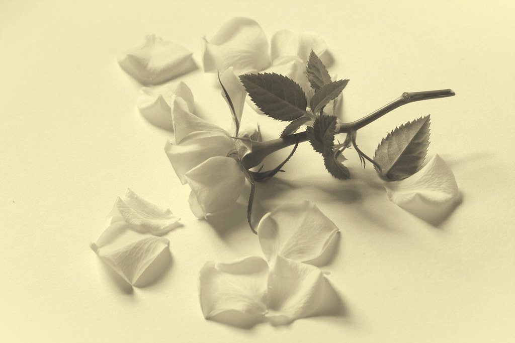
I like your second image better, with the white background. The concept is interesting, and I think it may work more if the stem was bent. The technical aspect is wonderful, very subtle. I wonder how it may look if the background was a little darker or, the petals were a little darker?? just a thought, it is a wonderful image.
-
29th April 2012, 03:01 PM #4
- Join Date
- Jan 2012
- Location
- Kane, PA USA
- Posts
- 59
Re: Broken
Sharon,
I like the first one better. Offers a feeling of not being fixable. Of course if you want it to be fixed the second would be better. Probably has to do with contrast.
Tim
-
29th April 2012, 03:03 PM #5

- Join Date
- Nov 2011
- Location
- Near Cambridge, UK
- Posts
- 147
- Real Name
- Nigel
Re: Broken
Hi Sharon,
I can't choose between them! They both have a great subtle feel to them with great exposure.
-
29th April 2012, 03:18 PM #6
- Join Date
- Aug 2011
- Location
- Wick, Caithness, Scotland.
- Posts
- 2,609
- Real Name
- Sharon
Re: Broken
Thank you Nigel, Tim and Pierre.
It seems like the vote is pretty evenly split.....I may have to keep them both! lol
Appreciate your comments.
-
29th April 2012, 06:49 PM #7
- Join Date
- Dec 2011
- Location
- pilot rock oregon
- Posts
- 592
- Real Name
- Jack R Mann
Re: Broken
Well done Sharon #2 i like the best y ou have a great eye and very creative.
-
29th April 2012, 06:53 PM #8
- Join Date
- Aug 2011
- Location
- Wick, Caithness, Scotland.
- Posts
- 2,609
- Real Name
- Sharon
Re: Broken
Thank you Jack.
I also have hayfever ...unfortunately!
-
29th April 2012, 06:56 PM #9

- Join Date
- Jan 2011
- Location
- Seattle Washington
- Posts
- 3,550
- Real Name
- Paul
Re: Broken
Second for me as well, quite nice really.
-
29th April 2012, 06:57 PM #10
- Join Date
- Aug 2011
- Location
- Wick, Caithness, Scotland.
- Posts
- 2,609
- Real Name
- Sharon
Re: Broken
 Originally Posted by jeeperman

 Thanks Paul..!
-
29th April 2012, 08:23 PM #11
- Join Date
- Nov 2011
- Location
- Nebraska
- Posts
- 949
- Real Name
- Kathy
Re: Broken
Sharon I like the first one. Very much sets the mood of being broken (when I look at it I see and feel a broken heart) The second one is very nice also, it give me the mood of peace, being hopeful. I guess it is going to depend on what story you want you photo to tell!! As always you never cease to impress me!! Originally Posted by Daisy Mae
Kathy
-
29th April 2012, 08:53 PM #12
- Join Date
- Aug 2011
- Location
- Wick, Caithness, Scotland.
- Posts
- 2,609
- Real Name
- Sharon
Re: Broken
Kathy, thank you sooo much for your lovely comments, Originally Posted by Kathy O
It's interesting rhat such a small difference influences the mood and hope.
I don't know the answer yet myself. xxxxxxxxxxxx
-
29th April 2012, 09:08 PM #13

- Join Date
- Jan 2012
- Location
- Albertville, Mn
- Posts
- 1,567
- Real Name
- randy
Re: Broken
I will have to go with #1, but then I have always preferred color over B&W, I just wonder what the effect would be with a darker background.
-
29th April 2012, 11:05 PM #14
- Join Date
- Aug 2011
- Location
- Wick, Caithness, Scotland.
- Posts
- 2,609
- Real Name
- Sharon
Re: Broken
Thank you Randy.
Next bloom ( same plant) I plan a deep grey / blue background for so we shall see!

 Reply With Quote
