
 Helpful Posts:
 So here it is. Honest critique will be nice.
Results 1 to 20 of 34
Thread: My portraits
-
16th April 2012, 07:23 AM #1

- Join Date
- Jan 2012
- Location
- Estonia
- Posts
- 105
My portraits
-
16th April 2012, 07:35 AM #2
- Join Date
- Apr 2012
- Location
- Lincs, UK
- Posts
- 38
- Real Name
- Peter K
Re: My portraits
Hi.
Nice idea and well taken. On my monitor the lower part is very dark except for the arm of what she is sitting on. She also seems to be sharing the limelight with the sofa. I would make a horizontal crop just below the elbows. As she is not looking at the camera this would also give some space for her to be looking into. Maybe a vignette too. Something like...

-
16th April 2012, 07:54 AM #3
- Join Date
- Jan 2012
- Location
- Estonia
- Posts
- 105
Re: My portraits
Yes one hand is little too dark. I have to figure how I can turn second flash little smaller. Maybe white umbrella to the right and second flash above her. Originally Posted by PKFUSION

Last edited by Colin Southern; 16th April 2012 at 08:20 AM.
-
16th April 2012, 10:48 AM #4

- Join Date
- Jan 2011
- Location
- Perth, Australia
- Posts
- 254
- Real Name
- Peter
Re: My portraits
Nice. I like the tone and the pose and the setting. All round a good job.
In terms of improvement, the two stars or flowers seem a bit bright and draw attention. I would consider toning these down a little. My only other consideration is what was mentioned above - the lady's dress is dark and you have lost some detail. Whilst that is ok, I think it probably isn't consistent with the rest of the image ie all other parts have detail.
-
16th April 2012, 06:34 PM #5

- Join Date
- Jul 2008
- Location
- Southern California, USA
- Posts
- 17,409
- Real Name
- Richard
Re: My portraits
I love the shot. It gives me feelings of the 1940's. However, I agree with Peter K. about the cropping and with Peter of Perth (one of my favorite cities) about the stars...
-
16th April 2012, 10:07 PM #6
- Join Date
- Jan 2012
- Location
- Estonia
- Posts
- 105
Re: My portraits
Ok this time light is increased...

-
16th April 2012, 10:15 PM #7Moderator

- Join Date
- May 2008
- Location
- Windsor, Berks, UK
- Posts
- 16,775
- Real Name
- Dave Humphries :)
Re: My portraits
Hi Hasso,
I prefer Peter K's crop, because it removes some of the pattern distraction, but I think I'd tone down the exposure on the remaining bright parts to our left.
Yes, there is a bit of a detail-less black hole where her dress is, but that doesn't worry me anywhere near as much as the print patterns.
Lovely model too,
-
17th April 2012, 01:40 AM #8

- Join Date
- May 2008
- Posts
- 1,543
- Real Name
- Ali
Re: My portraits
My two cents: Two things to pay attention to as you try to improve; one is to pay attention to the separation you need from background. Specially the hair. Portrait is easy if you don't have to do that. It can be natural light or a flash. I admit it usually not that easy to achieve specially when you are not equipped with the right gear.
Second issue in your two portraits: distracting bright areas/reflections in the background. I think you should try to keep them to a minimum.
Overall, i think both are pretty shots!
-
17th April 2012, 02:24 AM #9
- Join Date
- Dec 2008
- Location
- New Zealand
- Posts
- 17,660
- Real Name
- Have a guess :)
Re: My portraits
Few quick thoughts ...
- Good job - some natural talent there, darn it!
- If something doesn't contribute to the image, get rid of it ... in this case there's too much space above the head not doing anything.
- Overall levels need to be raised slightly
- Image is sharpened badly - we might need to review your sharpening workflow.
- Get rid of the watermark -- it draws the eye away from the face.

-
17th April 2012, 03:03 AM #10Moderator

- Join Date
- Mar 2012
- Location
- Ottawa, Canada
- Posts
- 22,501
- Real Name
- Manfred Mueller
Re: My portraits
One minor thing to add. Be very careful when you have a model put her hand on or near her face. It's all to easy to get some really strange shadows and distortions that do not add to he image. If you want the hand there, make sure that it does not press against her skin. Also watch the positioning of the hand. It's all too easy to get something that looks distorted. I prefer shooting hands along the side to slim things out a bit.
-
17th April 2012, 06:54 AM #11
- Join Date
- Jan 2012
- Location
- Estonia
- Posts
- 105
Re: My portraits
- Overall levels need to be raised slightly Originally Posted by Colin Southern
You mean change little exposure in post processing.
Here is only "unsharp mask" used for sharpening(1,4px). Maybe if I use different tactics for sharpening I can get better result.
-
18th April 2012, 09:09 AM #12
- Join Date
- Dec 2008
- Location
- New Zealand
- Posts
- 17,660
- Real Name
- Have a guess :)
Re: My portraits
Yes - it just looked a little too dark to me. Originally Posted by HaSSo
Starting with the full resolution capture, you'll probably want a USM of around 300% @ 0.3px for capture sharpening, 40% @ 4 pixel for content/creative sharpening, and then after you downsample the image for online display (say, 1000px long side) then a USM of around 50 to 100% @ 0.3px for output sharpening.Here is only "unsharp mask" used for sharpening(1,4px). Maybe if I use different tactics for sharpening I can get better result.
I've written a little about sharpening in previous posts, if you're interested ...
When/How to Best Sharpen a Digital Photograph
Sharpening and Noise Reduction Sequence
-
19th April 2012, 08:09 AM #13
- Join Date
- Jan 2012
- Location
- Estonia
- Posts
- 105
Re: My portraits
Ok little different post processing.

Last edited by Colin Southern; 19th April 2012 at 08:53 PM.
-
19th April 2012, 08:54 PM #14
- Join Date
- Dec 2008
- Location
- New Zealand
- Posts
- 17,660
- Real Name
- Have a guess :)
Re: My portraits
I'm not sure what you're doing in post-processing, but the images are looking very flat -- almost like you've used negative clarity on them in an attempt to smooth skin tones. Originally Posted by HaSSo
If you still have the RAW file I can take a look and see how it processes using my normal workflow if you like.
PS: Still waaaay to much space above the head too (don't worry about maintaining a 2:3 aspect ratio).
-
25th April 2012, 08:40 PM #15
- Join Date
- Jan 2012
- Location
- Estonia
- Posts
- 105
Re: My portraits
New model and little different lighting setup. I know black on black is not the best.

-
26th April 2012, 04:18 AM #16
- Join Date
- Dec 2008
- Location
- New Zealand
- Posts
- 17,660
- Real Name
- Have a guess :)
Re: My portraits
I love black on black but you have to light it carefully - preferably with kicker lights to give you good background seperation. If you light it carefully, you'll also be able to differentiate it from the tone of the background, eg: Originally Posted by HaSSo
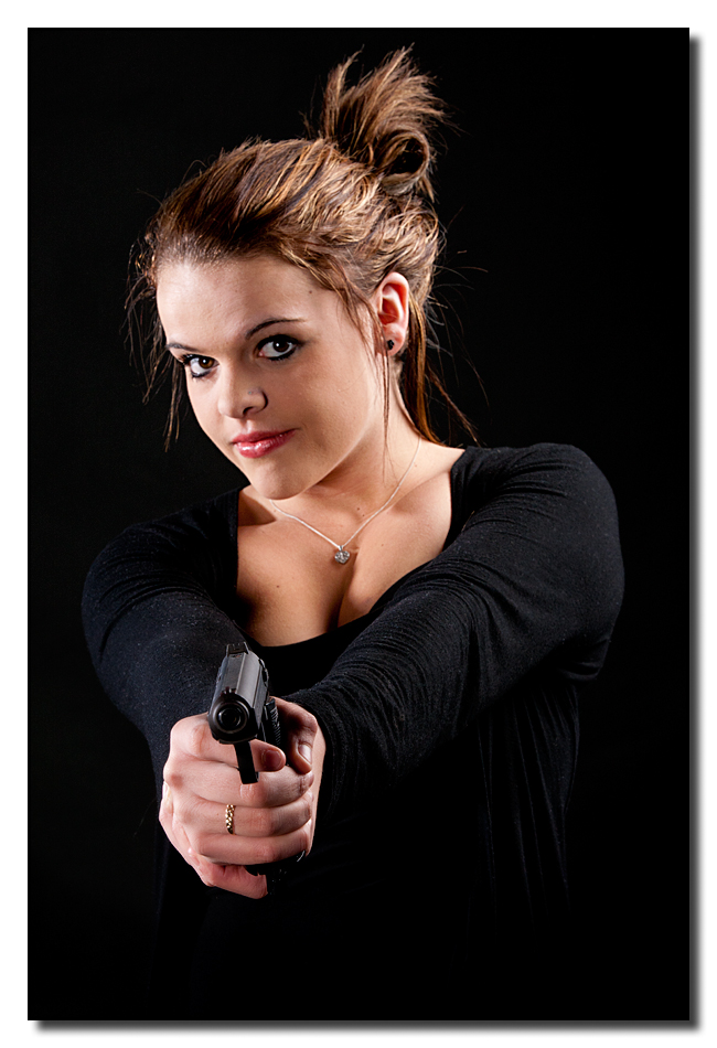
But back to your image ...
1. Would be great to see some separation between the black & the black, but
2. Far more noticeable is the models skin - it's VERY plastic looking (and very unnatural looking) - I'm not sure what you're doing to it in processing, but it's something we really need to get sorted (sorry!).
-
26th April 2012, 06:02 AM #17
- Join Date
- Jan 2012
- Location
- Estonia
- Posts
- 105
Re: My portraits
In the processing I did her skin softer and turned vibrance down. Maybe there is the problem. Originally Posted by Colin Southern
In this version I left her skin much more natural and more colorful.

-
26th April 2012, 07:13 AM #18
- Join Date
- Dec 2008
- Location
- New Zealand
- Posts
- 17,660
- Real Name
- Have a guess :)
Re: My portraits
I'd do it something like this ...
- White Balance Image
- Crop
- Minor blemish removal
- Minor skin soften

Your skin softening is totally "over the top" I'm afraid
-
26th April 2012, 07:48 AM #19
- Join Date
- Jan 2012
- Location
- Estonia
- Posts
- 105
Re: My portraits
Thank You again Colin. She have naturally really "soft and white" skin. But I used Portraiture plug-in in first picture of her. Your framing is good. And I like also vignette what You have added. Ok I take some lessons about portraiture. Originally Posted by Colin Southern
-
26th April 2012, 08:31 AM #20
- Join Date
- Dec 2008
- Location
- New Zealand
- Posts
- 17,660
- Real Name
- Have a guess :)
Re: My portraits
No worries Originally Posted by HaSSo

The plugin wasn't portrait-professional was it?


 Reply With Quote