
Following my post regarding the Drago TMO for Qtpfsgui, here are some notes on the Manntiuk operator. An image created with this TMO is appended.
Qtpfsgui Mantiuk Notes
Test Image: Test1.hdr (Hass Burn images 357, 359, 361, April 2009 copyright DARW)
Initial Set-Up: As per Qtpfsgui Drago Notes.
Mantiuk Tone Mapping Operator
This recently updated TMO (new version in Qtpfsgui 1.9.3) has little documentation available for users. However, original published papers are available (see Technical Notes). The authors are R Mantiuk, K Myszkowski and H-P Seidel.
As before, these notes take an empirical approach. Having loaded an HDR file and switched to the TMO panel, the Mantiuk operator is selected from the drop down menu. There are four parameter options available: a radio button to switch on/off Contrast Equalisation, Contrast Factor, Saturation, Factor, Detail Factor (this is the new addition in version 1.9.3).
Leaving aside Contrast Equalisation for the moment, the default settings and ranges for the parameters are:
Contrast Factor: 0.100 default, range 0.001 – 10.000;
Saturation Factor: 0.800 default, range 0.000 – 2.000;
Detail Factor: 1.0 default, range 1.0 – 99.0.
With these default settings and pre-gamma also at its default of 1.000, the resulting image has an unsaturated aspect and is somewhat dark. Examination of the histogram shows a warped Gaussian-like distribution with both black and white adjustments possible. Adjusting pre-gamma to lower values (0.500) gives greater saturation, to higher values a lighter and progressively less saturated image.
Starting from default values and increasing Saturation Factor to 1.600 gives a reasonable degree of saturation, but the image is still dark unless Adjust Levels is used.
Increasing the Contrast Factor (1.100) appears to smooth out some details, but increasing it to much higher values (5.000 – 10.000) gives rise to an other-worldly look with details restored and enhanced. This is what I consider a characteristic Mantiuk image, not quite realistic but not over the top; an artistic or painterly feel. However, the image is still somewhat dark.
Reverting to default settings and increasing the new parameter, Detail Factor, slowly starts to introduce the “Mantiuk Look”. By a value of 20, this characteristic look is pronounced.
Compiling these different findings to set a Contrast Factor of 5.0, Saturation Factor of 1.6, Detail Factor of 20, and pre-gamma of 0.5 gives a characteristic Mantiuk Look of good saturation, detail, contrast and other-worldliness, brightened by use of the Adjust Levels tool.
The final option in the Mantiuk TMO is Contrast Equalisation. Reverting to default settings and activating this option gives a pale greyed-out image. Reducing pre-gamma to 0.5 results in a more saturated version. Reverting pre-gamma to default and increasing the Contrast Factor leads to images similar to those without Contrast Equalisation activated. The other parameters act as before. Overall, the benefit of Contrast Equalisation is not clear, but see Technical Aspects below.
Technical Aspects:
The terms “Contrast Factor”, Saturation Factor” and “Detail” may be thought to be self-explanatory. Indeed, changing these parameters does affect contrast, saturation and detail. The term “Contrast Equalisation” appears from the original paper by Mantiuk et al. to mean something akin to histogram equalisation as found in image processing software. Indeed, perusal of the published work provides some important points about this TMO that are probably not generally known.
First, the TMO is based on what the authors call the gradient domain method. The algorithm works by converting an image into a form dominated by changes in contrast. This contrast image can then be altered (contrast enhancement) and the result inversely transformed back into a visual form. In fact, the authors refer to their method as contrast mapping, one application of which is tone mapping. They assert that this method leads to a reduction of (halo) artefacts and of discontinuities. However, Mantiuk et al. also point out:
“Our method does not address the.....issue of trying to make images
look realistic and natural. Instead we try to fit to the dynamic
range of the display so that no information is lost due to saturation
of luminance values and at the same time, small contrast details,
such as textures, are preserved.”
Second, Mantiuk et al. point out that:
“Our tone mapping method is likely to magnify camera noise if its amplitude
exceeds the threshold contrast .......... Therefore, to
obtain good results, the noise should be removed from images prior
to the contrast mapping.”
In practical terms, this implies users should have carried out noise reduction prior to using this TMO.
Third, the Contrast Equalisation function is said to lead to sharpening and visualisation of detail:
“The results of the contrast equalization algorithm may appear like
the effect of a sharpening filter. ... Sharpening filters tend to enhance local contrast at
the cost of global contrast, which results in images that have (a) flat
appearance..... Sharpening filters also introduce ringing and halo
artefacts, especially in the areas of high local contrast, .... The results of the contrast
equalization algorithm are free of these artefacts.”
In my hands, I cannot see any benefit regarding sharpening or detail.
Conclusions:
The Mantiuk TMO is a more complex algorithm than some. It can produce realistic images, but given the authors' comments, it is not designed for natural looking images, but for the preservation of information, texture and detail. In that regard, the Mantiuk TMO does generate painterly images that, for landscapes and the like can have a pleasing aspect. Overdoing this look leads to OTT or “fantasy” images. Overall, this would not be the first choice of a TMO for a purist, but provides good scope for artistic images.
Sources:
As per those in Drago Notes.
See also:
A Perceptual Framework for Contrast Processing of High Dynamic Range Images
R. Mantiuk, K. Myszkowski, and H.-P. Seidel
In ACM Transactions on Applied Perception, 2006
and Ed Bramley's page: http://www.damtp.cam.ac.uk/user/ejb48/hdr/index.html
Cheers
David
 Helpful Posts: 0
Results 1 to 12 of 12
Thread: Qtpfsgui Notes - Manntiuk TMO
-
12th May 2009, 09:41 AM #1


- Join Date
- Apr 2008
- Location
- Cheshire and Dumfries & Galloway
- Posts
- 732
- Real Name
- David
Qtpfsgui Notes - Manntiuk TMO
Last edited by David; 12th May 2009 at 09:46 AM. Reason: Forgot to sign
-
11th July 2010, 02:36 PM #2New Member
- Join Date
- Jul 2010
- Posts
- 8
- Real Name
- Lucan
Re: Qtpfsgui Notes - Manntiuk TMO
This is my favourite of all the tone mappers I've played with so far. I'd most likely use something else if I wanted a realistic final image, sure, but for the most part, that's not what I'm after. I love Mantiuk for the sheer weirdness of it.
-
11th July 2010, 04:03 PM #3

- Join Date
- May 2010
- Location
- I'm from Seattle and I go to school in Utah
- Posts
- 92
- Real Name
- Justin
Re: Qtpfsgui Notes - Manntiuk TMO
I think that sometimes Manituk can give fairly realistic-looking results. I mean, it depends on the shot, but I've had some success with 'keeping it real.'
Like this one:
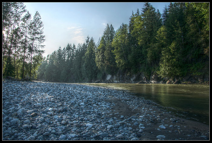
Manituk is really the only one I use in Qtpfsgui. I'm not a huge fan of the other ones.
-
11th July 2010, 07:41 PM #4New Member
- Join Date
- Jul 2010
- Posts
- 8
- Real Name
- Lucan
Re: Qtpfsgui Notes - Manntiuk TMO
Hey, that's really nice! Originally Posted by neverhood311


-
12th July 2010, 04:20 AM #5

- Join Date
- Jan 2010
- Location
- Caboolture, Queensland, Australia.
- Posts
- 235
- Real Name
- Edwin
Re: Qtpfsgui Notes - Manntiuk TMO
A very nice image & not overdone like some HDR'S.
-
12th July 2010, 10:20 AM #6

- Join Date
- Mar 2010
- Posts
- 220
- Real Name
- Tim
-
12th July 2010, 06:37 PM #7

- Join Date
- Sep 2009
- Location
- Burton on Trent, UK
- Posts
- 4,788
- Real Name
- Steve
Re: Qtpfsgui Notes - Manntiuk TMO
You don't know how much I don't know what your talking about, but this image is brilliant, exceptional ect ect.
-
13th July 2010, 02:25 PM #8
- Join Date
- May 2010
- Location
- I'm from Seattle and I go to school in Utah
- Posts
- 92
- Real Name
- Justin
Re: Qtpfsgui Notes - Manntiuk TMO
Hmm, I never thought of that before. I'll have to try that out on my full-size one. How exactly did you do that? Did you just select the area with rocks in it and change the hue? Or did you do 'color balance' and play with the color sliders a bit? Or what? Originally Posted by timo2
-
13th July 2010, 02:56 PM #9New Member
- Join Date
- Jul 2010
- Posts
- 8
- Real Name
- Lucan
Re: Qtpfsgui Notes - Manntiuk TMO
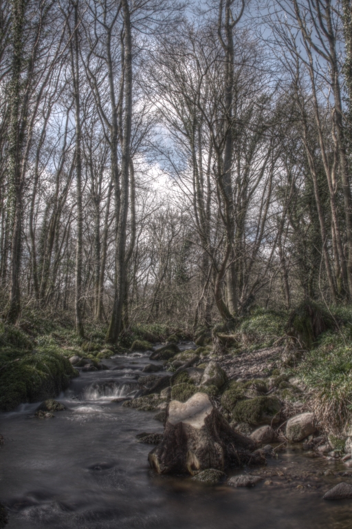
I reckon I got an alright one too!
http://img.photobucket.com/albums/v6...arkMantiuk.jpgLast edited by Quasarsphere; 13th July 2010 at 06:43 PM.
-
13th July 2010, 05:33 PM #10
- Join Date
- Jul 2010
- Location
- Ottawa, Canada
- Posts
- 19
- Real Name
- Matthew
Re: Qtpfsgui Notes - Manntiuk TMO
Excuse my ignorance, but enlighten me with the meaning of "Qtpfsg"
Nice shot though, I agree with Timo about the blue cast on the rocks, a nice retouch.
-
13th July 2010, 07:59 PM #11
- Join Date
- May 2010
- Location
- I'm from Seattle and I go to school in Utah
- Posts
- 92
- Real Name
- Justin
Re: Qtpfsgui Notes - Manntiuk TMO
Qtpfsgui is an HDR creation program. You can check it out and download version 1.9.3 free here: http://qtpfsgui.sourceforge.net/ They have version 2 but it costs 15 euros....however much that is. It's like $19.05 USD and about $19.67 Canadian. Originally Posted by stripe
-
14th July 2010, 04:45 AM #12
- Join Date
- Mar 2010
- Posts
- 220
- Real Name
- Tim
Re: Qtpfsgui Notes - Manntiuk TMO
I selected the area and applied a warm-up filter. Originally Posted by neverhood311

 Reply With Quote
