
I took these while just sitting (waiting for dinner) without a tripod, as I had to move around way too much to make it practical, over rocks. Your opinions would be much appreciated:
and this one
 Helpful Posts: 0
Results 1 to 11 of 11
Thread: Thanksgiving at the beach
-
25th November 2011, 06:24 AM #1

- Join Date
- Jan 2011
- Location
- Kennewick, WA
- Posts
- 565
- Real Name
- Bob R
Thanksgiving at the beach
-
25th November 2011, 07:52 AM #2Moderator

- Join Date
- Feb 2009
- Location
- Glenfarg, Scotland
- Posts
- 21,402
- Real Name
- Just add 'MacKenzie'
Re: Thanksgiving at the beach
Bob
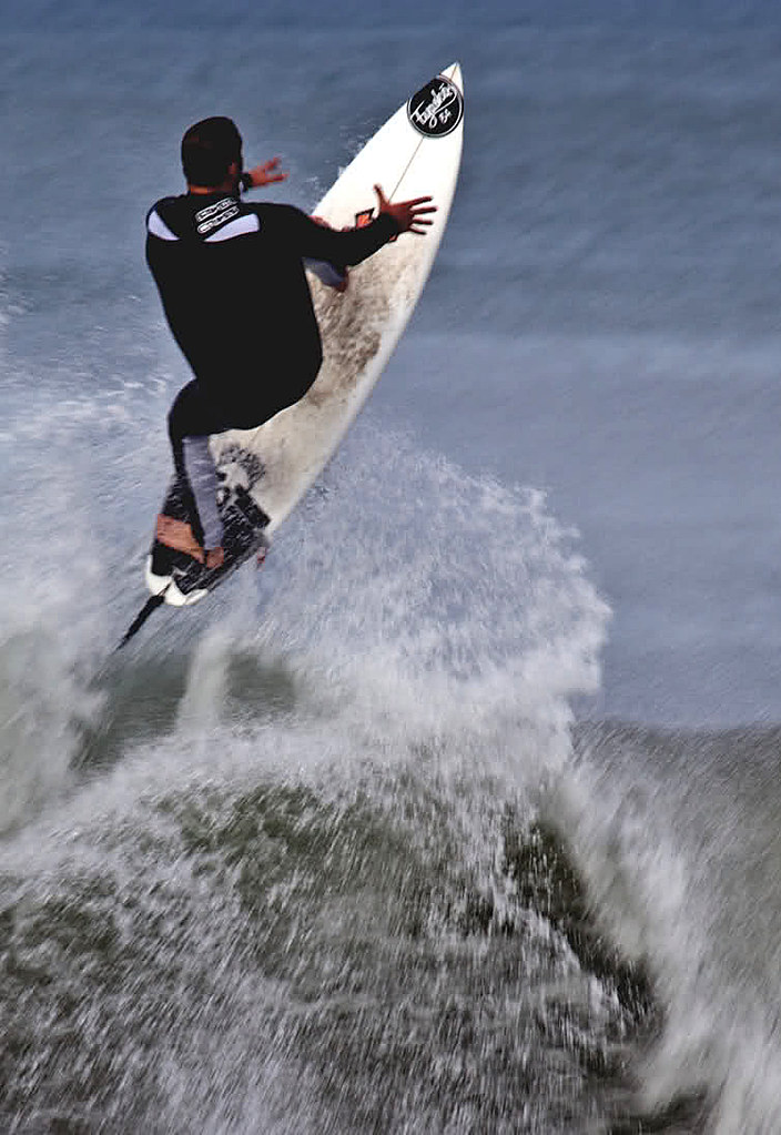
I'm not sure that the second one can stand up, because although we can work out that there is a person in there, I think the image needs to show more detail of him/her.
Which is what the first one does. I wonder if that one needs all the water to the left (as we look at it) of the surfer? I was trying to envisage a crop on, maybe, a 5:4 ratio. That would result in the surfer filling a greater percentage of the overall frame.Last edited by Donald; 25th November 2011 at 08:23 AM.
-
25th November 2011, 10:56 AM #3New Member

- Join Date
- Nov 2011
- Location
- Melbourne,VIC,Australia
- Posts
- 1
- Real Name
- David Johnston
Re: Thanksgiving at the beach
get some turkey on the beach to celebrate thanksgiving.
-
25th November 2011, 03:43 PM #4
- Join Date
- Jan 2011
- Location
- Kennewick, WA
- Posts
- 565
- Real Name
- Bob R
Re: Thanksgiving at the beach
Thank you David, I did, too much as a matter of fact, anyway, Donald, I tried as you suggested with the second image. I was so disappointed no use in posting. You are right, if it had not been for the first image you would not even know what the second image was (even after cropping in on it). The rider is too much hidden in the white water. One would be left wondering what the subject was (unless he/she was a surfer). I have another good shot I'll post after PP.
Thank you,
Bob
-
25th November 2011, 04:25 PM #5
- Join Date
- Jan 2011
- Location
- Kennewick, WA
- Posts
- 565
- Real Name
- Bob R
Re: Thanksgiving at the beach
The first one, I wanted to show the intensity of the surfer and the sport. While I could have left so much more of the wave, I don't think that would have helped the frame. Thoughts?

The second, I had lots of wave below him with curl converging toward him and pushing him skyward as you see, but again, to add all that missed the intention, I feel, of the surfer being tossed into the air. Again, thoughts?

-
25th November 2011, 04:36 PM #6Moderator
- Join Date
- Feb 2009
- Location
- Glenfarg, Scotland
- Posts
- 21,402
- Real Name
- Just add 'MacKenzie'
Re: Thanksgiving at the beach
Totally agree on both counts. We don't need to see more more water in order to fully understand the story and these compositions bring an intensity and dynamism (which is what surfing is all about) to the action. Originally Posted by SpiderBob

-
26th November 2011, 05:35 AM #7

- Join Date
- Nov 2010
- Location
- Owensboro, KY
- Posts
- 1,530
- Real Name
- Brian
Re: Thanksgiving at the beach
Hi Bob,
As far as composition goes, the third one is great! The fourth one to me looks as though it should be a portrait crop.
As far as the content goes - wow, that looks really awesome!
What lens were you using to shoot these?
Is the water color accurate? It makes me wonder if the white balance is right.
I really like these.
-
26th November 2011, 06:55 AM #8
- Join Date
- Jan 2011
- Location
- Kennewick, WA
- Posts
- 565
- Real Name
- Bob R
Re: Thanksgiving at the beach
That one was the 100-400 L IS Canon Zoom Originally Posted by speedneeder
Water is pretty accurate as those in Southern California coast range can attest too. It is during an unusually high tide lots of churning of the bottom, hence the muddy brown color and algae green. Not like some of the islands for sure. I changed the balance on a couple and was not happy with the rich blue as we don't have that color here. I shoot in RAW / JPEG so I can set white balance as close to as what I have seen as I can.
Not sure what you are saying about making number 4 a portrait crop, seems that with the surfers back to us it would be odd. I try it though and take a look.
Thanks,
Bob
-
26th November 2011, 11:45 AM #9
- Join Date
- Nov 2010
- Location
- Owensboro, KY
- Posts
- 1,530
- Real Name
- Brian
Re: Thanksgiving at the beach
Something like this.
-
26th November 2011, 07:50 PM #10
- Join Date
- Jan 2011
- Location
- Kennewick, WA
- Posts
- 565
- Real Name
- Bob R
Re: Thanksgiving at the beach
Brian thanks for the input. It looks great. Indeed this cut is much better. Brings one right to the subject and I lost nothing in you doing this. I mean I have the same view I intended with your crop. I really like it.
-
26th November 2011, 08:06 PM #11
- Join Date
- Nov 2010
- Location
- Owensboro, KY
- Posts
- 1,530
- Real Name
- Brian
Re: Thanksgiving at the beach
Bob, you are quite welcome! FYI I also made a slight curves adjusment to darken the black.


 Reply With Quote