 Helpful Posts: 0
Results 1 to 11 of 11
Thread: Graffiti
-
30th October 2011, 12:51 PM #1
-
30th October 2011, 01:32 PM #2
-
30th October 2011, 01:38 PM #3
Re: Graffiti
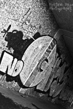
Greetings Kristina, neat shot. This is an artistic shot of an artistic subject - if you think combined you're telling the story you intended to, I'd leave it as-is (monochrome). For me personally, maybe a little more of the message on the wall (composition), less harsh of an angle (running down the wall shot perhaps), and color (if possible). From the looks of it you're under an overpass so lighting could be a challenge (light to dark to light again); is that why you were not happy with your color version / switched to mono.?
-
30th October 2011, 04:03 PM #4Moderator


- Join Date
- Feb 2009
- Location
- Glenfarg, Scotland
- Posts
- 21,402
- Real Name
- Just add 'MacKenzie'
Re: Graffiti
Kristiina
Very good first posting onto CiC. I like your approach is setting it at the angle you have.
You have posted it at quite a small size. I think it would have more impact if we could see it a larger size.
-
31st October 2011, 09:07 AM #5
Re: Graffiti
Thanks for the comments!
 I think I wasn't happy with the colour version mostly because most of the graffiti was in black and silver, except some bright blue and white dots. But those dots didn't have the same effect on the photograph than they do in the real life graffiti. So it just seemed to suit better to turn it into black&white.
-
31st October 2011, 09:15 AM #6
-
31st October 2011, 10:04 AM #7

- Join Date
- Nov 2009
- Location
- Chandigarh, India
- Posts
- 1,542
- Real Name
- Sahil Jain
Re: Graffiti
How about sharing a coloured version too? Would love to see it.
-
31st October 2011, 10:40 AM #8
-
31st October 2011, 12:58 PM #9
Re: Graffiti
Hi Kristina,
much prefere the B&W version the WB doesnt look correct to me on this one
-
31st October 2011, 02:47 PM #10
Re: Graffiti
I'm just wondering.. Isn't white balance one of those "creative tools" with what to show the emotion etc. Or is it something totally fixed, that it has to be in a certain way to be correct?
-
31st October 2011, 04:21 PM #11Moderator


- Join Date
- Feb 2009
- Location
- Glenfarg, Scotland
- Posts
- 21,402
- Real Name
- Just add 'MacKenzie'
Re: Graffiti
Kristiina
You are quite correct. The photographer does have licence to create the image that he or she considers correctly represented the vision that he or she had for the final image. And not everyone will share that vision.
I do think that for a range of subjects in particular lighting condition then it does need to be 'correct' in the sense of being accurate and true. This is where grey cards, or white balance cards, come into to play, or where the judgement of the photographer in adjusting white balance is important.
There are also situations in which is would be silly to set the 'correct' white balance; e.g. a candlelit scene.Last edited by Donald; 31st October 2011 at 06:22 PM.


 Reply With Quote

