
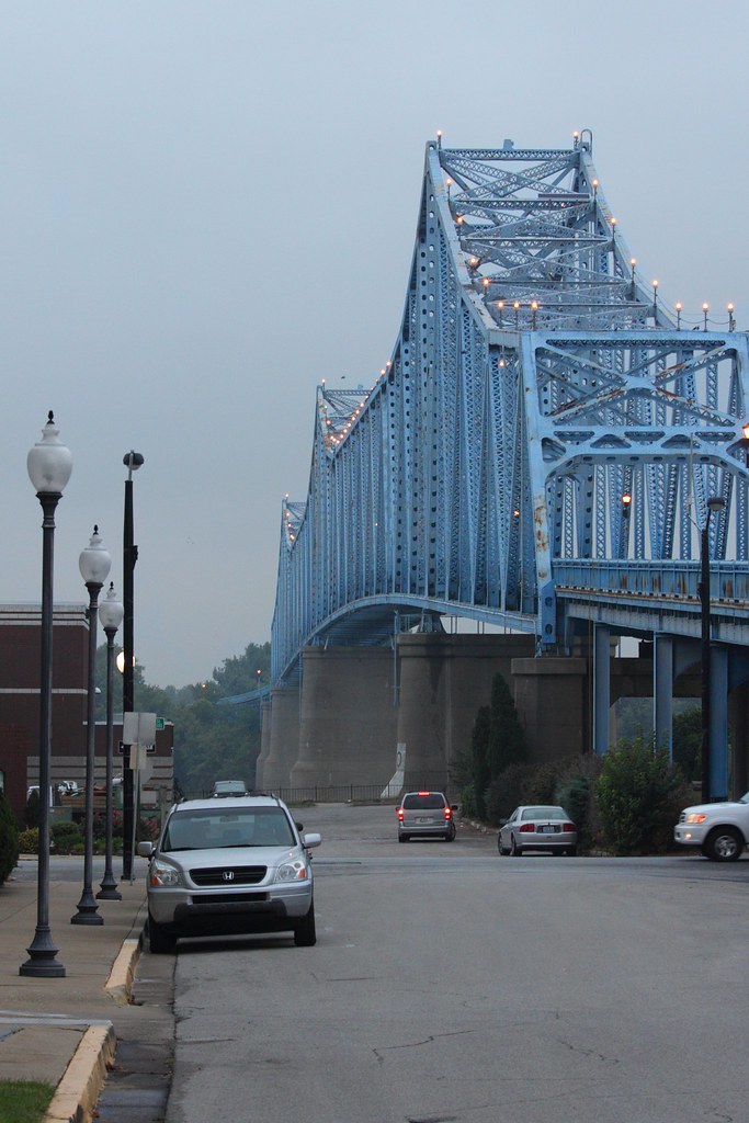
There were some stormy skies brewing tonight and I had this idea about a photo to take down by the bridge... Well the clouds never really cooperated and I ended converting one to B&W on a whim. Any thought, comments, suggestions appreciated.
Thanks
 Helpful Posts: 0
Results 1 to 20 of 25
-
7th September 2011, 02:35 AM #1


- Join Date
- Nov 2010
- Location
- Owensboro, KY
- Posts
- 1,530
- Real Name
- Brian
This is one reason why I don't do B&W
-
7th September 2011, 03:41 AM #2
- Join Date
- Nov 2010
- Location
- Panama City, FL
- Posts
- 3,540
- Real Name
- Chris
Re: This is one reason why I don't do B&W
Can't imagine why you don't like B&W after producing this fine shot...
-
7th September 2011, 03:55 AM #3

- Join Date
- May 2011
- Location
- Brisbane Australia
- Posts
- 4,636
- Real Name
- Dave Ellis
Re: This is one reason why I don't do B&W
I'll second that Brian! I think the composition is spot on and the clouds, in this shot anyway, are very co-operative Originally Posted by MiniChris


Cheers Dave
-
7th September 2011, 03:56 AM #4

- Join Date
- Apr 2009
- Location
- On 67 Acres Somewhere in Texas
- Posts
- 846
- Real Name
- Steaphany
Re: This is one reason why I don't do B&W
I second your sentiment Chris
-
7th September 2011, 05:56 AM #5

- Join Date
- Nov 2010
- Location
- England
- Posts
- 308
- Real Name
- Keith
Re: This is one reason why I don't do B&W
If this lovely shot is an example of you not 'doing' B&W Brian then I can't wait until you do!

-
7th September 2011, 06:30 AM #6
- Join Date
- Dec 2010
- Location
- Stockholm. Sweden
- Posts
- 108
- Real Name
- Jim
Re: This is one reason why I don't do B&W
What do you feel is wrong with this image.? To me it's just fine.
-
7th September 2011, 06:36 AM #7
- Join Date
- Apr 2011
- Location
- Ontario (mostly)
- Posts
- 6,667
- Real Name
- Bobo
Re: This is one reason why I don't do B&W
It is a fine b&w.
-
7th September 2011, 06:52 AM #8Moderator

- Join Date
- Feb 2009
- Location
- Glenfarg, Scotland
- Posts
- 21,402
- Real Name
- Just add 'MacKenzie'
Re: This is one reason why I don't do B&W
I've been trying really hard to get this sort of look for the past 10 days ... and you do it on a whim!! As Keith says, once you start doing it seriously ..!
Last edited by Donald; 7th September 2011 at 07:14 AM.
-
7th September 2011, 08:59 AM #9Moderator

- Join Date
- May 2008
- Location
- Windsor, Berks, UK
- Posts
- 16,771
- Real Name
- Dave Humphries :)
Re: This is one reason why I don't do B&W
Hi Brian,
It isn't at all bad as it stands and I don't want to contradict what the others have posted above, but I do sorta see what you mean when you say "the clouds never really cooperated".
The good news is I think it is fixable from this capture (because you made a good job of that).
My advice;
keep the bridge exposure exactly as it is, but decrease the sky exposure, especially under and around the bridge some more, to get more 'foreboding' into the clouds. That said, the vignette effect (might be delibrate or incidental) is too harsh, especially top left, so that area might need dodging to lighten it some.
Now I'm not sure how best to achieve that; it might be simple burning, or better done as a Local Contrast Enhancement on a separate layer, with selective reveal to the main image.
Just be careful not to get the classic 'ultra tone mapped' halo around the bridge when you do this, or it'll make it 10x worse (IMHO).
Cheers,
-
7th September 2011, 12:41 PM #10

- Join Date
- Mar 2011
- Location
- Pittsburgh, PA
- Posts
- 1,518
- Real Name
- Bill S
Re: This is one reason why I don't do B&W
Brian,
Dave beat me to pretty much everything I was going to say.
I think the reason you're not liking this as a B&W is because you wanted the sky to be the main subject, but lost a bunch of detail in the clouds in the conversion and as such the bridge becomes the main subject. I think doing the stuff Dave suggested might bring back a balance.
I still like the shot as is though.
- Bill
-
7th September 2011, 12:57 PM #11

- Join Date
- Apr 2008
- Location
- London
- Posts
- 1,502
- Real Name
- Ian
Re: This is one reason why I don't do B&W
Yes, I've tried playing with the clouds and can understand the dilemma. Even when I manipulated and dropped the brightness of the sky, the clouds still disappoint me.
Of course thats the issue of nature, it will encourage you on occasion to come back another day, whatever you have tried to achieve, to give it another go.
However, I would not be disappointed with what you have so far...
-
7th September 2011, 04:19 PM #12
- Join Date
- Nov 2010
- Location
- Owensboro, KY
- Posts
- 1,530
- Real Name
- Brian
Re: This is one reason why I don't do B&W
I see that the title of my thread properly conditioned you all not to expect too much when you looked at my photo

What's wrong with it? Well, it's not at all what I had in mind to create last night! I was trying to make a long exposure with some light and dark clouds and get some streakyness in the sky. Since the sky was almost ALL THE SAME COLOR, this made that impossible.
Bill is absolutely right - the sky WAS going to be basically the subject in context with the bridge (was thinking a portrait orientation with more sky than anything else).
Dave, I'm still torn about the vignette (actually some linear gradients applied in GIMP). I tried it with and without. For me, the gradient does help keep the focus on the bridge as opposed to the relatively boring sky. Also, keeping the sky bright only around the bridge makes sure the bridge stays as the 'subject'. I agree with you that I may have over done it in the top left corner.
Overall, making this image was a really fun experience for me. Everything from shooting it to processing it to getting comments and suggestions here.
Donald, I really like your bridge photo. It reminds me that I didn't do a very good job of incorporating a foreground element. Perhaps a lower perspective to the parking lot I was standing on would help? Who knows, maybe there will be some stormy skies tonight
-
7th September 2011, 04:58 PM #13Moderator
- Join Date
- May 2008
- Location
- Windsor, Berks, UK
- Posts
- 16,771
- Real Name
- Dave Humphries :)
Re: This is one reason why I don't do B&W
Here's a 'quick and dirty' interpretation;Original:

Burned, Dodged and cloned the sky
Got rid of the block of trees on left distance
Cloned out some cables and separated tree under bridge, from deck
Perspective tweakLast edited by Dave Humphries; 7th September 2011 at 05:11 PM. Reason: replaced image
-
7th September 2011, 07:51 PM #14
- Join Date
- Mar 2011
- Location
- Pittsburgh, PA
- Posts
- 1,518
- Real Name
- Bill S
Re: This is one reason why I don't do B&W
Brian and Dave,
I like Dave's edit. I think it is getting closer to Brian's original vision (as I've read to understand it). After seeing the adjustments to the trees that Dave has done, I'd actually recommend cloning out all of the trees. I know, I know! That's a tall order! But really, think about what that would do for the image. It would make the bridge be surrounded and isolated by clouds both above and below. The only subjects in the frame would be bridge and clouds, so they would be much more evenly matched in how they attract your eye. Some viewers will latch onto the bridge while others will be pulled towards the sky (I'm sure there would be volumes you could write about why that would be the case for each individual, but we won't go there), but that's all their eyes would have the option to do. The image (like the colors) would be simplified down to cloud or bridge, black or white. I think then it would have the impact you're looking for.
Like I said, I know this is a tall order, and I honestly am not one for that much manipulation of an image, but after seeing how Dave's minor adjustments to the trees helped, I think going the whole nine yards with it just might be the way to tip the scale.
Or I could be dead wrong... who knows!
- Bill
-
7th September 2011, 09:59 PM #15
- Join Date
- Nov 2010
- Location
- Owensboro, KY
- Posts
- 1,530
- Real Name
- Brian
Re: This is one reason why I don't do B&W
Looks good Dave. I was wanting to chop the top of that tree off!
You just cloned out the building? At the beginning of processing it wasn't so dark and I gave up on getting rid of it.
-
7th September 2011, 10:04 PM #16

- Join Date
- Jul 2011
- Location
- Concrete, WA. USA
- Posts
- 686
- Real Name
- Mike
Re: This is one reason why I don't do B&W
Manipulation will get you everywhere... Originally Posted by speedneeder
")
Since you shot yourself in the foot with the title, once it heals you need to
get out and shoot more B&W...
-
7th September 2011, 10:58 PM #17
- Join Date
- Nov 2010
- Location
- Owensboro, KY
- Posts
- 1,530
- Real Name
- Brian
Re: This is one reason why I don't do B&W
Thank you Mike, I will take that as a compliment
-
20th September 2011, 02:29 AM #18
- Join Date
- Nov 2010
- Location
- Owensboro, KY
- Posts
- 1,530
- Real Name
- Brian
Re: This is one reason why I don't do B&W
I had another chance with the local bridge. Here is another attempt at B&W.

My wife says it looks better in color.
-
20th September 2011, 04:32 AM #19
- Join Date
- Nov 2010
- Location
- Panama City, FL
- Posts
- 3,540
- Real Name
- Chris
Re: This is one reason why I don't do B&W
Honestly, I think both are too busy, but prefer the B&W - though you need to watch picking up to much noise in either the conversion process or sharpening.
-
20th September 2011, 11:31 AM #20
- Join Date
- Nov 2010
- Location
- Owensboro, KY
- Posts
- 1,530
- Real Name
- Brian
Re: This is one reason why I don't do B&W
Hi Chris,
You are correct, down town can be busy
In the b&w version, the noise was intentional on my part - I thought it gave the image an 'old' look?
It seems I may have missed the mark...
Thank you for your comments.

 Reply With Quote