
My daughter wasn't in a very photogenic mood with tomorrow being the first day of the school year, so I went out with my son and got some more practice using the 55-250mm F4 and the 50mm F1.8 I recently received.
I took a shade over 130 frames tonight and these, I think, are the best ones for the set. Comments, questions, concerns, and critique's are greatly appreciated.
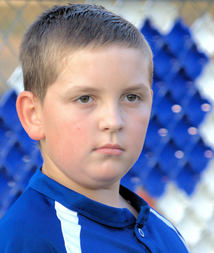
113 -1 by KHarmon1971, on Flickr
This I think, is a bit over processed. The background appears to be too washed out;
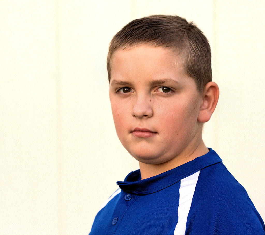
091 -1 by KHarmon1971, on Flickr
I may be wrong, and I usually am, but I like the way the post processing looks on these next two;
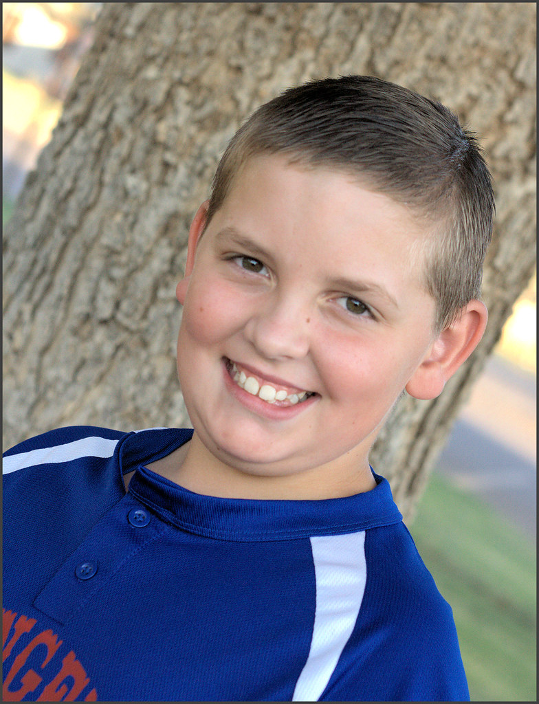
043 -1 by KHarmon1971, on Flickr
Blake 3 by KHarmon1971, on Flickr
I played with "frames" in Corel tonight for the first time;
012 -1 by KHarmon1971, on Flickr
 Helpful Posts: 0
Results 1 to 6 of 6
Thread: New model, more practice.
-
22nd August 2011, 04:21 AM #1

- Join Date
- Jul 2011
- Location
- 30 miles south of Lubbock TX
- Posts
- 320
- Real Name
- Kris Harmon
New model, more practice.
-
22nd August 2011, 04:22 AM #2
- Join Date
- Jul 2011
- Location
- 30 miles south of Lubbock TX
- Posts
- 320
- Real Name
- Kris Harmon
Re: New model, more practice.

Blake 2 by KHarmon1971, on Flickr
-
22nd August 2011, 08:11 PM #3
- Join Date
- Jul 2011
- Location
- 30 miles south of Lubbock TX
- Posts
- 320
- Real Name
- Kris Harmon
Re: New model, more practice.
Anybody have comments ordered critiques on this set? Am I making progress or spinning my wheels?
-
23rd August 2011, 04:26 AM #4

- Join Date
- Jan 2011
- Location
- Perth, Australia
- Posts
- 254
- Real Name
- Peter
Re: New model, more practice.
Kris - no expert here, I am likewise a beginner but I'll add my 2 cents worth.
I think the 1st 3 are a bit soft. The 4th one looks the best out of the lot in terms of focus.
For me, the frames don't really add to the photo. Particularly your 1st frame I think detracts quite a bit.
With regards to the photos themselves, they appear a little on the noisy side. Did you have high ISO or have you cranked the sharpening up a little too much?
The 3rd shot - the lighting doesn't make your subject stand out from the background. It would be nice to see the background a bit darker than the subject.
The 4th shot appears to be the strongest out of the set.
Finally, I'd have a closer look at your backgrounds. The 1st frame I think is a bit busy, I also think the background blends too much with the shirt. 2nd frame is certainly washed out - I'm not sure if this is the effect you are going for? 3rd and 4th frames with the tree I think are better, but they are uneven in that the trunk sort of stops either side of the head. Personnally I'd prefer either an even background or one that is consistent across the frame rather than the stop / start of the tree.
Good luck - I am going through a similar "journey" to you in trying to improve my portraits. It is good fun and I love the general advice I get from here. Keep it up!
-
25th August 2011, 02:05 PM #5

- Join Date
- Jun 2011
- Location
- Manchester, England
- Posts
- 77
- Real Name
- David Duffy
Re: New model, more practice.
Hi Kris
I like the 4th one most. The expression is very natural and winning. What I'd suggest with portraits is to make sure there's nothing in the pic (eg background or clothing) which is competing for attention with the face. In the case of the 4th pic, there are bright yellow highlights on each side of the tree which are brighter than the model. Try covering them up with your hands for a moment - his face stands out more now doesn't it?
best wishes, David
-
25th August 2011, 07:55 PM #6Moderator

- Join Date
- May 2008
- Location
- Windsor, Berks, UK
- Posts
- 16,775
- Real Name
- Dave Humphries :)
Re: New model, more practice.
Hi Kris,
OK, I'll bite too
I'll try to be balanced and suggest improvements for the criticisms
First = #113-1:
He looks fed up not worth persuing, but other aspects are;
Received wisdom is that focus should be on the eye nearest the camera
The background, while a bit busy, is at least matching the colours for his shirt, unfortunately, I'm still trying to work out what it is, distracting me from the subject
The face is a little bright and lacking slightly in contrast
Composition is OK by me
Second = #091-1:
As a deliberate white/pale background, this doesn't worry me, although I am undecided whether I like it off-white/creamy
It isn't quite sharp enough on the eyes, although I think the nearest is sharpest
Better expression
Some might argue there's too much space on the left of frame, but again, I can accept it
Third = 043-1;
Best expression of series I think, nice smile
Good white balance
Good saturation
Like the angle
I'd also clone out/dim down (a lot) those really bright bits in left top background
Fourth = Blake 3;
Another good expression
A slightly less broad smile might be better, as in third
Definitely over saturated, even background, compare with third shot
I would crop the right hand side so we don't see behind the tree here
I'd also clone out those really bright bits in left background
Fifth = 012-1;
The fence has too bold planking and distracts, also conflicts with angles in frame pattern
A slightly less broad smile might be better
There's a shadow on the fence and I wonder what it is, suggest cropping that off
You want to look out for the nose shadow on the far cheek caused by the hard light
Definitely over saturated on the face
Sixth = Blake 2;
The fence has too bold planking and distracts
You want to look out for large nose shadows on the far cheek
For me, slightly too wide on the white part of the border
His expression is serious, but ok
Did you PP #1, #3 and #6 at a different time, or on a different monitor from the others?
I find these 3 more natural for saturation, the others (#2, #4 and #5) are a bit too saturated in the skin tones.
In general, the hair is often sharper than the eyes, so selectively sharpen to avoid that happening
Not a bad series, but one we can all learn from, even me, as I don't do this often myself.
I hope that was helpful,


 Reply With Quote