 Helpful Posts: 0
Results 1 to 15 of 15
Thread: Telecom Tower Dubai (UAE)
-
8th March 2009, 08:02 AM #1
-
8th March 2009, 03:16 PM #2
Re: Telecom Tower Dubai (UAE)
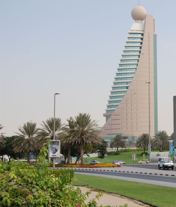
Hi Dharankk9 - The good thing about this image is that the verticals are vertical; there is no perspective distortion. However, I would crop out about 2/3 rds of the image and concentrate on the tower itself as much of the rest of the image is a bit distracting. Then I would add some more saturation, a tad of contrast enhancement, before sharpening some more. I say these things not to be critical or uncomplimentary, but because I have taken so many shots like this and then spent so much time trying to make them look better.
Keep up the good work.
Cheers
David
-
8th March 2009, 04:44 PM #3
Re: Telecom Tower Dubai (UAE)
Last edited by Colin Southern; 9th March 2009 at 03:29 AM.
-
9th March 2009, 02:07 AM #4
Re: Telecom Tower Dubai (UAE)
Hi dharankk9: I like the image and agree with David's comments. I've looked at your revised version and I like it even though you have pushed it a little into the unrealistic. Depending on what you are hoping to accomplish it doesn't bother me and actually makes it a more interesting image in my eyes.
I appreciate that a utility structure has been made into an aesthetic building. Communications towers don't have to look so good and it's nice when they do.
An interesting effect for me is that at first glance the image looks like it's not straight. However when I look closer it is nice and straight as David said. It must be the curved line that creates that effect.
Chuck
-
9th March 2009, 02:50 AM #5
Re: Telecom Tower Dubai (UAE)
Thanks for the description and comment.
correction with photoshop get a real color of glass only color of wall and grass become different from original. If i reduces color of grass then the color of glass is fading.Any way I will try it to make it more realistic.I am happy to learn something with these meaningful comments.
Regards
dharankk9
-
9th March 2009, 03:58 AM #6
Re: Telecom Tower Dubai (UAE)
Ah you can change the grass separate from the glass colours but it takes a bit of practise and familiarity with editing software so I'll leave out the how since you said are new to it. Just thought might be something to bear in mind for the future. It is easy to do but experimenting and getting comfortable with the editor is prerequisite or it's a bit like jumping in the deepend before you can swim. Nice image by the way.
-
9th March 2009, 06:23 AM #7

- Join Date
- Dec 2008
- Location
- New Zealand
- Posts
- 17,660
- Real Name
- Have a guess :)
Re: Telecom Tower Dubai (UAE)
Hi Vidyadharan,
What software do you have for doing your photo editing?
-
9th March 2009, 06:51 AM #8
-
9th March 2009, 06:56 AM #9
-
9th March 2009, 08:47 AM #10

- Join Date
- Dec 2008
- Location
- New Zealand
- Posts
- 17,660
- Real Name
- Have a guess :)
-
9th March 2009, 11:57 AM #11
Re: Telecom Tower Dubai (UAE)
This is more what I had in mind:

Note that because the upload photo does not have that many pixels changes to the image can lead to unwanted artefacts, like posterisation. I did this using the GIMP. Cropping as seen, saturation enhancement about 15%, and sharpening using a plugin similar to unsharp mask, set at a radius of about 1.5.
Now I look more closely at the image, there is a strange distortion or optical effect apparent. The verticals are OK, but the horizontals seen in the different floors vary. Is this the lens or the angle? I'm not sure.
Cheers
David
-
9th March 2009, 12:28 PM #12
-
9th March 2009, 01:03 PM #13
Re: Telecom Tower Dubai (UAE)
I now see what you mean David, but looking at it I suspect there may be a slow twist to the 'sharp edge' on the left hand side, whereby the corner on the lower floors are further from us than the top most floors. That was my theory and I am pleased to confirm it here.
BTW Does cutting that tree in half bug anyone else?
Cheers,
-
9th March 2009, 05:36 PM #14
Re: Telecom Tower Dubai (UAE)
Looking at the original Dave, it looks like a bit of cloning etc would be required or a slightly different viewpoint initially. The latter would be my preferred solution, if there was a second chance to go there.
Ian
-
9th March 2009, 05:53 PM #15
Re: Telecom Tower Dubai (UAE)
Dave - Well spotted re the twist. Also, half a tree is not so good, but for the purpose of illustration ....
Cheers
David


 Reply With Quote
