
 Helpful Posts:
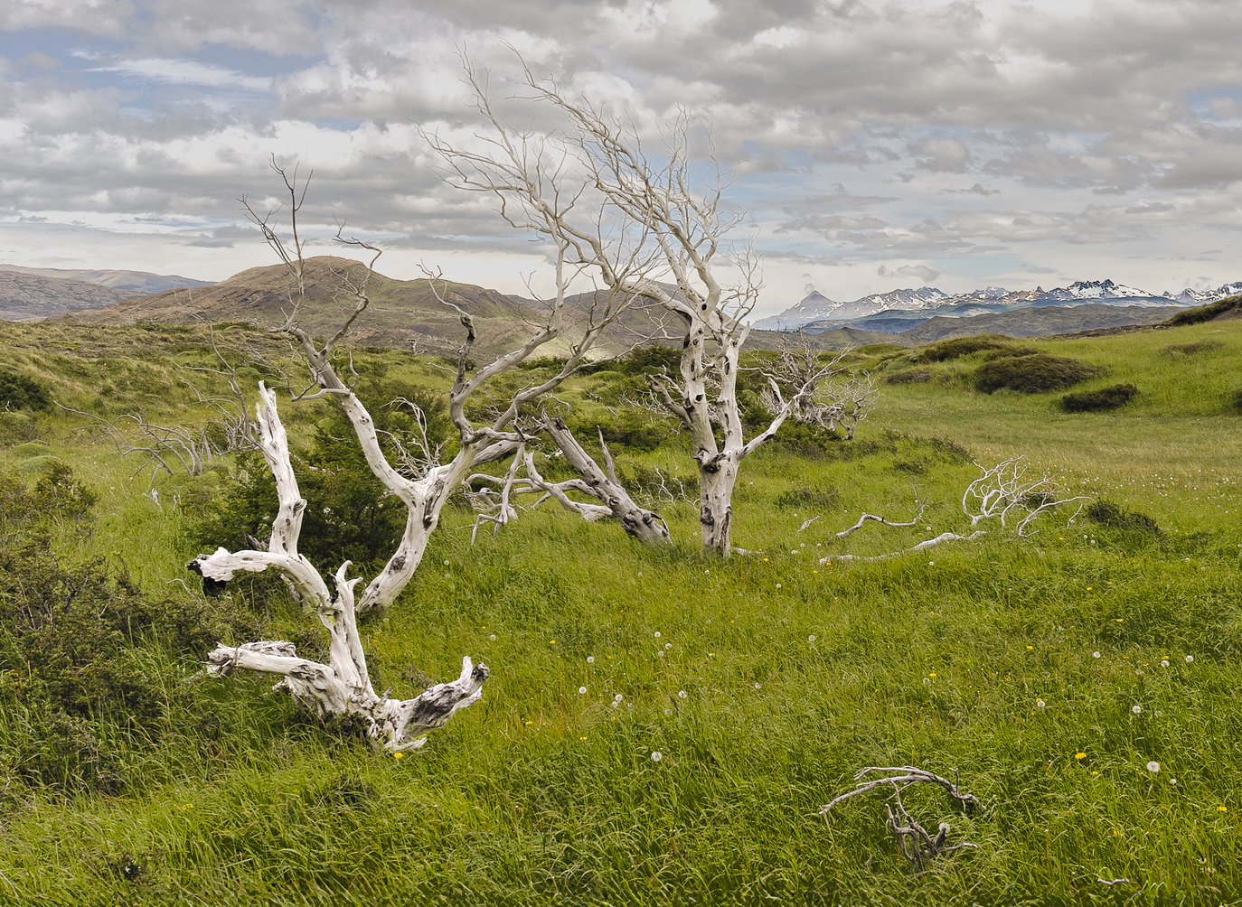
 The contained silence of this landscape is fantastic, where the vastness imposes itself without the need for grandiloquence.
The bare trees, like white skeletons lost in the intense green, mark the time of a past that is visible but nevertheless already distant. There is no shadow in these trunks, just memories.
The meadow stretches in all directions, cradled by a sky heavy with clouds and the line of mountains in the background, which rests like a distant limit.
The wind is felt even without hearing it, the cold is guessed even without touching it.
In this image there is solitude, yes, but also space. Space to stop, look and listen to what the silence has to say.
Results 1 to 20 of 39
Thread: Slow Breath
-
17th May 2025, 01:25 PM #1


- Join Date
- Mar 2025
- Location
- Setúbal - Portugal
- Posts
- 322
Slow Breath
-
17th May 2025, 01:56 PM #2

- Join Date
- Aug 2015
- Location
- Scotland
- Posts
- 3,195
- Real Name
- Bill
Re: Slow Breath
I'm trying hard to like this one Antonio, but it doesn't quite work for me.
The problem was that those lovely leading lines created by the trees and undultions in the grassy areas don't actually lead to anything of interest.
I tried cropping to give a triangular image with the trees on or near the vertices to contain the area of interest but wasn't sure ...
-
17th May 2025, 04:31 PM #3
- Join Date
- Mar 2025
- Location
- Setúbal - Portugal
- Posts
- 322
Re: Slow Breath
Thank you, Bill, for your comment.
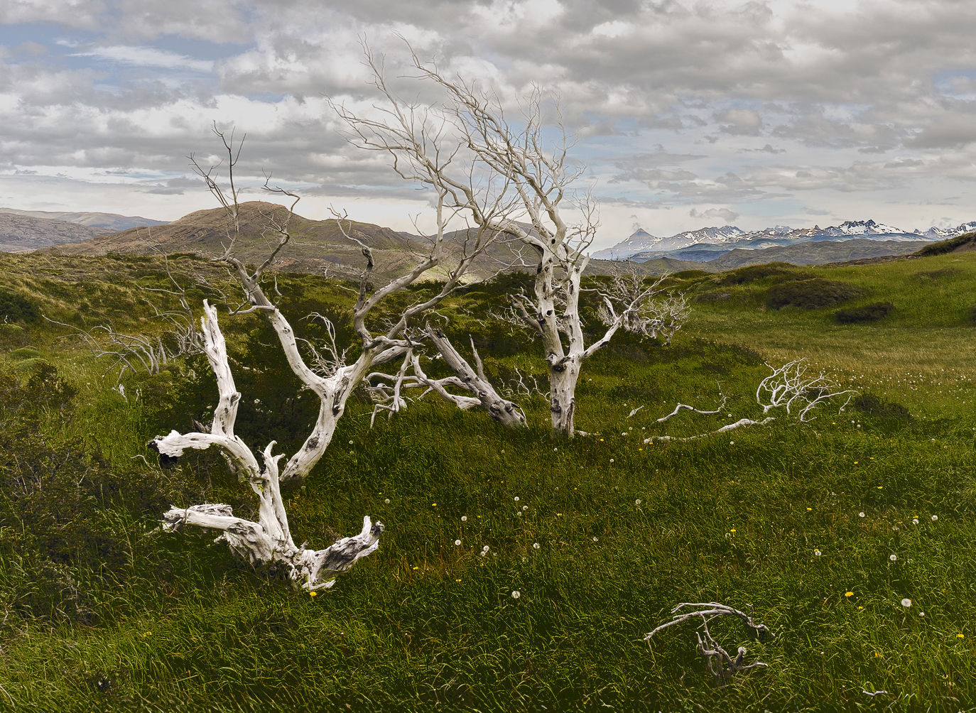
In fact, I have to admit that you are right. Not really one of my best photographs. Perhaps I was fascinated by the environment, but I confess that on location, it wasn't easy for me to stop to take this photo.Obviously, that isn't and cannot be a justification, or rather, it's a weak, poor one.
.
I opened the photo, gave the mountains in the background a few touch-ups, made a new slightly tighter framing, and here is the result which...In the end, I'm just trying to save a photo that perhaps isn't even worth the attempt. Or maybe it's just me who doesn't know any better...

-
17th May 2025, 05:26 PM #4
- Join Date
- Jan 2009
- Location
- South Devon, UK
- Posts
- 14,875
Re: Slow Breath
The edit looks better to me although I suspect the foreground would benefit from a fraction more brightness - but not the sky which is almost at the stage of maximum highlights now.
-
17th May 2025, 05:53 PM #5
- Join Date
- Mar 2025
- Location
- Setúbal - Portugal
- Posts
- 322
Re: Slow Breath
Just a tad...
Cheers !

-
17th May 2025, 11:56 PM #6

- Join Date
- Apr 2015
- Location
- Ottawa, Ontario, Canada
- Posts
- 1,594
- Real Name
- André
Re: Slow Breath
Antonio,
If you make it more about the trees, you could end up with a keeper.
What do you think?
-
18th May 2025, 11:00 AM #7
- Join Date
- Mar 2025
- Location
- Setúbal - Portugal
- Posts
- 322
Re: Slow Breath
My dear André,
What a magnificent and valuable suggestion! After so many adjustments and helpful inputs from this forum, I truly improved the image and I believe Ive finally arrived at what is indeed a keeper !
I tightened the crop, reduced the saturation, removed a few distracting spots, darkened the overall scene and lightened certain areas.
Ah yes, I also made the trees pop although they had already been adjusted previously, but now with more emphasis.
It now feels genuinely well-balanced.
Thank you so much, André, for your wonderful suggestion. Now it really does look very good.
That said and I must insist, its still not one of my best...

-
18th May 2025, 12:06 PM #8
- Join Date
- Apr 2015
- Location
- Ottawa, Ontario, Canada
- Posts
- 1,594
- Real Name
- André
Re: Slow Breath
This looks good to me. Glad I could be of assistance. Originally Posted by AntonioCorreia

-
18th May 2025, 12:55 PM #9

- Join Date
- Dec 2011
- Location
- New England
- Posts
- 9,278
- Real Name
- Dan
Re: Slow Breath
I agree: Andre's edit is a very big improvement, and I like the image. However, I do have one additional suggestion.
I don't think your reduction of saturation helps. I'm not a fan of saturation and almost never boost it in my own photos, although I do modestly boost vibrance a lot. More often than not, if I fiddle with saturation, it's to reduce it. However, in this case, that last edit has two negative effects. First, it makes the grass, which still makes up about half the image, dull. Second, it reduces the color contrast between the trees and the grass, making the trees stand out less. That's the opposite of the intent of Andre's edit, which was to make the photo about the trees.
Just my two cents.
-
18th May 2025, 02:45 PM #10
- Join Date
- Mar 2025
- Location
- Setúbal - Portugal
- Posts
- 322
Re: Slow Breath
Dan, thank you for your always helpful comment.
Let me start by saying that Ive been practising with Curves with some success, always learning, of course.
Ive noticed, for instance, that when we hover the little arrows over the image, a point appears on the curve, allowing for slow adjustments using the keyboard arrows. Thats really handy.
This is especially useful as I dont have a graphics tablet, at least not yet.
On the other hand, Ive never seen this method explained anywhere. I hope Ive expressed myself clearly enough.
.
Now, regarding this image.
If you dont use Saturation or rather, negative Saturation, then how do you go about it?
I find the Colour Mixer quite interesting and potentially capable of surprising and creative results, especially when we shift the Hue.
This tool is also available within masks, though presented a bit differently, which I personally think is a pity as there should be more consistency and uniformity across similar commands, which would make learning and using these tools much easier.
Within masks, colour selection is indeed more precise
Cheers !
-
18th May 2025, 05:43 PM #11
- Join Date
- Apr 2015
- Location
- Ottawa, Ontario, Canada
- Posts
- 1,594
- Real Name
- André
Re: Slow Breath
Antonio, If I wanted to increase the contrast between the trees and the grass, I would select the green using the "select color range" sub menu of the "select" menu then click on a green area and adjust the fuzzyness slider to refine the selection. I would then use a "curve" layer or a "selective color" layer to darken the grass. Originally Posted by AntonioCorreia
This is too dark for my liking but it illustrate the process.Last edited by Round Tuit; 18th May 2025 at 05:49 PM.
-
18th May 2025, 10:32 PM #12
- Join Date
- Mar 2025
- Location
- Setúbal - Portugal
- Posts
- 322
Re: Slow Breath
André, thank you very much for your tip.
Its truly useful and relevant. Ive been exploring around but I still dont have the kind of practice Id like to achieve good results. Still, I keep trying.
Have a great week !
-
19th May 2025, 04:47 PM #13
- Join Date
- Dec 2011
- Location
- New England
- Posts
- 9,278
- Real Name
- Dan
Re: Slow Breath
This discussion about methods has gone will beyond my suggestion, which is that if I were doing this, I wouldn't do whatever it is you did to reduce the saturation of the greens.
Re curves: I know I'm repeating myself, but it really is essential to learn how to use that tool. If we were in the same place, I'd be happy to sit in front of a monitor with you for half an hour or an hour to teach you, but we unfortunately, that's not the case.
-
19th May 2025, 05:44 PM #14
- Join Date
- Mar 2025
- Location
- Setúbal - Portugal
- Posts
- 322
Re: Slow Breath
Thanks Dank ! Originally Posted by DanK
I am doing my best !
Cheers !
-
19th May 2025, 05:57 PM #15
- Join Date
- Jan 2009
- Location
- South Devon, UK
- Posts
- 14,875
Re: Slow Breath
Some people prefer to use Levels instead of Curves but that can be a bit harsh, although it is sometimes useful when making large changes. I use Curves, to a greater or lesser amount, on all my images.
Another option, but this may just add confusion to the situation, is to alter the Blend Mode. For example, Create a Curves adjustment layer and set the Blend Mode to Overlay or Soft Light Mode. Other options include Multiply and many others. Then adjust the Curves setting as normal but it creates more contrast or saturation, etc.
Or, create a duplicate layer, add a general overall mask (Hide All or Reveal All) and edit that as required. For example using a brush.
These options won't suit everybody but they are worth trying as an experiment. Using selections and masking is a skill which has a rather steep learning curve but I frequently use them.
-
19th May 2025, 10:25 PM #16
- Join Date
- Mar 2025
- Location
- Setúbal - Portugal
- Posts
- 322
Re: Slow Breath
Geoff, thank you, but I think its enough for now when it comes to adding more processing methods to images.
Of course, your suggestion is equally valid, but as you can imagine, I simply cant absorb everything especially as there are other tasks besides photography that take up my time.
I do find your idea of using Blending Modes particularly interesting and worth exploring, although sometimes my learning curve can be slow, at least in the beginning.
I do have some knowledge, but there are so many tools we cant possibly explore them all, let alone master their use.
It reminds me of when I used to work with a very specialised software I knew a millimetre of a program that was a kilometre long.
Thanks again !
-
20th May 2025, 12:21 AM #17
- Join Date
- Dec 2011
- Location
- New England
- Posts
- 9,278
- Real Name
- Dan
Re: Slow Breath
Levels does much less, but what levels does do (leaving aside the output controls), curves can do as well. Moving the black and white points on the curves tool is the same as moving the ends of the curve horizontally using the curves tool. There is a very good video about the choice between these tools on piximperfect.Some people prefer to use Levels instead of Curves but that can be a bit harsh, although it is sometimes useful when making large changes. I use Curves, to a greater or lesser amount, on all my images.
Changing the black or white point with either tool increases contrast because it broadens the tonal range. For example, if the lowest point is 100, which is not very dark, and you bring the black point up to, say, 98, the pixels that used to be 100, thereore gray, become almost pure black.
The more common way to use a curve is to increase midtone contrast using an S-shaped curve. This doesn't change the total tonal range, but it expands the range in the midtones while decreasing it in the tails. That also increases the perception of contrast.
When I want a simple change in the white or black point, I sometimes use the levels first, just to avoid compressing the space on the curves tool for other adjustments.
-
20th May 2025, 11:32 AM #18
- Join Date
- Dec 2011
- Location
- New England
- Posts
- 9,278
- Real Name
- Dan
Re: Slow Breath
Yes, there are too many to learn at once, and at least for me, only a few of them are useful.I do find your idea of using Blending Modes particularly interesting and worth exploring, although sometimes my learning curve can be slow, at least in the beginning.
I do have some knowledge, but there are so many tools we cant possibly explore them all, let alone master their use.
My (unsolicited) advice is to leave blend modes alone until you have mastered the basic tools. Once you are comfortable with the basic tools, there are a few blend modes that are important to learn, although I never use most of them. Like Geoff, I use the overlay mode, and I frequently use luminosity. (Luminosity is the first one I would recommend learning after "normal", but that's a discussion for a later time.) On very rare occasions, I use a few others, like multiply and screen. I'd ignore them for now.
What makes the curves tool hard to learn at first is that you are transforming the original histogram to another, and while you can see the revised histogram in the histogram panel, that's different from what you see in the curves tool itself.
The basic idea of the curve is that it's a histogram showing how many pixels are at each brightness level, with zero (pure black) a the left hand edge of the x axis and 255 at the right. If you select any point and move it up, you are brightening the pixels at that point and, to a progressively lesser degree as you move away from that point, brightening pixels of similar brightness. Pulling down does the reverse.
So, let's say that you have a well exposed image with the histogram running all the way from 10 to 244, and you want to increase midtone contrast. Select a point that is somewhere near the bottom, say, 40, and pull it down a bit. The LR histogram will tell you the new value. Let's say you pull it down to 30. Now pick a value near the top, lets say 200. (The actual points are determined by the effect you want.) Pull 200 up to 220. What's happened?
--the pixels that used to be in the range of 40-200 now extend from 30 to 220. the midtones have been expanded. this will create more perception of contrast.
--the pixels that used to be in the range of 10-40 are now darker, compressed into 10-30. 10 isn't changed, 11 is changed a tiny bit, 12 is changed a bit more, and when you get to 40, it's been changed by the full 10.
--the pixels that used to be in the range of 200-244 are brighter, compressed into the range of 220-244.
--although the darks as a whole are darker, also contributing to contrast, the darkest value (the black point) has not been moved.
--although the highlights as a whole are brighter, the white point has not been moved.
--therefore, the total tonal range remains the same, but the distribution of light values within that range has been changed quite a bit.
Where you put the anchors and how far up or down you move them is a matter of taste and often trial and error. You can also add additional point, for example, to keep bright areas unchanged while increasing contrast in the mids and lows, or whatever you want.
Once you are comfortable with this the next issue about using the tool in my view is one that many people ignore: changing tonality with any tools also changes saturation. Sometimes that's fine, sometimes it's not. It depends on the image and your taste. To avoid this with the LR curve tool, just move the slider on the bottom of the curve tool. To avoid this in Photoshop, change the blend mode of the curves layer from normal to luminosity.
I hope this helps.
-
21st May 2025, 05:44 PM #19
- Join Date
- Mar 2025
- Location
- Setúbal - Portugal
- Posts
- 322
Re: Slow Breath
Dan, of course your unsolicited advice is always very welcome, it's instructive and useful every time. I can only thank you for your patience in giving so many explanations on the same topic.
You see, Dan, I'm not completely unfamiliar with adjustments, as I'm still able to produce images with at least a minimum level of quality, as you've seen and acknowledged. But it's highly likely that I might be making certain procedural mistakes, and consequently, my results may not be, shall we say brilliant.
One tip that caught my attention, among others, was this one:
"What makes the curves tool hard to learn at first is that you are transforming the original histogram to another, and while you can see the revised histogram in the histogram panel, that's different from what you see in the curves tool itself."
I was entirely unaware of this, or rather, I had never noticed such a detail before !
I already knew about and use the new Saturation adjustment that Curves introduced.
Anyway, I keep experimenting, adjusting, and tweaking, so that my images turn out as well as possible.
But there's another aspect I'd like to highlight or mention.
Sometimes, creating a technically correct histogram doesn't necessarily match the image we have in mind or the visual impact we want to achieve.
But that's another story entirely.
Once again, my sincere thanks for all your efforts in conveying the best ways to use Curves.
Cheers !
-
21st May 2025, 09:13 PM #20
- Join Date
- Apr 2015
- Location
- Ottawa, Ontario, Canada
- Posts
- 1,594
- Real Name
- André
Re: Slow Breath
Hi Antonio, Originally Posted by AntonioCorreia
It looks to me like you are misunderstanding the emphasis that Dan & I place on mastering photo processing tools. The sole purpose of these tools is to help you, the photographer, create the pictures that you want. There is no inherent right histogram any more that there is a right exposure, shutter speed or aperture. All these parameters and many more are adjustable so that the photographer can realize his vision.
Soft and dream like photos as just as technically correct as sharp pictures. The same is true for bright photos vs dark photos or any of the other aspect of photography. Technical competence greatly facilitate creating the pictures that match your vision. As you gain technical skills, the options that you have to interpret your vision will expand.
To use your photo as an example. If the only option that you know how to make the trees stand out against the grass is desaturating the grass, then you cannot consider darkening the grass, brightening the trees or blurring the grass to achieve your aim. Knowing all these options will let you decide which technique or combination of techniques best meets your aim. Nothing is technically correct if the resulting photo does not reflect the photographer's vision.
André


 Reply With Quote