TUTORIALS: PHOTOSHOP CURVES
The Photoshop curves tool is perhaps the most powerful and flexible image transformation, yet it may also be one of the most intimidating. Since photographers effectively paint with light, curves is central to their practice because it affects light's two primary influences: tones and contrast. Tonal curves are also what give different film types their unique character, so understanding how they work allows one to mimic any film — without ever having to retake the photograph.
HOW IT WORKS
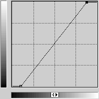
Similar to Photoshop levels, the curves tool can take input tones and selectively stretch or compress them. Unlike levels however, which only has black, white and midpoint control, a tonal curve is controlled using any number of anchor points (small squares below, up to a total of 16). The result of a given curve can be visualized by following a test input tone up to the curve, then over to its resulting output tone. A diagonal line through the center will therefore leave tones unchanged.
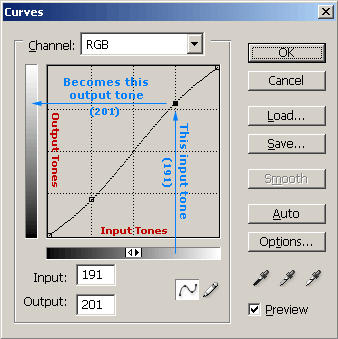
If you follow two spaced input tones, note that their separation becomes stretched as the slope of the curve increases, whereas tones get compressed when the slope decreases (compared to the original diagonal line). Recall from the image histogram tutorial that compressed tones receive less contrast, whereas stretched tones get more contrast. Move your mouse over the curve types below to see how these changes affect this exaggerated example:
 |
|
| Choose: | |
| High Contrast | Low Contrast |
| Show Tonal Labels? | |
| YES | NO |


Note: curves and histograms shown above are applied to and shown for luminosity (not RGB)
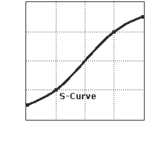
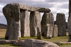
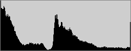
The curves shown above are two of the most common: the "S-curve" and "inverted S-curve." An S-curve adds contrast to the midtones at the expense of shadows and highlights, whereas the inverted S-curve does the opposite. Note how these change the histogram and most importantly, also notice how these changes influence the image: reflection detail on the side and underside of the boat become clearer for the inverted S-curve while water texture becomes more washed out (and the opposite for the S-curve).
MOTIVATION: DYNAMIC RANGE & FILM CURVES
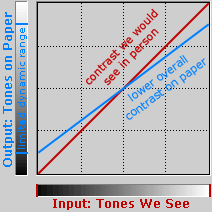

Why redistribute contrast if this is always a trade-off? Since actual scenes contain a greater lightness range (dynamic range) than we can reproduce on paper, one always has to compress the tonal range to reproduce it in a print. Curves allows us to better utilize limited dynamic range.
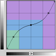
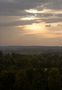
Midtone contrast is perceptually more important, so the shadows and highlights usually end up bearing the bulk of this tonal compression. Most films and photo papers therefore use something similar to an S-curve to maintain midtone contrast. Move your mouse over the image (right) to see how an S-curve can help maintain contrast in the midtones,and note its similarity to an actual film curve (below). Each film's unique character is primarily defined by its tonal curve.
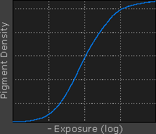
(Shown for Kodak Supra II Paper)
Furthermore, while our camera (ideally) estimates the relative amount of photons hitting each pixel, our eyes/brain actually apply a tonal curve of their own to achieve the maximum visual sensitivity over the greatest lightness range. The camera therefore has to apply its own tonal curve to the RAW file format to maintain accuracy. On top of this, each type of digital sensor has their own tonal response curve, and even PC/Mac computers apply a different tonal curve when displaying images (gamma).
In summary: tonal curves are required for every image in one form or another — whether this be by our eyes, the film emulsion, digital camera, display device or in post-processing.
IN PRACTICE: OVERVIEW
The key concept with curves is that you can never add contrast in one tonal region without also decreasing it in another. In other words, the curves tool only redistributes contrast. All photographs therefore have a "contrast budget" and you must decide how to spend it — whether this be by spreading contrast evenly (straight diagonal line) or by unequal allocation (varying slope).
Furthermore, curves always preserves the tonal hierarchy (unless uncommon curves with negative slope are used). This means that if a certain tone was brighter than another before the conversion, it will still be brighter afterwards — just not necessarily by the same amount.
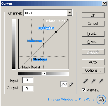
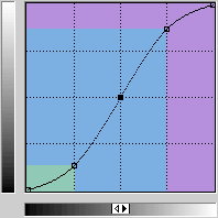
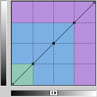
Three anchor points shown above (each for shadows, midtones and highlights) are generally all that is needed (in addition to the black and white points). A tricky aspect is that even minor movement in an anchor point can result in major changes in the final image. Abrupt changes in slope can easily induce posterization by stretching tones in regions with gradual tonal variation. Therefore moderate adjustments which produce smooth curves usually work best. If you need extra fine-tuning ability, try enlarging the size of the curves window.
Pay close attention to the image histogram when making adjustments. If you want to increase contrast in a certain tonal peak, use the histogram to ensure that the region of greater slope falls on top of this peak. I prefer to open the histograms window (Window > Histogram) to see live changes as I drag each anchor point.
UTILIZING EMPTY TONAL RANGE
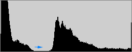
The exception to the contrast trade-off is when you have unused tonal range, either at histogram edges or as gaps in between tonal peaks. If these gaps are at the histogram's edges, this unused tonal range can be utilized with the black and white anchor points (as with levels tool).
 | |
 | |
| BEFORE | AFTER |
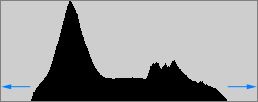
If the gaps occur in between tonal peaks, then a unique ability with curves is that it can decrease contrast in these unused tones — thereby freeing up contrast to be spent on tones which are actually present in the image. The next example uses a curve to close the tonal gap between the sky and darker foliage.

 |
|
| BEFORE | AFTER |
Note how this produces an overall smoother toned image, and that the midtones and highlights remain more or less unchanged on the histogram.
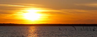
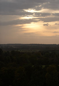
TRANSITION OF CLIPPED HIGHLIGHTS
Digital photos may abruptly clip their highlights once the brightness level reaches its maximum (255 for 8-bit images). This can create an unrealistic look, and often a smoother transition to white is preferred. Move your mouse over the image to see the difference.
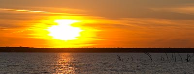
(Above results achieved with a custom color profile curve.)
Note the transition at the sun's border. In general, the highlight transition can be made more gradual by decreasing the curve's slope at the far upper right corner.
LIGHTNESS CHANNEL & ADJUSTMENT LAYERS
Performing curves to just the lightness/luminosity channel - either in LAB mode or as an adjustment layer - can help reduce changes in hue and color saturation. Move your mouse over each of the images below to see what would have happened if this curve had been applied to the RGB channel.
 Inverted S-Curve
 S-Curve
Note how color saturation is greatly decreased and increased for the inverted S-curve and the regular S-curve, respectively. In general, curves with a large slope in the midtones will increase color saturation, whereas a small slope will decrease it. Changes in saturation may be desirable when brightening shadows, but in most other instances this should be avoided.
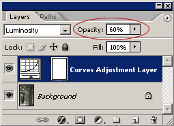
Adjustment layers (Layer > New Adjustment Layer > Curves...) can be set to make curves only apply to the luminosity channel by choosing a different blending mode (right).
Another benefit is that it can make your curves adjustment more subtle. This is accomplished by reducing the opacity appropriately (circled in red above). This is particularly useful because small changes in anchor points sometimes yield too much of a change in the image. Finally, you can continually fine-tune the curve without changing the actual image levels each time — thereby reducing posterization.
USING CURVES TO CORRECT COLOR BALANCE
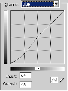
Although all curves thus far have been applied to RGB values or luminosity, they can also be used on individual color channels as a powerful way of correcting color casts in specific tonal areas. Let's say your image had a bluish color cast in the shadows, however both the midtones and highlights appeared balanced. Changing the white balance or adjusting the overall color to fix the shadows would inadvertently harm the other tones.
 | |
| BEFORE | AFTER |
The above example selectively decreases the amount of blue in the shadows to fix the bluish color cast. Make sure to apply anchor points along the diagonal for all tonal regions which you do not wish to change. If you do not require precise color adjustments, the curves tool is probably overkill. In such cases a color balance correction would be much easier ("Image > Adjustments > Color Balance..." in Photoshop).
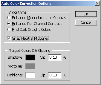
Alternatively, overall color casts can be fixed using the "Snap Neutral Midtones" setting under the options button. This works best for images whose average midtone color is roughly neutral; photos with an overabundance of one color (such as one taken within a forest) should use other methods such as white balance in RAW or with the levels tool.
NOTES ON IMAGE CONTRAST
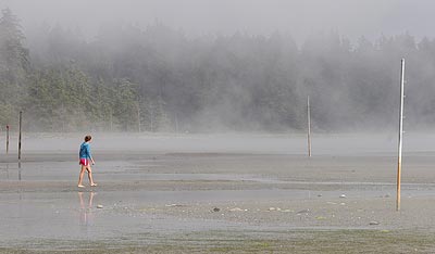
This tutorial has discussed contrast as if it were always desirable, however this depends on subject matter, atmosphere and artistic intent. There may be cases where one would wish to deliberately not use the entire tonal range. These may include Images taken in fog, haze or very soft light as they often never have fully black or white regions. Contrast can emphasize texture or enhance subject-background separation, however harsh or overcast light can result in too much or too little contrast, respectively.
PRECAUTIONS
- Minimize use of the curves tool, as anything which stretches the image histogram increases the possibility of posterization.
- Always perform curves on 16-bit images when possible.
- Extreme levels adjustments in the RGB channel should be avoided; for such cases perform curves using the lightness channel in an adjustment layer or LAB mode to avoid significant changes in hue and saturation.
For related reading, please visit:
Using "Levels" in Photoshop