TUTORIALS: WHITE BALANCE
White balance (WB) is the process of removing unrealistic color casts, so that objects which appear white in person are rendered white in your photo. Proper camera white balance has to take into account the "color temperature" of a light source, which refers to the relative warmth or coolness of white light. Our eyes are very good at judging what is white under different light sources, but digital cameras often have great difficulty with auto white balance (AWB) — and can create unsightly blue, orange, or even green color casts. Understanding digital white balance can help you avoid these color casts, thereby improving your photos under a wider range of lighting conditions.


BACKGROUND: COLOR TEMPERATURE
Color temperature describes the spectrum of light which is radiated from a "blackbody" with that surface temperature. A blackbody is an object which absorbs all incident light — neither reflecting it nor allowing it to pass through. A rough analogue of blackbody radiation in our day to day experience might be in heating a metal or stone: these are said to become "red hot" when they attain one temperature, and then "white hot" for even higher temperatures. Similarly, blackbodies at different temperatures also have varying color temperatures of "white light." Despite its name, light which may appear white does not necessarily contain an even distribution of colors across the visible spectrum:
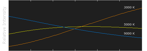
Relative intensity has been normalized for each temperature (in Kelvins).
Note how 5000 K produces roughly neutral light, whereas 3000 K and 9000 K produce light spectrums which shift to contain more orange and blue wavelengths, respectively. As the color temperature rises, the color distribution becomes cooler. This may not seem intuitive, but results from the fact that shorter wavelengths contain light of higher energy.
Why is color temperature a useful description of light for photographers, if they never deal with true blackbodies? Fortunately, light sources such as daylight and tungsten bulbs closely mimic the distribution of light created by blackbodies, although others such as fluorescent and most commercial lighting depart from blackbodies significantly. Since photographers never use the term color temperature to refer to a true blackbody light source, the term is implied to be a "correlated color temperature" with a similarly colored blackbody. The following table is a rule-of-thumb guide to the correlated color temperature of some common light sources:
| Color Temperature | Light Source |
| 1000-2000 K | Candlelight |
| 2500-3500 K | Tungsten Bulb (household variety) |
| 3000-4000 K | Sunrise/Sunset (clear sky) |
| 4000-5000 K | Fluorescent Lamps |
| 5000-5500 K | Electronic Flash |
| 5000-6500 K | Daylight with Clear Sky (sun overhead) |
| 6500-8000 K | Moderately Overcast Sky |
| 9000-10000 K | Shade or Heavily Overcast Sky |
IN PRACTICE: JPEG & TIFF FILES
Since some light sources do not resemble blackbody radiators, white balance uses a second variable in addition to color temperature: the green-magenta shift. Adjusting the green-magenta shift is often unnecessary under ordinary daylight, however fluorescent and other artificial lighting may require significant green-magenta adjustments to the WB.
| Auto White Balance | |
| Custom | |
| Kelvin | |
| Tungsten | |
| Fluorescent | |
| Daylight | |
| Flash | |
| Cloudy | |
| Shade |
Fortunately, most digital cameras contain a variety of preset white balances, so you do not have to deal with color temperature and green-magenta shift during the critical shot. Commonly used symbols for each of these are listed to the left.
The first three white balances allow for a range of color temperatures. Auto white balance is available in all digital cameras and uses a best guess algorithm within a limited range — usually between 3000/4000 K and 7000 K. Custom white balance allows you to take a picture of a known gray reference under the same lighting, and then set that as the white balance for future photos. With "Kelvin" you can set the color temperature over a broad range.
The remaining six white balances are listed in order of increasing color temperature, however many compact cameras do not include a shade white balance. Some cameras also include a "Fluorescent H" setting, which is designed to work in newer daylight-calibrated fluorescents.
The description and symbol for the above white balances are just rough estimates for the actual lighting they work best under. In fact, cloudy could be used in place of daylight depending on the time of day, elevation, or degree of haziness. In general, if your image appears too cool on your LCD screen preview (regardless of the setting), you can quickly increase the color temperature by selecting a symbol farther down on the list above. If the image is still too cool (or warm if going the other direction), you can resort to manually entering a temperature in the Kelvin setting.
If all else fails and the image still does not have the correct WB after inspecting it on a computer afterwards, you can adjust the color balance to remove additional color casts. Alternatively, one could click on a colorless reference (see section on neutral references) with the "set gray point" dropper while using the "levels" tool in Photoshop. Either of these methods should be avoided since they can severely reduce the bit depth of your image.
IN PRACTICE: THE RAW FILE FORMAT
By far the best white balance solution is to photograph using the RAW file format (if your camera supports them), as these allow you to set the WB *after* the photo has been taken. RAW files also allow one to set the WB based on a broader range of color temperature and green-magenta shifts.
Performing a white balance with a raw file is quick and easy. You can either adjust the temperature and green-magenta sliders until color casts are removed, or you can simply click on a neutral reference within the image (see next section). Even if only one of your photos contains a neutral reference, you can click on it and then use the resulting WB settings for the remainder of your photos (assuming the same lighting).
CUSTOM WHITE BALANCE: CHOOSING A NEUTRAL REFERENCE
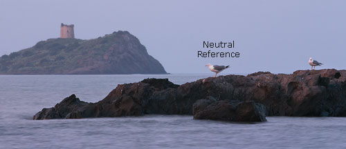
A neutral reference is often used for color-critical projects, or for situations where one anticipates auto white balance will encounter problems. Neutral references can either be parts of your scene (if you're lucky), or can be a portable item which you carry with you. Below is an example of a fortunate reference in an otherwise bluish twilight scene.
On the other hand, pre-made portable references are almost always more accurate since one can easily be tricked into thinking an object is neutral when it is not. Portable references can be expensive and specifically designed for photography, or may include less expensive household items. An ideal gray reference is one which reflects all colors in the spectrum equally, and can consistently do so under a broad range of color temperatures. An example of a pre-made gray reference is shown below:
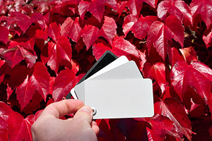
Common household neutral references are the underside of a lid to a coffee or pringles container. These are both inexpensive and reasonably accurate, although custom-made photographic references are the best (such as the cards shown above). Custom-made devices can be used to measure either the incident or reflected color temperature of the illuminant. Most neutral references measure reflected light, whereas a device such as a white balance meter or an "ExpoDisc" can measure incident light (and can theoretically be more accurate).
Care should be taken when using a neutral reference with high image noise, since clicking on a seemingly gray region may actually select a colorful pixel caused by color noise:
 Low Noise
(Smooth Colorless Gray)
 High Noise
(Patches of Color)
If your software supports it, the best solution for white balancing with noisy images is to use the average of pixels with a noisy gray region as your reference. This can be either a 3x3 or 5x5 pixel average if using Adobe Photoshop.
NOTES ON AUTO WHITE BALANCE
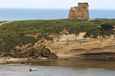
Certain subjects create problems for a digital camera's auto white balance — even under normal daylight conditions. One example is if the image already has an overabundance of warmth or coolness due to unique subject matter. The image below illustrates a situation where the subject is predominantly red, and so the camera mistakes this for a color cast induced by a warm light source. The camera then tries to compensate for this so that the average color of the image is closer to neutral, but in doing so it unknowingly creates a bluish color cast on the stones. Some digital cameras are more susceptible to this than others.


(Custom white balance uses an 18% gray card as a neutral reference.)
A digital camera's auto white balance is often more effective when the photo contains at least one white or bright colorless element. Of course, do not try to change your composition to include a colorless object, but just be aware that its absence may cause problems with the auto white balance. Without the white boat in the image below, the camera's auto white balance mistakenly created an image with a slightly warmer color temperature.
IN MIXED LIGHTING
Multiple illuminants with different color temperatures can further complicate performing a white balance. Some lighting situations may not even have a truly "correct" white balance, and will depend upon where color accuracy is most important.
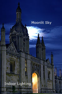
 |
||
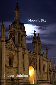
| Reference: | Moon | Stone |
Under mixed lighting, auto white balance usually calculates an average color temperature for the entire scene, and then uses this as the white balance. This approach is usually acceptable, however auto white balance tends to exaggerate the difference in color temperature for each light source, as compared with what we perceive with our eyes.
Exaggerated differences in color temperature are often most apparent with mixed indoor and natural lighting. Critical images may even require a different white balance for each lighting region. On the other hand, some may prefer to leave the color temperatures as is.
Note how the building to the left is quite warm, whereas the sky is somewhat cool. This is because the white balance was set based on the moonlight — bringing out the warm color temperature of the artificial lighting below. White balancing based on the natural light often yields a more realistic photograph. Choose "stone" as the white balance reference and see how the sky becomes unrealistically blue.